


In October of 2022, we changed the settings experience to move what was once four disparate and messy pages (“Newsletter”, “Account”, “Design”, and “Embedding”) into one big settings page:
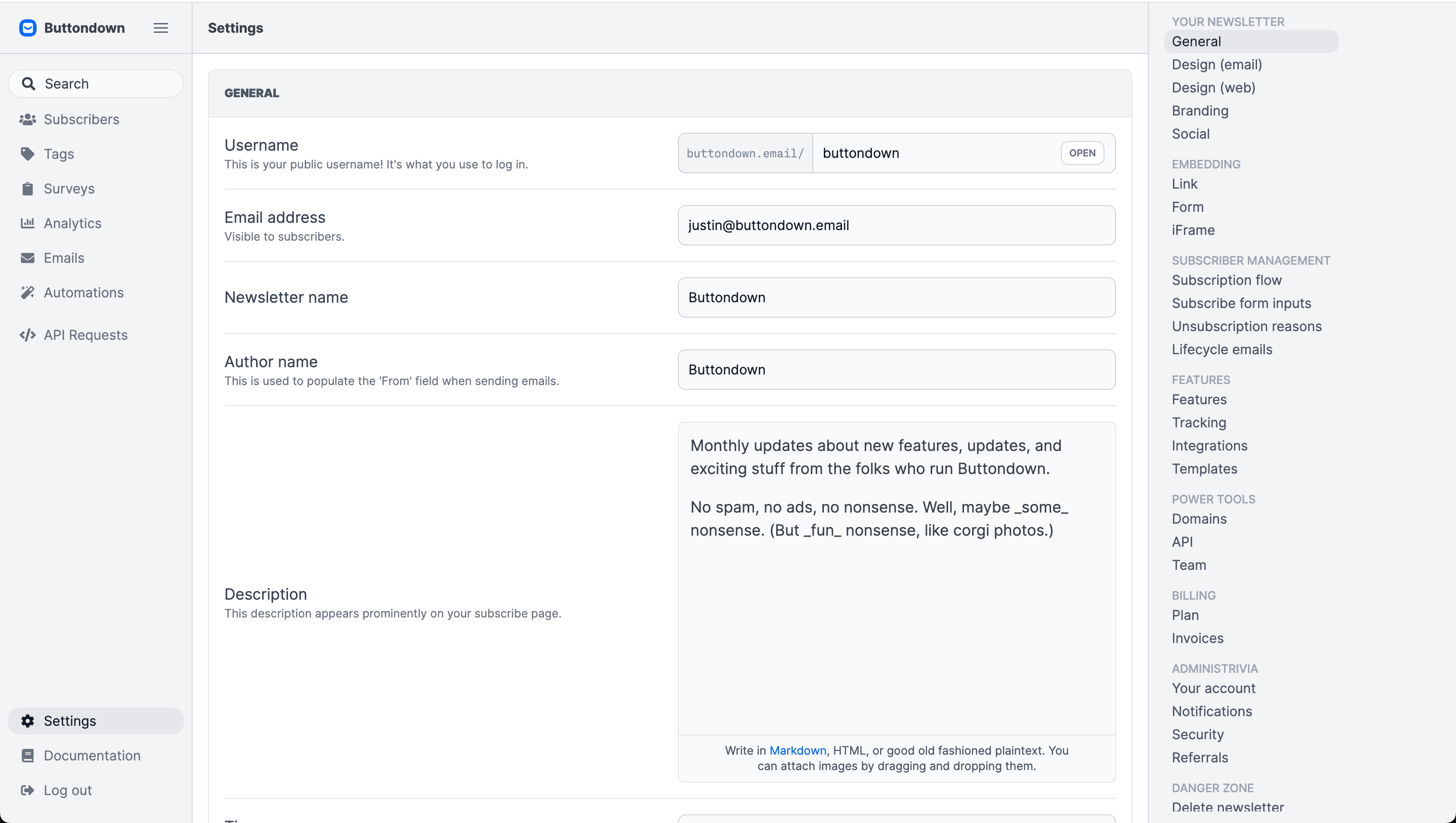
The rationale for this change was two-fold:
- There was no clear definition of what settings mapped onto which page, and it was confusing for people to have to hop around between different pages;
- The “Newsletter” page was becoming a grab-bag page with no discernible architecture or flow.
And so, for the past eighteen months, we’ve toiled along with a big ol’ settings page.
The big ol’ settings page has its flaws, though:
- The first-run experience for users is overwhelming and confusing. New authors are bombarded with dozens of inputs and toggles and knobs and whistles.
- While the minimap-esque navigation provides some level of hierarchy and orientation, it’s still quite hard to develop a muscle memory or mise en place for commonly-accessed settings.
- The settings page is very slow, an account of the sheer number of settings and data required to power those settings.
In short: it’s clear that the big ol’ settings page was a bit of a failure, design-wise. Our goal is to make it easy for authors to spin up on Buttondown and make it easy for authors to confidently and quickly make changes to their newsletter; it’s not quite good at either of those things.
So we’re going back! Now, when you click on Settings, you’re taken to a smaller page with the bare essentials, plus a bunch of other links to dive into specifics like Integrations, Notifications, and so on.
It’s boring to talk about changes to settings pages, I know — they’re sort of the unfinished basement of any application, useful in its own way but best left unshown to house guests. But running a newsletter has a lot of fiddly bits, and we want to make it as pleasant as possible for you to accomplish whatever you’re trying to accomplish.
There are more changes in this vein coming:
- We’re gonna add a nice preview pane to the Design settings page, so you can more quickly see how changes to your newsletter will look in your subscribers’ inbox;
- The Subscribing page will be cleaned up from its current state of “grab bag of miscellany”.
But this was the big one. I hope it makes your life 0.25% better; if it doesn’t (or if there are other changes you’d like to see!) shoot me an email and tell me about it.