


A rebrand had been on the cards for a while. We wanted something that helped us stand out. Not just look different, but own what we actually do.
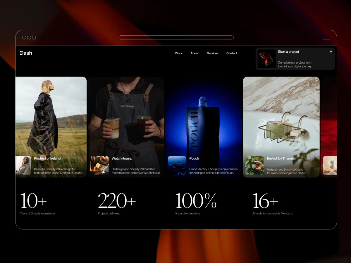
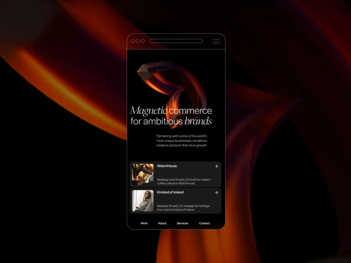
That process led to a simple concept: magnetic commerce. Great digital experiences do more than inform. They draw people in. That idea shaped our new logo, with part of the D pulled inward as if by magnetic force. The emblem became the starting point for almost every design decision that followed.
Once we had that asset rendered as a rotating 3D object, the cursor interaction came naturally. The logo should behave like its concept. Drag the cursor over it and it pulls. That one detail set the tone for how we’d think about motion across the rest of the site.
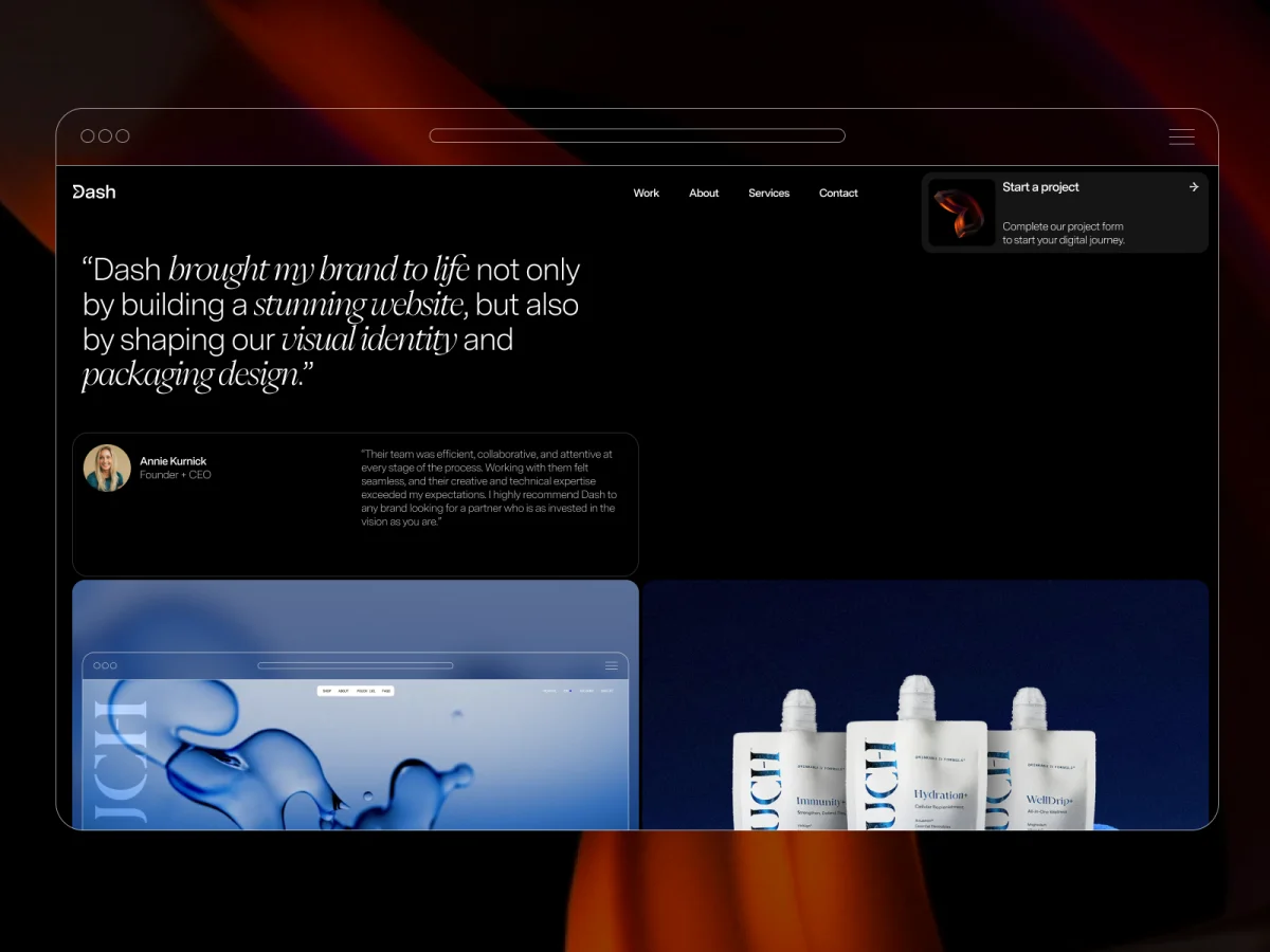
The other early decision was to let iOS design inform how we handle cards and CTAs. We designed project cards as a deliberate nod towards iOS notifications: familiar, tactile, a little unexpected in context. The brand guidelines were strict. That constraint turned out to be useful. It stopped decisions from drifting and pushed us toward something more considered.
In total the project ran for a few months. The concept landed relatively quickly. Getting the content right and the animations properly refined in development: that’s where the time went.
Figma for design. The brand guidelines were tightly defined, and Figma kept everything systematic (type, spacing, components) without getting in the way of iteration.
Webflow for the build. Our own site is built on Webflow, and it made sense to use it as a proof of what’s possible on the platform for prospective clients. Most interactions live inside Webflow’s animation system.
GSAP for the parts Webflow’s native interactions couldn’t reach, particularly the more precise cursor-driven behaviours and sequencing.
Custom WebGL for the hero background. That one couldn’t live anywhere else.
The hero background started with a straightforward idea: use a fullscreen video as a texture and distort it in response to cursor movement. The goal was to make the background feel responsive without becoming distracting.
One thing was important from the start. We didn’t want the effect to behave like a simple ripple centred on the cursor. Instead, the distortion should continue in the direction of movement, giving the impression that the surface is being pulled rather than simply reacting to a hover state.
The effect is implemented entirely in a fragment shader. Instead of layering effects over the video, the shader remaps the video’s texture coordinates directly. The cursor defines the area of influence, while the movement direction controls how the distortion propagates. A damped sine function generates the wave that drives the displacement.
The configurable values are defined once and passed into the renderer:
const SETTINGS = {
  radius: 0.41,
  amplitude: 0.082,
  frequency: 13,
  speed: 0.98,
  carry: 6,
  stagger: 12,
  centerPower: 2,
  verticalDampPower: 2.2,
  motionGain: 220,
  speedDecay: 0.86,
};
The geometry consists of a single fullscreen quad:
const vertices = new Float32Array([
  -1, -1, 0, 0,
   1, -1, 1, 0,
  -1,  1, 0, 1,
  -1,  1, 0, 1,
   1, -1, 1, 0,
   1,  1, 1, 1,
]);
The distortion itself happens in the fragment shader:
float maskFn(vec2 uv) {
  vec2 d = uv - uMouseSm;
  d.x *= uAspect;
  float dist = length(d);
  return pow(smoothstep(uRadius, uRadius - uSoft, dist), uCenterPow);
}

float wave = sin(
  d.y * uFreq +
  dot(d, dir) * uCarry +
  uTime * uSpeed +
  d.y * uStagger
);

d += dir * (wave * amp * maskFn(uv) * damp);
The result is an effect that responds to cursor movement without behaving like a simple hover interaction. The distortion carries momentum in the direction of travel before gradually settling.
Before values are passed to the shader, the interaction state is smoothed and decayed on the JavaScript side:
motionTarget *= SETTINGS.speedDecay;
const mappedMotion = Math.min(motionTarget * SETTINGS.motionGain, 1);

motion += (mappedMotion - motion) * SETTINGS.momentum;
dirSm.x += (dirTarget.x - dirSm.x) * SETTINGS.dirSmooth;
dirSm.y += (dirTarget.y - dirSm.y) * SETTINGS.dirSmooth;
This persistence prevents the effect from stopping as soon as the cursor does. Instead, the distortion gradually loses momentum before returning to its resting state, making the interaction feel more continuous and less mechanical.
The aim was to add movement to the hero without competing with the content. The effect sits behind the typography, adding depth while keeping the text easy to read.
The influence field uses a soft falloff rather than a hard edge, avoiding the look of a spotlight around the cursor. Vertical damping also limits how far the wave spreads, giving the distortion a more directional shape instead of expanding evenly in every direction.
The rest of the hero is deliberately simple: a black background, a full-bleed video, and the shader applied directly to the texture. Keeping everything else minimal helps keep the focus on the interaction itself.
The structure is fairly simple.
<section id="us-sine-bg" class="hero-sine-bg">
  <video id="bgvid" class="hero-sine-bg__video" muted playsinline autoplay loop></video>
</section>
The setup consists of a hero container, a hidden video element used as the texture source, and a WebGL canvas layered above it.
From there, the renderer performs five main tasks:
The renderer doesn’t rely on a scene graph, post-processing pipeline, or additional geometry. It works with a single texture, a fullscreen quad, and a pair of shaders, making it straightforward to integrate into a production site.
Frame uploads are only performed once the video is ready:
if (video.readyState >= 2) {
  gl.texImage2D(gl.TEXTURE_2D, 0, gl.RGBA, gl.RGBA, gl.UNSIGNED_BYTE, video);
}

rafId = requestAnimationFrame(renderFrame);
The implementation keeps the render loop lightweight. Interaction values are smoothed over time, the shader only remaps UV coordinates, the canvas is limited to the hero section, and rendering doesn’t begin until the video is ready.
The same approach can be reused with different video sources, distortion profiles, or sections of a site without changing the overall structure.
The final result feels much closer to what we wanted the site to communicate. The technical implementation came together relatively quickly. Most of the time was spent refining the motion, editing the content, and making sure both worked together.
One of the biggest challenges was knowing when to stop adding. Small adjustments to timing, easing, and copy often had more impact than introducing new effects.
Looking back, the main thing we’d approach differently is the reliance on cursor interaction. The experience changes significantly on touch devices, so that’s something we’d consider earlier in the design process rather than adapting later.
Overall, the project reinforced an idea that shaped the rebrand from the beginning: interaction works best when it supports the concept rather than drawing attention to itself.

此内容由惯性聚合(RSS阅读器)自动聚合整理,仅供阅读参考。 原文来自 — 版权归原作者所有。