


You probably don't immediately notice the design when you walk into a well-designed store. However, you end up finding what you need without wandering, and you move from browsing to buying without getting frustrated. You may notice that you had a pleasant shopping experience, but you may not realize that every part of the environment is intentional: the lighting, the aisles, the checkout flow, even what is placed at eye level.
Good documentation must behave like a storefront, with a layout built for momentum and clear decision-making points. Yet many teams still treat documentation like a warehouse. Everything is there somewhere, but finding the right route feels tiring and slow.
In this article, I'll share a simple formula for designing documentation that drives action.
In a previous article, we challenged the assumption that developers dislike reading documentation. What we found to be the cause has some major impacts on conversion: when developers abandon your documentation, they're dropping out of the journey altogether.
Every missed cue, unclear step, or contextless example increases the chance they'll leave before they find or experience value. Without that value, you have a high tendency to lose a user. That's the real cost of friction: unconverted developers.
Conversion happens when a developer takes a meaningful step that moves them closer to integrating your product into their workflow. At that point, they are committing to action, and that's what you want.
This action can be:
Each of these actions signals momentum and buy-in. They're small conversions that build toward something bigger: a developer who integrates your software product deeply, recommends it to their team, and influences other user groups like system administrators or project managers.
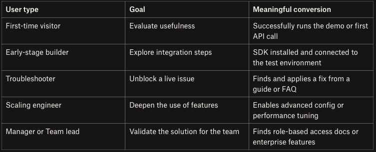
The mistake many teams make is defining one “success event” for all users. But not every developer shows up to your docs with the exact needs or the same expectations.
What feels like a win to a first-time evaluator isn't the same for a senior engineer integrating your tool into a production pipeline with multiple programming languages or overseeing a larger software component integration.
The table below shows a breakdown of how conversion goals differ by user persona and their stage in the software development lifecycle:
Great documentation drives action. It guides developers, with intention, through every sentence, heading, and code block, toward meaningful outcomes.
Building on the storefront analogy from earlier, docs are part of the buying journey. If the path is confusing, momentum dies. If the next step is buried, trust erodes.
Structure and flow convert interest into commitment, so you need a formula for docs that convert. The formula I follow has three parts: clarity, context, and flow.
When a developer is mid-task, conversion means surfacing the exact information they need. The goal is to make comprehension feel instant, especially when your documentation includes complex reference documentation.
Here's how to do that in practice:
Do this: “To send your first request…”
Here is an example:
Before:
To configure your API key, navigate to the developer dashboard and locate the credentials section.
After:
Set your API key:
Have you ever followed perfect instructions but still felt lost? That's what happens when docs skip the why. Motivational framing keeps readers invested by giving each action meaning.
What this looks like:

Expandables in Mintlify
Example before context:
Add your API key on the settings page.
After:
You'll need your API key to authenticate requests.
To add it:
That one line gives the action meaning and a reason not to skip it. When developers understand how each piece fits into the bigger picture, they're more likely to finish the puzzle.
Most documentation is organized by file structure or feature area. But that's not how developers think. They think interms of goals to achieve, tasks to complete, and specific states they're trying to reach or troubleshoot. Your docs should reflect that.
How to create a flow:
“Now that you've sent a request, see how to handle errors.”
Example structure:
Instead of dropping users into a reference dump or scattered guides, build a layout like this:
If you had a landing page that linked to your OpenAPI spec and four scattered articles before, now design it to have a structured layout with “Quickstart,” “Authentication,” “First API Call,” and “Common Errors” all in one guided path.
Mintlify, for example, can help you structure sidebars around flows, embed checklists in guides, and surface “next step” links at just the right moment, reinforcing momentum and reducing bounce.
If there's one balancing act that separates good docs from great ones, it's this: being simple without being simplistic.
Too often, documentation swings between two extremes:
Both fail in different ways. One drowns the developer in noise, and the other leaves them confused. Instead, aim for layered simplicity, clear enough to follow and deep enough to trust.
Here's how:
Start with the happy path. Not everything needs to be visible upfront; borrow UI/UX patterns to manage complexity without hiding it:
This approach ensures that your interactive documentation remains useful for new adopters and experienced users in the same document without confusion, which is a key benefit in developer onboarding.
Do this:
The beginner sees only what they need. The advanced user finds what they're looking for.
Every doc should have a mainline path—a clear journey from “I have no idea what this is” to “I got it working.”
Treat everything else, such as optimizations, alternative configurations, and edge case behaviors, as branch paths, not detours. Think like a game designer: The player can go explore side quests, but the main storyline should always be obvious and frictionless.
Practical tactics:
Let the dev get to “it works” before you show them “here's how to make it better.” This keeps your main content lean while signaling to experts that you're speaking their language.
Good documentation makes developers feel in control, trust the content, and sense progress. That sometimes means removing technically correct information if it slows people down.
The biggest trap is to think that adding excess details is always better. But in practice, it often backfires:
Always ask: What does the developer need to succeed in the next 30 seconds? Start there. The goal is to help developers do the next thing well.
Good docs are designed, not just written. Use customizable templates, callouts, headings, and visual anchors to help the reader navigate large blocks of technical content.
Nothing stands out when everything looks the same, so be deliberate in how you guide the eye.
Does your documentation tooling support product thinking? This is an important question to answer if you want to adopt the “docs as product” mindset. It can be tempting to think that better documentation is just a matter of writing better content.
If you want to create documentation that converts, the tools you use and how they shape your workflow are equally important.
Here's what to look out for in a good documentation tool:
If your docs are a product surface, they should follow product-quality workflows:
These practices make it easier to automatically generate documentation directly from source code and keep things consistent across contributors. Docs-as-code platforms enable these patterns. More importantly, they let teams treat docs with the same rigor as any other part of the software product.
The Diátaxis model is only useful if your tooling supports it. You should be able to publish how-to guides, explanations, reference manuals, and tutorials all in one place, with clear labelling and smart linking. This will ensure that your document management workflow serves every user persona, from software engineers to project managers.
If your software documentation tool only supports linear docs or forces everything into one long page, you're sacrificing experience for simplicity.
Clean, versionable content written in Markdown or MDX gives you the best of both worlds: developer control and writer flexibility.
It should be easy to add custom components such as tabs, collapsible sections, or callouts without leaving the writing flow.
Stale docs are silent churn. Your tooling should make it easy to:
Keeping your docs up to date shouldn't require manual effort.
Docs don't live in a vacuum. They support onboarding, activation, and support, which means they need to align with the rest of your development experience. Look for API documentation tools that integrate with:
Use this checklist to evaluate your current documentation tooling through a product lens:
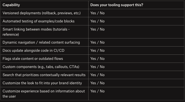
You don't have to over-engineer the documentation process; there are software documentation tools that support all of this out of the box, with a clean structure, rich components, a code-first workflow, and built-in analytics. But whatever platform you choose, the goal should be the same: creating a better documentation experience for your developers.
Docs that convert aren't just written, they're designed. When you treat documentation as part of the product, you shift from explaining features to shaping behavior. Clarity, context, and flow become your UX pillars, not just writing tips.
The right tooling should support that shift; it should be flexible enough to scale depth and modular enough to adapt to user intent.
You don't need a complete rewrite to start. Pick your most visited page and apply three minor changes: add one line of motivation, one verb-led heading, and one clear next step. Then watch how it performs. Because great docs don't just help, they move developers forward.
此内容由惯性聚合(RSS阅读器)自动聚合整理,仅供阅读参考。 原文来自 — 版权归原作者所有。