








这篇笔记写太长了,之后会继续在Hugo Stack主题装修笔记Part 2 里更新
显示效果:
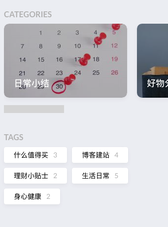
在layouts/_default/archives.html里的</header>后面加上如下代码:
{{- $taxonomy := $.Site.GetPage "taxonomyTerm" "tags" -}}
{{- $terms := $taxonomy.Pages -}}
{{ if $terms }}
<section class="widget tagCloud">
<h2 class="section-title">{{ $taxonomy.Title }}</h2>

    <div class="tagCloud-tags">
        {{ if ne (len $.Site.Taxonomies.tags) 0 }}
            {{ range $name, $taxonomy := $.Site.Taxonomies.tags }}
                {{ $tagCount := len $taxonomy.Pages }}
                <a href="{{ "/tags/" | relURL }}{{ $name | urlize }}" class="tagCloud-tags">
                    {{ $name }}<span class="tagCloud-count">{{ $tagCount }}</span>
                </a>
            {{ end }}
        {{ end }}
    </div>
<section>
{{ end }}
以上代码用了tagCloud-count来修饰tag后面的数字,所以还需要在assets/scss/partials/widgets.scss里面加上如下代码,让数字变成浅灰:
.tagCloud {
    .tagCloud-count {
        color: var(--body-text-color);
    }
}
在assets/scss/variables.scss做如下修改:
--tag-border-radius: 24px; // Change from 4px to make it round corner
--category-border-radius: 4px; // Add category border setting
其实改了--tag-border-radius圆角标签就已经完成了。但由于Stack主题的“分类”也跟标签共用css,所以首页的分类也会变成圆角。要想维持分类的原样,还需要做以下改动。
首先在assets/scss/partials/article.scss里找到.article-category并替换成以下代码:
.article-category {
        display: flex;
        flex-wrap: wrap;
        gap: 10px;

        a {
            background: var(--card-background);
            box-shadow: var(--shadow-l1);
            border-radius: var(--category-border-radius);
            padding: 8px 20px;
            color: var(--card-text-color-main);
            font-size: 1.4rem;
            transition: box-shadow 0.3s ease;

            &:hover {
                box-shadow: var(--shadow-l2);
            }
        }
    }
在assets/scss/partials/widgets.scss增加如下代码:
/* Category widget */
.category {
    .category-label {
        display: flex;
        flex-wrap: wrap;
        gap: 10px;

        a {
            background: var(--card-background);
            box-shadow: var(--shadow-l1);
            border-radius: var(--category-border-radius);
            padding: 8px 20px;
            color: var(--card-text-color-main);
            font-size: 1.4rem;
            transition: box-shadow 0.3s ease;

            &:hover {
                box-shadow: var(--shadow-l2);
            }
        }
    }
    .category-count {
        margin-left: 7px;
        color: var(--body-text-color);
    }
}
最后在layouts/partials/widget/categories.html作如下修改。其中我加上了{{ .Count }}来显示分类的条目数量。
<section class="widget category">
     <div class="widget-icon">
         {{ partial "helper/icon" "categories" }}
     </div>
     <h2 class="widget-title section-title">{{ T "widget.categoriesCloud.title" }}</h2>

     <div class="category-label">
         {{ range first $limit $context.Site.Taxonomies.categories.ByCount }}
             <a href="{{ .Page.RelPermalink }}" class="font_size_{{ .Count }}">
                 {{ .Page.Title }}<span class="category-count">{{ .Count }}</span>
             </a>
         {{ end }}
     </div>
</section>
默认的代码Copy按钮也跟标签共用一个css设定,所以要保留方形Copy键也需要做相应改动。在assets/scss/partials/layout/article.scss找到下列项并修改:
.copyCodeButton {
    border-radius: var(--category-border-radius);
}
同理,文内的inline代码也需要修正,依旧是在article.scss里修改:
code {
    border-radius: var(--category-border-radius);
}
显示效果:

在layouts/partials/footer/custom.html里添加以下JS代码,其中s1是网站创建日期。代码参考自这里
,我加上了小时和分钟的计算。
<!-- Add blog running time -->
<script>
    let s1 = '2023-3-18'; //website start date
    s1 = new Date(s1.replace(/-/g, "/"));
    let s2 = new Date();
    let timeDifference = s2.getTime() - s1.getTime();

    let days = Math.floor(timeDifference / (1000 * 60 * 60 * 24));
    let hours = Math.floor((timeDifference % (1000 * 60 * 60 * 24)) / (1000 * 60 * 60));
    let minutes = Math.floor((timeDifference % (1000 * 60 * 60)) / (1000 * 60));

    let result = days + "天" + hours + "小时" + minutes + "分钟";
    document.getElementById('runningdays').innerHTML = result;
</script>
再在layouts/partials/footer/footer.html里添加以下代码:
<!-- Add blog running time -->
<section class="running-time">
本博客已稳定运行
<span id="runningdays" class="running-days"></span>
</section>
在assets/scss/partials/footer.scss里添加风格样式,这里我单独把计时的部分加粗,并改了颜色。
.running-time {
    color: var(--card-text-color-secondary);
    font-weight: normal;

    .running-days {
        font-weight:bold;
        color: var(--emphasize-text-color);
    }
}
上面的计时部分设置成var(--emphasize-text-color),这样能比较方便地在assets/scss/variables.scss里设置暗色模式的颜色:
    --accent-color-text: #fff;
    --body-text-color: #b0b0b0;
    --emphasize-text-color: #9e8f9f; // Add emphasize font color

    &[data-scheme="dark"] {
        --emphasize-text-color: #d5cfc4; // Add emphasize font color for dark scheme
    }
显示效果:

在layouts/partials/footer/footer.html里增加以下代码,其中文章篇数统计参考了这篇 ,字数统计的展示方式参考了小球飞鱼的博客 。
<!-- Add total page and word count time -->
<section class="totalcount">
    {{$scratch := newScratch}}
    {{ range (where .Site.Pages "Kind" "page" )}}
        {{$scratch.Add "total" .WordCount}}
    {{ end }}
    发表了{{ len (where .Site.RegularPages "Section" "post") }}篇文章 ·
    总计{{ div ($scratch.Get "total") 1000.0 | lang.FormatNumber 2 }}k字
</section>
在assets/scss/partials/footer.scss里修改风格:
.totalcount {
    color: var(--card-text-color-secondary);
    font-weight: normal;
    margin-bottom: 5px;
    }
显示效果:

在layouts/_default/_markup/render-link.html里{{ .Text | safeHTML }}之后增加如下代码,代码源自这篇
。
{{ if strings.HasPrefix .Destination "http" }}
<span style="white-space: nowrap;"><svg width=".7em"
    height=".7em" viewBox="0 0 21 21" xmlns="http://www.w3.org/2000/svg">
    <path d="m13 3l3.293 3.293l-7 7l1.414 1.414l7-7L21 11V3z" fill="currentColor" />
    <path d="M19 19H5V5h7l-2-2H5c-1.103 0-2 .897-2 2v14c0 1.103.897 2 2 2h14c1.103 0 2-.897 2-2v-5l-2-2v7z"
        fill="currentColor">
</svg></span>
{{ end }}
显示效果:

默认的卡片有些太大了。在assets/scss/partials/layout/list.scss更改样式:
    .article-list--tile {
        display: flex;
        padding-bottom: 0px; // Narrow the spacing

        article {
            width: 150px; // Make category cards smaller
            height: 90px;
            margin-right: 5px; // Make cards spacing narrower
            flex-shrink: 0;
默认的代码字体在移动端显示有点大了。在assets/scss/partials/article.scss内加上font-size设定:
code {
    border-radius: var(--tag-border-radius);
    font-size: 14px; // Add font size setting for code block
    font-family: var(--code-font-family);
}
代码全部抄自主题repo的这个PR 。作者没有采用,似乎是因为结构有一些问题。我测试了下反正功能是没问题的,就凑合用着吧。
2025-03-16 更新:原链接已失效,代码部分已更新。
代码抄自Rubber Duck博客的笔记 ,我把JS的部分放在layouts/partials/footer/components/script.html里了,本来想把css也拿出来放在scss,但试了一下不成功就懒得折腾了。
<!-- Add back to top button -->
<script>
    function backToTop() {
      document.documentElement.scrollIntoView({
        behavior: 'smooth',
      })
    }

    window.onload = function () {
      let scrollTop =
        this.document.documentElement.scrollTop || this.document.body.scrollTop
      let totopBtn = this.document.getElementById('back-to-top')
      if (scrollTop > 0) {
        totopBtn.style.display = 'inline'
      } else {
        totopBtn.style.display = 'none'
      }
    }

    window.onscroll = function () {
      let scrollTop =
        this.document.documentElement.scrollTop || this.document.body.scrollTop
      let totopBtn = this.document.getElementById('back-to-top')
      if (scrollTop < 200) {
        totopBtn.style.display = 'none'
      } else {
        totopBtn.style.display = 'inline'
        totopBtn.addEventListener('click', backToTop, false)
      }
    }
  </script>
background-color 和 border-color),跟主题色系统一。<!-- Add back to top button -->
<a href="#" id="back-to-top" title="返回顶部"></a>
<!--返回顶部 CSS -->
<style>
#back-to-top {
display: none;
position: fixed;
bottom: 5px;
right: 15px;
width: 40px; /* Reduced size */
height: 40px; /* Reduced size */
border-radius: 50%; /* Circular button for modern look */
background-color: var(--body-background);
box-shadow: var(--shadow-l2);
font-size: 20px; /* Adjusted for smaller button */
text-align: center;
line-height: 38px; /* Center align arrow */
cursor: pointer;
transition:
transform 0.3s ease,
background-color 0.3s ease; /* Added smooth interaction */
}
#back-to-top:before {
content: "";
display: inline-block;
position: relative;
transform: rotate(135deg);
height: 8px; /* Reduced size */
width: 8px; /* Reduced size */
border-width: 0 0 2px 2px;
border-color: var(--back-to-top-color);
border-style: solid;
}
#back-to-top:hover {
transform: scale(1.1); /* Slightly larger on hover */
background-color: var(--accent-background); /* Optional hover effect */
}
#back-to-top:hover:before {
border-color: var(--accent-color); /* Change arrow color on hover */
}
/* Responsive styles */
@media screen and (max-width: 768px) {
#back-to-top {
bottom: 5px;
right: var(--container-padding);
width: 30px; /* Slightly smaller for mobile */
height: 30px;
font-size: 16px;
line-height: 32px;
}
}
@media screen and (min-width: 1024px) {
#back-to-top {
bottom: 10px;
right: 20px;
}
}
@media screen and (min-width: 1280px) {
#back-to-top {
bottom: 15px;
right: 25px;
}
}
@media screen and (min-width: 1536px) {
#back-to-top {
bottom: 15px;
right: 25px;
/* visibility: hidden; */
}
}
</style>
解决办法来自Stackoverflow 。
在assets/scss/variables.scss按需更改,在此就不放代码了。
显示效果:

在assets/scss/partials/article.scss里找到.article-list--compact,在里面添加如下css设置:
.article-subtitle {
    margin-top: -5px;
    font-size: 1.5rem;

    @include respond(md) {
        font-size: 1.6rem;
    }
}
再在layouts/partials/article-list/compact.html添加如下代码:
<h2 class="article-title">
    {{- .Title -}}
</h2>
{{ with .Params.description }}
<div class="article-subtitle">
    {{ . }}
</div>
{{ end }}
显示效果如下:

从山茶花舍的博客 知道了这个好玩的小插件,是一个日本公司提供的服务Channel.io ,网页气泡是个入口,实际聊天可以在它们的App里完成。配置过程和山茶花舍说的一样,在官网注册完之后,点击小齿轮 – General – Manage Plug-in – Install plug-in – 点击JavaScript并复制框里的代码,粘贴到layouts/partials/footer/custom.html就可以啦。附个图:
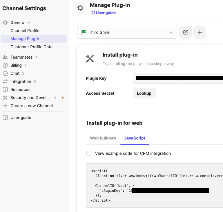
内容也能自行定制,可以自己多玩一下各种设置~
2025-03-16 更新:在实际使用中我后来其实都在用relative link,即
[text](/first-post-slug)的形式。一是我永远记不住Hugo shortcode的写法;二是slug简洁好记,我的文件夹结构出于方便整理的需要还包含了年月,名字就比较冗长。
读了半天难读得要命的hugo官方文档
,终于弄清一点了。Stack主题的博客内容结构是这样的:
.
└── content
    ├── post
    |   ├── first-post
    |   |   └── index.md
    |   |   └── image1.jpg
    |   └── second-post
    |   |   └── index.md
在文章内引用另一篇博文的时候,可以使用hugo自带的shortcode。格式如下所示,其中first-post为博文所在的文件夹名字。
[some text]({{< relref "first-post#heading" >}})

<!-- Example: -->
[上个月打了一个月的有氧拳击2]({{< relref "2023-05-31-may-2023-recap#本月庆祝" >}})
显示效果为: 上个月打了一个月的有氧拳击2
如果直接在代码块写shortcodes,hugo会解析这部分代码。要跳过解析的话需要在<和>符号之前分别加上/*和*/:
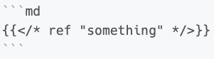
<!-- 显示效果 -->
{{< ref "something" >}}
{{ partial "helper/icon" "category" }},已修正category为categories参考文章:
代码实现给个人博客增加“本站已稳定运行xx天”效果 - 二歪同学
Hugo 总文章数和总字数 :: 木木木木木
Hugo | 第三篇Stack主题装修记录,堂堂再临! | 小球飞鱼
Extrenal Link Icon in Hugo Natively, Markdown Render Hooks | Ion Orion
Feature/add inline toc by MikDal002 · Pull Request #615 · CaiJimmy/hugo-theme-stack · GitHub
Hugo|自定义 hugo-theme-Stack
markdown - Add collapsible section in hugo - Stack Overflow
给Hugo加一点好玩的功能
Channel.io - A CRM based Live Chat, Team Chat & Chatbot
Links and Cross References | Hugo
此内容由惯性聚合(RSS阅读器)自动聚合整理,仅供阅读参考。 原文来自 — 版权归原作者所有。