


Line, bar, and pie charts are the bread and butter of dashboards and are the basic components of any data visualization toolkit. Sure, you can use SVG or a JavaScript chart library like Chart.js or a complex tool like D3 to create those charts, but what if you don’t want to load yet another library into your already performance-challenged website?
There are plenty of articles out there for creating CSS-only bar charts, column charts, and pie charts, but if you just want a basic line chart, you’re out of luck. While CSS can “draw lines” with borders and the like, there is no clear method for drawing a line from one point to another on an X and Y coordinate plane.
Well, there is a way! If all you need is a simple line chart, there’s no need to load in a huge JavaScript library or even reach for SVG. You can make everything you need with just CSS and a couple of custom properties in your HTML. Word of warning, though. It does involve a bit of trigonometry. If that didn’t scare you off, then roll up your shirt sleeves, and let’s get started!
Here’s a peek at where we’re headed:
If you are creating a line chart by hand (as in, literally drawing lines on a piece of graph paper), you would start by creating the points, then connecting those points to make the lines. If you break the process down like that, you can recreate any basic line chart in CSS.
Let’s say we have an array of data to display points on an X and Y coordinate system, where days of the week fall along the X-axis and the numeric values represent points on the Y-axis.
[
  { value: 25, dimension: "Monday" },
  { value: 60, dimension: "Tuesday" },
  { value: 45, dimension: "Wednesday" },
  { value: 50, dimension: "Thursday" },
  { value: 40, dimension: "Friday" }
]
Let’s create an unordered list to hold our data points and apply some styles to it. Here’s our HTML:
<figure class="css-chart" style="--widget-size: 200px;">
  <ul class="line-chart">
    <li>
      <div class="data-point" data-value="25"></div>
    </li>
    <li>
      <div class="data-point" data-value="60"></div>
    </li>
    <li>
      <div class="data-point" data-value="45"></div>
    </li>
    <li>
      <div class="data-point" data-value="50"></div>
    </li>
    <li>
      <div class="data-point" data-value="40"></div>
    </li>
  </ul>
</figure>
A couple notes to glean here. First is that we’re wrapping everything in a <figure> element, which is a nice semantic HTML way of saying this is self-contained content, which also provides us the optional benefit of using a <figcaption>, should we need it. Secondly, notice that we’re storing the values in a data attribute we’re calling data-value that’s contained in its own div inside a list item in the unordered list. Why are we using a separate div instead of putting the class and attribute on the list items themselves? It’ll help us later when we get to drawing lines.
Lastly, note that we have an inlined custom property on the parent <figure> element that we’re calling --widget-size. We’ll use that in the CSS, which is going to look like this:
/* The parent element */
.css-chart {
  /* The chart borders */
  border-bottom: 1px solid;
  border-left: 1px solid;
  /* The height, which is initially defined in the HTML */
  height: var(--widget-size);
  /* A little breathing room should there be others items around the chart */
  margin: 1em;
  /* Remove any padding so we have as much space to work with inside the element */
  padding: 0;
  position: relative;
  /* The chart width, as defined in the HTML */
  width: var(--widget-size);
}


/* The unordered list holding the data points, no list styling and no spacing */
.line-chart {
  list-style: none;
  margin: 0;
  padding: 0;
}


/* Each point on the chart, each a 12px circle with a light border */
.data-point {
  background-color: white;
  border: 2px solid lightblue;
  border-radius: 50%;
  height: 12px;
  position: absolute;
  width: 12px;
}
The above HTML and CSS will give us this not-so-exciting starting point:
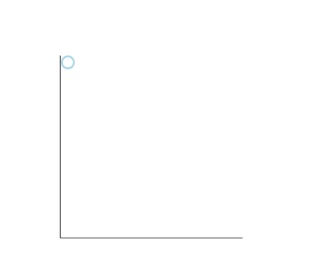
That doesn’t look like much yet. We need a way to draw each data point at its respective X and Y coordinate on our soon-to-be chart. In our CSS, we’ve set the .data-point class to use absolute positioning and we set a fixed width and height on its parent .css-chart container with a custom property. We can use that to calculate our X and Y positions.
Our custom property sets the chart height at 200px and, in our values array, the largest value is 60. If we set that data point as the highest point on the chart’s Y axis at 200px, then we can use the ratio of any value in our data set to 60 and multiply that by 200 to get the Y coordinate of all of our points. So our largest value of 60 will have a Y value that can be calculated like this:
(60 / 60) * 200 = 200px And our smallest value of 25 will end up with a Y value calculated the same way:
(25 / 60) * 200 = 83.33333333333334pxGetting the Y coordinate for each data point is easier. If we are spacing the points equally across the graph, then we can divide the width of the chart (200px) by the number of values in our data array (5) to get 40px. That means the first value will have an X coordinate of 40px (to leave a margin for a left axis if we want one), and the last value will have an X coordinate of 200px.
You just got mathed! 🤓
For now, let’s add inline styles to each of the divs in the list items. Our new HTML becomes this, where the inline styles contain the calculated positioning for each point.
<figure class="css-chart">
  <ul class="line-chart">
    <li>
      <div class="data-point" data-value="25" style="bottom: 83.33333333333334px; left: 40px;"></div>
    </li>
    <li>
      <div class="data-point" data-value="60" style="bottom: 200px; left: 80px;"></div>
    </li>
    <li>
      <div class="data-point" data-value="45" style="bottom: 150px; left: 120px;"></div>
    </li>
    <li>
      <div class="data-point" data-value="50" style="bottom: 166.66666666666669pxpx; left: 160px;"></div>
    </li>
    <li>
      <div class="data-point" data-value="40" style="bottom: 133.33333333333331px; left: 200px;"></div>
    </li>
  </ul>
</figure>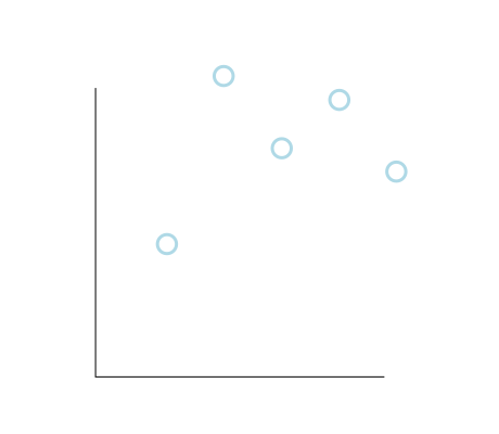
Hey, that looks a lot better! But even though you can see where this is going, you still can’t really call this a line graph. No problem. We only need to use a little more math to finish our game of connect-the-dots. Take a look at the picture of our rendered data points again. Can you see the triangles that connect them? If not, maybe this next picture will help:
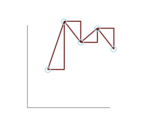
Why is that important? Shhh, the answer’s coming up next.
See the triangles now? And they’re not just any old triangles. They’re the best kind of triangles (for our purposes anyway) because they are right triangles! When we calculated the Y coordinates of our data points earlier, we were also calculating the length of one leg of our right triangle (i.e. the “run” if you think of it as a stair step). If we calculate the difference in the X coordinate from one point to the next, that will tell us the length of another side of our right triangle (i.e. the “rise” of a stair step). And with those two pieces of information, we can calculate the length of the magical hypotenuse which, as it turns out, is exactly what we need to draw to the screen in order to connect our dots and make a real line chart.
For example, let’s take the second and third points on the chart.
<!-- ... -->


<li>
  <div class="data-point" data-value="60" style="bottom: 200px; left: 80px;"></div>
</li>
<li>
  <div class="data-point" data-value="45" style="bottom: 150px; left: 120px;"></div>
</li>


<!-- ... -->
The second data point has a Y value of 200 and the third data point has a Y value of 150, so the opposite side of the triangle connecting them has a length of 200 minus 150, or 50. It has an adjacent side that is 40 pixels long (the amount of spacing we put between each of our points).
That means the length of the hypotenuse is the square root of 50 squared plus 40 squared, or 64.03124237432849.
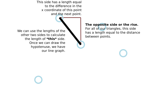
Let’s create another div inside of each list item in the chart that will serve as the hypotenuse of a triangle drawn from that point. Then we’ll set an inline custom property on our new div that contains the length of that hypotenuse.
<!-- ... -->


<li>
  <div class="data-point" data-value="60"></div>
  <div class="line-segment" style="--hypotenuse: 64.03124237432849;"></div>
</li>


<!-- ... -->
While we’re at it, our line segments are going to need to know their proper X and Y coordinates, so let’s remove the inline styles from our .data-point elements and add CSS custom properties to their parent (the <li> element) instead. Let’s call these properties, creatively, --x and --y. Our data points don’t need to know about the hypotenuse (the length of our line segment), so we can add a CSS custom property for the length of the hypotenuse directly to our .line-segment. So now our HTML will look like this:
<!-- ... -->


<li style="--y: 200px; --x: 80px">
  <div class="data-point" data-value="60"></div>
  <div class="line-segment" style="--hypotenuse: 64.03124237432849;"></div>
</li>


<!-- ... -->
We’ll need to update our CSS to position the data points with those new custom properties and style up the new .line-segment div we added to the markup:
.data-point {
  /* Same as before */


  bottom: var(--y);
  left: var(--x);
}


.line-segment {
  background-color: blue;
  bottom: var(--y);
  height: 3px;
  left: var(--x);
  position: absolute;
  width: calc(var(--hypotenuse) * 1px);
}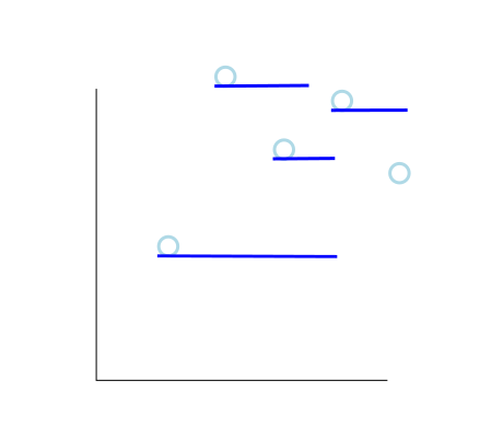
Well, we have line segments now but this isn’t at all what we want. To get a functional line chart, we need to apply a transformation. But first, let’s fix a couple of things.
First off, our line segments line up with the bottom of our data points, but we want the origin of the line segments to be the center of the data point circles. We can fix that with a quick CSS change to our .data-point styles. We need to adjust their X and Y position to account for both the size of the data point and its border as well as the width of the line segment.
.data-point {
  /* ... */


  /* The data points have a radius of 8px and the line segment has a width of 3px,
    so we split the difference to center the data points on the line segment origins */
  bottom: calc(var(--y) - 6.5px);
  left: calc(var(--x) - 9.5px);
}
Secondly, our line segments are being rendered on top of the data points instead of behind them. We can address that by putting the line segment first in our HTML:
<!-- ... -->


<li style="--y: 200px; --x: 80px">
    <div class="line-segment" style="--hypotenuse: 64.03124237432849;"></div>
    <div class="data-point" data-value="60"></div>
</li>


<!-- ... -->We’ve almost got it now. We just need to do one last bit of math. Specifically, we need to find the measure of the angle that faces the opposite side of our right triangle and then rotate our line segment by that same number of degrees.
How do we do that? Trigonometry! You may recall the little mnemonic trick to remember how sine, cosine and tangent are calculated:
You can use any of them because we know the length of all three sides of our right triangle. I picked sine, so that that leaves us with this equation:
sin(x) = Opposite / HypotenuseThe answer to that equation will tell us how to rotate each line segment to have it connect to the next data point. We can quickly do this in JavaScript using Math.asin(Opposite / Hypotenuse). It will give us the answer in radians though, so we’ll need to multiply the result by (180 / Math.PI).
Using the example of our second data point from earlier, we already worked out that the opposite side has a length of 50 and the hypotenuse has a length of 64.03124237432849, so we can re-write our equation like this:
sin(x) = 50 / 64.03124237432849 = 51.34019174590991That’s the angle we’re looking for! We need to solve that equation for each of our data points and then pass the value as a CSS custom property on our .line-segment elements. That will give us HTML that looks like this:
<!-- ... -->


<li style="--y: 200px; --x: 80px">
  <div class="data-point" data-value="60"></div>
  <div class="line-segment" style="--hypotenuse: 64.03124237432849; --angle: 51.34019174590991;"></div>
</li>


<!-- ... -->
And here’s where we can apply those properties in the CSS:
.line-segment {
  /* ... */
  transform: rotate(calc(var(--angle) * 1deg));
  width: calc(var(--hypotenuse) * 1px);
}
Now when we render that, we have our line segments!
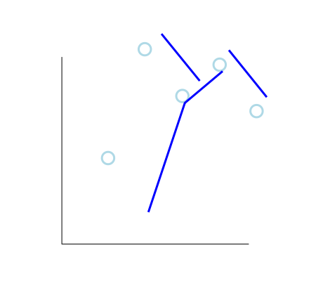
Wait, what? Our line segments are all over the place. What now? Oh, right. By default, transform: rotate() rotates around the center of the transformed element. We want the rotation to occur from the bottom-left corner to angle away from our current data point to the next one. That means we need to set one more CSS property on our .line-segment class.
.line-segment {
  /* ... */
  transform: rotate(calc(var(--angle) * 1deg));
  transform-origin: left bottom;
  width: calc(var(--hypotenuse) * 1px);
}
And, now when we render it, we finally get the CSS-only line graph we’ve been waiting for.
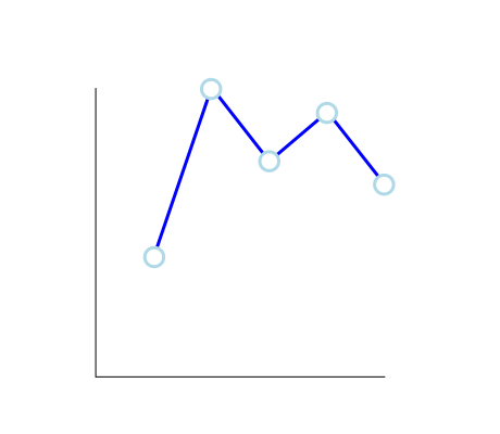
Important note: When you calculate the value of the opposite side (the “rise”), make sure it’s calculated as the “Y position of the current data point” minus the “Y position of the next data point.” That will result in a negative value when the next data point is a larger value (higher up on the graph) than the current data point which will result in a negative rotation. That’s how we ensure the line slopes upwards.
This approach is great for a simple static site or for a dynamic site that uses server-side generated content. Of course, it can also be used on a site with client-side dynamically generated content, but then you are back to running JavaScript on the client. The CodePen at the top of this post shows an example of client-side dynamic generation of this line chart.
The CSS calc() function is highly useful, but it can’t calculate sine, cosine, and tangent for us. That means you’d have to either calculate your values by hand or write a quick function (client-side or server-side) to generate the needed values (X, Y, hypotenuse and angle) for our CSS custom properties.
I know some of you got through this and will feel like it’s not vanilla CSS if it requires a script to calculate the values — and that’s fair. The point is that all of the chart rendering is done in CSS. The data points and the lines that connect them are all done with HTML elements and CSS that works beautifully, even in a statically rendered environment with no JavaScript enabled. And perhaps more importantly, there’s no need to download yet another bloated library just to render a simple line graph on your page.
As with anything, there’s always something we can do to take things to the next level. In this case, I think there are three areas where this approach could be improved.
The approach I’ve outlined uses a fixed size for the chart dimensions, which is exactly what we don’t want in a responsive design. We can work around this limitation if we can run JavaScript on the client. Instead of hard-coding our chart size, we can set a CSS custom property (remember our --widget-size property?), base all of the calculations on it, and update that property when the container or window either initially displays or resizes using some form of a container query or a window resize listener.
We could add a ::before pseudo-element to .data-point to display the data-value information it contains in a tooltip on hover over the data point. This is a nice-to-have sort of touch that helps turn our simple chart into a finished product.
Notice that the chart axises are unlabeled? We could distribute labels representing the highest value, zero, and any number of points between them on the axis.
I tried to keep the numbers as simple as possible for this article, but in the real world, you would probably want to include some margins in the chart so that data points don’t overlap the extreme edges of their container. That could be as simple as subtracting the width of a data point from the range of your y coordinates. For the X coordinates, you could similarly remove the width of a data point from the total width of the chart before dividing it up into equal regions.
And there you have it! We just took a good look at an approach to charting in CSS, and we didn’t even need a library or some other third-party dependency to make it work. 💥
此内容由惯性聚合(RSS阅读器)自动聚合整理,仅供阅读参考。 原文来自 — 版权归原作者所有。