


The Web Content Accessibility Guidelines (WCAG), an organization that defines standards for web content accessibility, does not specify a minimum font size for the web.
But we know there’s such a thing as text that is too small to be legible, just as text that can be too large to consume. So, how can we make sure our font sizes are accessible? What sort of best practices can we rely on to make for an accessible reading experience?
The answer: it’s not up to us. It Depends™. We’ll get into some specific a bit later but, for now, let’s explore the WCAG requirements for fonts.
First, resizing text. We want to provide users with low vision a way to choose how fonts are displayed. Not in a crazy way. More like the ability to increase the size by 200% while maintaining readability and avoiding content collisions and overlaps.
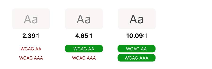
Secondly, there’s contrast. This is why I said “it depends” on what makes an accessible font size. Text has to follow a contrast ratio of at least 4.5:1, with the exception of a large-scale text that should have a contrast ratio of at least 3:1. You can use tools like WebAIM’s Contrast Checker to ensure your text meets the guidelines. Stacy Arrelano’s deep dive on color contrast provides an excellent explanation of how contrast ratios are calculated.
There are around 300 alphabets in the world. Some characters are simple and readable in smaller sizes, others are incredibly complex and would lose vital details at the same size. That’s why specs cannot define a font size that meets the specification for contrast ratios.
And when we talk about “text” and “large text” sizes, we’re referring to what the spec calls “the minimum large print size used for those languages and the next larger standard large print size.” To meet AAA criteria using Roman text, for example, “large” is 18 points. Since we live in a world with different screen densities, specs measure sizes in points, not pixels, and in some displays, 18pt is equal to 24px. For other fonts, like CJK (Chinese, Japanese, Korean) or Arabic languages, the actual size in pixel would be different. Here’s the word “Hello” compared next to three other languages:
Hello สวัสดี مرحبا 你好
In short, WCAG specifies contrast instead of size.

Here is the good news: a browser’s default styles are accessible and we can leverage them to build an accessible font size strategy. Let’s see how.
The browser first loads its default styles (also known as the “User Agent stylesheet”), then those cascade to the author’s styles (the ones we define), and they both cascade and get overwritten by the user’s styles.
As Adrian Sandu mentions in his article about rem CSS units:
[…] there is an empirical study run by the people behind the Internet Archive showing that there is a significant amount of users who change their default font size in the browser settings.
We don’t fully control the font-family property, either. The content might be translated, the custom font family might fail to load, or it might even be changed. For example, OpenDyslexic is a typeface created to increase readability for readers with dyslexia. In some situations, we may even explicitly allow switching between a limited set of fonts.
Therefore, when defining fonts, we have to avoid hindering the ability of a user or a device to change our styles and let go of assumptions: we just don’t know where our content is going to land and we can’t be sure about the exact size, language, or font that’s used to display content.
But there is one thing that we can control: proportions.
By using CSS relative units, we can set our content to be proportional to whatever the environment tells it to be. WCAG recommends using em units to define font size. There are several publications discussing the benefits of using ems and rems and it’s beyond the scope of this article. What I’d say here is to use rems and ems for everything, even for other properties besides font-size (with the exception of borders, where I use pixels).
My recommendation is to avoid setting font-size on the :root, <html> or <body> elements in favor of letting the browser’s default size serve as a baseline from where we can cascade our own styles. Since this default is accessible, the content will also be accessible. The WACAG 2.2 working draft states that:
When using text without specifying the font size, the smallest font size used on major browsers for unspecified text would be a reasonable size to assume for the font.
Of course, there is an exception to the rule. When using an intricate, thin, or super short x-height font, for example, you might consider bumping up the font size base to get the correct contrast. Remember that the spec defines contrast, not size:
Fonts with extraordinarily thin strokes or unusual features and characteristics that reduce the familiarity of their letter forms are harder to read, especially at lower contrast levels.
In the same manner, a user might change the base font size to fit their needs. A person with low vision would want to choose a larger size, while someone with an excellent vision can go smaller to gain real estate on their screens.
It’s all about proportions: we define how much larger or smaller parts of the content should be by leveraging the default base to set the main text size.
:root {
  /* Do not set a font-size on a :root, body nor html level */
  /* Let your main text size be decided by the browser or the user settings */
}
.small {
  font-size: .8rem;
}
.large {
  font-size: 2rem;
}Since headings create a document outline that helps screenreaders navigate a document, we aren’t defining type selectors for heading sizes. Heading order is a WCAG criteria: the heading elements should be organized in descending order without skipping a level, meaning that an h4 should come right after an h3.
Sometimes resetting the font sizing of all headings to 1rem is a good strategy to make the separation of the visual treatment from the meaning mandatory.
Both rem or em sizing is relative to something else. For example, rem calculates size relative to the <html> element, where em is calculated by the sizing of its own element. It can be confusing, particularly since many of us came up working exclusively in pixels.
So, how can we still think in pixels but implement relative units?
More often than not, a typographical hierarchy is designed in pixels. Since we know about user agent stylesheets and that all major browsers have a default font size of 16px, we can set that size for the main text and calculate the rest proportionately with rem units.
| Browser Name | Base Font Size |
|---|---|
| Chrome v80.0 | 16px |
| FireFox v74.0 | 16px |
| Safari v13.0.4 | 16px |
| Edge v80.0 (Chromium based) | 16px |
| Android (Samsung, Chrome, Firefox) | 16px |
| Safari iOS | 16px |
| Kindle Touch | 26px (renders as 16px since it’s a high density screen) |
Now let’s explore three methods for using relative sizing in CSS by converting those pixels to rem units.
In order to seamlessly convert pixels to rem, we can set the root sizing to 62.5%. That means 1rem equals 10px:
:root {
  font-size: 62.5%; /* (62.5/100) * 16px = 10px */
  --font-size--small: 1.4rem; /* 14px */
  --font-size--default: 1.6rem; /* 16px */
  --font-size--large: 2.4rem; /* 24px */
}


.font-size--small {
  font-size: var(--font-size--small);
}

.font-size--default {
  font-size: var(--font-size--default);
}

.font-size--large {
  font-size: var(--font-size--large);
}calc() functionWe can also calculate sizes with CSS calc() by dividing the pixel value by the font base we assume most browsers have:
:root {
  --font-size--small: calc((14/16) * 1rem); /* 14px */
  --font-size--default: calc((16/16) * 1rem); /* 16px */
  --font-size--large: calc((24/16) * 1rem); /* 24px */
}


.font-size--small {
  font-size: var(--font-size--small);
}

.font-size--default {
  font-size: var(--font-size--default);
}

.font-size--large {
  font-size: var(--font-size--large);
}Similar to calc() , we can leverage a preprocessor to create a “pixel-to-rem” function. There are implementations of this in many flavors, including this Sass mixin and styled-components polish.
:root {
  --font-size--small: prem(14); /* 14px */
  --font-size--default: prem(16); /* 16px */
  --font-size--large: prem(24); /* 24px */
}


.font-size--small {
  font-size: var(--font-size--small);
}

.font-size--default {
  font-size: var(--font-size--default);
}

.font-size--large {
  font-size: var(--font-size--large);
}
It’s even possible to create a “pixel-to-rem” function with vanilla CSS:
The bottom line is this: we don’t have control over how content is consumed. Users have personal browser settings, the ability to zoom in and out, and various other ways to customize their reading experience. But we do have best CSS best practices we can use to maintain a good user experience alongside those preferences:
:root, <html> or <body>.rem units to help scale content with a user’s personal preferences.Special thanks to Franco Correa for all the help writing this post.
此内容由惯性聚合(RSS阅读器)自动聚合整理,仅供阅读参考。 原文来自 — 版权归原作者所有。