








Our dev team recently threw us a curveball: ship dark mode in 2 days. From a coding perspective, it seems straightforward. Just add light and dark values to every element, right? But here's the thing. It's not that simple. Dark mode isn't about swapping colors. It's about rethinking how we convey information and interactions in a completely different visual context.
So as we sprint through this YouMind implementation, let's talk about the pitfalls of dark mode design and where we can actually make a difference. Because let me tell you, when developers make it sound easy, designers end up doing twice the work.
Dark Mode Doesn't Protect Your Eyes
Before diving into dark mode design, we need to clear up a common misconception. Dark mode isn't about eye protection. Many of us switch to dark themes, feel more comfortable, and naturally assume we're being kind to our eyes. But that's not quite right.
For example, a study published in the International Journal of Environmental Research and Public Health tested 30 users after using both light and dark modes. The results showed no statistically significant difference in visual fatigue between the two.
So why does dark mode exist? Its main purpose is to reduce the brightness contrast between your screen and environment, helping users focus better and stay immersed in whatever they're creating or reading. The comfort you feel comes primarily from minimizing that jarring brightness gap.
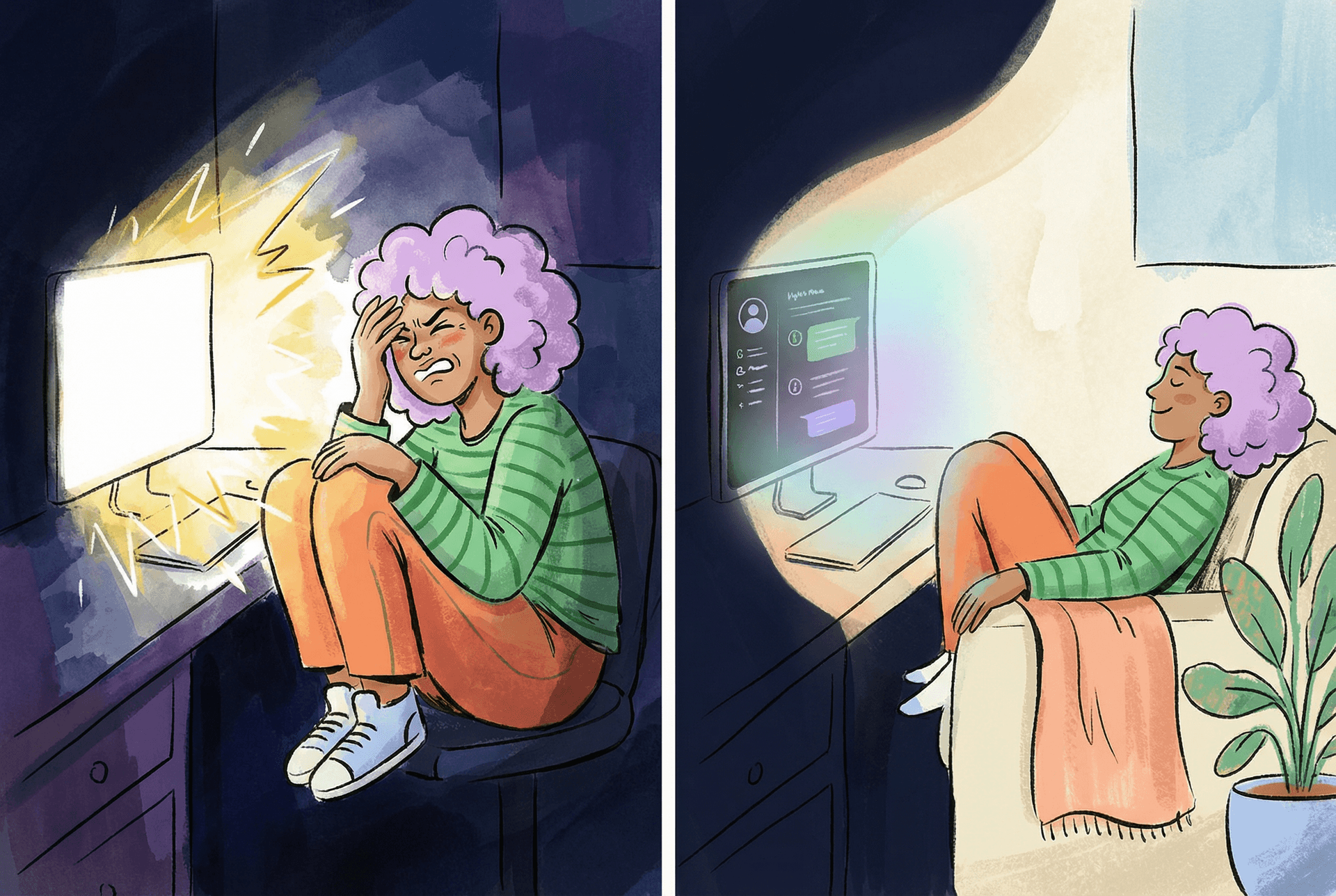
In light mode, your screen acts like a mini sun. Stare at it for a while, then glance at your dim surroundings. You'll feel that sharp contrast. Your pupils need to constantly adjust, and your eyes get tired. Dark mode lowers the overall screen brightness, bringing it closer to your ambient lighting, so your eyes don't have to work as hard.
Bottom line: dark mode isn't designed for eye health. It's a stylistic choice that many users prefer for its aesthetic appeal and atmosphere.
It's Not Just Two Variables. It's a Redesign.
Many developers fall into a mental trap. They think dark mode is just two color variables. But that's not how it works. It's not about inverting colors either. What we're really doing is redesigning the entire color system within the same functional context.
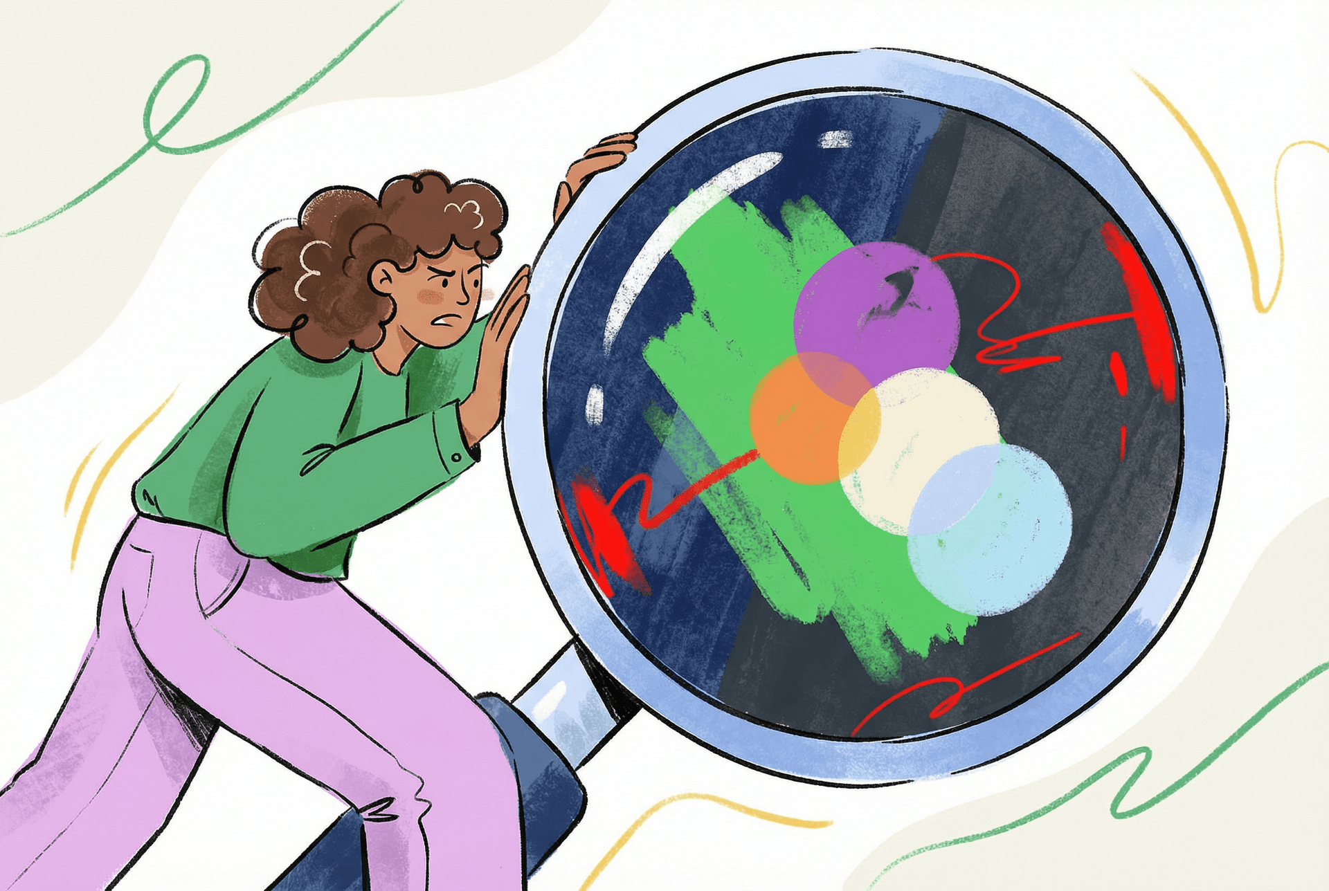
The key insight is this. The visual hierarchy created by different colors reflects the information architecture we want to present. What works in light mode doesn't automatically translate to dark mode.
Let me give you a simple example of what goes wrong when you just swap colors.
For example, in the YouMind Chatbox we designed, using shadows can effectively distinguish hierarchical relationships in a light color scheme, highlighting the Chatbox area. However, in dark mode, the traditional dark shadow effect significantly weakens due to the insufficient contrast between the dark shadow and the dark background.

If we simply map the colors directly, the design falls flat. Instead, we need to use light shadows or lighten background colors to create depth and establish that spatial relationship. So in our new design, we adjusted the Chatbox background color and borders to amplify the sense of space.
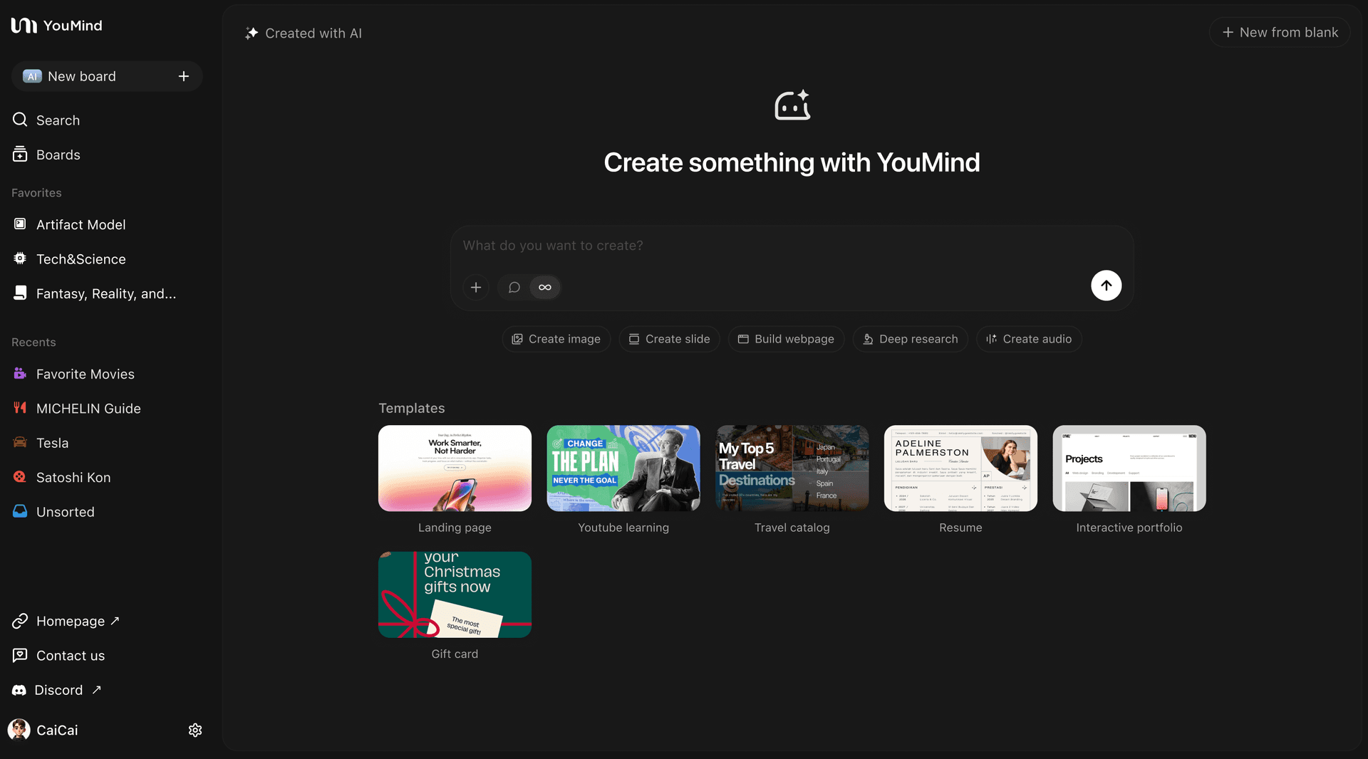
In short, visual techniques that work on white backgrounds might not work in dark mode. We need to adapt based on the actual conditions.
This is why a new theme isn't just a color swap. It doubles your design workload.
So if you have a designer willing to create two complete color schemes for you, treasure them. They're worth their weight in gold.
When Colors Go Wrong
Beyond these challenges, dark mode has plenty of other gotchas that'll add to your workload. The most notorious one? How different colors behave across both themes.
Text and button colors usually don't cause major issues. They're relatively muted. But brand colors and illustrations often use high saturation, and that's where things get tricky. Take YouMind's Pick feature for YouTube videos. In light mode, it looks fine. White paired with soft red feels playful and cheerful.
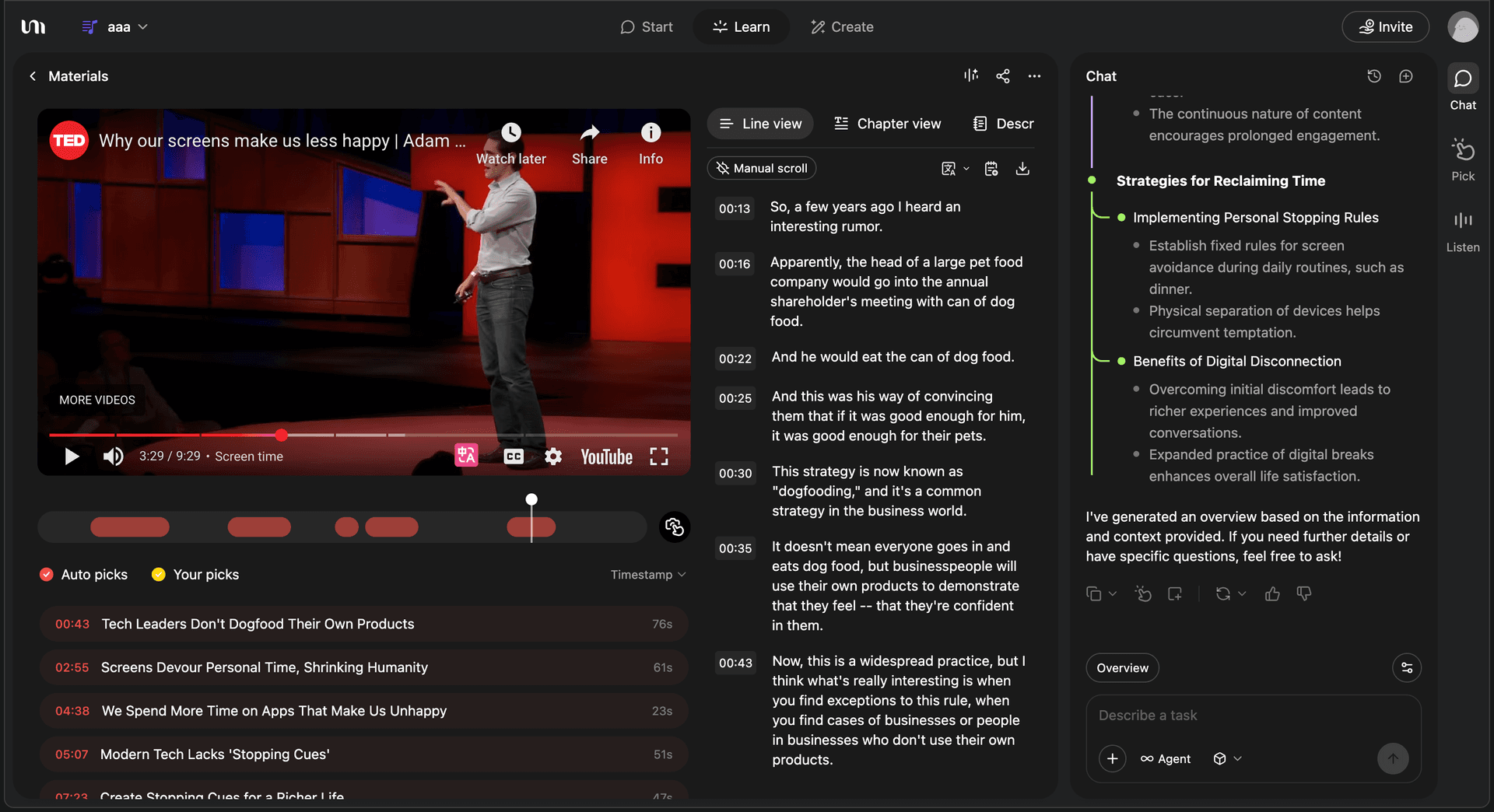
But pair that red with a black background? High chance of disaster. The reason lies in luminance contrast:
- White background (100% luminance) + red (70% luminance) = 30% difference
- Black background (0% luminance) + red (70% luminance) = 70% difference
When the luminance gap is too wide, your eyes have to constantly adjust, creating visual vibration at the edges. In plain English, it feels jarring. The same color combo that works fine on white suddenly feels off on black.
There's more to it. Human vision craves "color balance." That's why some combinations feel harmonious and others don't. With brand colors on white backgrounds, the neutral nature of white accommodates warm colors without creating harsh temperature clashes. But with black backgrounds, that balance breaks easily.
Here's the detail. If your brand color has high luminance and high saturation, you'll need to adjust both when pairing it with black backgrounds. Most people might think that harsh look is just part of dark mode's character, but there's a catch. Brand colors need to stay recognizable. Don't sacrifice brand identity for visual balance. Find the sweet spot.
Dark Mode's Moment to Shine
We've covered a lot of dark mode pitfalls and the extra effort required. But dark mode isn't all bad. For designers, it can breathe new life into a product and add a completely different flavor.
Why? Because most dark mode designs offer opportunities for clever touches that enhance brand perception and user delight.
There are many approaches, but let me share one example from our work on Yuque. This design detail won over many users the moment they saw it. They felt it brought real warmth to the product.
We were designing a 404 page that appears when users can't find what they're looking for. The illustration carried a simple message. In the garden of knowledge, there's no dead end. Keep moving forward, and there's always a path. Though the page is temporarily missing, the garden of knowledge is full of life and roads to explore.

But this design faced the same challenge. If we dropped it straight onto a black background, the greens and yellows would clash horribly due to luminance issues.
What could we do? We couldn't adjust the entire composition. The green grass and yellow path were perfectly balanced on white. Changing any color would destroy that visual harmony.
So we took dark mode one step further. Since it's dark, we embraced the night. We lit up the path with two beams of light, added a starry sky, and sprinkled in fireflies. Suddenly, dark mode wasn't just a color swap. By weaving in night, stars, and fireflies, we transformed the illustration from something balanced on white into something equally balanced and delightful on black.
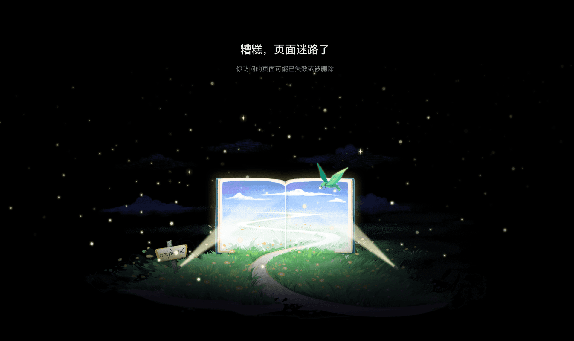
That's what dark mode can be. Not just a replacement, but an evolution of your creative design. Different contexts can evoke completely different feelings.
There are many more designs like this. My point with this example is simple. Don't limit yourself to color changes. You can also transform the scene and meaning of your work.