





After releasing the new product interface this week, I received two completely different types of feedback: some said it looked better and felt smoother, while others were upset asking "where did the features go?"
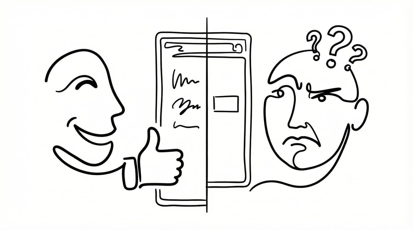
As a product built from the ground up, YouMind has undergone three major interface changes in the past six months. I can't say each one was perfect, but behind every change lies our vision for the product and incremental progress. So today, I'd like to take this opportunity to share some thoughts behind this latest redesign.
The Courage to Subtract
Sometimes we all say, "Man, adding a feature is so hard." Sometimes we just can't figure out what to build next. But for a product that's already complex, the hardest part isn't adding features, once users come on board, demand is usually abundant. At that point, the real test is what you're willing to give up.
Many people don't understand why we'd talk about cutting features when the product is doing fine and people are using it. There are many reasons, but for YouMind, which is still in the early stages of validating PMF, the thinking is quite simple: the earlier you are, the more courage you need to let go.
Because many features actually provide limited value but become obstacles on the path forward. They make the product bloated and rob it of the flexibility it needs. Imagine this: you quickly identify a potentially transformative need and want to evolve the product to address it, but you find that no matter how you try to change things, nothing works. That's terrifying, because you haven't left room for the product to adapt.
A product's flexibility comes from your courage to leave white space.
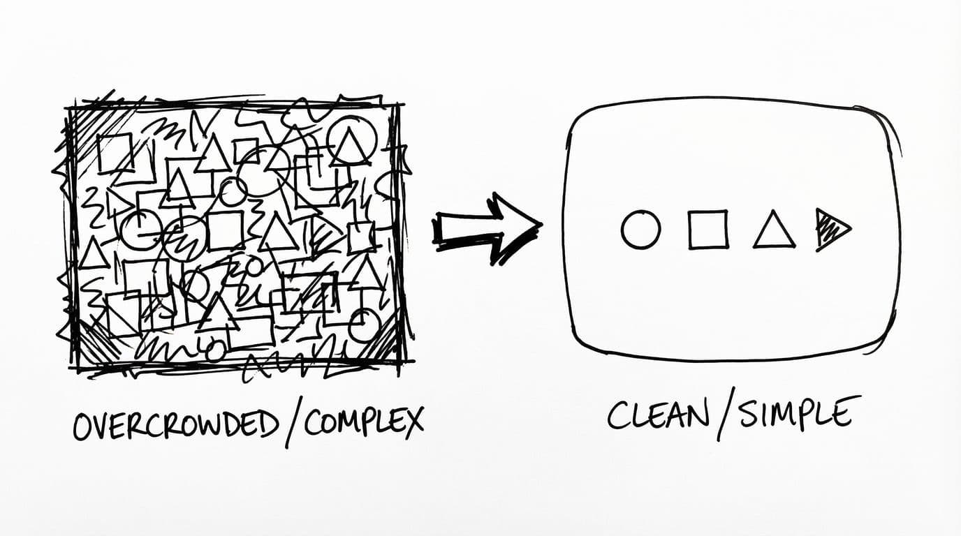
Of course, giving up doesn't mean mindlessly cutting features. Within a reasonable framework, it means letting everything return to its most natural state. Features often have logical relationships, and what we're doing today is providing value to users at the right moment.
It's like how everyone prefers to rename a file directly on the filename itself, rather than hunting for an "edit" button in some corner and then selecting "rename file" in a popup. That's the most natural user behavior in the critical path.
Why Such a Drastic Overhaul?
So why did YouMind undergo such a drastic structural overhaul in version 0.8, even cutting many existing features?
Although we haven't reached version 1.0 yet, YouMind was already facing some pretty serious problems:
- Feature Bloat: We wanted too much, kept adding randomly, and ended up accumulating product and technical debt
- Too Many Entry Points: A single feature existed in locations A, B, and C, sometimes making it hard to tell them apart
- Complex and Impure Logic: Too many hidden relationships existed, making things less straightforward
Because of these issues, we became hesitant in our actions. Many times, we should have handled requirements using the most natural logic, but instead we went in circles until even we got confused. No exaggeration—including myself, sometimes I wasn't familiar with how certain features worked. This is just the reality of rapid iteration with parallel development.
While this is normal, it was definitely holding us back. If we wanted to quickly experiment with new features and scenarios today, this state made it hard to move fast. Especially in the fast paced AI wave, if we want to compete on speed, we sometimes have to slim down the product to ensure it stays in peak condition.
Product growth isn't about adding features, it's about multiplying experiences.
The Detours We Took
Actually, before this redesign, we also tried the simplest approach: "stuffing all features into the sidebar." At the time, we thought that as long as we hid the features, the interface would become cleaner. But after repeated consideration, we found that even we couldn't find the features we wanted. That's when we realized: simplicity isn't about hiding things, it's about not needing them in the first place.
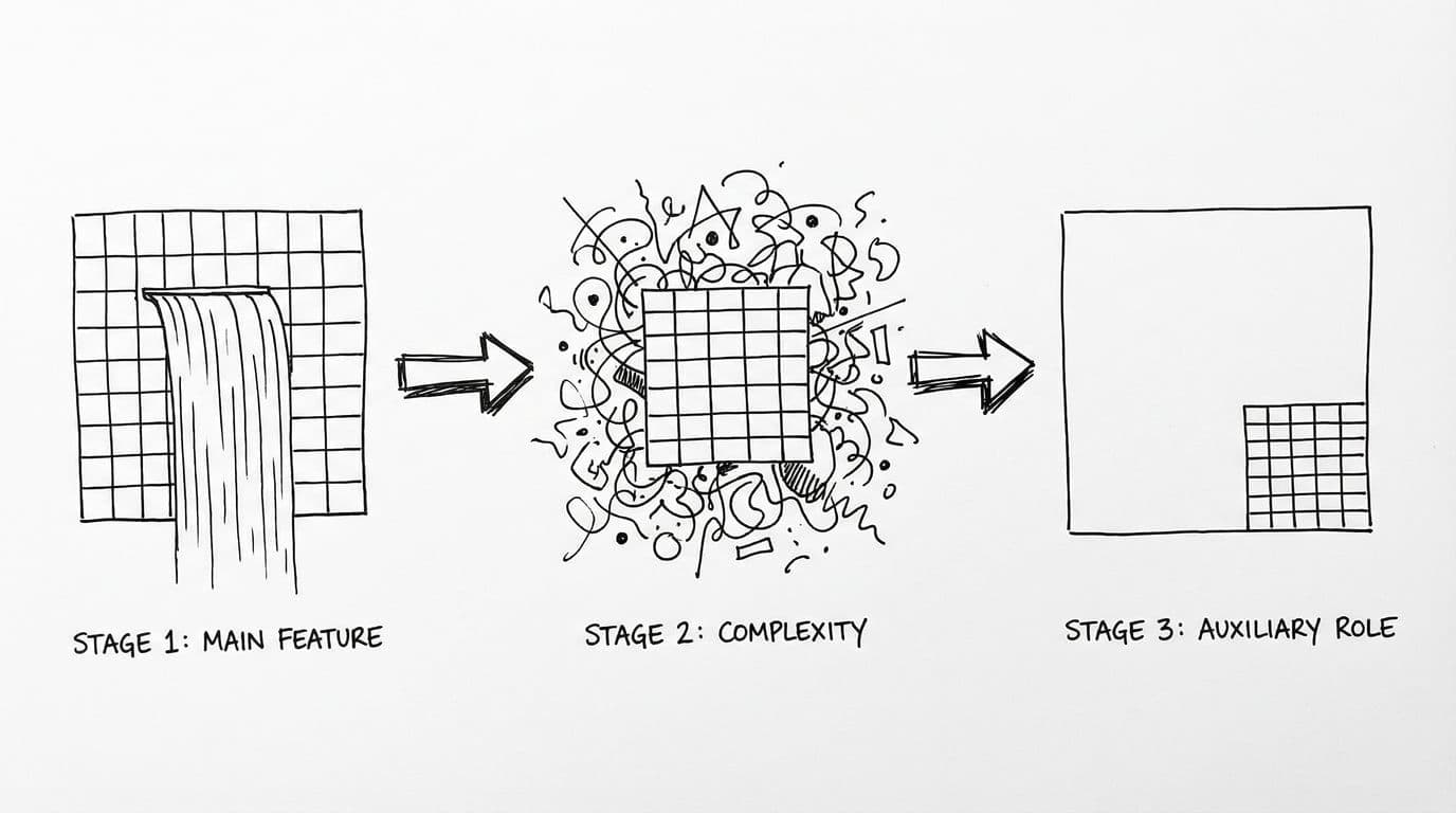
Take our waterfall view feature, for example. It looked cool, and some team members really liked it. But in reality, many people just treated it as window dressing, purely aesthetic, not actually using it to manage content. Yet to maintain this feature, we had to ensure compatibility every time, and for a while we lost sight of priorities, adding a bunch of management features to what was essentially a display function.
So in this redesign, we quietly downplayed its presence. An old user commented: "Where did the waterfall view go? I loved that browsing experience!" I understand their disappointment and I'm aware of the consequences of this decision, but to keep the product from becoming overly complex, sometimes tough choices have to be made. Of course, the waterfall view is still there. It's just become an auxiliary feature now, giving people a path to walk rather than making it the main highway.
The Underestimated Competitive Edge
So what's left after we cut those redundant features? A purer, more beautiful product experience. And this change in experience even changed my own usage habits.
After this release, we spent some time observing feedback from users and team members. Most gave fairly positive feedback, saying the interface became more attractive and smoother to use. Of course, some people were upset because they couldn't find previous features (which, as mentioned earlier, I had cut). Overall, the evaluation leaned positive.
In today's world of increasingly homogeneous product features, beauty and delightful experiences often become the key factors in user choice. When everyone can achieve "usable," "easy to use" and "want to use" become the core differentiators. And this differentiation often comes from design restraint and attention to detail.
My Creative Workflow Migrated to YouMind
Speaking for myself, the tangible change is that I moved my creative workflow to YouMind.
I'm embarrassed to admit that I hadn't really been doing text creation in YouMind before. I sometimes found it inconvenient to use, not because the features weren't good. I believe our team's work on AI writing is definitely superior to other products. The main reason was habit.
After the Yuque team disbanded years ago, I started migrating my document management to Notion. It's been about two years now, and while Notion has its issues, I gradually developed a habit of creating text there. Previously, YouMind's biggest use case for me was auxiliary reading and thinking. Because I'm the type who, while not a great writer, can just write whatever comes to mind, I didn't really need a creation environment most of the time since that work was done in Notion.
But after this redesign, I've quietly started using YouMind to write documents I want to share. This isn't because we're the creators and I'm forcing myself to use the product. I believe many so-called product creators probably haven't even touched 10% of their own product's features.
But this time, both the interface and user experience genuinely moved me. You might say, "Come on, you're just tooting your own horn!" Sure, I can't rule out that possibility. But most importantly, I've started to believe that this version of our design, from my own perspective, has actually surpassed Notion's experience.
My creative workflow migration happened naturally. This also validates from the side that this redesign genuinely moved me, and that feeling came from my most authentic inner response.
Where Does This Satisfaction Come From?
So if we look at this satisfaction from a design perspective, how do we articulate it? There are actually a few key points:
- Extreme Simplicity and White Space: The current version of YouMind is very clean, with plenty of white space that lets you focus when creating or reading. For example, in the editor, we removed many of the originally complex toolbars, keeping only the most commonly used features, giving the entire interface more breathing room. When you open a blank page, you're not distracted by a bunch of buttons and options, you can just start writing.
- Features Just Right: Not too many, not too few, basically appearing where you'd expect them. For instance, when reading materials, Pick (annotation) naturally appears when you select text, rather than being hidden in some corner. When you want to share content, the share button is right where you'd most easily find it. This "just right" quality makes the entire usage flow incredibly smooth.
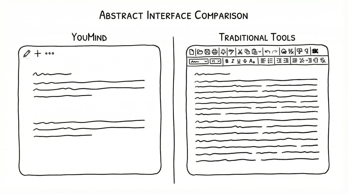
Of course, when it actually got to users, there was some feedback that differed from our design intentions. For example, some couldn't find the waterfall view, others asked why Side Peek couldn't open other content and only allowed materials. Behind this feedback are actually some of our thoughts on feature positioning.
Feature Positioning Purity: The Side Peek Example
Many times, it's not that we couldn't do it from a design perspective. It's that I intentionally chose not to. I've debated this topic with the development team for a long time. Although everyone's opinions sometimes differ, the basic assumptions are the same.
We want to provide users with a purer product experience, which sometimes means not letting auxiliary features become more complex.
Why doesn't Side Peek have complex capabilities? Simple, since we defined it as Side Peek, it's meant to be auxiliary in the moment, not a main feature. An auxiliary feature shouldn't add to the overall complexity here, as that would make Side Peek steal the spotlight.
Good design isn't about showing users all possibilities. It's about showing them the one they need most.
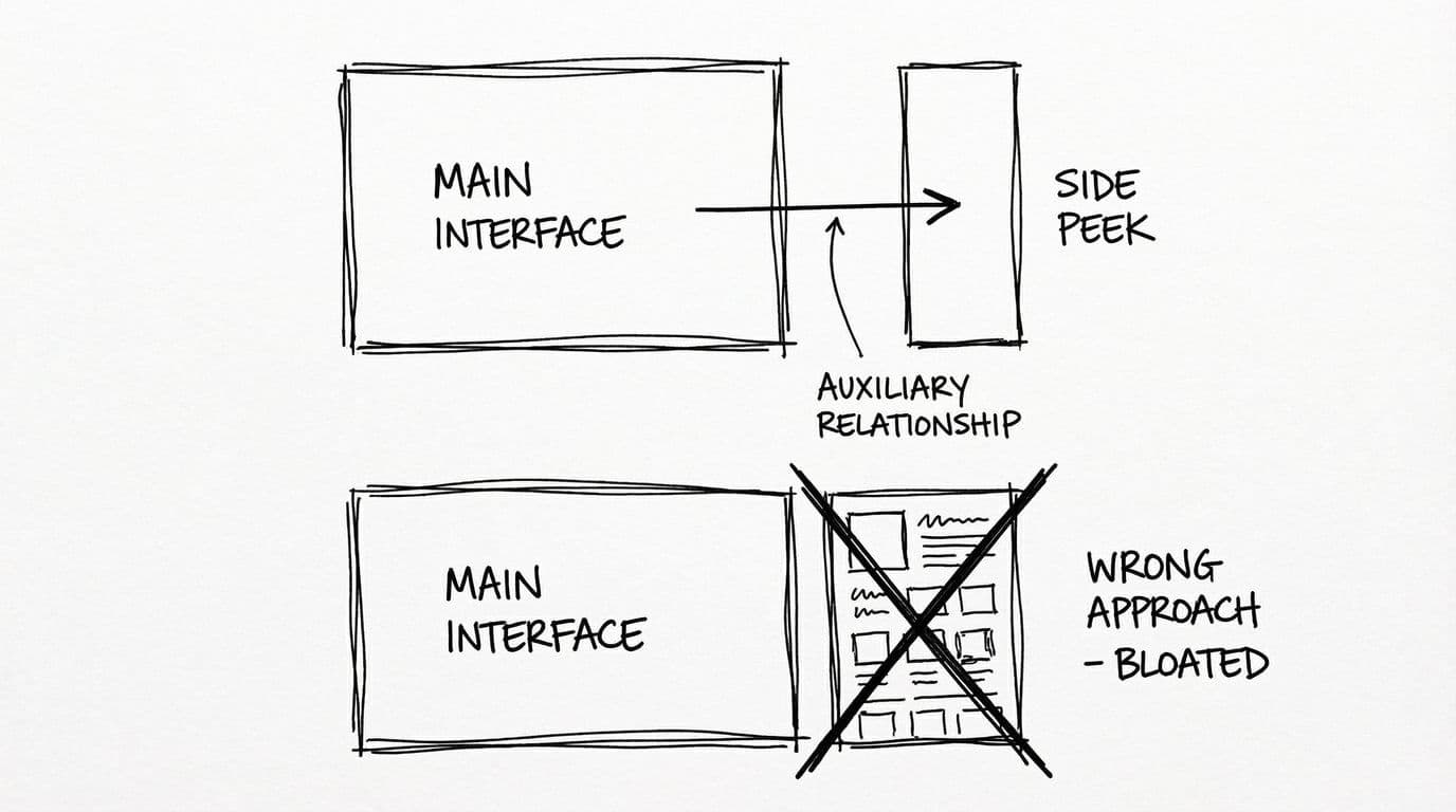
We didn't design it to replace the main function, but rather to assist our learning and creation scenarios at the right moments in the main flow. Side Peek's restraint is to keep the main function pure.
In Closing
Product growth isn't about piling up features. It's about finding balance through subtraction. That's the fundamental logic behind our redesign. Looking back at this entire redesign process, we also have some design insights to share:
- Features need clear boundaries: Main features should be just right, auxiliary features should be restrained, and shouldn't steal the spotlight
- Design should follow natural user behavior: Don't make users adapt to the product, make the product adapt to users
- Features require trade-offs: If a feature is only "potentially useful" rather than "definitely useful," don't build it
We believe that truly great products aren't those with the most features, but those that understand users best. And this "understanding" often comes from polishing details and staying true to core values.
Of course, YouMind still has many issues, and there are many phenomena I can't validate on my own in this document. But I hope that deep down, whether it's me or the YouMind development team, we all maintain this restraint and vigilance, making YouMind a tool that is both elegant and just right.
If you're also building products, I hope the thinking behind this redesign gives you some inspiration. If you're a YouMind user, feel free to tell us where we can do better. After all, products are meant to serve users, and your feedback is what drives us forward.
Let's work together to find product balance through subtraction.