




Time series is a collection of numerical data points (often measurements), gathered in discrete time intervals, and indexed in order of the time. Common examples of time series data are CPU utilization metrics, Temperature of some geolocation, New User Signups of a product, etc.
Observing time-series of critical metrics helps in spotting trends, aberrations, and anomalies. Time series forecasting helps in predicting future demand and thus aids in altering and adjusting the supply to match that. Software companies continuously monitor hundreds of time series plots for anomalies that, if unattended, could result in downtime or a loss in revenue.
Unfortunately, time series data have a lot of short-term irregularities, often making it harder for the observer to spot the sudden spikes and true anomalies; and which is where the need for smoothing arises. By smoothing the plot we get rid of the irregularities, to some extent, while enabling the observer to clearly see the patterns, trends, and anomalies.
In this essay, we take a detailed look into how we can optimally smooth the time series data to prioritize the user’s attention i.e. making it easier for the observer to spot the aberrations. The approach we discuss was introduced in the paper ASAP: Automatic Smoothing for Attention Prioritization in Streaming Time Series Visualization by Kexin Rong, Peter Bailis.
Time Series, more often than not, is very irregular in nature. Below is the plot of India’s Average Temperature - Monthly since 1870. We can clearly see the plot being very irregular making it harder for us to deduce any information out of it whatsoever. Probably the only fact we can point out is that the Monthly Average temperature in India is always between 15 - 30 degrees celsius, which everyone can agree, is not that informative enough.
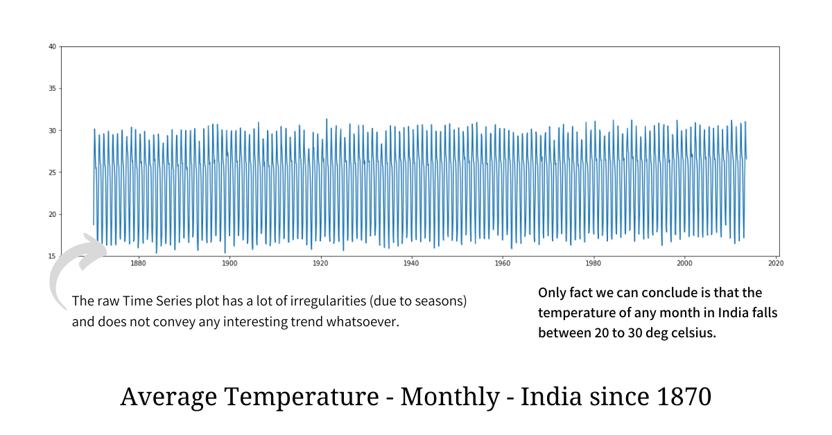
In order to make sense of such an irregular plot and find a pattern or a trend out of it, we have to get rid of short-term irregularities without substantial information loss; and this process is called “smoothing”. Aggregation doesn’t work well here because it will not only hide the anomaly but will also reduce the data density making the resultant plot sparse; hence in order to spot anomalies and see long-term trends smoothing is preferred.
If we smooth the above raw plot using one of the simplest techniques out there, we get the following plot which, everyone would agree, not only looks cleaner but it also clearly shows us the long-term trend while being rich in information.
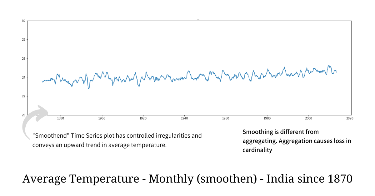
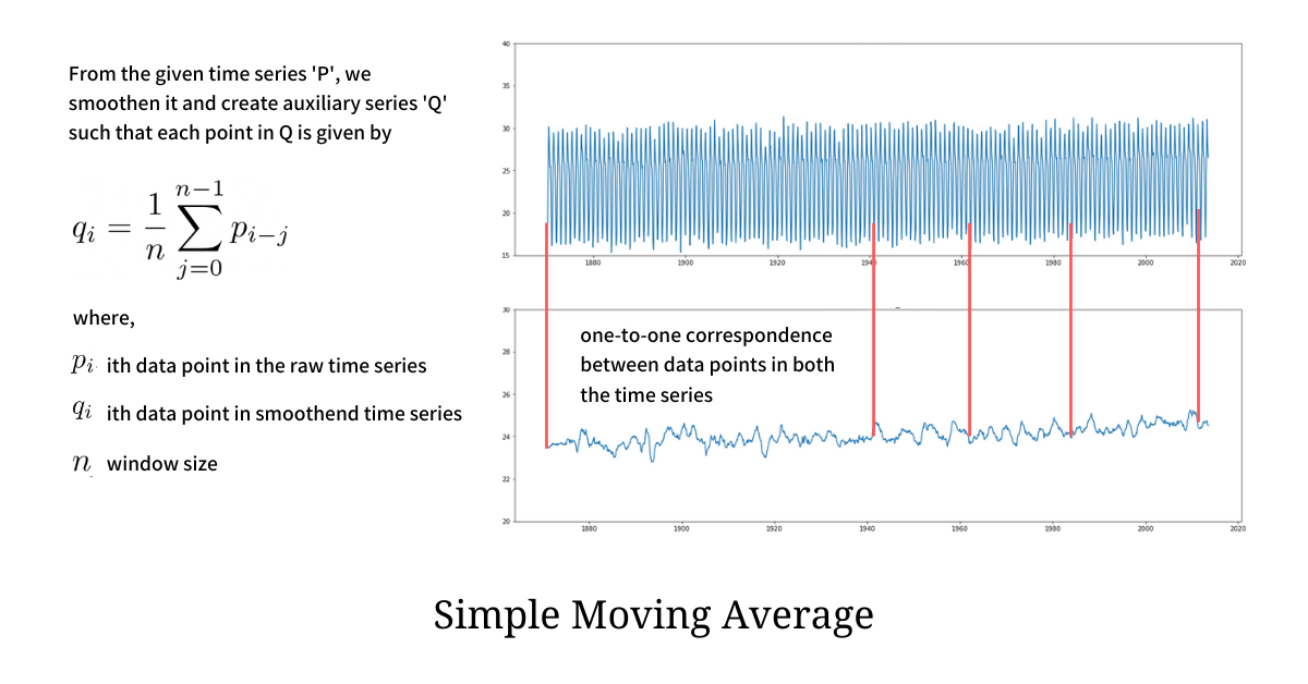
The technique we used to smooth the temperature plot is known as Simple Moving Average (SMA) and it is the simplest, most effective, and one of the most popular smoothing techniques for time series data. Moving Average, very instinctively, smooths out short-term irregularities and highlights longer-term trends and patterns. Computing it is also very simple - each point in the smoothened plot is just an unweighted mean of the data points lying in the sliding window of length n. Because of the Sliding Window, SMA ensures that there is no substantial loss of data resolution in the smoothened plot.
We apply SMA, with window length 11, to another time series plot and we clearly find the smoothened plot to be visually cleaner with fewer short-term irregularities.
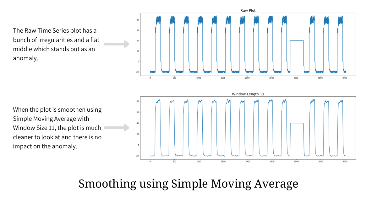
When an observer is looking at the plot, the primary motive is to spot any aberrations and anomalies. If the plot has irregularities (i.e. it is not smooth enough), spotting anomalies or aberrations becomes tough, and hence smoothing plays a vital role here.
Simple Moving Average is a very effective smoothing technique but choosing the optimal window size is a challenge. Picking a smaller window size will not help in getting rid of irregularities while picking the window size that is too large will mask all the anomalies.
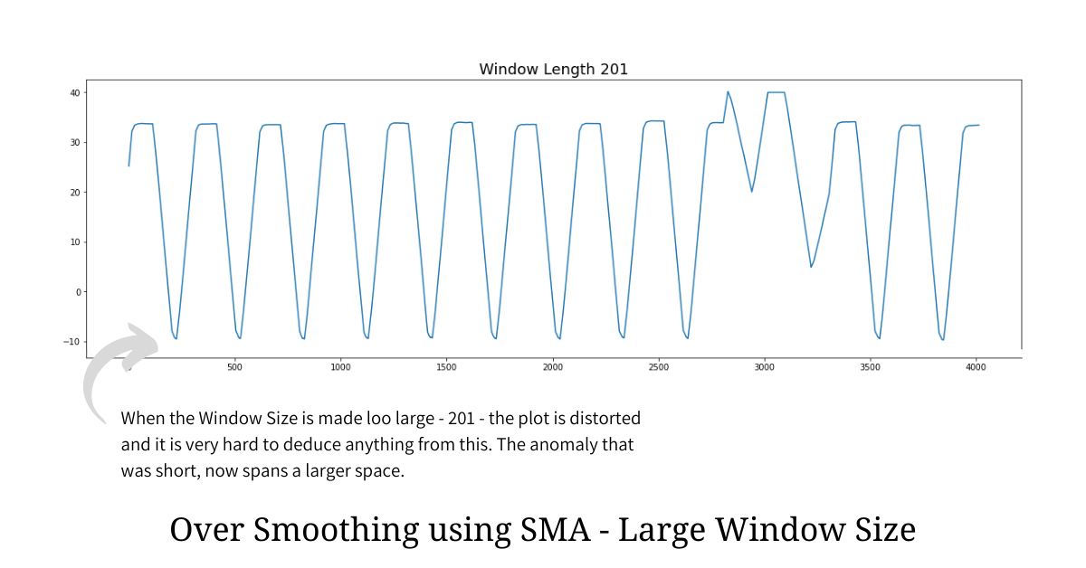
From the over-smoothened plot illustrated above it is clear that having a large window size leads to a heavy information loss and in most cases hides the anomalies and aberrations. Hence we reduce our problem statement to find the optimal window size for a given plot such that we make anomalies and aberrations standout.
In any data distribution, the anomalies and aberrations form in the long tail which means they are some extreme values that are far away from the mean. Being part of the long tail makes these anomalies - outliers i.e. data points that do not really fit the distribution.
Hence in order to find out optimal window size that gets rid of short-term irregularities but makes anomalies stand out, we have to make the resultant distribution “tail heavy” implying the presence of anomalies. This is exactly where Kurtosis - a famous concept from Statistics comes into the picture.
Kurtosis is the measure of “tailedness” of the probability distribution (data distribution) and it helps in describing the shape of the plot. Kurtosis is the fourth standardized moment and is defined as

The high value of kurtosis implies that the distribution is heavy on either tail and this is evident when we compute Kurtosis of various distributions with and without any tail noise - mimicking anomalies.
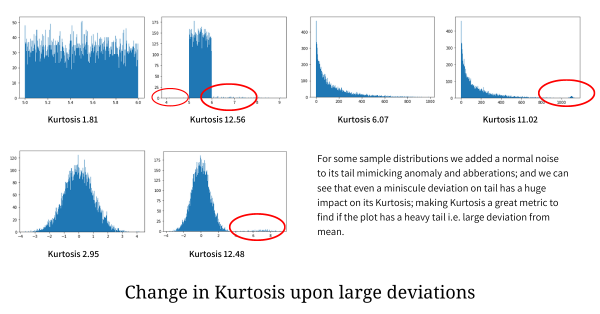
In the illustration above, a small variation (anomaly) is added to the tail of the individual distribution and is encircled in red; and we can clearly see that even a tiny tailedness (anomaly and aberration) that makes the distribution deviate from the mean has a heavy impact on the Kurtosis, making it go much higher.
As established earlier, anomalies and aberrations are extreme values that largely deviate from the mean and hence occupy a position on either tail of the distribution. Hence in order to find the optimal window size that neither under-smooths nor over-smooths the plot while ensuring that it makes anomalies and aberrations stand out, we need to find the window size that maximizes the Kurtosis.
from scipy.stats import kurtosis

optimal_window, max_kurt = 1, kurtosis(raw_plot)

for window_size in range(2, len(raw_plot), 1):
    # we get the smoothened plot from the `raw_plot` by applying
    # Simple Moving Average for a window of length `window_size`
    smoothened_plot = moving_average_plot(raw_plot, window=window_size)

    # measure the kurtosis of the smoothened_plot
    kurt = kurtosis(smoothened_plot)

    # if kurtosis of the current smoothened plot is greater than the
    # max we have seen, then we update the optimal window the max_kurt
    if kurt > max_kurt:
        max_kurt, optimal_window = kurt, window_size
The pseudocode above computes the optimal window size that maximizes the Kurtosis and in turn ensuring that the smoothened plot has a heavy tail, making anomalies and aberrations stand out.
Finding the global optimal window size, that maximizes Kurtosis, is not always a good idea, because doing so can totally distort the plot leading to heavy information loss. A better way is to find local optimum within pre-defined limits; for example, an optimal point for window size between 10 and 40. These limits totally depend on the data at hand. Doing this not only leads to a smooth plot that highlights anomalies but also converges the computation to a local optimum much quicker.
此内容由惯性聚合(RSS阅读器)自动聚合整理,仅供阅读参考。 原文来自 — 版权归原作者所有。