








HTML comes with a lot of ready to use and flexible elements, but date selector has a handful of limitations and the need to write your own calendar / date input emerges sooner rather than later. In this tutorial I'll walk you through implementing a calendar view and show how you can extend its functionality to fit your booking widget or dashboard filter.
Here's how the final result might look like:
| Sun | Mon | Tue | Wed | Thu | Fri | Sat |
|---|---|---|---|---|---|---|
Building a calendar might sound challenging at first: you could wonder what function to use to get days in a month or how would you handle date range selection; and thus I suggest to start with something easier and less uncertain: a static representation of one specific month.
For example something like this:
See the Pen Calendar View by Valeria (@valeriavg-the-flexboxer) on CodePen.
I used semantic markup: table for the days table, th for the table headers
and button for the calendar days that can be selected. This should reduce
potential accessibility issues to a minimum since screen readers are pretty good
at reading standard html and browsers already have all required keyboard
navigation handlers assigned.
If you're, like me, residing in a country that counts weekdays from Monday, I
still suggest starting with a Sunday-first calendar and change the order later on to match how
JavaScript Date does that.
I encourage you to spend some time styling the calendar till it matches your vision before we move on to implement a function that would be able to create such view for any month of your choice.
If we are to strip the markup from above to the bare bones we would end up with the following data structure:
[
  [null, null, 1, 2, 3, 4, 5],
  [6, 7, 8, 9, 10, 11, 12],
  [13, 14, 15, 16, 17, 18, 19],
  [20, 21, 22, 23, 24, 25, 26],
  [27, 28, 29, 30, 31, null, null]
]
We have a table with seven rows, a.k.a. matrix, where each row represents a tr
in a table and each cell represents a td within that row. Implementing JSX
component from such structure would be trivial:
export default function CalendarView({
  month,
  year,
  days,
}: {
  month: string;
  year: number;
  days: Array<Array<number | null>>;
}) {
  return (
    <section>
      <header>
        {month}, {year}
      </header>
      <table>
        <thead>
          <tr>
            <th>Sun</th>
            <th>Mon</th>
            <th>Tue</th>
            <th>Wed</th>
            <th>Thu</th>
            <th>Fri</th>
            <th>Sat</th>
          </tr>
        </thead>
        <tbody>
          {days.map((row) => (
            <tr>
              {row.map((day) => (
                <td>{Boolean(day) && <button>{day}</button>}</td>
              ))}
            </tr>
          ))}
        </tbody>
      </table>
    </section>
  );
}
Now we "just" need to generate said matrix for every month of every year 😅.
Note: I highly recommend creating a separate
Calendarcomponent that would hold the state and logic and would callCalendarViewwith the proper props to avoid over complicating the latter.
If you're up for a challenge, feel free to use these test cases to try and write a function that would generate a proper matrix so that all the tests would pass (including the commented out test checking all the calendars in the range of 1970 and 2100):
Note: function
createCalendar, similarly toDateitself, accepts integer month in a range from0to11, therefore March, for example, would be4and not5due to that.
const lastDay = new Date(year, month + 1, 0);
And the whole solution if you prefer:
export default function createCalendar({
  month,
  year,
}: {
  month: number;
  year: number;
}) {
  const days: Array<Array<number | null>> = [];
  const firstDay = new Date(year, month, 1);
  days.push(new Array(firstDay.getDay()).fill(null));
  const lastDay = new Date(year, month + 1, 0);
  for (let i = 1; i <= lastDay.getDate(); i++) {
    if (days[days.length - 1].length === 7) days.push([]);
    days[days.length - 1].push(i);
  }
  while (days[days.length - 1].length < 7) {
    days[days.length - 1].push(null);
  }
  return days;
}
Now with an actual calendar let's try and highlight today's date and selected date.
const today = new Date();
const isToday = (day: number) =>
  today.getFullYear() === year &&
  today.getMonth() === month &&
  today.getDate() === day;
Then you just need to define a proper class for such case and assign it to the day button:
<button className={cx("day", isToday(day) && "today")}>{day}</button>;
Function cx I use comes from @emotion/css package I use, but you can write
it yourself:
export const cx = (...classNames: Array<string | null | undefined | false>) =>
  classNames.filter(Boolean).join(" ");
Let's do the same for the selected dates. For now add e.g. selectedDays
property to the CalendarView and add a function to check is a certain day is
selected:
// selectedDays?: Array<{day: number, month: number, year: number}>
const isSelected = (day: number) =>
  !!selectedDays?.find(
    (d) => d.year === year && d.month === month && d.day === day,
  );
And apply desired styles:
<button
  className={cx("day", isToday(day) && "today", isSelected(day) && "selected")}
>
  {day}
</button>;
Note: as you can see I'm avoiding using
Datefor storing calendar dates. This is intentional as I want to avoid issues due to time zones, since we're only interested in date and not specific time, but JavaScript is lacking a built in type for that.
Finally we've got to the most important part of functionality: actually being able to select dates!
Let's start with defining the interface for our component. Similarly to design driven development where we ensure that code reflects UX, it's easier to write a function if we know what we want to pass as an input there.
I think I'd like to be able to pass any previously selected date into the
Calendar and have a callback function to notify when user has made it's
selection, something like that:
export default function Calendar({
  onSelect,
  selectedDate,
}: {
  onSelect: (date: string) => void;
  selectedDate?: string;
}) {
  /* ... */
}
Depending on your needs, you should adjust the definition, for example if you'd like to handle both selecting one date and interval you could write the following code:
export default function Calendar({
  onSelect,
  selectedDates,
}: {
  onSelect: (...dates: string[]) => void;
  selectedDates?: [string] | [string, string];
});
Or you could create a component for selecting two dates and a component for
selecting one date, since you can reuse CalendarView for either of the cases.
We've previously added selectedDays to CalendarView, so we only need to map
dates to {day, month, year} format:
const date = new Date(selectedDate);
const selectedDays = [{
  year: date.getFullYear(),
  month: date.getMonth(),
  day: date.getDate(),
}];
Handling the selection itself is even easier. Let's add onDayClick prop in the
CalendarView for it:
export default function CalendarView({
  month,
  year,
  days,
  onDayClick = () => { // <-- providing default "no operation" handler
    /*noop*/
    // <-- this comment there is to appease my linter that catches unintentional empty functions
  },
  selectedDays,
}: {
  month: number;
  year: number;
  days: Array<Array<number | null>>;
  onDayClick?: (day: Day) => void; // <--- optional, because we defined a default value
  selectedDays?: Day[];
});
And finally, add it to day button.onClick:
<td>
  {!!day && (
    <button
      className={cx(
        styles.day,
        isToday(day) && styles.today,
        isSelected(day) && styles.selected,
      )}
      onClick={() => onDayClick({ day, month, year })}
    >
      <span>{day}</span>
    </button>
  )}
</td>;
You've probably heard about controlled and uncontrolled inputs in the context of
React components and we can make a similar architectural decision for our
Calendar component: would it have it's own state or would it be driven by
parent component?
Given that we already have CalendarView that is fully controlled by it's
props, I makes more sense to let Calendar handle logic and state.
For a single date selection we can utilize useState hook:
const [selectedDay, setSelectedDay] = useState<
  { day: number; month: number; year: number }
>(defaultValue);
Then we pas setSelectedDay to CalendarView.onDayClick and done ✅
But when it comes to selecting two dates, the logic is much more complicated:
Calendar in this case could only transition between certain "states", e.g. if
user hasn't selected the first day they yet can neither select the second one
nor highlight date they hover. This model is usually referred as a finite-state
machine and React (as well as Preact and other renditions) have a hook called
useReducer for that case.
Reducer is a simple function that accepts two parameters: previous state and action object and returns next state:
type CalendarState = {
  month: number;
  year: number;
  selectedDays?: [Day] | [Day, Day];
  hoverDay?: Day;
  isDirty: boolean;
};

type CalendarAction =
  | {
    type: "select_day";
    day: Day;
  }
  | {
    type: "hover_day";
    day: Day;
  };

const calendarReducer = (
  prevState: CalendarState,
  action: CalendarAction,
): CalendarState => {
  return prevState;
};
Unlike a hook, a reducer doesn't need to be defined within a component and can be moved into it's own file and be unit tested just like any other function.
Here are some ideas how you could write tests for it:
describe("calendarReducer", () => {
  it.todo("should only allow to select first date when no dates are selected");
  it.todo("should only allow to hover on a day when first day is selected");
  it.todo("should only clear hover on day selection");
  it.todo("should only allow to select second date when first one is selected");
});
Here's how I'd handle date selection:
const calendarReducer = (
  prevState: CalendarState,
  action: CalendarAction,
): CalendarState => {
  if (action.type === "select_day") {
    if (prevState.selectedDays?.length === 1) {
      return {
        ...prevState,
        hoverDay: undefined,
        selectedDays: [prevState.selectedDays[0], action.day].sort(
          (a, b) =>
            new Date(a.year, a.month, a.day).getTime() -
            new Date(b.year, b.month, b.day).getTime(),
        ) as [Day, Day],
        isDirty: true,
      };
    }

    return {
      ...prevState,
      hoverDay: undefined,
      selectedDays: [action.day] as [Day],
      isDirty: true,
    };
  }
  return prevState;
};
Note: Do not modify
prevState. You should either pass it as is to indicate that no changes were made or create a new object to trigger re-render of your component.
With that in place we can add the following to the Calendar component:
const [state, dispatch] = useReducer(
  calendarReducer,
  createDefaultState(selectedDates),
);

const days = createCalendar({ month: state.month, year: state.year });

const onDayClick = (day: Day) => {
  dispatch({ type: "select_day", day });
};
That should handle the selection of multiple dates as well as lay out the
foundation for switching between the months and years. The only missing part is
calling onSelect when the selection is made.
We can't really incorporate it into a reducer, since it's outside of Calendar,
but useEffect hook would come in handy.
useEffect(() => {
  if (state.isDirty && state.selectedDays?.length === 2) {
    if (
      state.selectedDays[0].day === state.selectedDays[1].day &&
      state.selectedDays[0].month === state.selectedDays[1].month &&
      state.selectedDays[0].year === state.selectedDays[1].year
    ) {
      return onSelect(
        new Date(
          state.selectedDays[0].year,
          state.selectedDays[0].month,
          state.selectedDays[0].day,
          12,
        )
          .toISOString()
          .split("T")
          .shift()!,
      );
    }
    onSelect(
      ...(state.selectedDays.map(
        (d) =>
          new Date(d.year, d.month, d.day, 12)
            .toISOString()
            .split("T")
            .shift()!,
      ) as [string, string]),
    );
  }
}, [state.isDirty, state.selectedDays]);
And that's pretty much a fully functional calendar that works with keyboard
navigation (try Tab,Shift + Tab and Enter), mobile touches and mouse out
of the box!
Let's add some finishing touches to user experience.
Take a look at this example from
Material Design library:
Every day in the selected interval is highlighted and "connects" selected dates with an uninterrupted line.
To achieve this effect we need to go back to CalendarView and add a span
element to the day button and move the selection state there:
<td>
  {!!day && (
    <button
      className={cx(
        "day",
      )}
      onClick={() => onDayClick({ day, month, year })}
    >
      <span
        className={cx(
          "day",
          isToday(day) && "today",
          isSelected(day) && "selected",
        )}
      >
        {day}
      </span>
    </button>
  )}
</td>;
This way we can use button container to add a background when day is covered,
alter edge days borders and have the selected and today date highlighted same as
before.
You'll probably need to adjust the "day" style and make sure that span takes
all the space in the button to fix this:
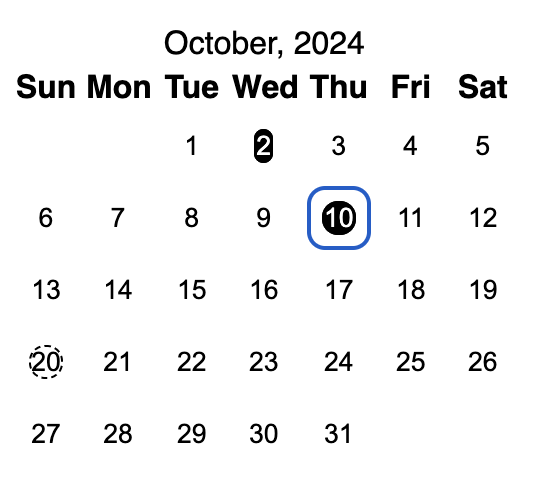
It can be done by setting display to flex (as span is inline by default)
and setting align-items and justify-content value to center
Let's define a style for the "hovered" day or a date in the selected interval, for example:
.hovered {
  background-color: pink;
  border-radius: 0;
}
And a function to determine if the day is within the interval:
const isBetweenSelected = (day: number) => {
  if (selectedDays?.length !== 2) return false;
  const interval = selectedDays.map((d) => new Date(d.year, d.month, d.day));
  const date = new Date(year, month, day);
  return (
    interval[0].getTime() < date.getTime() &&
    interval[1].getTime() > date.getTime()
  );
};
Note: this is possible because we're sorting state on every date selection therefore we can trust that days are always ordered in ascending order (older first).
But when applied to button class name the effect is not exactly as he hoped
for: 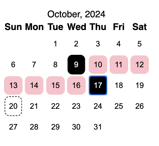
To change that let's remove the gap between table cells:
table {
  border-spacing: 0;
  border-collapse: collapse;
}
Add add these properties to the table:
<table cellpadding={0} cellspacing={0}>
Additionally, you might need to increase the size of cells or reduce the text size in the table header as "Wed" was pushing all the cells in the column to be a bit wider than all others:
.day {
  width: 2.5rem;
  height: 2.5rem;
  min-width: 2.5rem; /* makes flex to be less flexible */
  min-height: 2.5rem; /* and keep the size intact */
}
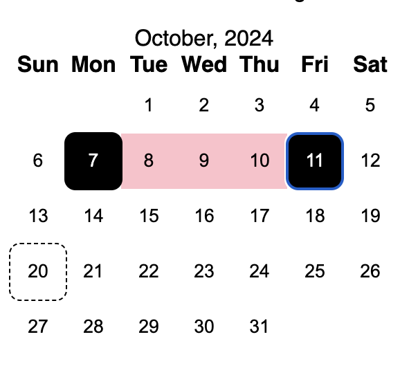
You could notice that there's a bit of a gap between selected date and the interval, to fix that we could add same background to the selected days and apply borders for the left and right side, e.g.:
.is-first-selected {
  border-top-left-radius: 0.5rem;
  border-bottom-left-radius: 0.5rem;
}
.is-last-selected {
  border-top-right-radius: 0.5rem;
  border-bottom-right-radius: 0.5rem;
}
And apply it to the button:
<button
  className={cx(
    "day",
    isBetweenSelected(day) && "hovered",
    isFirstSelected(day) && "isFirstSelected",
    isLastSelected(day) && "isLastSelected",
  )}
  onClick={() => onDayClick({ day, month, year })}
>
  <span
    className={cx(
      "day",
      isToday(day) && "today",
      isSelected(day) && "selected",
    )}
  >
    {day}
  </span>
</button>;
Note: You might also want to change
isBetweenSelectedto include first & last date or add same background to the last & first selected classes.
const isBetweenSelected = (day: number) => {
  if (selectedDays?.length !== 2) return false;
  const interval = selectedDays.map((d) => new Date(d.year, d.month, d.day));
  const date = new Date(year, month, day);
  return (
    interval[0].getTime() <= date.getTime() &&
    interval[1].getTime() >= date.getTime()
  );
};

const isFirstSelected = (day: number) => {
  if (!selectedDays?.length) return false;
  const d = selectedDays[0];
  return d.year === year && d.month === month && d.day === day;
};
const isLastSelected = (day: number) => {
  if (selectedDays?.length !== 2) return false;
  const d = selectedDays[1];
  return d.year === year && d.month === month && d.day === day;
};
Implementing hover functionality should be quite straightforward by using the
same approach we used with selectedDays and I'll leave it to you to figure
out, but if you are interested in the exact code that fuels
example, feel free to check it on
GitHub.
Challenge: Remember how I said you could come back and implement a calendar that starts from Monday later on? Now is the time to try and tackle this challenge! Good luck!
此内容由惯性聚合(RSS阅读器)自动聚合整理,仅供阅读参考。 原文来自 — 版权归原作者所有。
