







Web Components are a set of browser APIs that allow us to create custom HTML elements. They are one of the major things that SPA (Single Page Application) frameworks have been giving us for a long time. Frameworks like Vue, React, Angular or Svelte have their own approach and APIs for creating and using reusable, isolated UI components. This framework-specific philosophy has been widely used for quite a long time right now. It has a few unfortunate consequences:
Luckily, for quite a long time right now, we have Web Components, native to the browser way of creating reusable, custom HTML elements. In a nutshell, we can encapsulate any behavior we want in the specific JavaScript class. We can then use it in the HTML, in the same way as we use div, p, input, button or any other, browser-native element.
Creating Web Components is extremely straightforward. To illustrate, let's say that we would like to have something like this:
<custom-message
  category="Curiosities"
  message="Some interesting message">
</custom-message>
All we need is a few lines of JavaScript:
class CustomMessage extends HTMLElement {
  constructor() {
    super();
    const category = this.getAttribute("category");
    const message = this.getAttribute("message");
    this.innerHTML = `
      <div>You've got an interesting message, from ${category} category:</div>
      <div>${message}</div>`;
  }
}

customElements.define('custom-message', CustomMessage);
That is all! No extra tooling and zero dependencies required. If we add to this the ability to observe attribute values changes and lifecycle callbacks:
...

static observedAttributes = ["category", "message"];

attributeChangedCallback(name, oldValue, newValue) {
  console.log(`${name} attribute was changed from ${oldValue} to ${newValue}!`);
}

connectedCallback() {
  console.log("Element was added to the DOM!");
}

disconnectedCallback() {
  console.log("Element was removed from the DOM!");
}

...
...there is virtually no limit to what we can do with Web Components! Moreover, there is also a possibility of creating Shadow (hidden) DOM with scoped CSS, but it is quite complex, has its drawbacks and is frankly not needed in the majority of cases. Because of that, we will stick with the basics here:
In addition, we shall ask the question: how and why can we utilize Web Components in the context of HTMX?
I wrote quite an extensive article about HTMX which you can find here. For the sake of completeness, let's give a short definition:
HTMX is a JavaScript library that allows making arbitrary http requests from any HTML element, not only from forms, links or videos. It expects HTML in response, and renders whole HTML pages or fragments directly in the page section we have specified. We do not need to exchange JSON or any other data format with the server only to then translate it to HTML on the client side, so that it can be rendered. It is done automatically by HTMX, we just need to use its own, custom HTML attributes.
It is highly interesting, useful and a promising technology. It simplifies many things and allows us to build SPA or SPA-like applications without complex tooling, dependencies, frameworks and mostly without writing application-specific JavaScript code. In a way, it is a JavaScript library thanks to which we do not need to write our own JavaScript. We can just have one application, no frontend/backend distinction, and that is it (simplifying a little of course, but it simplifies soo many things). There is one thing that I find missing though. There is no straightforward way to create isolated and reusable components where we can encapsulate HTML templates and JavaScript (if needed) related to a given component. Wouldn't it be amazing, if we can create a library of reusable, framework-agnostic components that can be then used in all HTMX-based applications? All of that is perfectly doable with Web Components, so let's dive in!
In our solution, we make the following assumptions:
Repo with referenced code, all and more examples can be found here.
I wanted to be as generic as possible, but at the same time to have as simple API as possible, so to make configuring our components simple (by HTML attributes) I have come up with the following convention:
{component-element}:{attribute}="{value}"
To illustrate how it works, here is the InfoModal example (classes are from Tailwind CSS):
<info-modal
id="info-modal"
container:class="bg-black/80"
content:class="bg-amber-300 border-solid border-4 border-black rounded-md m-auto mt-32 px-8 pt-8 pb-32 w-3/5"
message:class="text-lg italic"
close:class="text-2xl p-4 cursor-pointer"
close-icon="✖">
</info-modal>
Basically, container:* attributes will be copied without container: prefix to the container element of the info-modal component. Content:* attributes will be copied without content: prefix to the content element and so on, for all supported and exposed elements of the info-modal component. Resulting HTML is as follows:
<info-modal
id="info-modal"
container:class="bg-black/80"
content:class="bg-amber-300 border-solid border-4 border-black rounded-md m-auto mt-32 px-8 pt-8 pb-32 w-3/5"
message:class="text-lg italic"
close:class="text-2xl p-4 cursor-pointer"
close-icon="✖">
<!-- style attributes are set internally by the component -->
<div
style="display: none;"
<!-- container has its own non-overridable class, ours is appended -->
class="fixed z-10 left-0 top-0 w-full h-full overflow-auto bg-black/80">
<div
style="position: relative;"
class="bg-amber-300 border-solid border-4 border-black rounded-md m-auto mt-32 px-8 pt-8 pb-32 w-3/5">
<span
<!-- close has its own non-overridable class, ours is appended -->
class="absolute top-0 right-0 text-2xl p-4 cursor-pointer">
✖
</span>
<!-- title has its own default class -->
<div class="text-2xl font-bold mb-2">Default title</div>
<!-- message does not have a default class, ours is set -->
<div class="text-lg italic">Default message</div>
</div>
</div>
</info-modal>
To make it possible, I created a Components object, which has the following, main method:
export const Components = {
  // element is a custom element reference,
  // elementId is a name of atrributes element,
  // like "container", "content", "input" and so on
  mappedAttributes(element, elementId,
    { defaultAttributes = {},
      defaultClass = "",
      // add (concatenate) attributes/class to the current ones
      toAddAttributes = {},
      toAddClass = "",
      // skip some attributes while copying/transforming
      toSkipAttributes = [],
      // change content:class to class,
      // while copying attributes, or keep it as it is
      keepId = false } = {}) {

    let baseAttributes = baseAtrributesFromDefaults(defaultAttributes, defaultClass);

    let mappedAttributes = mappedAttributesWithDefaults(element, elementId, baseAttributes, toSkipAttributes, keepId);

    mappedAttributes = mappedAttributesWithToAddValues(mappedAttributes, toAddAttributes, toAddClass);

    // turn this map of element attributes into a string like:
    // id="custom-element-id"
    // class="custom-element-class"
    // hx-post="/validate"
    return Object.entries(mappedAttributes)
      .map(e => `${e[0]}="${e[1]}"`)
      .join("\n");
},

...
Default attributes will be overridden by anything that a client supplies and additional attributes will be added to the current ones, using simple string concatenation. DefaultClass and toAddClass are treated in the same way as defaultAttributes and toAddAttributes - they are separate parameters for the sake of API simplicity.
We then make use of the Components object in our custom components (InfoModal again):
...

const containerAttributes = Components.mappedAttributes(this, "container", {
  toAddClass: containerClass,
  defaultClass: containerClassDefault
});
const contentAttributes = Components.mappedAttributes(this, "content", {
  defaultClass: contentClassDefault
});

...

this.innerHTML = `
<div style="display: none;" ${containerAttributes}>
  <div style="position: relative;" ${contentAttributes}>
    <span ${closeAttributes}>${closeIcon}</span>
    <div ${titleAttributes}>${titleToRender}</div>
    <div ${messageAttributes}>${messageToRender}</div>
  </div>
</div>`;

...
As we can see, this is extremely generic and has nothing to do with HTMX: we just allow to inject arbitrary, external attributes into all elements exposed by a component.
Using HTMX is mostly about setting its attributes on HTML elements. Our generic approach has thus interesting consequences: we can take components created in that way (without any knowledge about HTMX) and use them together with HTMX in the following manner (InputWithError):
<input-with-error
  input:type="text"
  input:name="message"
  input:placeholder="Input something..."
  <!-- HTMX starts here -->
  input:hx-post="/validate"
  input:hx-trigger="input changed delay:500ms"
  input:hx-swap="outerHTML"
  input:hx-target="next input-error">
</input-with-error>
Let's walk through a few concrete examples of Web Components used together with HTMX.
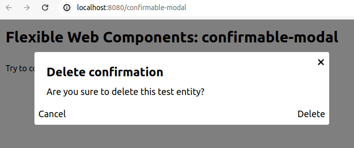
We quite often face a need for certain requests to be confirmed by the user, before actually issuing them. There is a special HTMX attribute that we can use for that purpose: hx-confirm. Having confirmable-modal similar to info-modal from one of the previous examples, we can write the following HTML:
<confirmable-modal
  title="Delete confirmation"
  ok-text="Delete">
</confirmable-modal>

<button
  hx-delete="/test"
  hx-confirm="Are you sure to delete this test entity?"
  hx-target="#delete-result">
  Try to confirm
</button>
To capture requests, sent by HTMX, and show confirmable-modal beforehand, we need to add the following JavaScript to our page:
const confirmableModal = document.querySelector("confirmable-modal");

document.addEventListener("htmx:confirm", e => {
  // do not issue http request
  e.preventDefault();

  confirmableModal.onOk = () => {
    // ok clicked, issue stopped previously http request
    e.detail.issueRequest(e);
    // hide modal after sending the request
    confirmableModal.hide();
  };

  // show confirmable modal with question configured through htmx attribute
  confirmableModal.show({ message: e.detail.question });
});
This will show our modal before issuing a http request which looks like:
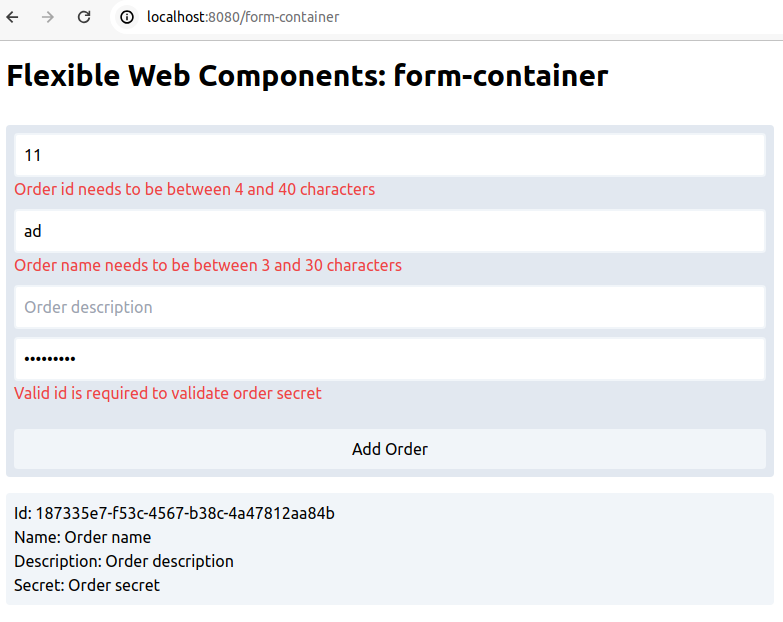
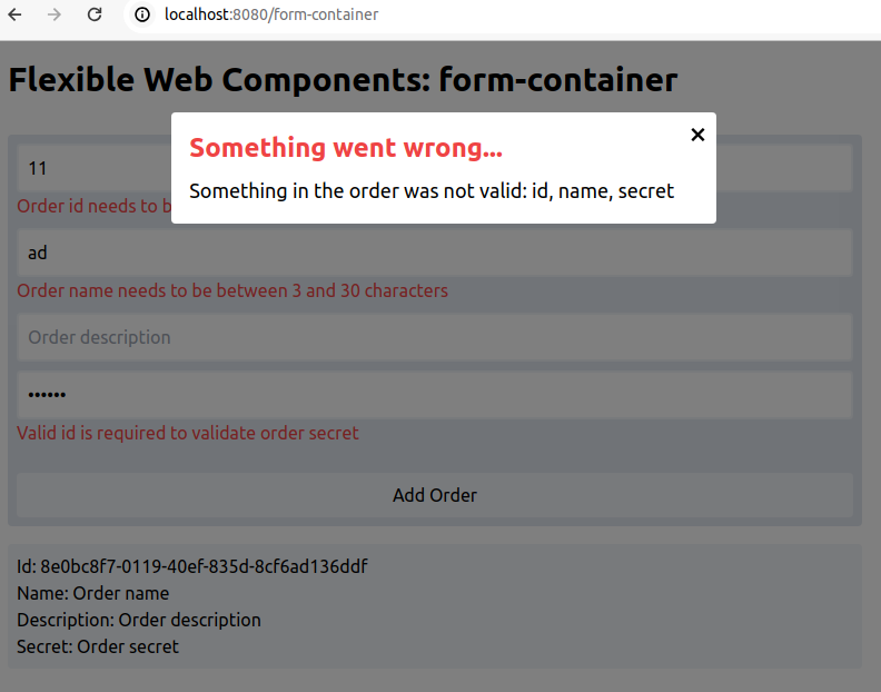
Building on previously shown input-with-error and info-modal, we can have a form-container that provides common form functionalities. As the name suggests, it is just a container, so it accepts and can work with any number of inputs, specification of which is left completely to a client. Common form functionalities include features like enabling/disabling form submission, clearing all inputs after successful submission, or showing generic error after failed submission. In the context of HTMX, having a form element allows us to send all form inputs data in a straightforward way. To make the example more relevant to HTMX, in the form we will be able to specify a new order entity. After failed submission, an error will be shown, using info-modal. After successful submission, a new order will be added to the orders list. Here is the simplified HTML:
<info-modal
  id="error-modal"
  <!-- Add value to default title class attribute -->
  title:add:class="text-red-500"
  title="Something went wrong...">
</info-modal>

<form-container
  form:id="order-form"
  form:class="rounded bg-slate-200 p-2 max-w-screen-md"
  form:hx-post="/orders"
  form:hx-target="#orders"
  submit:class="py-2 rounded bg-slate-100 mt-4 w-full"
  submit:value="Add Order">

  <input-with-error
    container:class="mb-2"
    <!-- Add value to default input class attribute -->
    input:add:class="w-full"
    input:name="id"
    input:placeholder="Order id"
    input:hx-post="/orders/validate-id"
    input:hx-trigger="input changed delay:500ms"
    input:hx-swap="outerHTML"
    input:hx-target="next-input-error"
    <!-- Send also secret input from below (secret-input is its id),
     id and secret validations are related -->
    input:hx-include="#secret-input">
  </input-with-error>

  <!-- Similar to above, definitions of other inputs:
   name, description, secret -->

</form-container>

<ul id="orders" class="space-y-2 max-w-screen-md">
  ${ordersHtml()}
</ul>

...

function ordersHtml() {
  return orders.map(o =>
  `<div class="rounded bg-slate-100 p-2">
     <div>Id: ${o.id}</div>
     <div>Name: ${o.name}</div>
     <div>Description: ${o.description}</div>
     <div>Secret: ${o.secret}</div>
   </div>`)
  .join("\n");
}
Additionally, we need to add some JavaScript, so that info-modal and a few of the form-container features can work:
const errorModal = document.getElementById("error-modal");

const formContainer = document.querySelector("form-container");

formContainer.addEventListener("htmx:afterRequest", e => {
  const form = document.getElementById("order-form");
  // we only care about requests sent by the form,
  // not other of its many elements (inputs mainly)
  if (e.srcElement == form) {
    // error text response from the server
    const error = e.detail.failed ? e.detail.xhr.response : "";
    // this will enable form submission again,
    // and clear inputs only if error is empty/undefined
    formContainer.afterSubmit({ error: error });
    // show error only if there is one
    if (error) {
      errorModal.show({ message: error });
    }
  }
});
This how it looks with input errors:
And this how it looks after getting submit error:
With the described approach, it is possible to create a collection of generic, reusable, flexible and framework-agnostic Web Components. When it comes to UI components, I think white box philosophy is superior: we should have access to the simple source code of components, they should be designed to be copied and possibly tinker with, and not used as a black box dependency. This is because, it is often the case that a given component almost matches our needs, but not exactly - in that situation it is a true lifesaver to have control and ability to change them. Tailwind UI takes a similar approach, but is not open-sourced; it is a paid tool and it focuses on framework-specific components.
There are a few libraries and collections of Web Components out there, most notably Shoelace. This is a step in the right direction, but unfortunately, they also use other tools, dependencies and additional abstractions and take a rather black box approach - they are meant to be used as a closed dependency, not something to copy, understand and tinker with. Additionally, they mostly use Shadow DOM and because of that, they can not be used with HTMX. I would love to see a collection of components created with a similar approach to the one described here: without unnecessary abstractions and with different, white box philosophy in mind. It means that these components would have a simple to understand source code with zero or minimal dependencies. Furthermore, they would be completely configurable from the outside, designed to be rather copied and possibly modified - not used as a black box dependency.
As we saw, Web Components are extremely easy to create and use with HTMX. They solve an important problem when working with HTMX: how and where should we define reusable components that also might need to use JavaScript to enhance their behavior, not only HTML? Additionally, if created with described here, generic approach to configuration through attributes, they can be extremely flexible and reusable:
<input-with-error
  container:class="mb-2"
  input:add:class="w-full"
  input:type="password"
  input:name="secret"
  input:id="secret-input"
  input:placeholder="Order secret, compatibility with id is required"
  input:hx-post="/orders/validate-secret"
  input:hx-trigger="input changed delay:500ms"
  input:hx-swap="outerHTML"
  input:hx-target="next input-error"
  input-error:id="secret-error">
</input-with-error>
Even though they do not know anything about HTMX, it turns out that it is a breeze to connect these two technologies!
此内容由惯性聚合(RSS阅读器)自动聚合整理,仅供阅读参考。 原文来自 — 版权归原作者所有。