











As we already know, HTMX pairs really nicely with Web Components. Shoelace is a popular and mature collection of configurable Web Components, which by definition are framework agnostic. Since writing our own components library is a ton of work, we should rather prefer using something ready and battle tested. Let's then see how this library plays with HTMX by building a real application! Other things we will use in an example Books App are:
With this simple stack, we will create a fully functional app and see how hard/easy, bad/good it is to do. But before that, let's spend a while talking about the Shoelace library and Shadow DOM in particular.
It is a really well-made and maintained collection of a huge number of Web Components, probably the largest one. There are dozens of components, ready to be used and configured to suit our exact needs. Some examples:
Every component is built with Shadow DOM, which has some advantages, but a few disadvantages as well. Because of that, styling and customization works differently to what we are accustomed to in the classic HTML/CSS/JS world. Let's talk about the Shadow DOM to understand why it is the case.
What the Shadow DOM even is?
Shadow DOM is a scoped, separate part of the Document Object Model that can be created within the standard DOM, isolated in both style and structure.
As an example, we can create a Web Component like this:
<!DOCTYPE html>
<html lang="en">
<head>
  <style>
    p {
      color: red;
    }
  </style>
</head>
<body>
  <p>Red text</p>
  <custom-p text="Blue, not red"></custom-p>
  <script>
    customElements.define("custom-p", class extends HTMLElement {
      connectedCallback() {
        const shadowRoot = this.attachShadow({ mode: 'open' });
        shadowRoot.innerHTML = `
          <style>
            p {
              color: blue;
            }
          </style>
          <p>${this.getAttribute("text")}</p>`;
      }
    });
  </script>
</body>
</html>
Style and structure of the Shadow DOM inside this <custom-p> component are completely isolated from the global Light DOM. Global CSS rules do not apply, and we cannot find elements of this component by using standard APIs like getElementById(), querySelector() or getElementsByTagName(). We might get them by using shadowRoot property though, if the Shadow DOM was created with open, not closed mode.
The benefits are pretty straightforward: we are able to create completely independent components which always look and behave in the same way, no matter where they are used, since they are not affected by the global CSS rules (almost, there are some exceptions). They might also be made unavailable for the external JavaScript. The question is: when and do we even need this degree of separation? I would argue that we only need it if:
On the other hand, if we are working on a system that adheres to any of the widely recognized CSS methodologies/conventions:
...I would argue that it is not needed at all, since we have highly specific CSS selectors. Because of that, our styling will not randomly leak into newly added components. In Shoelace library, they made a different decision so obviously they do not agree. I really want to get this point across here: we do not have to use Shadow DOM to create reusable, flexible and configurable framework-agnostic components. It is a choice, with a set of tradeoffs.
What are the drawbacks? It is harder and less intuitive to style components created with Shadow DOM. We cannot use standard CSS selectors or externally defined classes. We have to use CSS shadow parts or CSS custom properties/variables and both of them must be explicitly exported by the component author, otherwise we are out of luck. Components can still be made highly configurable and flexible, as it is in the Shoelace library, but that is something new, something additional that we need to learn how to use alongside standard CSS rules, not instead of them. Here is a real-world example (from an example app) of styling a Shoelace button (<sl-button>):
:root,
:host {
  ...

  --color-primary-500: #f59e0b;
  --color-primary-600: #d97706;
  --color-primary-700: #b45309;
  --color-primary-800: #92400e;
  --color-primary-900: #78350f;
  --color-primary-950: #451a03;

  --color-text-600: #52525b;
  --color-text-700: #3f3f46;
  --color-text-800: #27272a;
  --color-text-900: #18181b;
  --color-text-950: #09090b;

  ...

  --sl-color-primary-400: var(--color-primary-400);
  --sl-color-primary-500: var(--color-primary-500);
  --sl-color-primary-600: var(--color-primary-600);
  --sl-color-primary-700: var(--color-primary-700);
  --sl-color-primary-800: var(--color-primary-800);

  ...
}

sl-button::part(base) {
  border-color: var(--color-primary-400);
  background-color: var(--color-primary-500);
  font-weight: bold;
}

sl-button::part(base):hover {
  border-color: var(--color-primary-500);
  background-color: var(--color-primary-600);
  color: var(--color-text-600);
}
We must override a few shoelace-specific variables to have consistent colors across the application, not only on a button. We also have a CSS selector, targeting the exported base part of <sl-button> to change its style. These things are something that we need to keep in mind and recheck with the documentation.
To sum it up, I think that Shadow DOM is not worth its complexity, in the vast majority of cases. Given that, I want to emphasize that Shoelace library authors made a superb effort of documenting how to customize their components using this new browser API. Having it in mind, let's finally dive into the HTMX + Shoelace example Books App!
It consists of two main parts:
In the static dir, we have all things static:
index.js file to minimize bundle sizeapp: After installing dependencies, we can build distributable (dist) with the mentioned above files inside:
npm run build

> [email protected] build
> bash build.bash


index.js → dist...
created dist in 1.2s

Rebuilding...

Done in 386ms.
In the dist, we can now find these few key static files that the app is about to serve. Assets from the static/assets directory (not bundled) will be exposed as well.
In the app dir, we have the Books App. It is just a node server, built with the help of Express.js. It has a few endpoints to deliver Books functionality and to serve static assets generated in the previous step (from static dir).
Basically, in the single HTML page we have (web.js):
<head>
  ...
  <link rel="stylesheet" href="/dist/shoelace.css">
  <link rel="stylesheet" href="/dist/style.css">
  <link rel="preload" as="font" type="font/ttf" crossorigin="anonymous"
    href="/assets/fonts/Kalam/Kalam-Regular.ttf">
  ...
</head>

<body class="bg-background-50 text-800">
  <div hx-history="false" hx-history-elt id="page">
    ...
  </div>
  ...
  <script src="/dist/index.js" defer></script>
  <script src="/dist/htmx/dist/htmx.min.js"></script>
</body>
This app is built with the HTMX, so only fragments of this HTML will be replaced as directly returned by the server.
After installing dependencies, we can finally start the app by running:
npm start

> [email protected] start
> node .

Server has started on port 8080!
As we are now running the app locally on http://localhost:8080, we can see its main page:
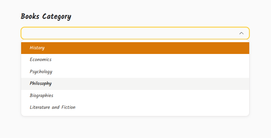
To make it look in this way, a few things were needed:
::part() CSS part selectors to style parts exposed by components; it it is done like that because of the Shadow DOMGoing back to the main page, we make use of Shoelace's <sl-select> and <sl-button> components. This is how it is all linked together to provide the functionality (app.js, lots of Tailwind classes!):
const categoriesHtml = Books.CATEGORIES.map(c => `<sl-option value="${c.value}">${c.name}</sl-option>`).join("\n");
const pageHtml = `
<div class="w-full h-full">
  <div class="w-full px-4 max-w-3xl absolute top-1/2 left-1/2 -translate-x-1/2 -translate-y-1/2">
    <h1 class="text-2xl my-4 font-bold">Books Category</h1>
    <sl-select>
      ${categoriesHtml}
    </sl-select>
    <sl-button class="my-8 hidden w-full" hx-target="#page">
      See Books
    </sl-button>
  </div>
  ${Web.scopedScript(`
    const categorySelect = document.querySelector("sl-select");
    const goToCategoryButton = document.querySelector("sl-button");
    let chosenCategory = ComponentsState.get("chosen-category");

    categorySelect.addEventListener("sl-change", e => {
      onChosenCategory(e.target.value);
    });

    function onChosenCategory(category) {
      goToCategoryButton.classList.remove("hidden");
      chosenCategory = category;
      const booksOfCategoryUrl = "/books/" + chosenCategory;
      goToCategoryButton.setAttribute("hx-push-url", true);
      goToCategoryButton.setAttribute("hx-get", booksOfCategoryUrl);
      htmx.process(goToCategoryButton);
      ComponentsState.set("chosen-category", chosenCategory);
    }

    if (chosenCategory) {
      categorySelect.value = chosenCategory;
      onChosenCategory(chosenCategory);
    }
  `)}
</div>`;

Web.returnFullOrPartialHTML(req, res, pageHtml);
What is most interesting here:
sl-change event provided by the ShoelacegoToCategoryButton HTMX attributes so it works with a newly selected category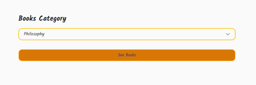
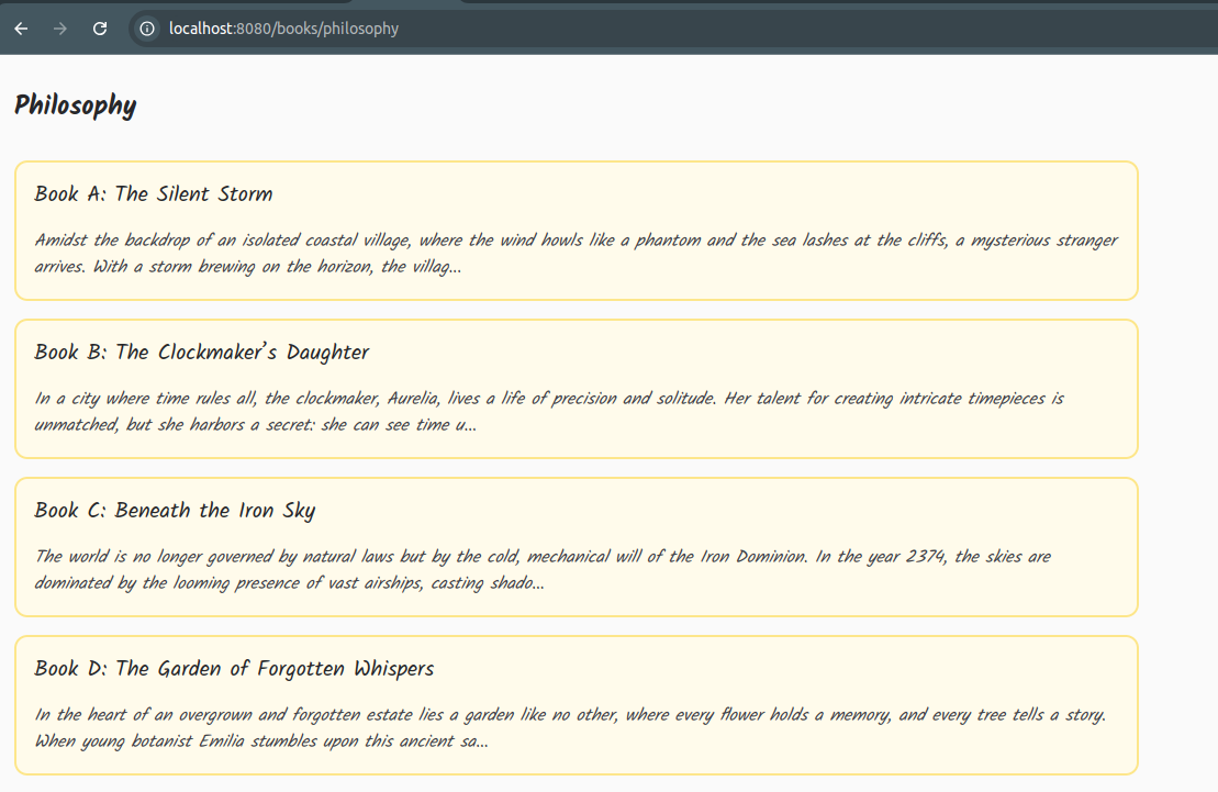
After selecting one of the categories, HTMX issues a request to the /books/:category endpoint and replaces the #page div content with received category's books:
We can also click on the "Book Error Trigger: Code of Shadows" book to see how an error might look:
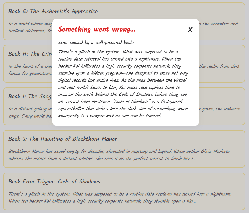
It is implemented with the help of a customized <sl-dialog> component:
const ERROR_TITLE = "Something went wrong...";

<sl-dialog id="error-dialog" no-header>
  <div class="mb-4 relative">
    <div class="text-2xl font-bold mr-6 text-red-600">${ERROR_TITLE}</div>
    <span id="error-dialog-close-button"
      class="absolute top-0 right-0 cursor-pointer text-3xl text-600-hover">
      X
    </span>
  </div>
  <div id="error-dialog-body"></div>
</sl-dialog>

// In the global init js, we set up a listener that reacts to HTMX response errors.
// It then takes errorHTML, returned by the server, and shows it
document.addEventListener("htmx:responseError", e => {
  errorDialog().body.innerHTML = e.detail.xhr.response;
  errorDialog().show();
});
After clicking on a book, we can enjoy its page:
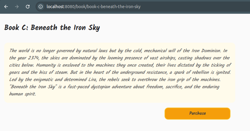
By clicking on the Purchase button, we might get an offer (<sl-dialog> again):
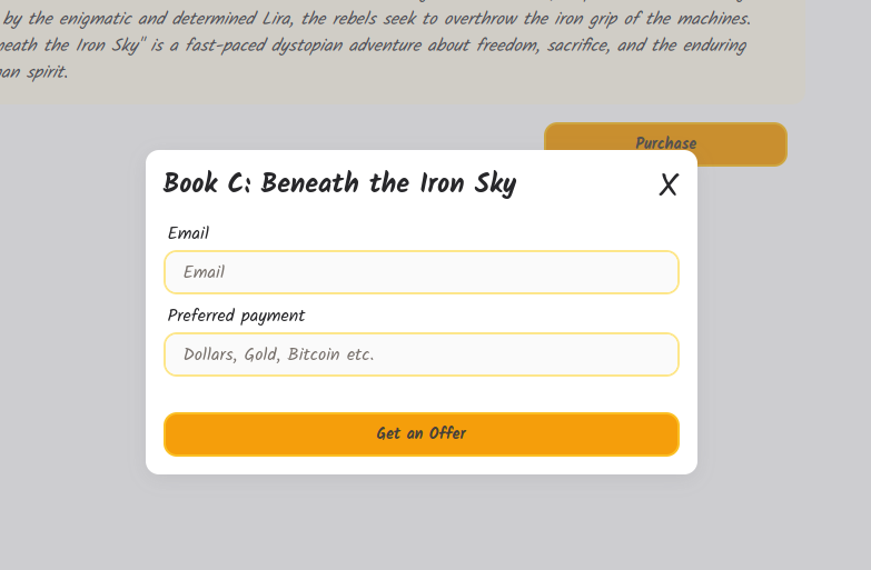
For input, we use <sl-input>. There is some inline validation as well:
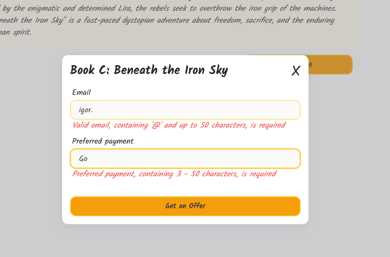
For this, we just use HTMX, no JavaScript required. The whole validation is performed on the backend:
function getBookOfferFormHtml(bookId, email, preferredPayment, emailError, preferredPaymentError) {
  return `
  <form hx-post="/books/${bookId}/get-offer" hx-swap="outerHTML">
    <sl-input label="Email" name="email" placeholder="Email" value="${email}"
      hx-post="/books/get-offer-validate-email"
      hx-trigger="sl-input changed delay:500ms"
      hx-swap="outerHTML"
      hx-target="next p">
    </sl-input>
    ${inputErrorHtml(emailError)}
    <sl-input label="Preferred payment" name="preferred-payment"
      placeholder="Dollars, Gold, Bitcoin etc." value="${preferredPayment}"
      class="mt-2"
      hx-post="/books/get-offer-validate-preferred-payment"
      hx-trigger="sl-input changed delay:500ms"
      hx-swap="outerHTML"
      hx-target="next p">
    </sl-input>
    ${inputErrorHtml(preferredPaymentError)}
    <sl-button type="submit" class="w-full mt-8">
      Get an Offer
    </sl-button>
  </form>`;
}

function inputErrorHtml(error) {
  const hideErrorClass = error ? "" : " hidden";
  return `<p class="text-red-500 italic mx-1${hideErrorClass}">${error ? error : ""}</p>`;
}
What is worth noting here:
hx-* attributesinputErrorHtml(error) functionsl-input event, triggered when a user changes input, we wait 500ms after last input change and then issue /books/get-offer-validate-email or /books/get-offer-validate-preferred-payment request to validate the datainputErrorHtml(error) function, which is just <p> with an error or hidden <p> in case of no error
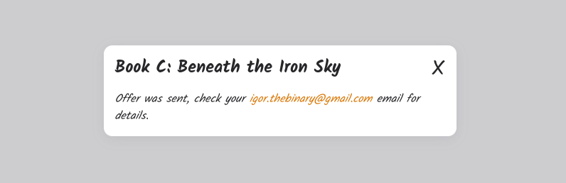
Finally, after submitting the form we will get an offer:
As we have seen, HTMX can be combined with the Shoelace components to create a fully functional app.
However, I do not find styling and customizing Shoelace components intuitive. Most things are described in the docs of each component but I found myself studying components source code to find out how something can be tweaked or made to look differently. This is primarily because of the taken black-box + Shadow DOM approach, where the assumption is that we should not care about component internals. Unfortunately, although sometimes Shadow DOM complexity might be worth its benefits, in most cases, it just makes styling and customization more complicated.
Shoelace is a really well-made library of framework-agnostic components. That being the case, I think that there are better approaches to solve this problem. I do not agree with the use of Shadow DOM and the black-box philosophy as it just makes components harder to style and customize. It is applied for a benefit that is rarely necessary - the absolute guarantee that the components will always look the same, no matter where and in what environment they are placed. I find that white-box philosophy, where we are fully aware of components structure, and traditional Light DOM is a more flexible and simpler strategy. We do not need to introduce new abstractions and the complexity they bring to the table. We can just agree on certain CSS conventions and strategies, like Tailwind utility-first approach or BEM, to achieve the vast majority of Shadow DOM benefits without actually using it and by sticking with the plain old and widely known Light DOM. As for examples of adopting this philosophy in practice, there are Tailwind UI, Preline UI or my own, experimental Flexible Components. The latter also uses Web Components but exclusively with the Light DOM, which allows for more flexible and intuitive styling and configuration. By allowing to place any CSS class on any element of every component, it enables customization of components without any restrictions. An example:
<input-with-error
  input:class="w-full focus:border-indigo-400 rounded-xl border-[4px] border-indigo-500 bg-indigo-800 p-4 text-slate-100 outline-none"
  input:placeholder="Input some name between 2 and 10 characters..."
  error:class="italic text-lg text-red-600">
</input-with-error>

<modal-container
  title:add:class="text-red-500"
  content:replace:class="bg-white=bg-amber-300"
  with-left-right-buttons="false">
  <div class="px-4 pb-16">Some error information...</div>
</modal-container>
In conclusion, as of now, Shoelace Library is the best and most comprehensive collection of framework-agnostic components for the Web. It can be used seamlessly with HTMX to create fully functional web applications. But, there are better approaches for creating framework-agnostic components out there, they are just not at the Sholeace's size and level of maturity.
此内容由惯性聚合(RSS阅读器)自动聚合整理,仅供阅读参考。 原文来自 — 版权归原作者所有。