








Breakpoint-based type sizing has always felt a bit arbitrary to me. It seems like equal parts guesswork and compromise, where the better we want it to work, the more stuff we need to design. It strikes me as inelegant and inefficient.
Over the past few years I’ve been lucky enough to work with some very smart designers and developers who have helped me hone my thoughts and ideas into a more tangible approach to fluid responsive design – particularly with regard to typography.
Although every project has different requirements, type size variation on a phone is usually relatively conservative, given that there’s limited horizontal space available. On a large laptop or desktop display it’s often desirable to use much more dramatic type scales to make the most of the extra space. The question is how to accommodate both screen sizes while respecting everything in between.
The big idea that triggered this train of thought now seems very simple:
This results in a set of type sizes which is always “in tune” with itself and feels at home on any device, without needing to manually specify sizes for x number of arbitrary breakpoints. For example we can just say H2s are always “size 4” and trust the calculation to generate a suitable size heading for everybody.
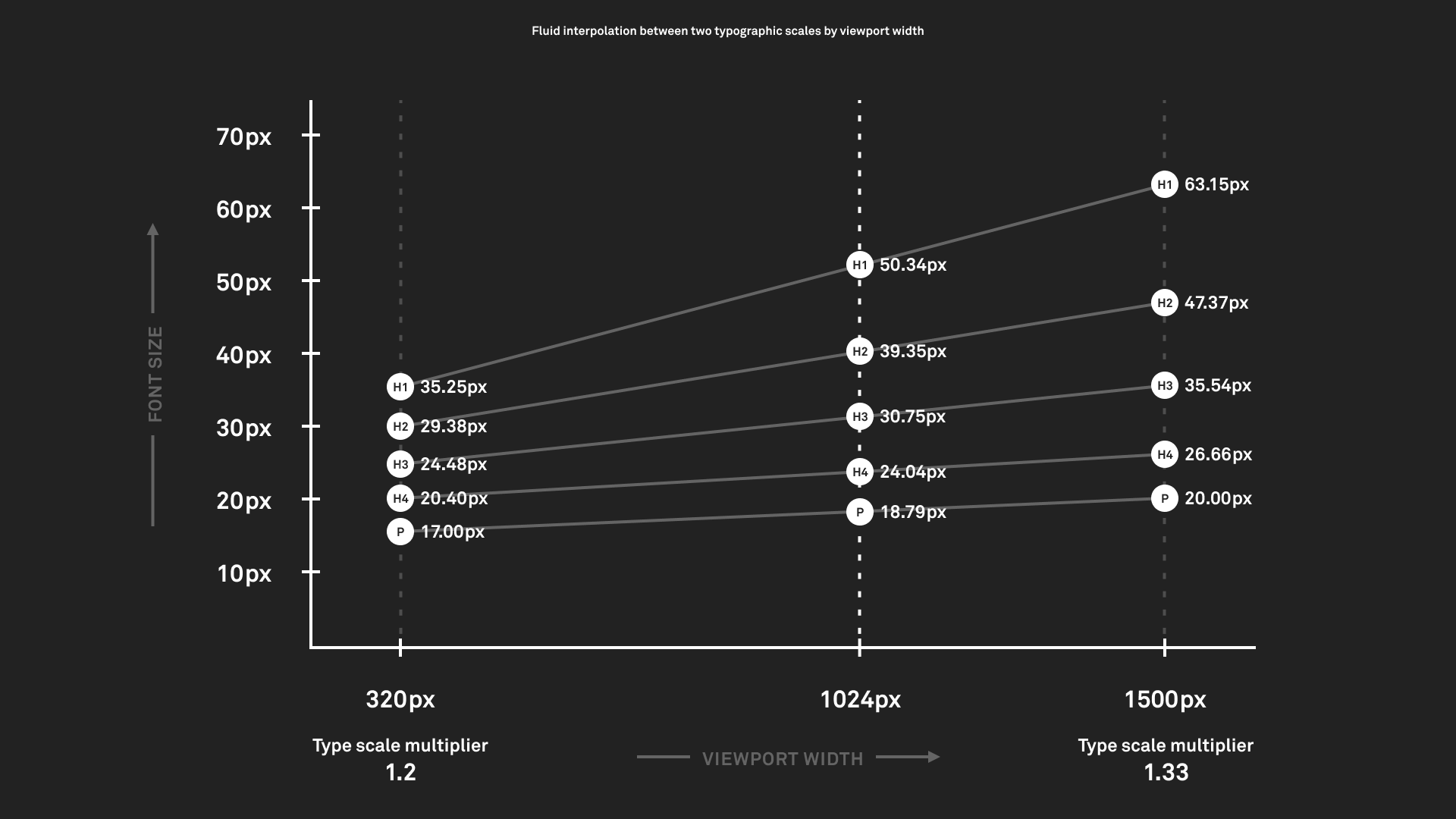
In the example above, I defined a typographic scale of 1.2x at 320px (mobile-ish) and 1.333x at 1500px (desktop-ish). At any viewport width in between, the set of type sizes is proportional, although I haven’t needed to manually specify any additional values. I dropped a line at 1024px to show the automatically-calculated font size values at that viewport size. For this example I generated the values using a Google Sheet but this can be elegantly replicated in CSS as described in this excellent blog post by Clearleft developer Trys.
Here’s how these values can translate into design:
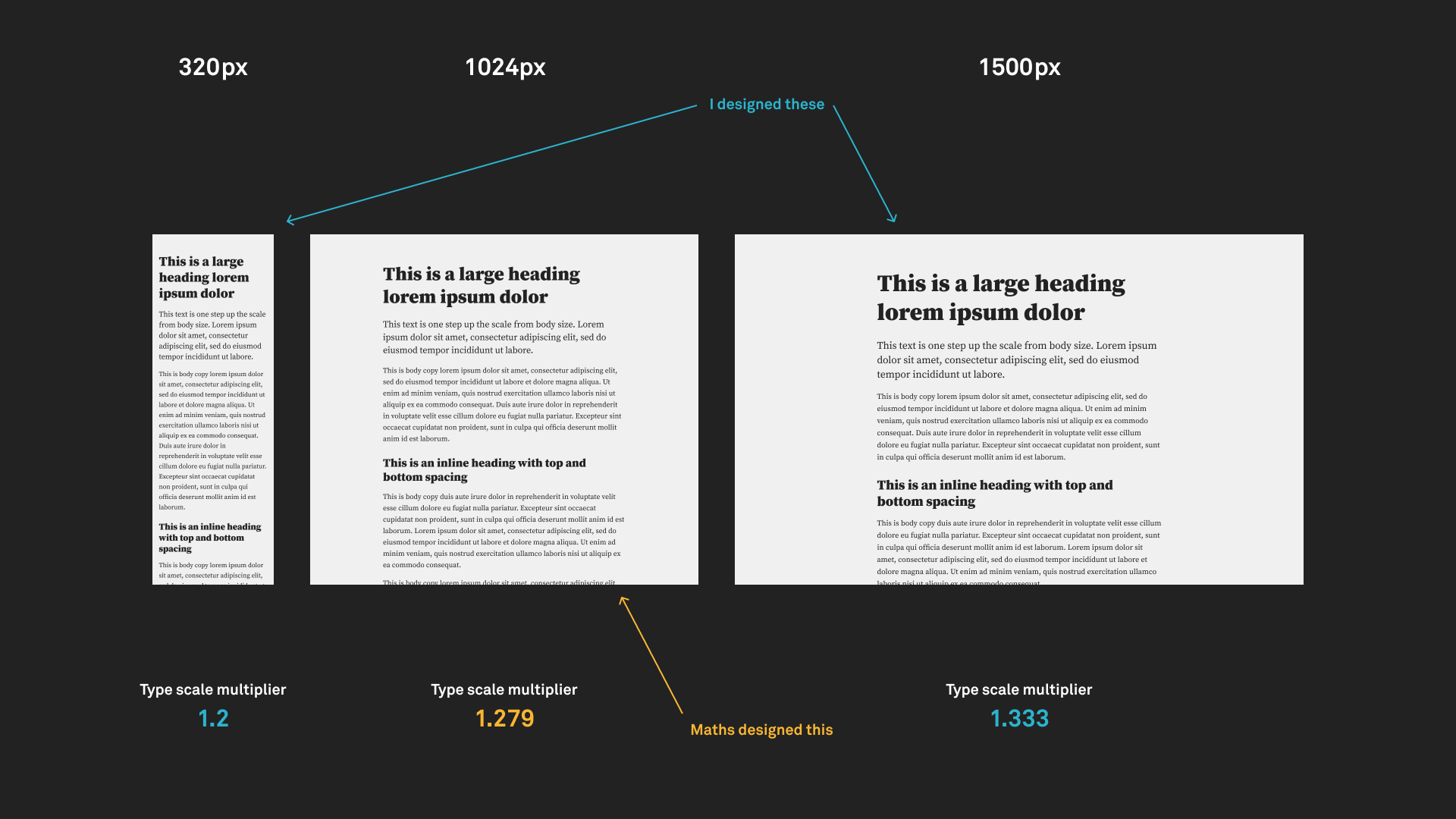
Trys has created a live version of the above example so you can see it in action: Watch the type breathe as you resize your viewport.
Exactly how you define your two type scales will depend on your product’s fonts, visual style, content, layout, audience, etc. This approach is not a substitute for good design, rather it encourages focusing design effort into the creation of a robust system. This should help to speed up future activity and decision making, as well as bake in consistency by establishing a “palette” of related type sizes.
The user benefit to this approach is that typography will always look “right”, regardless of the device being used. This is not always the case with the standard approach, where your brand new tablet might land you on the wrong side of the nearest breakpoint.
此内容由惯性聚合(RSS阅读器)自动聚合整理,仅供阅读参考。 原文来自 — 版权归原作者所有。