




When it comes to design systems, it's all too easy to focus on the components, the chunky bricks that make up majority of the digital experiences we use. But personally, I'm more excited about the cement that holds it all together.
Gaps, margin, padding, gutters. Whatever you call it, space is everywhere on a website. It's the glue that holds components together, and dictates whether they sit in harmony, or feel disjointed. But in my experience, intentional, systemised and elegant placement of space is so often overlooked by developers and designers alike.
We developers tend to fall into two camps: the "eyeing it brigade", and the "treating the design as gospel clan". The first group see a gap between two components and think "well... that looks roughly like 2rem, let's go with that.". The other bunch get their rulers out and measure the precise gap, popping a 1.9375rem into the system. Neither is ideal. The first runs the risk of disregarding the nuanced decisions that go into a design. The second doesn't allow for the designer making an honest mistake. But importantly, both groups generate duplicate code, every time they set a gap. This issue is only accelerated when a larger team of designers & developers work on a project.
As I blogged recently, intentional friction points and shared language help prevent entropy in our design systems. We have a rule of thumb that applies to the big things (components), as well as the small (type and space):
"Before adding to a system, first consider whether anything similar exists, and if so, can the design can be adapted to use the system after all."
By designing from the same system, we can shortcut many of the fiddly micro-decisions about gaps, and as developers, feel empowered to roll out space intentionally on our sites.
We're used to the concept of a colour palette. Brand guidelines surface the pre-agreed sets of colours the can be used, and their varying tints and shades, and designers have to are meant to stick to them. But what if we applied the same thinking to space?
Until now, Utopia has focused on harmonious and fluid typographic scales that help to ensure your text looks "at home" on any device. But we knew from the start that type was only one side of the coin. In our latest release, we've taken the foundations of a fluid type scale, and built a lightweight but extensible space system atop it, creating a "fluid space palette".
"Step 0" of our type scale becomes the t-shirt size "S", and acts as our origin for further spaces. We then multiply up and down to create a variety of intentional spaces. The multipliers are up to you and your specific design, but we tend to find you need more options close to the origin ("S"), and fewer further out.
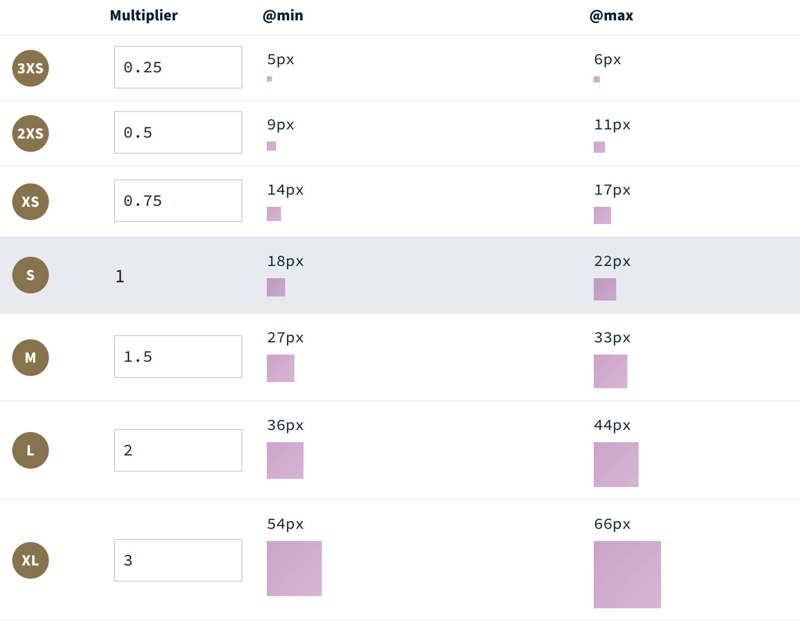
T-shirt sizing for space isn't a new concept—most systems map a "size" to a static value. But by building the space system on top of a fluid base value, each "size" is inherently fluid out of the box, rendering smaller on mobile screens, and gradually growing bigger on larger devices.
James has written a post documenting how a designer can arrive at these values, and use them within their design tool. For now, I'm going to carry on talking about how a developer can use this palette.
Now we have a set of individual space units, we can interpolate between them. "XS → S", "M → 3XL", and even reverse interpolations of "2XL → 2XS".

Out of the box, Utopia provides all the positive "single-step pairs" (2XS → XS, XS → S, S → M etc). Where an individual space value (M) grows a slight amount, these single-steps grow at a slightly steeper rate.
Pairs are perfect for handling internal component padding between small and large screens. Thanks to custom properties and CSS locks, you don't need to lock off these values every time you use them, it's a simple as:
.c-card {
  padding: var(--space-s-m); // 18px → 33px
}
To take it one step further, you can interpolate between any two individual space sizes, creating incredibly steep slopes (3XS → 4XL), perfect for handling spacing for hero slats, or even reverse slopes that get smaller as you expand the screen width (2XL → XS). These custom space pairs are fully configurable within the space calculator on Utopia.
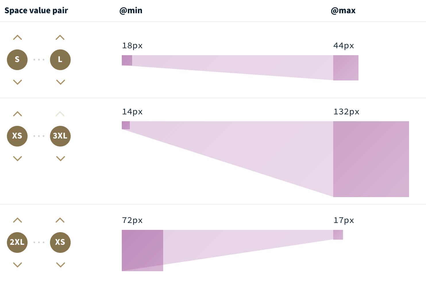
Utopia exposes these fluid spaces as custom properties, which makes them entirely opt-in. There are two main ways to use them:
As demonstrated with the earlier internal padding example, you can use fluid space values directly in your CSS. It's not limited to padding though, anything that can take a pixel value, can also use these fluid values. Margin, padding, grid-gap, clip-path, transform all work great with Utopia:
.o-grid {
  display: grid;
  grid-template-columns: 1fr 1fr;
  grid-gap: var(--space-s-l); // 18px → 44px
}
When used appropriately, utility classes can be a great way to 'paint' space onto a web page. I love the flow utility that Andy Bell documented, so I often start by creating a few versions of that with fluid space values:
.u-flow > * + * {
  margin-top: var(--space-s);
}

.u-flow--l > * + * {
  margin-top: var(--space-l);
}

.u-flow--s-m > * + * {
  margin-top: var(--space-s-m);
}
These can then be used in my HTML to provide bulletproof and fluid spacing between any number of items:
<article class="c-card u-flow">
  <img src="" alt="" />
  <h2>Card title</h2>
  <p>Card description</p>
</article>
The most empowering part of this system, is the control it gives me, as a developer, to make the call on how things should shrink or grow on different devices. In the past, I would be given a 'desktop' mockup, a 'mobile' mockup, and occasionally a 'tablet' sized mockup, and I'd have to try and shoehorn a system that worked between all three sizes. Now, with a fluid space palette, and a common language between design and development, I rarely get need more than a large screen design file. This leaves me to make the most appropriate call on how components should be spaced, or what the most appropriate gutter is to make the design feel at home on a small device.
I can't begin to explain how much of a difference it has made to my personal development process to be able to check a consistent design, and have the control at my fingertips to create a harmoniously spaced website. But more importantly, this shared language has significantly improved the way I communicate with the design team. And by spending time upfront deciding on the shared design foundations, we can each focus on what we’re best at.
If this has whetted your appetite to start building with fluid space, head on over to the fluid space calculator and create your own responsive and intuitive space system. The tool visualises the space system, and generates all the CSS you'll need to implement it in your project. Furthermore, we're working on a Figma plugin to make the designer's life easier too—watch this space.
此内容由惯性聚合(RSS阅读器)自动聚合整理,仅供阅读参考。 原文来自 — 版权归原作者所有。