





IMPACT to save 20% off today).
So we design and ship a shiny new feature. How do we know if it’s working? How do we measure and track its impact? There is no shortage in UX metrics, but what if we wanted to establish a simple, repeatable, meaningful UX metric — specifically for our features? Well, let’s see how to do just that.
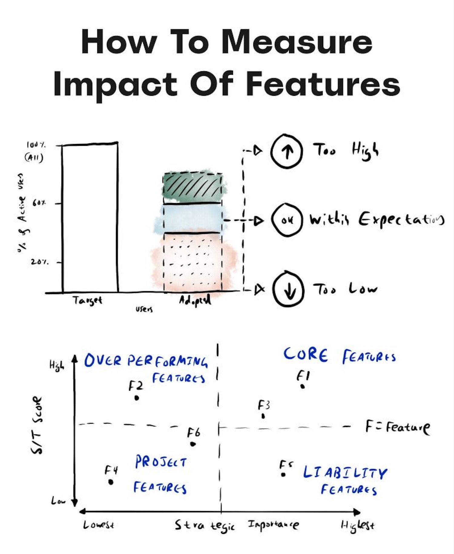
I first heard about the TARS framework from Adrian H. Raudschl’s wonderful article on “How To Measure Impact of Features”. Here, Adrian highlighted how his team tracks and decides which features to focus on — and then maps them against each other in a 2×2 quadrants matrix.
It turned out to be a very useful framework to visualize the impact of UX work through the lens of business metrics.
Let’s see how it works.
1. Target Audience (%)
We start by quantifying the target audience by exploring what percentage of a product’s users have the specific problem that a feature aims to solve. We can study existing or similar features that try to solve similar problems, and how many users engage with them.
Target audience isn’t the same as feature usage though. As Adrian noted, if we know that an existing Export Button feature is used by 5% of all users, it doesn’t mean that the target audience is 5%. More users might have the problem that the export feature is trying to solve, but they can’t find it.
Question we ask: “What percentage of all our product’s users have that specific problem that a new feature aims to solve?”
2. A = Adoption (%)
Next, we measure how well we are “acquiring” our target audience. For that, we track how many users actually engage successfully with that feature over a specific period of time.
We don’t focus on CTRs or session duration there, but rather if users meaningfully engage with it. For example, if anything signals that they found it valuable, such as sharing the export URL, the number of exported files, or the usage of filters and settings.
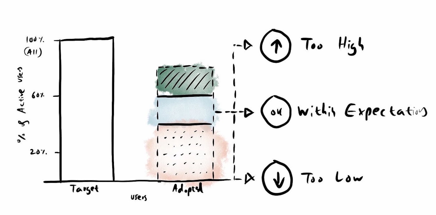
High feature adoption (>60%) suggests that the problem was impactful. Low adoption (<20%) might imply that the problem has simple workarounds that people have relied upon. Changing habits takes time, too, and so low adoption in the beginning is expected.
Sometimes, low feature adoption has nothing to do with the feature itself, but rather where it sits in the UI. Users might never discover it if it’s hidden or if it has a confusing label. It must be obvious enough for people to stumble upon it.
Low adoption doesn’t always equal failure. If a problem only affects 10% of users, hitting 50–75% adoption within that specific niche means the feature is a success.
Question we ask: “What percentage of active target users actually use the feature to solve that problem?”
3. Retention (%)
Next, we study whether a feature is actually used repeatedly. We measure the frequency of use, or specifically, how many users who engaged with the feature actually keep using it over time. Typically, it’s a strong signal for meaningful impact.
If a feature has >50% retention rate (avg.), we can be quite confident that it has a high strategic importance. A 25–35% retention rate signals medium strategic significance, and retention of 10–20% is then low strategic importance.
Question we ask: “Of all the users who meaningfully adopted a feature, how many came back to use it again?”
4. Satisfaction Score (CES)
Finally, we measure the level of satisfaction that users have with that feature that we’ve shipped. We don’t ask everyone — we ask only “retained” users. It helps us spot hidden troubles that might not be reflected in the retention score.
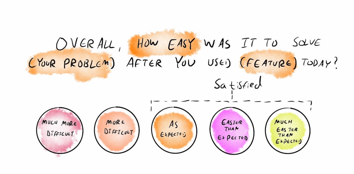
Once users actually used a feature multiple times, we ask them how easy it was to solve a problem after they used that feature — between “much more difficult” and “much easier than expected”. We know how we want to score.
Using TARS For Feature Strategy
Once we start measuring with TARS, we can calculate an S÷T score — the percentage of Satisfied Users ÷ Target Users. It gives us a sense of how well a feature is performing for our intended target audience. Once we do that for every feature, we can map all features across 4 quadrants in a 2×2 matrix.

Overperforming features are worth paying attention to: they have low retention but high satisfaction. It might simply be features that users don’t have to use frequently, but when they do, it’s extremely effective.
Liability features have high retention but low satisfaction, so perhaps we need to work on them to improve them. And then we can also identify core features and project features — and have a conversation with designers, PMs, and engineers on what we should work on next.
Conversion Rate Is Not a UX Metric
TARS doesn’t cover conversion rate, and for a good reason. As Fabian Lenz noted, conversion is often considered to be the ultimate indicator of success — yet in practice it’s always very difficult to present a clear connection between smaller design initiatives and big conversion goals.
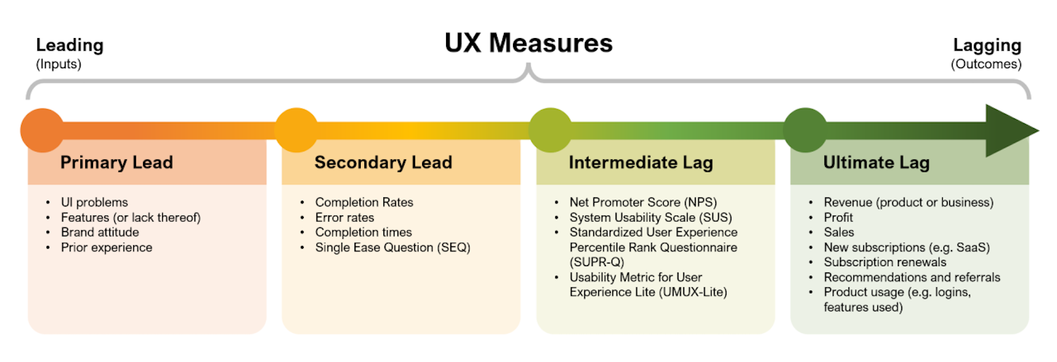
The truth is that almost everybody on the team is working towards better conversion. An uptick might be connected to many different initiatives — from sales and marketing to web performance boost to seasonal effects to UX initiatives.
UX can, of course, improve conversion, but it’s not really a UX metric. Often, people simply can’t choose the product they are using. And often a desired business outcome comes out of necessity and struggle, rather than trust and appreciation.
High Conversion Despite Bad UX
As Fabian writes, high conversion rate can happen despite poor UX, because:
- Strong brand power pulls people in,
- Aggressive but effective urgency tactics,
- Prices are extremely attractive,
- Marketing performs brilliantly,
- Historical customer loyalty,
- Users simply have no alternative.

Low Conversion Despite Great UX
At the same time, a low conversion rate can occur despite great UX, because:
- Offers aren’t relevant to the audience,
- Users don’t trust the brand,
- Poor business model or high risk of failure,
- Marketing doesn’t reach the right audience,
- External factors (price, timing, competition).
An improved conversion is the positive outcome of UX initiatives. But good UX work typically improves task completion, reduces time on task, minimizes errors, and avoids decision paralysis. And there are plenty of actionable design metrics we could use to track UX and drive sustainable success.
Wrapping Up
Product metrics alone don’t always provide an accurate view of how well a product performs. Sales might perform well, but users might be extremely inefficient and frustrated. Yet the churn is low because users can’t choose the tool they are using.
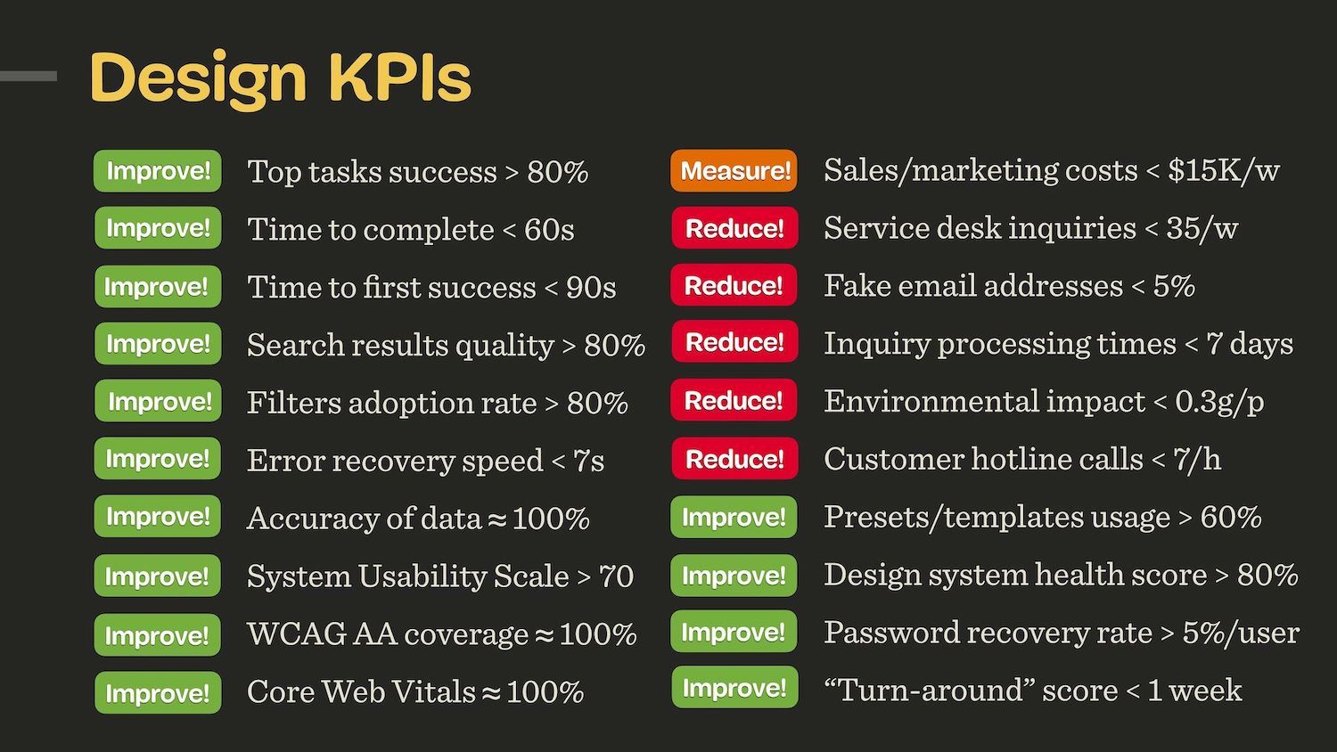
We need UX metrics to understand and improve user experience. What I love most about TARS is that it’s a neat way to connect customers’ usage and customers’ experience with relevant product metrics. Personally, I would extend TARS with UX-focused metrics and KPIs as well — depending on the needs of the project.
Huge thanks to Adrian H. Raudaschl for putting it together. And if you are interested in metrics, I highly recommend you follow him for practical and useful guides all around just that!
Meet “How To Measure UX And Design Impact”
You can find more details on UX Strategy in 🪴 Measure UX & Design Impact (8h), a practical guide for designers and UX leads to measure and show your UX impact on business. Use the code 🎟 IMPACT to save 20% off today. Jump to the details.

Useful Resources
- “How To Measure UX and Design Impact”, by yours truly
- “Business Thinking For Designers”, by Ryan Rumsey
- “ROI of Design Project
- “How the Right UX Metrics Show Game-Changing Value”, by Jared Spool
- “Research Sample Size Calculators”
Further Reading
- “Designing For Stress And Emergency”, Vitaly Friedman
- “AI In UX: Achieve More With Less”, Paul Boag
- “The Accessibility Problem With Authentication Methods Like CAPTCHA”, Eleanor Hecks
- “From Prompt To Partner: Designing Your Custom AI Assistant”, Lyndon Cerejo
 (yk)
(yk)