





- 11 min read
- UX, Design, User Research
In the early days of the web, the search bar was a luxury, added to a site once it became “too big” to navigate by clicking. We treated it like an index at the back of a book: a literal, alphabetical list of words that pointed to specific pages. If you typed the exact word the author used, you found what you needed. If you didn’t, you were met with a “0 Results Found” screen that felt like a digital dead end.
Twenty-five years later, we are still building search bars that act like 1990s index cards, even though the humans using them have been fundamentally rewired. Today, when a user lands on your site and can’t find what they need in the global navigation within seconds, they don’t try to learn your taxonomy. They head for the search box. But if that box fails them, and demands they use your specific brand vocabulary, or punishes them for a typo, they do something that should keep every UX designer awake at night. They leave your site, go to Google, and type site:yourwebsite.com [query]. Or, worse still, they just type in their query and end up on a competitor’s website. I personally use Google over a site’s search nearly every time.
This is the Site-Search Paradox. In an era where we have more data and better tools than ever, our internal search experiences are often so poor that users prefer to use a trillion-dollar global search engine to find a single page on a local site. As Information Architects and UX designers, we have to ask, why does the “Big Box” win, and how can we take our users back?
The “Syntax Tax” And The Death Of Exact Match
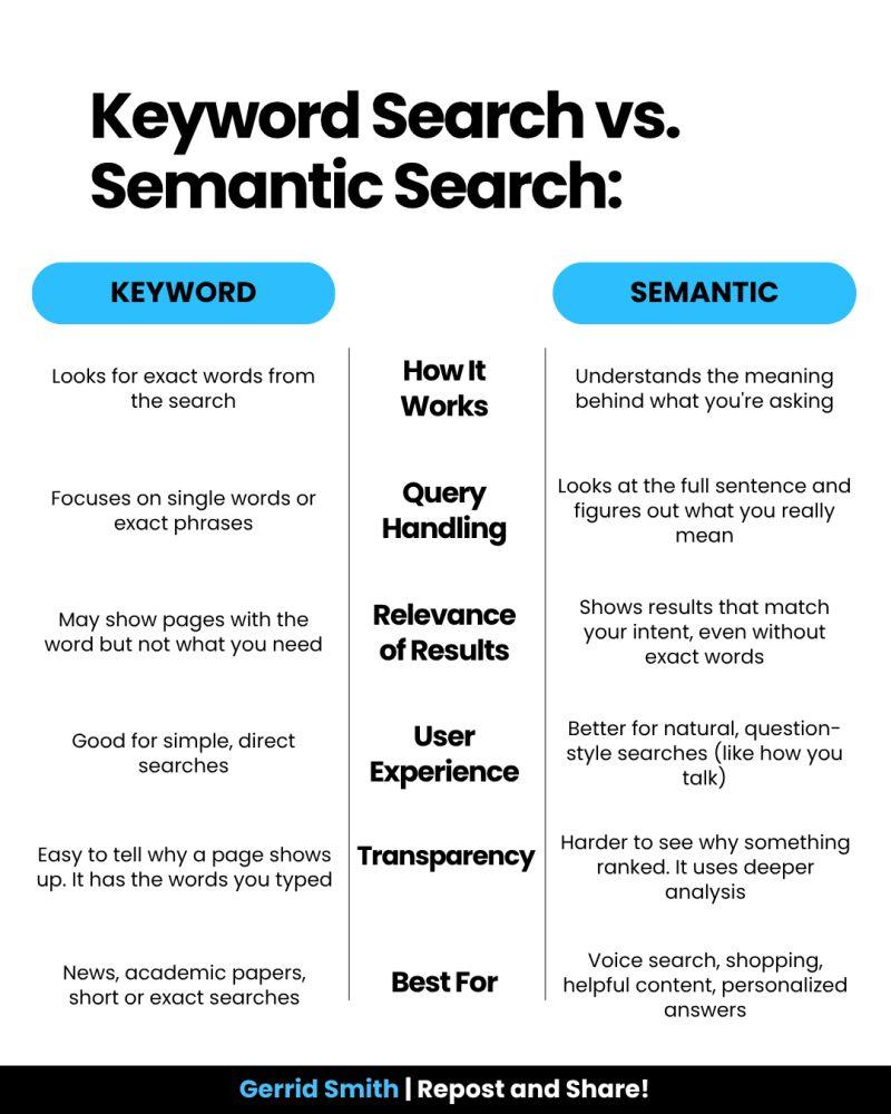
The primary reason site search fails is what I call the Syntax Tax. This is the cognitive load we place on users when we require them to guess the exact string of characters we’ve used in our database.
Research by Origin Growth on Search vs Navigate shows that roughly 50% of users go straight to the search bar upon landing on a site. For example, when a user types “sofa” into a furniture site that has categorised everything under “couches,” and the site returns nothing, the user doesn’t think, “Ah, I should try a synonym.” They think, “This site doesn’t have what I want.”
This is a failure of Information Architecture (IA). We’ve built our systems to match strings (literal sequences of letters) rather than things (the concepts behind the words). When we force users to match our internal vocabulary, we are taxing their brainpower.
Why Google Wins: It’s Not Power, It’s Context
It is easy to throw our hands up and say, “We can’t compete with Google’s engineering.” But Google’s success isn’t just about raw power; it’s about contextual understanding. While we often treat search as a technical utility, Google treats it as an IA challenge.
Data from the Baymard Institute reveals that 41% of e-commerce sites fail to support even basic symbols or abbreviations, and this often leads to users abandoning a site after a single failed search attempt. Google wins because it uses stemming and lemmatization — IA techniques that recognize “running” and “ran” are the same intent. Most internal searches are “blind” to this context, treating “Running Shoe” and “Running Shoes” as entirely different entities.
The UX Of “Maybe”: Designing For Probabilistic Results
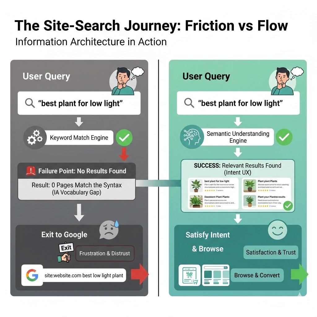
In traditional IA, we think in binaries: A page is either in a category, or it isn’t. A search result is either a match or it isn’t. Modern search, which users now expect, is probabilistic. It deals in “confidence levels.”
According to Forresters, users who use search are 2–3 times more likely to convert than those who don’t, if the search works. And 80% of users on e-commerce sites exit a site due to poor search results.
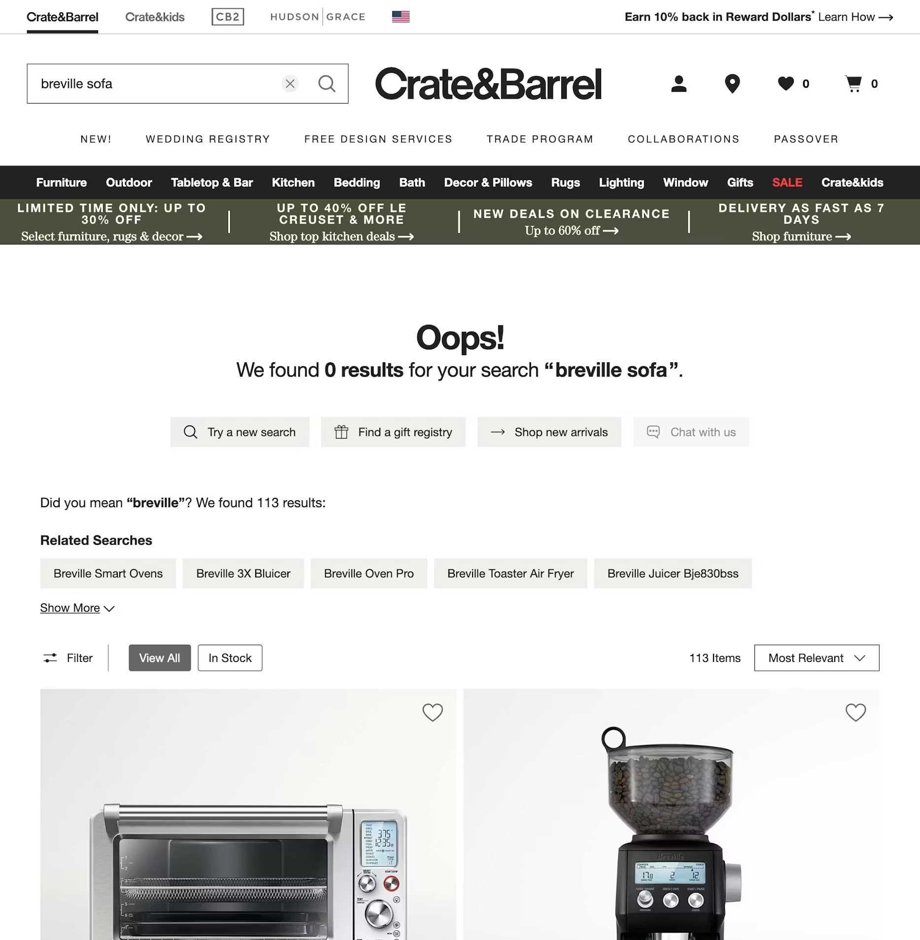
As designers, we rarely design for the middle ground. We design a “Results Found” page and a “No Results” page. We miss the most important state: The “Did You Mean?” State. A well-designed search interface should provide “Fuzzy” matches. Instead of a cold “0 Results Found” screen, we should be using our metadata to say, “We didn’t find that in ‘Electronics,’ but we found 3 matches in ‘Accessories’.” By designing for “Maybe,” we can keep the user in the flow.
Case Study: The Cost Of “Invisible” Content
To understand why IA is the fuel for the search engine, we must look at how data is structured behind the scenes. In my 25 years of practice, I’ve seen that the “findability” of a page is directly tied to its structured metadata.
Consider a large-scale enterprise I worked with that had over 5,000 technical documents. Their internal search was returning irrelevant results because the “Title” tag of every document was the internal SKU number (e.g., “DOC-9928-X”) rather than the human-readable name.
By reviewing the search logs, we discovered that users were searching for “installation guide.” Because that phrase didn’t appear in the SKU-based title, the engine ignored the most relevant files. We implemented a Controlled Vocabulary, which was a set of standardised terms that mapped SKUs to human language. Within three months, the “Exit Rate” from the search page dropped by 40%. This wasn’t an algorithmic fix; it was an IA fix. It proves that a search engine is only as good as the map we give it.
The Internal Language Gap
Throughout my two decades in UX, I’ve noticed a recurring theme: internal teams often suffer from “The curse of knowledge.” We become so immersed in our own corporate vocabulary, or sometimes referred to as business jargon, that we forget the user doesn’t speak our language.
I once worked with a financial institution that was frustrated by high call volumes to their support centre. Users were complaining they couldn’t find “loan payoff” information on the site. When we looked at the search logs, “loan payoff” was the #1 searched term that resulted in zero hits.
Why? Because the institution’s IA team had labelled every relevant page under the formal term “Loan Release.” To the bank, a “payoff” was a process, but a “Loan Release” was the legal document that was the “thing” in the database. Because the search engine was looking for literal character strings, it refused to connect the user’s desperate need with the company’s official solution.
This is where the IA professional must act as a translator. By simply adding “loan payoff” as a hidden metadata keyword to the Loan Release pages, we solved a multi-million dollar support problem. We didn’t need a faster server; we needed a more empathetic taxonomy.
The 4-step Site-search Audit Framework
If you want to reclaim your search box from Google, you cannot simply “set it and forget it.” You must treat search as a living product. Here is the framework I use to audit and optimise search experiences:
Phase 1: The “Zero-result” Audit
Pull your search logs from the last 90 days. Filter for all queries that returned zero results. Group these into three buckets:
- True gaps
Content the user wants that you simply don’t have (a signal for your content strategy team). - Synonym gaps
Content you have, but described in words the user doesn’t use (e.g., “Sofa” vs “Couch”). - Format gaps
The user is looking for a “video” or “PDF,” but your search only indexes HTML text.
Phase 2: Query Intent Mapping
Analyse the top 50 most common queries. Are they Navigational (looking for a specific page), Informational (looking for “how to”), or Transactional (looking for a specific product)? Your search UI should look different for each. A navigational search should “Quick-Link” the user directly to the destination, bypassing the results page entirely.
Phase 3: The “Fuzzy” Matching Test
Intentionally mistype your top 10 products. Use plurals, common typos, and American vs. British English spellings (e.g., “Color” vs. “Colour”). If your search fails these tests, your engine lacks “stemming” support. This is a technical requirement you must advocate for to your engineering team.
Phase 4: Scoping And Filtering UX
Look at your results page. Does it offer filters that actually make sense? If a user searches for “shoes,” they should see filters for Size and Colour. Generic filters can be as bad as no filters.
Reclaiming The Search Box: A Strategy For IA Professionals
To stop the exodus to Google, we must move beyond the “Box” and look at the scaffolding.
Step A: Implement semantic scaffolding.
Don’t just return a list of links. Use your IA to provide context. If a user searches for a product, show them the product, but also show them the manual, the FAQs, and the related parts. This “associative” search mimics how the human brain works and how Google operates.
Step B: Stop being a librarian, start being a concierge.
A librarian tells you exactly where the book is on the shelf. A concierge listens to what you want to achieve and gives you a recommendation. Your search bar should use predictive text not just to complete words, but to suggest intentions.
Using A Google-powered Search Bar
Using a “Google-powered” search bar, as seen on the University of Chicago website, is essentially an admission that a site’s internal organisation has become too complex for its own navigation to handle. While it is a quick “fix” for massive institutions to ensure users find something, it is generally a poor choice for businesses with deep content.
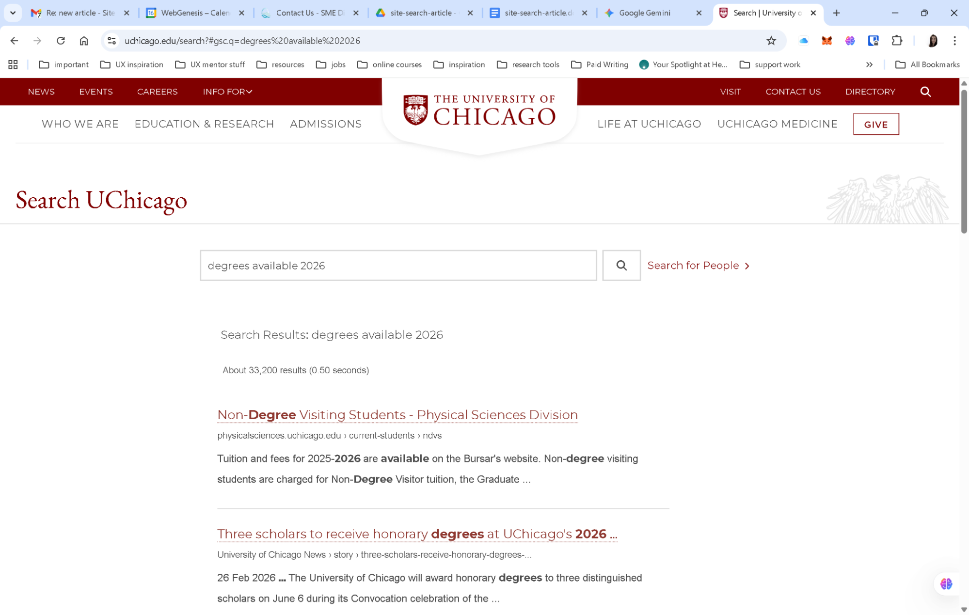
By delegating the search to Google, you surrender the user experience to an outside algorithm. You lose the ability to promote specific products, you expose your users to third-party ads, and you train your customers to leave your ecosystem the moment they need help. For a business, search should be a curated conversation that guides a customer toward a goal, not a generic list of links that pushes them back to the open web.
The Simple Search UX Checklist
Here is a final checklist for reference when you are building the search experience for your users. Work with your product team to ensure you are engaging with the right team members.
- Kill the dead-end.
Never just say “No results found.” If an exact match isn’t there, suggest a similar category, a popular product, or a way to contact support. - Fix “almost” matches.
Make sure the search can handle plurals (like “plant” vs. “plants”) and common typos. Users shouldn’t be punished for a slip of the thumb. - Predict the user’s goal.
Use an “auto-suggest” menu to show helpful actions (like “Track my order”) or categories, not just a list of words. - Talk like a human.
Look at your search logs to see the words people actually use. If they type “couch” and you call it “sofa,” create a bridge in the background so they find what they need anyway. - Smart filtering.
Only show filters that matter. If someone searches for “shoes,” show them size and color filters, not a generic list that applies to the whole site. - Show, don’t just list.
Use small thumbnails and clear labels in the search results so users can see the difference between a product, a blog post, and a help article at a glance. - Speed is trust.
If the search takes more than a second, use a loading animation. If it’s too slow, people will immediately go back to Google. - Check the “failure” logs.
Once a month, look at what people searched for that returned zero results. This is your “to-do list” for fixing your site’s navigation.
Conclusion: The Search Bar Is A Conversation
The search box is the only place on your site where the user tells us exactly, in their own words, what they want. When we fail to understand those words, when we let the “Big Box” of Google do the work for us, we aren’t just losing a page view. We are losing the opportunity to prove that we understand our customers.
By moving from literal string matching to semantic understanding, and by supporting our search engines with robust, human-centered Information Architecture, we can finally close the gap.
 (yk)
(yk)