


- 14 min read
- Product Strategy, Branding, Business
When a branding project fails, it usually happens long before the logo stage: in the strategy phase, when words like “modern,” “trustworthy,” “premium,” “friendly,” and “disruptive” are left undefined. The result is a gap between what the brand is supposed to communicate and what the designer is expected to create. This is the space I like to call the “pre-concept” phase.
At the beginning of a project, designers usually receive many inputs: a brief, a few stakeholder conversations, competitor references, maybe a moodboard or a list of adjectives. From there, they are expected to create visual concepts that feel right. But “right” is difficult to judge when the team has not agreed on what the brand is supposed to communicate in the first place.
As an example, a health tech company we worked with said they wanted to look modern, trustworthy, and disruptive. At first, “disruptive” sounded like a push toward something bold and unconventional. But as we talked, it became clear that disruption, for them, still had to feel credible inside a conservative healthcare environment. Their clients were large government medical institutions. A brand that felt too rebellious, experimental, or visually loud would not create the right kind of trust.
In other words, their version of “disruptive” looked more traditional than the word suggested.
The problem was not that the client used the wrong language. The problem was that the language was too broad to guide design decisions. Before a designer can turn strategy into a visual concept, those words need to become more specific. What kind of modern? Trustworthy in what way? Disruptive compared to whom? And how far can the brand move away from category expectations before it starts to feel wrong for its audience?
This article is about that pre-concept phase: the work that happens after the kickoff but before the first visual direction. While the broader brand identity process for digital products includes strategy, concepts, implementation, and the assets a product team needs to build consistently, this article focuses on the earlier work that makes the first concept possible: researching the brand context, uncovering hidden assumptions with stakeholders, and turning shared direction into a visual foundation. Rather, a practical bridge between what the brand needs to mean and how it might begin to look.
The first place to build that bridge is the brand workshop, where broad discovery needs to become a clearer understanding of the brand context.
Stage 1: Research The Brand Context
A brand workshop will naturally cover the standard discovery topics: the business, its goals, the product or service, the competitive landscape, and the target audience. This article will not try to list every question a designer should ask in that workshop. For readers who want a broader starting point, we prepared a Brand Workshop Toolkit: Questions and Exercises, a FigJam framework we use in our studio to structure discovery conversations.
Here, I want to focus on a smaller set of questions that are easy to skip but extremely useful before visual work begins. These questions are less about collecting facts and more about clarifying perception. They help the team understand what the brand needs to make people believe, where it needs to feel credible, and which category assumptions it should follow or challenge.
Perception sits at the center of brand discovery because the brand is shaped in someone else’s mind.
“A brand is a person’s gut feeling about a product, service, or company.”— Marty Neumeier, The Brand Gap
If the brand ultimately lives in someone else’s perception, the workshop has to clarify what perception the team is trying to create.
The perception questions I focus on are:
- What should people believe about the company after seeing the brand for the first time?
- What would make the brand feel credible in this category?
- If the brand were a person in the room, how would they speak?
- What do customers currently misunderstand about the company, product, or category?
- Where does the brand need to fit the category, and where does it need to break from it?
These questions help reveal the assumptions behind people’s opinions, instead of simply adding more opinions to the room. The questions matter because brand attributes often sound aligned before they are actually understood. A stakeholder may say the brand should feel “premium,” and everyone may nod. But one person may mean refined and editorial. Another may mean expensive and exclusive. Another may mean clean, quiet, and minimal. The word sounds shared, but it can lead to three completely different visual systems.
For instance, in the health tech project mentioned earlier, the client described the desired brand as “disruptive.” In many categories, that might suggest something bold, loud, or unconventional. But their audience was large government medical institutions, so disruption had to be expressed through clarity, efficiency, and confidence rather than rebellion. If we had taken the word at face value, the visual direction could easily have moved too far from what their audience would trust.
In another project, a fintech team wanted the brand to feel “bold” without losing credibility. That word created useful tension. The word bold could mean bright colors, oversized typography, and a highly expressive system. But in a financial category, it also had to carry signals of security, control, and competence. The question was not whether the brand should be bold, but what kind of boldness would still feel trustworthy.
When the team can define what these attributes mean in context, the designer is no longer working from broad adjectives. They are working from a clearer design problem.
Strategically selected questions can uncover part of the verbal layer, but words alone are rarely enough. To move from language into visual direction, it helps to incorporate exercises that make stakeholders think through images, associations, and relative perception.
Jake Knapp makes a similar point in GV’s Three-Hour Brand Sprint:
“The point of these exercises is to make the abstract idea of “our brand” into something concrete.”— Jake Knapp
The following two exercises help translate what stakeholders say about the brand into material that can later inform look and feel, design principles, and concept development.
This is also where stakeholder participation becomes important. When clients only receive a strategy presentation, they can stay passive. They may agree in the meeting without noticing the assumptions they are bringing into the process. But when they have to place a competitor on a map, choose an image, or explain why a certain reference feels credible, they become active participants. Their attitudes, beliefs, and disagreements become visible before they have a chance to derail the first concept review.
I usually start by looking outward at the category, then inward at the brand itself.
Exercise 1: Competitor Perception Mapping
Before the workshop, collect screenshots of competitor brands, websites, product interfaces, social visuals, or other visible brand touchpoints. During the workshop, ask the client team to place those competitors on a simple two-axis map.
This exercise is not about deciding which competitors have “good” or “bad” design. It is about understanding how the client reads the category: what feels credible, what feels generic, what feels too conservative, what feels too experimental, and where there may be an open visual territory for the brand.
The axes should be chosen based on the tension the brand needs to solve. For example:
- Traditional to progressive.
- Corporate to human.
- Understated to bold.
- Accessible to exclusive.
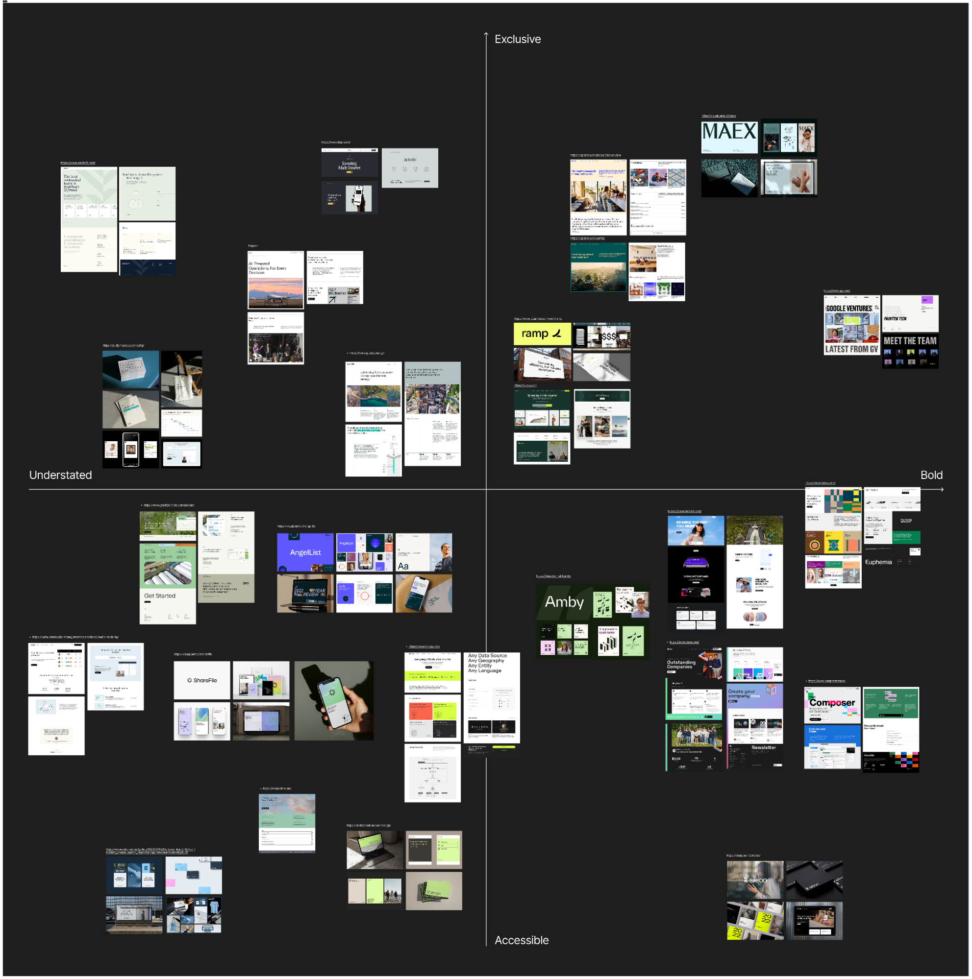
For a health tech company that wants to feel innovative but works with conservative medical institutions, the map might use traditional to progressive and corporate to human. For a fintech brand that wants to stand out without losing trust, it might use understated to bold and accessible to exclusive.
The most useful part of this exercise is often not the final map, but the disagreement it creates. One stakeholder may read a competitor as progressive, while another sees it as generic. One may see a brand as premium, while another reads it as cold. These disagreements reveal how different people define trust, innovation, credibility, and differentiation. That is exactly the kind of ambiguity that needs to be resolved before design begins.
Exercise 2: Visual Brand Driver
After the team has discussed the category, I like to turn the conversation inward. One exercise we use for this is called Visual Brand Driver. Each stakeholder is asked to choose images for a set of unrelated categories: transport, typeface, activity, furniture, mood, object, animal, architecture, and drink.
The instruction is important: the images should not represent the person’s personal taste. They should represent the company.
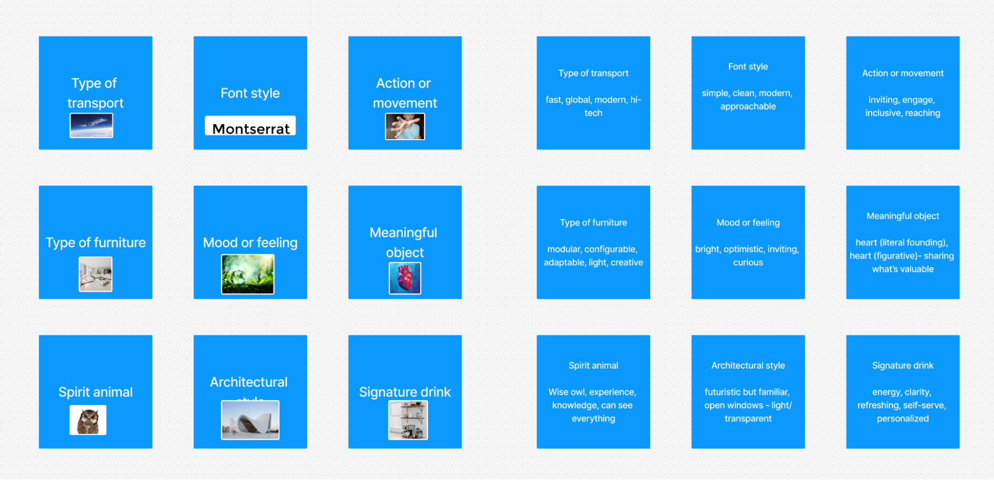
For example, if the company were a type of transport, what would it be? A quiet electric car, a high-speed train, a private jet, a bicycle, a delivery van? If it were a piece of furniture, would it be a soft lounge chair, a precise modular desk, or a heavy boardroom table?
After choosing the images, each person adds four or five adjectives to explain why they selected them. This part matters more than the image itself. The same object can mean different things to different people. A train might suggest speed, structure, reliability, mass accessibility, or a fixed route. A lounge chair might suggest comfort, calm, informality, or lack of urgency.
The exercise helps create a deeper layer of brand perception. Instead of asking people to describe the company directly, it asks them to think through metaphor and association. Patterns and contradictions become visible. One stakeholder may see the brand as refined and calm, another as energetic and experimental. One may describe the company as precise and structured, another as warm and flexible.
Those differences are not a problem. They are useful materials. They show what needs to be clarified before the visual concept phase begins.
This exercise is also helpful because it separates brand perception from aesthetic preference. A stakeholder may personally like a certain image, but if it does not describe the company, it should not be part of the exercise. That distinction is important throughout the branding process. The question is not “Do we like this?” but “Does this express the right thing about the brand?”
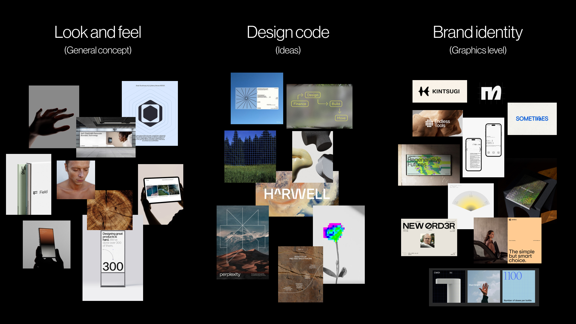
Once the workshop has revealed the main assumptions, the next client meeting can turn that shared understanding into a visual foundation. This is still not the first identity concept. It is a working layer between strategy and design, where the client can react to perception, visual principles, and early asset directions before the designer invests time in full concepts.
We usually structure this meeting around three connected layers:
- Look and feel
What should the brand feel like? - Design code
How can key brand ideas become visual principles? - Branding assets
What early choices should guide typography, color, logo direction, imagery, and illustration?
Together, these layers move the conversation from perception to practical design boundaries.
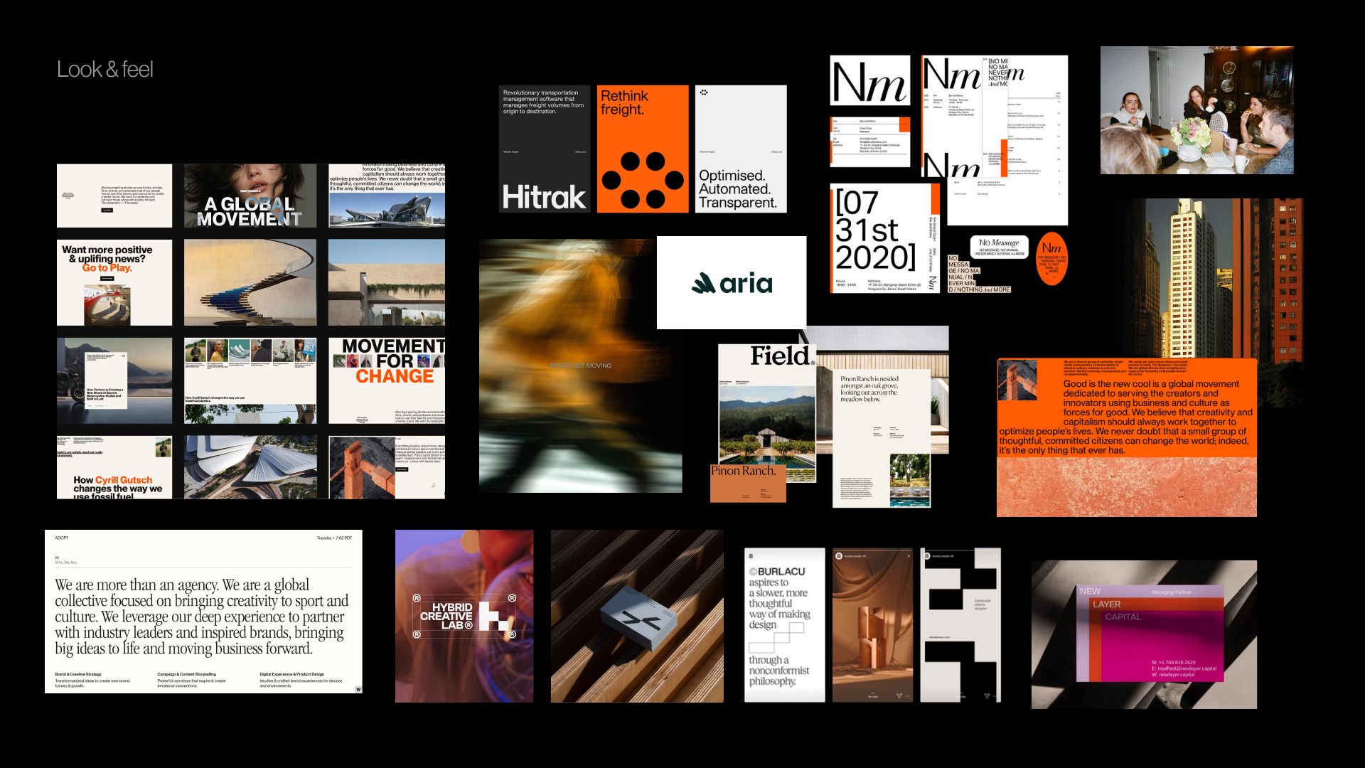
Look And Feel
Look and feel boards are not collections of visuals the team likes. They are perception boards. The designer collects references based on the workshop: desired perception, category tension, competitor codes, stakeholder disagreements, and brand character.
If the brand needs to feel trustworthy, modern, and human, the board should help the team discuss what kind of trust, modernity, and humanity are appropriate. Is the brand calm and institutional, or warm and accessible? Is it progressive through precision, or through a more expressive editorial tone?
The point is to let the client respond to perception before reacting to a logo, color palette, or finished visual system.
Design Code
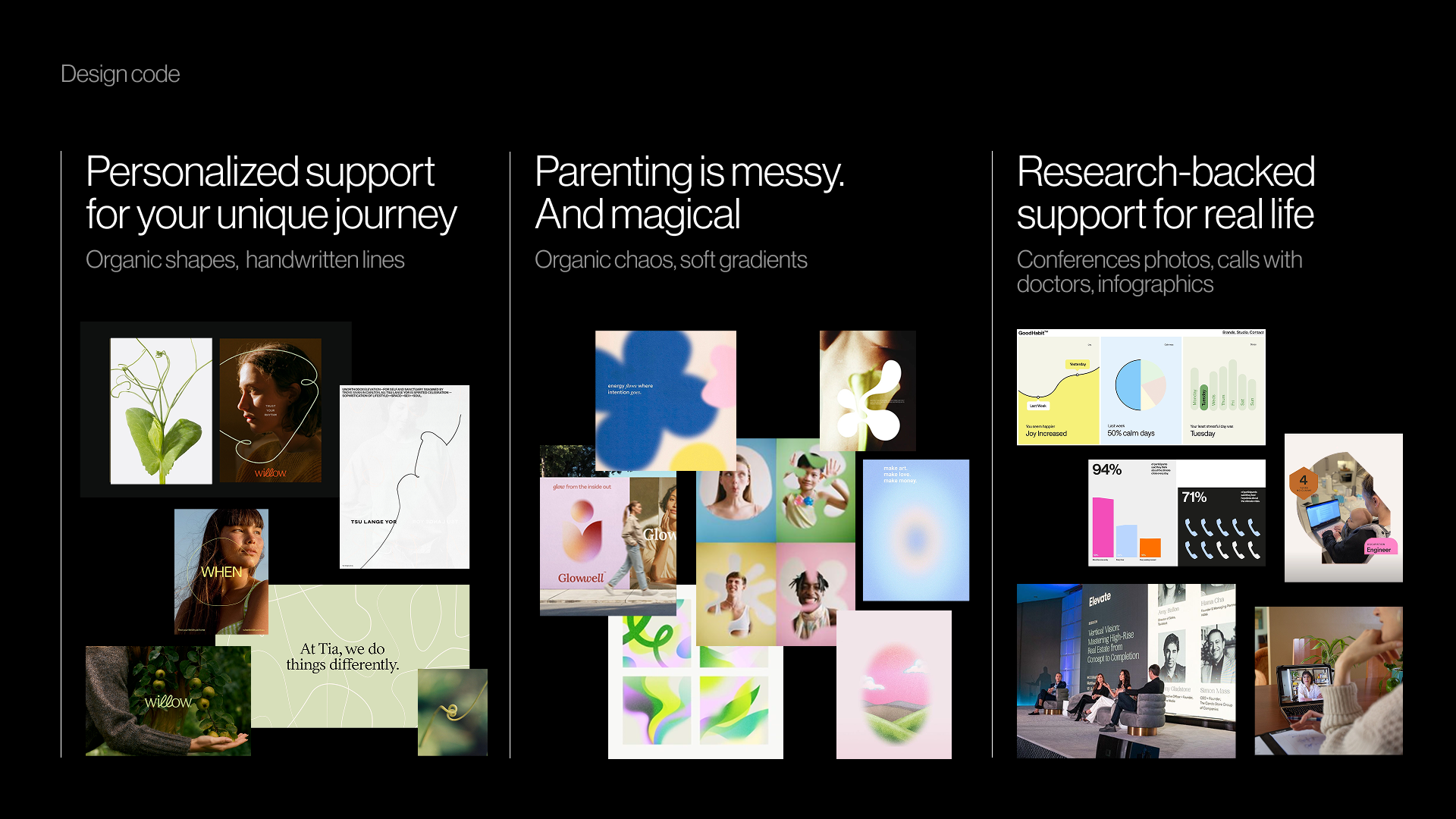
Design code makes the direction more specific by translating key brand ideas into visual principles.
For a parenting app in Germany, personalized support for your unique journey might become organic shapes, handwritten lines, and softer compositions. Parenting is messy and magical might become soft gradients, layered imagery, and playful irregularity. Research-backed support for real life might introduce doctor calls, data snapshots, infographics, and editorial layouts that make the brand feel credible.
For a PR agency working with prop tech companies, momentum in motion might become lines, arrows, ripple effects, or motion blur. Springboard might become a lift-off moment and elastic visual energy. Building blocks might become modular shapes or stacked compositions.
The team is not choosing the final graphic expression here. It is testing whether the visual metaphors make sense before concept design begins.
Brand Assets
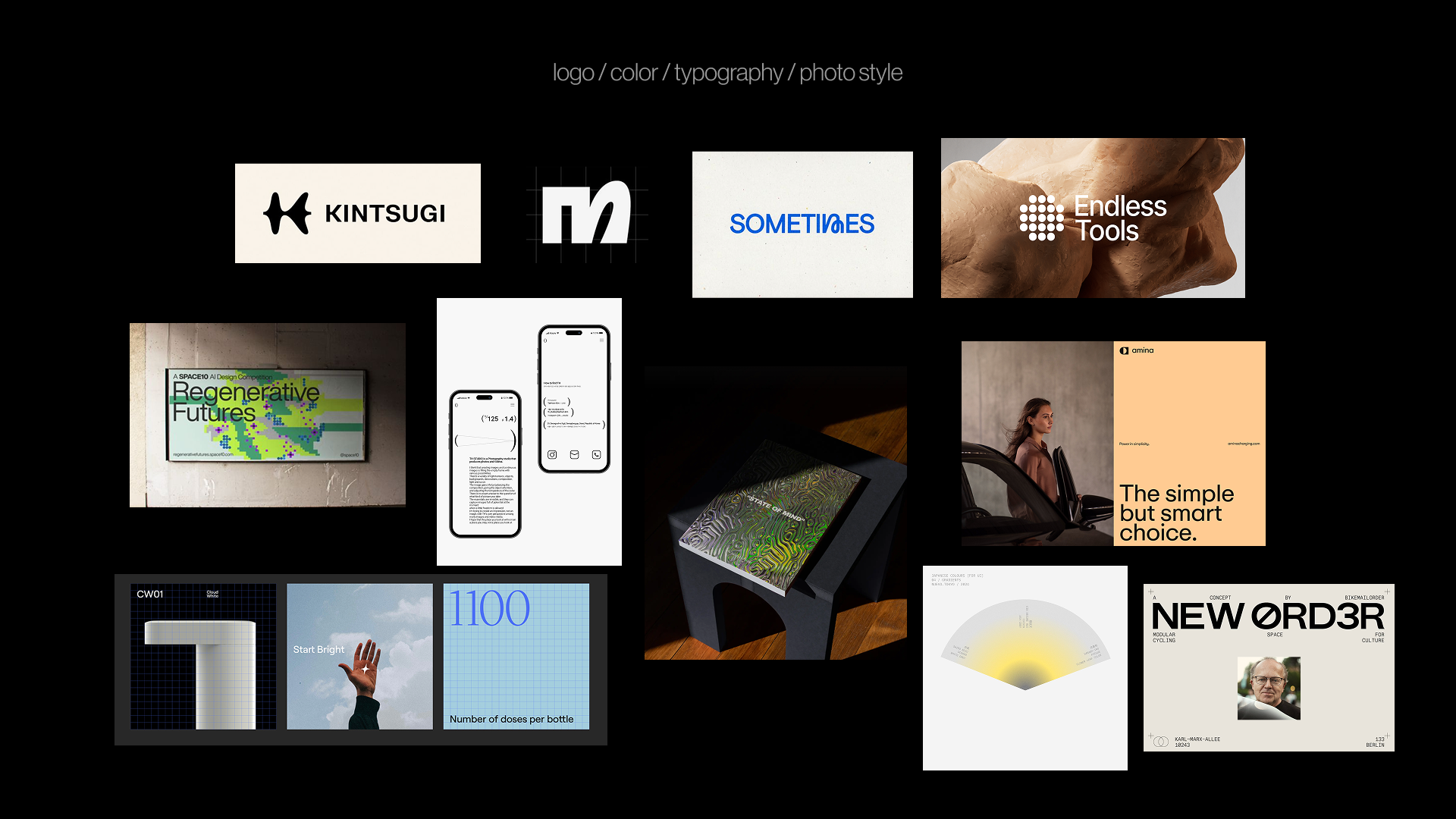
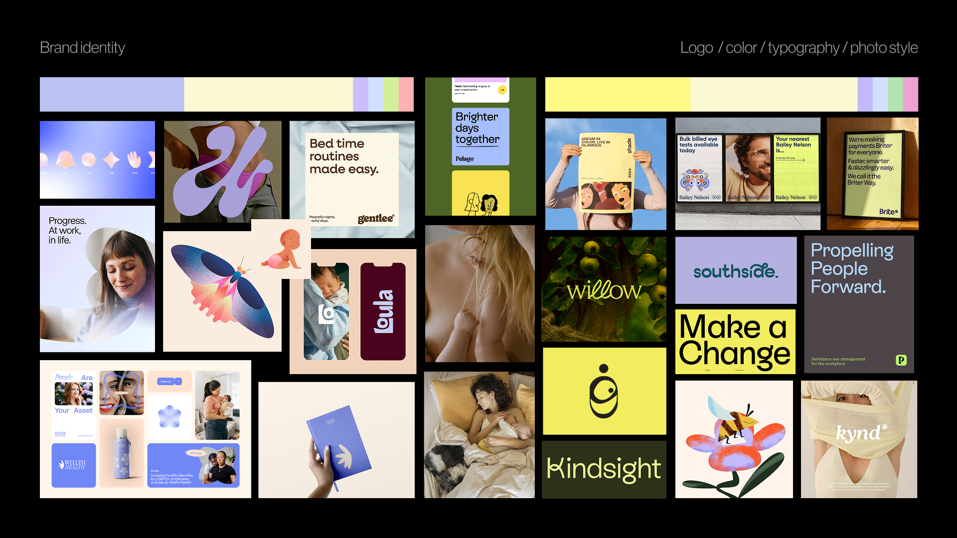
The final layer brings the conversation down to the building blocks of identity: typography, color, logo style, photography, illustration, and graphic language.
At this stage, the team can discuss questions such as:
- Should the typography feel editorial, technical, warm, precise, expressive, or restrained?
- Should the color palette follow category codes or create contrast?
- Should the logo be a quiet typographic mark, a flexible symbol, or a more expressive character?
- Should photography feel documentary, polished, intimate, product-led, everyday, or aspirational?
- Should illustration explain complex ideas, add warmth, or become a distinctive brand language?
This gives the designer boundaries without making the final identity predictable. The next step is still concept design, but the team is no longer starting from vague adjectives or private expectations.
Pre-Concept Checklist
Before moving into the first concept, it helps to pause and check whether the team has enough shared direction. The checklist is not meant to make every decision in advance. It is meant to make sure the designer is not starting from vague words, hidden assumptions, or unresolved disagreements.
Before creating the first concept, check whether the team has:
- A clear understanding of what the brand needs to communicate.
- A defined brand character.
- A shared sense of what that character means and what it does not mean.
- Visual references tied to perception, not taste.
- Key brand ideas translated into visual principles.
- Early direction for typography, color, imagery, and graphic language.
- Documented areas of agreement and disagreement.
- A clear sense of which concept directions would be wrong before designing them.
This last point is especially useful. A strong pre-concept phase not only tells the designer what to explore. It also clarifies what to avoid: directions that would be too expected, too cold, too playful, too conservative, too loud, too generic, or too far from what the audience can trust.
When the team can name those boundaries, the first concept becomes easier to evaluate. The conversation shifts from “I like it” or “I do not like it” to “Does this express the brand we agreed on?”
The First Concept Should Not Be A Guess
The first concept should not feel like a guess or a surprise reveal. It should feel like the next step in a direction the team already understands.
That does not mean removing intuition, experimentation, or creative risk from the branding process. It means giving those things a sharper problem to solve. When the team has clarified the brand character, tested visual perception, translated ideas into design principles, and discussed the early building blocks of the identity, the designer can explore with more confidence.
Pre-concept work does not need to make the final identity predictable. It needs to make the conversation around it more meaningful. Instead of asking whether the work matches someone’s private expectation, the team can ask a better question: Does this visual direction express what the brand needs to become?
 (yk)
(yk)