

惯性聚合 高效追踪和阅读你感兴趣的博客、新闻、科技资讯
阅读原文 在惯性聚合中打开

推荐订阅源

T
The Exploit Database - CXSecurity.com
V
Vulnerabilities – Threatpost
Google DeepMind News
Attack and Defense Labs
Webroot Blog
Webroot Blog
cs.CV updates on arXiv.org
TaoSecurity Blog
TaoSecurity Blog
I
Intezer
Application and Cybersecurity Blog
N
News | PayPal Newsroom
S
Security Affairs
T
Tor Project blog
P
Proofpoint News Feed
Exploit-DB.com RSS Feed
S
Security @ Cisco Blogs
H
Heimdal Security Blog
Hacker News: Ask HN
Hacker News: Ask HN
Help Net Security
Help Net Security
U
Unit 42
云风的 BLOG
云风的 BLOG
The Hacker News
The Hacker News
Cisco Talos Blog
Cisco Talos Blog
量子位
F
Full Disclosure
cs.AI updates on arXiv.org
OSCHINA 社区最新新闻
OSCHINA 社区最新新闻
博客园 - 叶小钗
有赞技术团队
有赞技术团队
T
Troy Hunt's Blog
P
Privacy & Cybersecurity Law Blog
Forbes - Security
Forbes - Security
人人都是产品经理
人人都是产品经理
L
Lohrmann on Cybersecurity
Apple Machine Learning Research
Microsoft Security Blog
博客园 - Franky
腾讯CDC
AI
AI
Last Week in AI
Last Week in AI
Latest news
Latest news
Google Online Security Blog
N
Netflix TechBlog - Medium
Engineering at Meta
Engineering at Meta
GbyAI
GbyAI
让小产品的独立变现更简单 - ezindie.com
IT之家
IT之家
Martin Fowler
Martin Fowler
Blog — PlanetScale
Blog — PlanetScale
V2EX - 技术
V2EX - 技术
酷 壳 – CoolShell
酷 壳 – CoolShell

Articles on Smashing Magazine — For Web Designers And Developers

No, People Don’t Want More AI In Their Life — Smashing Magazine From Kickoff To First Concept: How To Turn Brand Strategy Into Visual Direction — Smashing Magazine Designing For Distressed Users: Why Mental Health Apps Shouldn’t Follow Every UI Fashion Meet Kirki: WordPress’s First Visual Builder With An Infinite Canvas — Smashing Magazine Users Don’t Need More Tools: They Need Seamless Integrations — Smashing Magazine Matching AI Modality To User Intent: Designing The Right Interface — Smashing Magazine Why Accessibility Is An Operational Capability, Not A Feature — Smashing Magazine Snapshots Of Summer (July 2026 Wallpapers Edition) — Smashing Magazine Designing With Uncertainty: How AI Supercharges Probabilistic Thinking — Smashing Magazine The Impact Of Humanoid Robots On Humanity — Smashing Magazine The Benefits Of Cognitive Inclusion In UX Research — Smashing Magazine How To Make Your Design System AI-Ready — Smashing Magazine June Is For Exploring (2026 Wallpapers Edition) — Smashing Magazine Algorithmic Theming Engines: Building Self-Correcting Color Systems With contrast-color() — Smashing Magazine Your Prototype Is Not Being Honest With Your Users (And Here’s How To Fix It) — Smashing Magazine Four Levels Of Customer Understanding — Smashing Magazine Advanced Tree Counting: Mathematical Layouts With sibling-index() And sibling-count() — Smashing Magazine Ten Data-Backed Truths Of User Experience ROI — Smashing Magazine Practical Interface Patterns For AI Transparency (Part 2) — Smashing Magazine The Architecture Of Local-First Web Development — Smashing Magazine Rethinking The Experience Of System Tools — Smashing Magazine Designing Stable Interfaces For Streaming Content — Smashing Magazine A Fresh View In May (2026 Wallpapers Edition) — Smashing Magazine The “Bug-Free” Workforce: How AI Efficiency Is Subtly Disrupting The Interactions That Build Strong Teams — Smashing Magazine The UX Designer’s Nightmare: When “Production-Ready” Becomes A Design Deliverable — Smashing Magazine Session Timeouts: The Overlooked Accessibility Barrier In Authentication Design — Smashing Magazine How To Improve UX In Legacy Systems — Smashing Magazine Identifying Necessary Transparency Moments In Agentic AI (Part 1) — Smashing Magazine A Practical Guide To Design Principles — Smashing Magazine The Joy Of A Fresh Beginning (April 2026 Wallpapers Edition) — Smashing Magazine The Site-Search Paradox: Why The Big Box Always Wins — Smashing Magazine Testing Font Scaling For Accessibility With Figma Variables — Smashing Magazine Modal vs. Separate Page: UX Decision Tree — Smashing Magazine Anime vs. Marvel/DC: Designing Digital Products With Emotion In Flow — Smashing Magazine Moving From Moment.js To The JS Temporal API — Smashing Magazine Beyond border-radius: What The CSS corner-shape Property Unlocks For Everyday UI — Smashing Magazine Building Dynamic Forms In React And Next.js — Smashing Magazine Persuasive Design: Ten Years Later — Smashing Magazine Human Strategy In An AI-Accelerated Workflow — Smashing Magazine Now Shipping: Accessible UX Research, A New Smashing Book By Michele Williams — Smashing Magazine Getting Started With The Popover API — Smashing Magazine Fresh Energy In March (2026 Wallpapers Edition) — Smashing Magazine Say Cheese! Meet SmashingConf Amsterdam 🇳🇱 — Smashing Magazine A Designer’s Guide To Eco-Friendly Interfaces — Smashing Magazine Designing A Streak System: The UX And Psychology Of Streaks — Smashing Magazine Building Digital Trust: An Empathy-Centred UX Framework For Mental Health Apps — Smashing Magazine Designing For Agentic AI: Practical UX Patterns For Control, Consent, And Accountability — Smashing Magazine CSS @scope: An Alternative To Naming Conventions And Heavy Abstractions — Smashing Magazine Short Month, Big Ideas (February 2026 Wallpapers Edition) — Smashing Magazine Practical Use Of AI Coding Tools For The Responsible Developer — Smashing Magazine Unstacking CSS Stacking Contexts — Smashing Magazine Beyond Generative: The Rise Of Agentic AI And User-Centric Design — Smashing Magazine Rethinking “Pixel Perfect” Web Design — Smashing Magazine Smashing Animations Part 8: Theming Animations Using CSS Relative Colour — Smashing Magazine UX And Product Designer’s Career Paths In 2026 — Smashing Magazine Penpot Is Experimenting With MCP Servers For AI-Powered Design Workflows — Smashing Magazine Pivoting Your Career Without Starting From Scratch — Smashing Magazine Countdown To New Adventures (January 2026 Wallpapers Edition) — Smashing Magazine How To Design For (And With) Deaf People — Smashing Magazine Giving Users A Voice Through Virtual Personas — Smashing Magazine How To Measure The Impact Of Features — Smashing Magazine Smashing Animations Part 7: Recreating Toon Text With CSS And SVG — Smashing Magazine Accessible UX Research, eBook Now Available For Download — Smashing Magazine State, Logic, And Native Power: CSS Wrapped 2025 — Smashing Magazine How UX Professionals Can Lead AI Strategy — Smashing Magazine
Combobox vs. Multiselect vs. Listbox: How To Choose The Right One — Smashing Magazine
About The Author · 2026-02-03 · via Articles on Smashing Magazine — For Web Designers And Developers

Combobox vs. Multi-Select vs. Listbox vs. Dual Listbox? How they are different, what purpose they serve, and how to choose the right one. Brought to you by Design Patterns For AI Interfaces, friendly video courses on UX and design patterns by Vitaly.

So what’s the difference between combobox, multiselect, listbox, and dropdown? While all these UI components might appear similar, they serve different purposes. The choice often comes down to the number of available options and their visibility.

Let’s see how they differ, what purpose they serve, and how to choose the right one — avoiding misunderstandings and wrong expectations along the way.
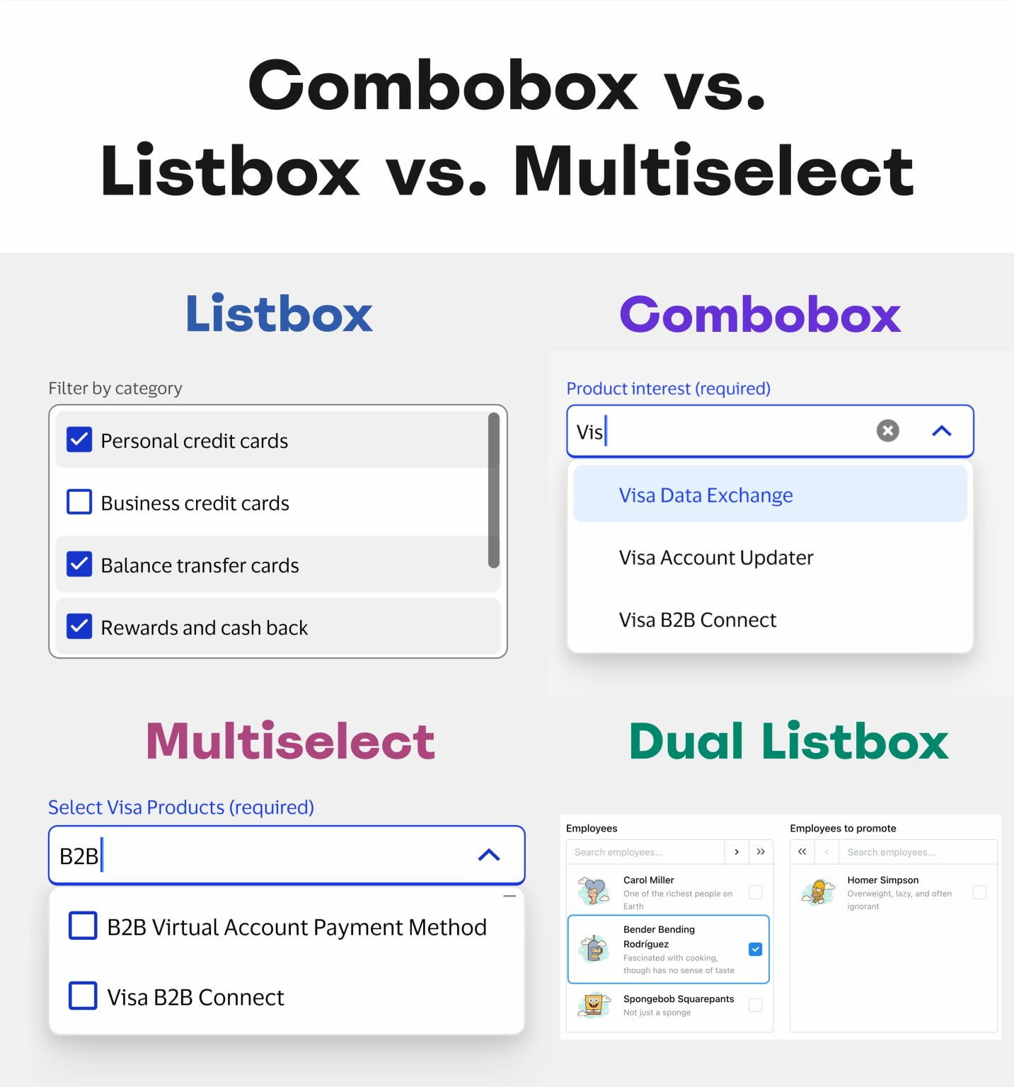
A comparison of UI elements: Listbox, Combobox, Multiselect, and Dual Listbox, showcasing different selection functionalities.
And the confusion begins: Listbox, Combobox, Multiselect, Dual Listbox. (Large preview)

Not All List Patterns Are The Same

All the UI components highlighted above have exactly one thing in common: they support users’ interactions with lists. However, they do so slightly differently.

Let’s take a look at each, one by one:

  • Dropdown → list is hidden until it’s triggered.
  • Combobox → type to filter + select 1 option.
  • Multiselect → type to filter + select many options.
  • Listbox → all list options visible by default (+ scroll).
  • Dual listbox → move items between 2 listboxes.
A text input field with a dropdown list
Watson design system with grouping inside of its combobox pattern. (Large preview)

In other words, Combobox combines a text input field with a dropdown list, so users can type to filter and select a single option. With Multiselect, users can select many options (often displayed as pills or chips).

Listboxes display all list options visible by default, often with scrolling. It’s helpful when users need to see all available choices immediately. Dual listbox (also called transfer list) is a variation of a listbox that allows users to move items between two listboxes (left ↔ right), typically for bulk selection.

Never Hide Frequently Used Options

As mentioned above, the choice of the right UI component depends on 2 factors: how many list options are available, and if all these options need to be visible by default. All lists could have tree structures, nesting, and group selection, too.

A dropdown menu showing product selection. Compass is selected, and Atlas is selected with two sub-options: Vector Search and Atlas CLI.
MongoDB design system with nested filters and chips. (Large preview)

There is one principle that I’ve been following for years for any UI component: never hide frequently used options. If users rely on a particular selection frequently, there is very little value in hiding it from them.

We could either make it pre-selected, or (if there are only 2–3 frequently used options) show them as chips or buttons, and then show the rest of the list on interaction. In general, it’s a good idea to always display popular options — even if it might clutter the UI.

How To Choose Which?

Not every list needs a complex selection method. For lists with fewer than 5 items, simple radio buttons or checkboxes usually work best. But if users need to select from a large list of options (e.g., 200+ items), combobox + multiselect are helpful because of the faster filtering (e.g., country selection).

Matrix of options for multiselect and listboxes.
A matrix of options, broken down by single- or multi-selection and static or scrollable view. By Anna Kaley, from NN/g. (Large preview)

Listboxes are helpful when people need to access many options at once, especially if they need to choose many options from that list as well. They could be helpful for frequently used filters.

Dual list box used to transfer items from one place to another.
Dual listbox in action: it can be very helpful when assigning tasks or permissions. That’s why it’s “Transfer List”. Example from Mantine. (Large preview)

Dual listbox is often overlooked and ignored. But it can be very helpful for complex tasks, e..g bulk selection, or assigning roles, tasks, responsibilities. It’s the only UI component that allows users to review their full selection list side-by-side with the source list before committing (also called “Transfer list”).

In fact, dual listbox is often faster, more accurate, and more accessible than drag-and-drop.

Usability Considerations

One important note to keep in mind is that all list types need to support keyboard navigation (e.g., ↑/↓ arrow keys) for accessibility. Some people will almost always rely uponthe keyboard to select options once they start typing.

Keyboard navigation is often in use with any type of lists.
Keyboard navigation is often in use with any kind of lists. Example: Watson. (Large preview)

Beyond that:

  • For lists with 7+ options, consider adding “Select All” and “Clear All” functionalities to streamline user interaction.
  • For lengthy lists with a combobox, expose all options to users on click/tap, as otherwise they might never be seen,
  • Most important, don’t display non-interactive elements as buttons to avoid confusion — and don’t display interactive elements as static labels.

Wrapping Up: Not Everything Is A Dropdown

Names matter. A vertical list of options is typically described as a “dropdown” — but often it’s a bit too generic to be meaningful. “Dropdown” hints that the list is hidden by default. “Multiselect” implies multi-selection (checkbox) within a list. “Combobox” implies text input. And “Listbox” is simply a list of selectable items, visible at all times.

The goal isn’t to be consistent with the definitions above for the sake of it. But rather to align intentions — speak the same language when deciding on, designing, building, and then using these UI components.

It should work for everyone — designers, engineers, and end users — as long as static labels don’t look like interactive buttons, and radio buttons don’t act like checkboxes.

Meet “Design Patterns For AI Interfaces”

Meet Design Patterns For AI Interfaces, Vitaly’s new video course with practical examples from real-life products — with a live UX training happening soon. Jump to a free preview.

Design Patterns For AI Interfaces promo picture
Meet Design Patterns For AI Interfaces, Vitaly’s video course on interface design & UX.

Useful Resources

Smashing Editorial (yk)