





- 8 min read
- UX, Accessibility, Design
When we think about people who are deaf, we often assume stereotypes, such as “disabled” older adults with hearing aids. However, this perception is far from the truth and often leads to poor decisions and broken products.
Let’s look at when and how deafness emerges, and how to design better experiences for people with hearing loss.
Deafness Is A Spectrum
Deafness spans a broad continuum, from minor to profound hearing loss. Around 90–95% of deaf people come from hearing families, and deafness often isn’t merely a condition that people are born with. It frequently occurs due to exposure to loud noises, and it also emerges with age, disease, and accidents.
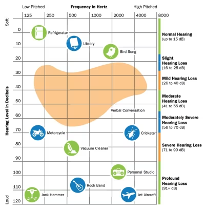
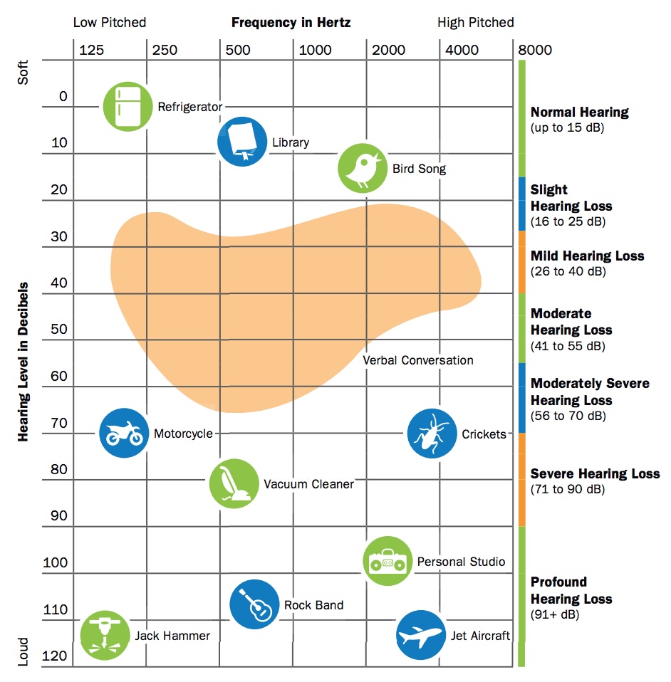
The loudness of sound is measured in units called decibels (dB). Everybody is on the spectrum of deafness, from normal hearing (up to 15 dB) to profound hearing loss (91+ dB):
- Slight Hearing Loss, 16–25 dB
At 16 dB hearing loss, a person can miss up to 10% of speech when a speaker is at a distance greater than 3 feet. - Mild hearing loss, 26–40 dB
Soft sounds are hard to hear, including whispering, which is around 40 dB in volume. It’s more difficult to hear soft speech sounds spoken at a normal volume. At 40dB hearing loss, a person may miss 50% of meeting discussions. - Moderate hearing loss, 41–55 dB
A person may hear almost no speech when another person is talking at normal volume. At a 50dB hearing loss, a person may not pick up to 80% of speech. - Moderately Severe Hearing Loss, 56–70 dB
A person may have problems hearing the sounds of a dishwasher (60dB). At 70 dB, they might miss almost all speech. - Severe Hearing Loss, 71–90 dB
A person will hear no speech when a person is talking at a normal level. They may hear only some very loud noises: vacuum (70 dB), blender (78 dB), hair dryer (90 dB). - Profound Hearing Loss, 91+ dB
Hear no speech and at most very loud sounds such as a music player at full volume (100 dB), which would be damaging for people with normal hearing, or a car horn (110 dB).
It’s worth mentioning that loss of hearing can also be situational and temporary, as people with “normal” hearing (0 to 25 dB hearing loss) will always encounter situations where they can’t hear, e.g., due to noisy environments.
Useful Things To Know About Deafness
Assumptions are always dangerous, and in the case of deafness, there are quite a few that aren’t accurate. For example, most deaf people actually do not know a sign language — it’s only around 1% in the US.
Also, despite our expectations, there is actually no universal sign language that everybody uses. For example, British signers often cannot understand American signers. There are globally around 300 different sign languages actively used.
“We never question making content available in different written or spoken languages, and the same should apply to signed languages.”
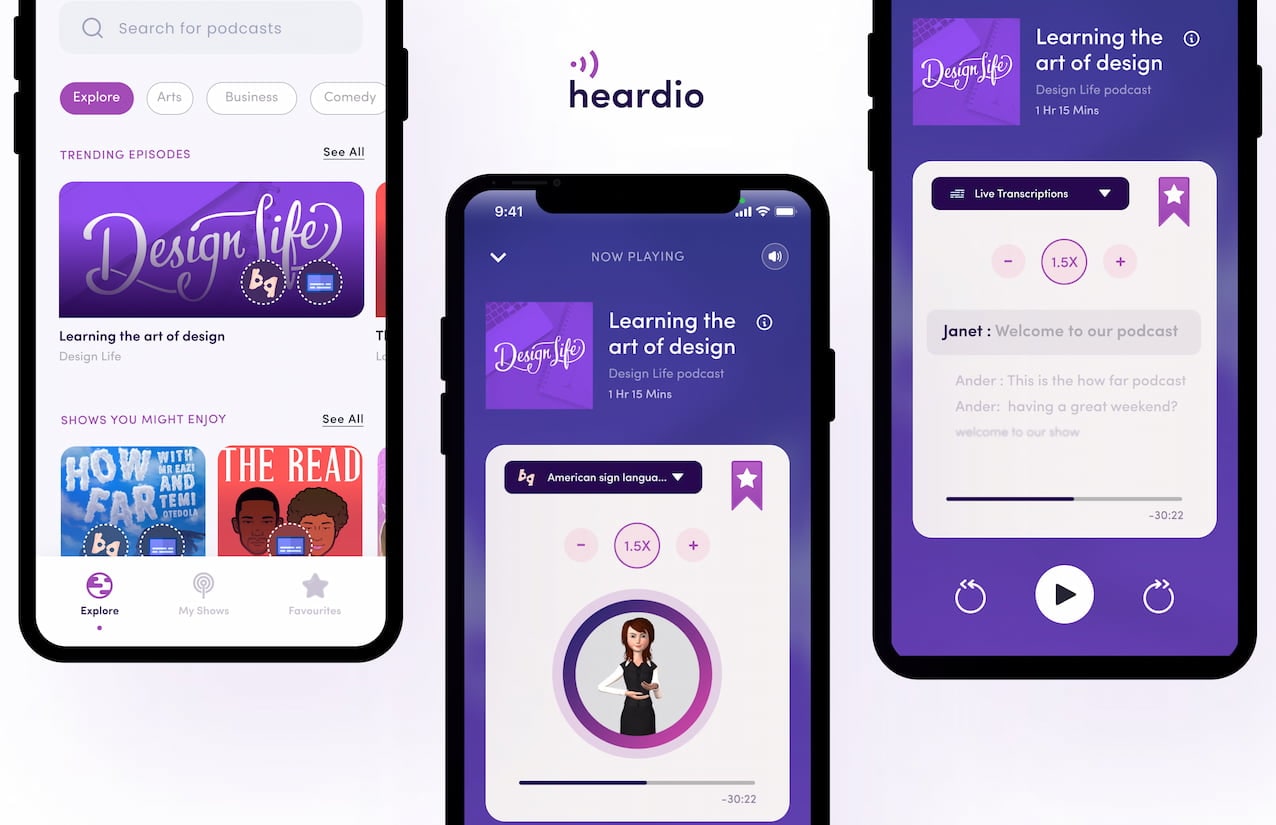
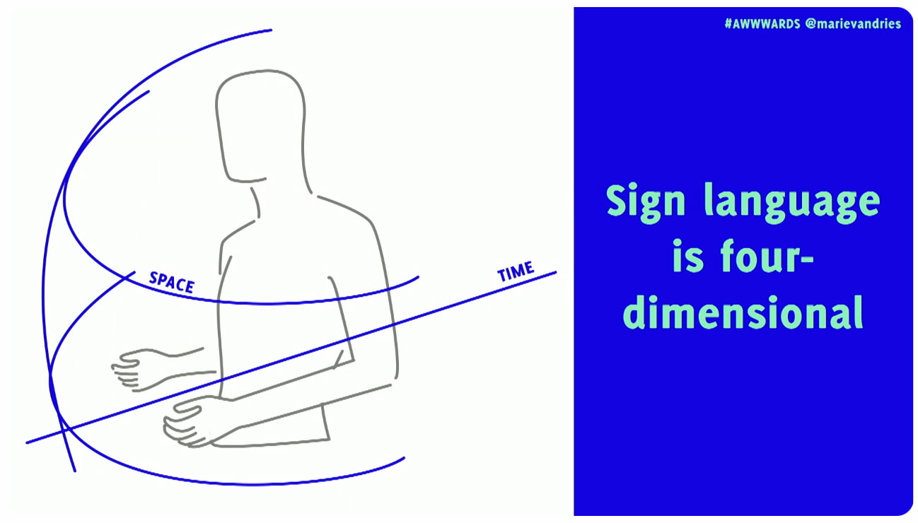
Sign languages are not just gestures or pantomime. They are 4D spatial languages with their own grammar and syntax, separate from spoken languages, and they don’t have a written form. They rely heavily on facial expression to convey meaning and emphasis. And they are also not universal — every country has its own sign language and dialects.
- You can only understand 30% of words via lip-reading.
- Most deaf people do not know any sign language.
- Many sign languages have local dialects that can be hard to interpret.
- Not all deaf people are fluent signers and often rely on visual clues.
- For many deaf people, a spoken language is their second language.
- Sign language is 4-dimensional, incorporating 3D space, time and also facial expressions.
How To Communicate Respectfully
Keep in mind that many deaf people use the spoken language of their country as their second language. So to communicate with a deaf person, it’s best to ask in writing. Don’t ask how much a person can understand, or if they can lip-read you.
However, as Rachel Edwards noted, don’t assume someone is comfortable with written language because they are deaf. Sometimes their literacy may be low, and so providing information as text and assuming that covers your deaf users might not be the answer.
Also, don’t assume that every deaf person can lip-read. You can see only about 30% of words on someone’s mouth. That’s why many deaf people need additional visual cues, like text or cued speech.
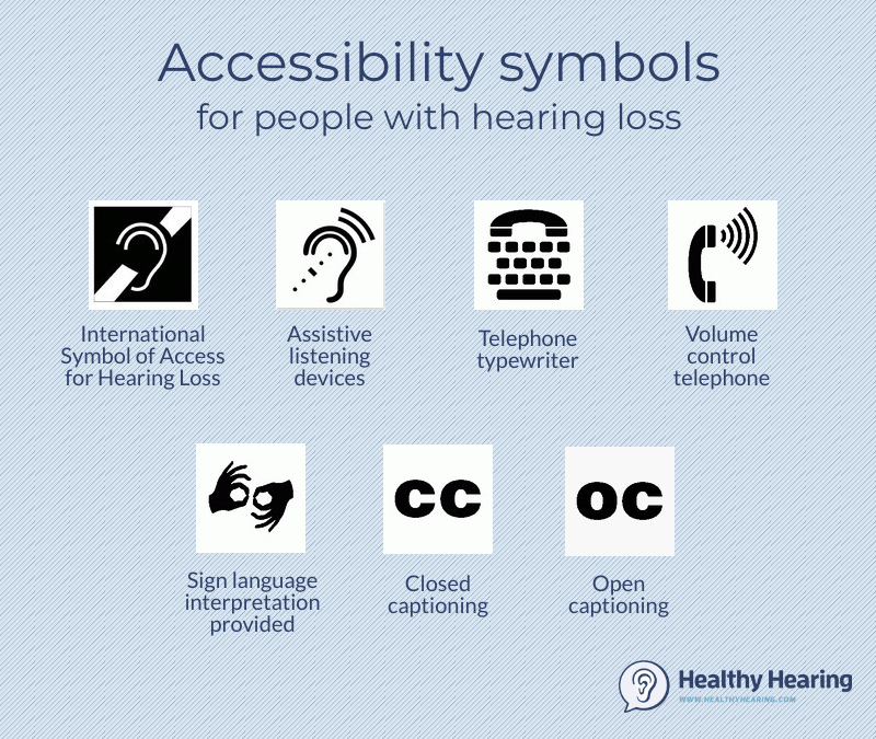
It’s also crucial to use respectful language. Deaf people do not always see themselves as disabled, but rather as a cultural linguistic minority with a unique identity. Others, as Meryl Evan has noted, don’t identify as deaf or hard of hearing, but rather as “hearing impaired”. So, it’s mostly up to an individual how they want to identify.
- Deaf (Capital ‘D’)
Culturally Deaf people who have been deaf since birth or before learning to speak. Sign language is often the first language, and written language is the second. - deaf (Lowercase ‘d’)
People who developed hearing loss later in life. Used by people who feel closer to the hearing/hard-of-hearing world and prefer to communicate written and/or oral. - Hard of Hearing
People with mild to moderate hearing loss who typically communicate orally and use hearing aids.
In general, avoid hearing impairment if you can, and use Deaf (for those deaf for most of their lives), deaf (for those who became deaf later), or hard of hearing (HoH) for partial hearing loss. But either way, ask politely first and then respect the person’s preferences.
Practical UX Guidelines
When designing UIs and content, consider these key accessibility guidelines for deaf and hard-of-hearing users:
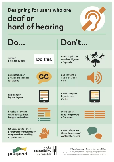

- Don’t make the phone required or the only method of contact.
- Provide text alternatives for all audible alerts or notices.
- Add haptic feedback on mobile (e.g., vibration patterns).
- Ensure good lighting to help people see facial expressions.
- Circular seating usually works better, so everyone can see each other’s faces.
- Always include descriptions of non-spoken sounds (e.g., rain, laughter) in your content.
- Add a transcript and closed captions for audio and video.
- Clearly identify each speaker in all audio and video content.
- Design multiple ways to communicate in every instance (online + in-person).
- Invite video participants to keep the camera on to facilitate lip-reading and the viewing of facial expressions, which convey tone.
- Always test products with the actual community, instead of making assumptions for them.
Wrapping Up
I keep repeating myself like a broken record, but better accessibility always benefits everyone. When we improve experiences for some groups of people, it often improves experiences for entirely different groups as well.
As Marie Van Driessche rightfully noted, to design a great experience for accessibility, we must design with people, rather than for them. And that means always include people with lived experience of exclusion into the design process — as they are the true experts.
Accessibility never happens by accident — it’s a deliberate decision and a commitment.
“
No digital product is neutral. There must be a deliberate effort to make products and services more accessible. Not only does it benefit everyone, but it also shows what a company stands for and values.
And once you do have a commitment, it will be so much easier to retain accessibility rather than adding it last minute as a crutch — when it’s already too late to do it right and way too expensive to do it well.
Meet “Smart Interface Design Patterns”
You can find more details on design patterns and UX in Smart Interface Design Patterns, our 15h-video course with 100s of practical examples from real-life projects — with a live UX training later this year. Everything from mega-dropdowns to complex enterprise tables — with 5 new segments added every year. Jump to a free preview. Use code BIRDIE to save 15% off.

Useful Resources
- Designing For Deaf People Helps Everyone, by Marie Van Driessche
- “Design considerations for the Deaf, deaf, and hard of hearing”, by Paul Roberts
- Beyond Video Captions and Sign Language, by Svetlana Kouznetsova
- “Best Practices For CC and Subtitles UX”, by Vitaly Friedman
- Web Accessibility for Deaf Users
- Inclusive Design Toolkit: Hearing
- “What It’s Like To Be Born Hard of Hearing”, by Twanna A. Hines, M.S.
- “Accessibility: Podcasts for the deaf”, by Mubarak Alabidun
Useful Books
- Sound Is Not Enough, by Svetlana Kouznetsova
- Mismatch: How Inclusion Shapes Design, by Kat Holmes
- Building for Everyone: Extend Your Product’s Reach Through Inclusive Design (+ free excerpt), by Annie Jean-Baptiste
 (yk)
(yk)