May 11, 2026 | News
In our latest update, we’ve introduced a couple of interface changes that you’ll notice right away – less movement, less clutter, and faster access to the things you use most.
Here’s what’s new:
The top bar has been redesigned to feel more stable and make content easier to scan. It now stays in a single, fixed line, which means no more expanding and collapsing as you scroll, fewer distractions, and no shifting elements while you’re reading.
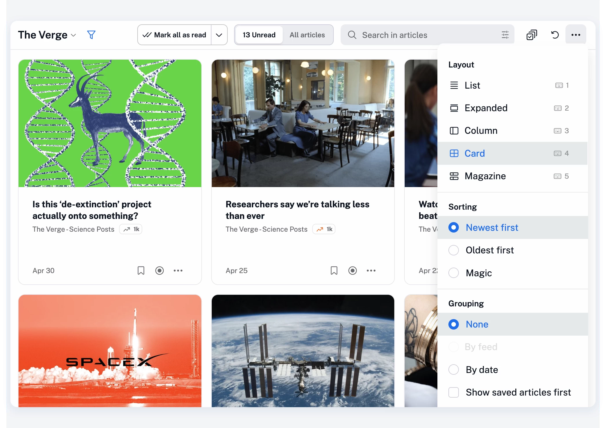
At the same time, based on your feedback, we’ve regrouped the controls so everything sits more logically in one place:
The goal here is simple: make the interface feel lighter, while giving you quicker access to key features with fewer clicks.
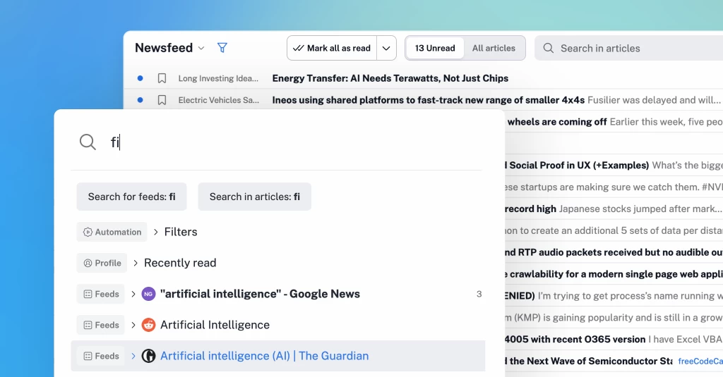
We’ve also reworked the quick access menu to make it much more useful in day-to-day browsing.
Press . (dot) on your keyboard at any time, start typing, and jump straight to what you need.
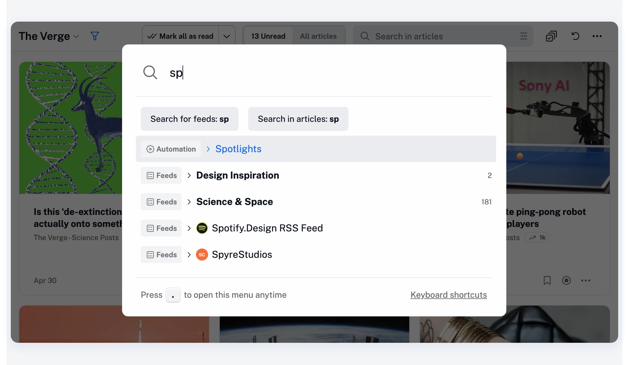
You can quickly access any section across Inoreader’s full range of features and settings:
…and pretty much anything else in your account.
You can also quickly add RSS feeds – just paste a URL and press Enter.
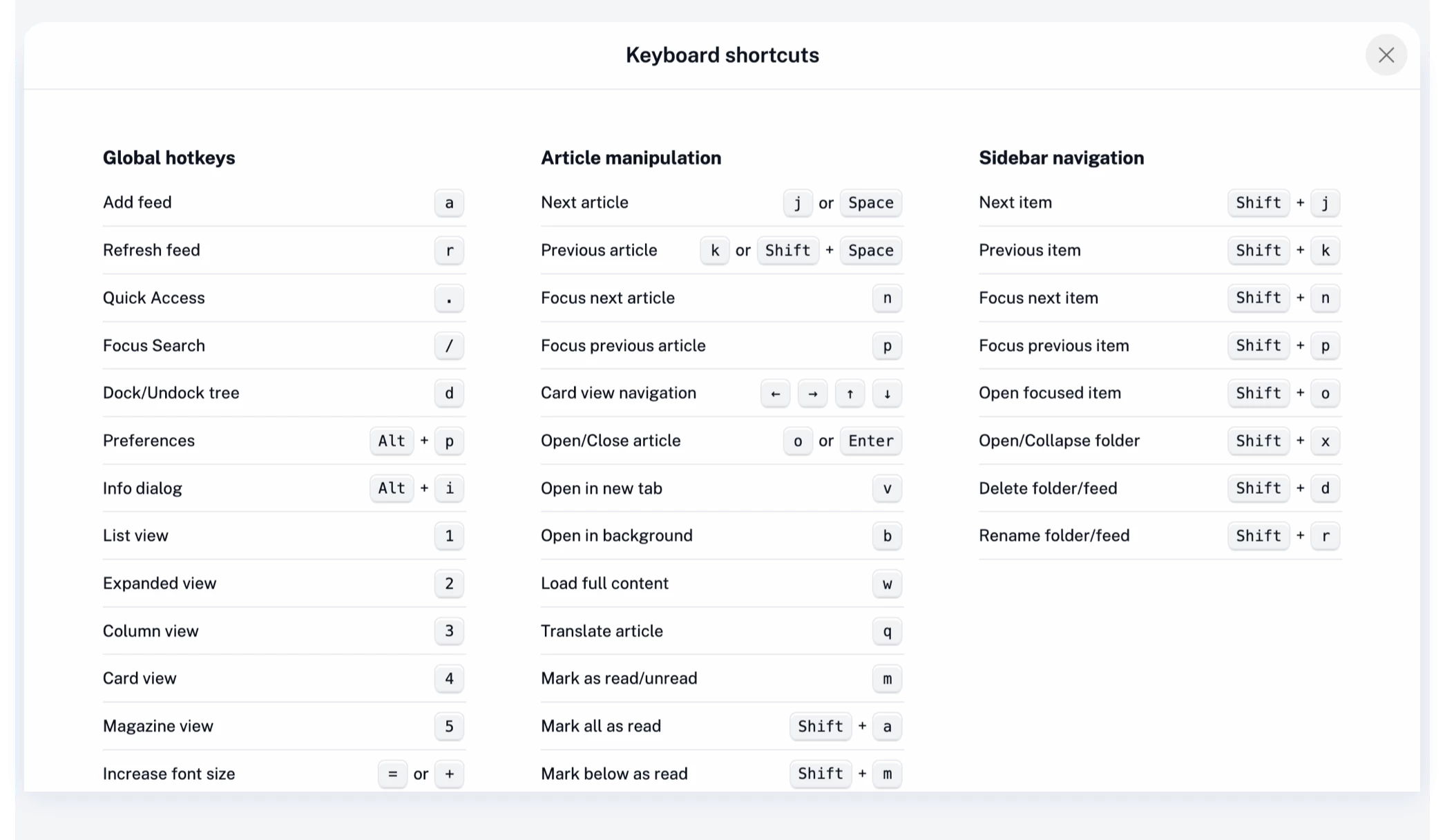
The full list of keyboard shortcuts is also available there, or you can open it anytime with h or ?.
The redesigned quick access menu is built for speed, especially if you prefer using your keyboard over clicking.
These changes aren’t about adding more – they’re about optimizing what you already use. Less movement in the interface, clearer actions, and quicker navigation all add up to a more focused reading experience.
As always, your feedback plays a big role in shaping updates like this, so thank you, and keep it coming!
此内容由惯性聚合(RSS阅读器)自动聚合整理,仅供阅读参考。 原文来自 — 版权归原作者所有。