什么是新拟态(Neumorphism) UI 风格?网上似乎还没有一个准确统一的定义。按照我个人的通俗理解,就是将界面的一部分凸起来,另一部分凹下去,形成的一种错落有致的拟物风格。代表作是乌克兰设计师 Alexander Plyuto 在各平台发布的新作品「Skeuomorph Mobile Banking」
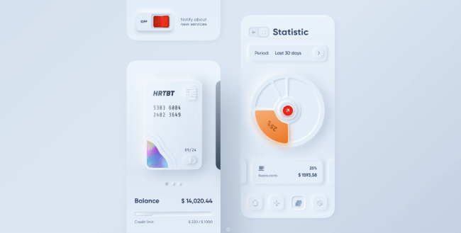
Skeuomorph Mobile Banking
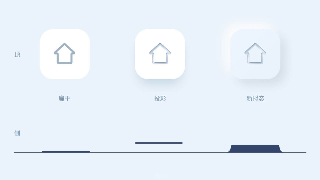
从上面这张对比图可以看出,扁平风格就像是一张纸贴在墙面上,投影风格像是浮在半空中,而新拟态风格则像是墙面上直接凸起了一块。
新拟态 UI 风格的实现方式
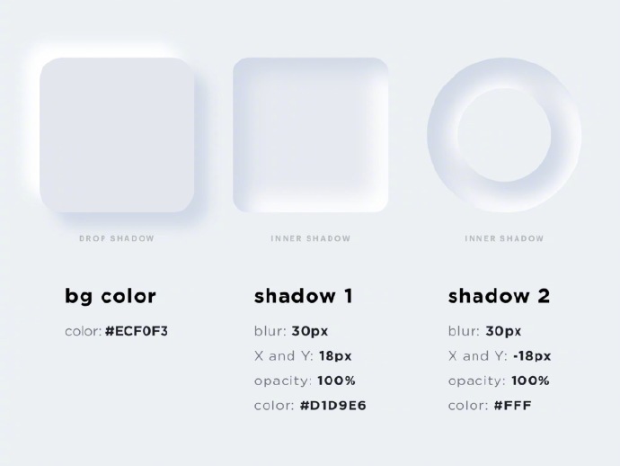
要实现这种风格,精髓在于一个白色的阴影+一个常规阴影。一个示例如下图所示:
新拟态 UI 风格的前端实现
闲来无事,参照着以上的实现方式临摹了一下练手(代码如下)。后来发现居然已经有了在线工具直接生成这种风格的 CSS 代码[aru_59],很强!Neumorphism CSS 在线生成器地址:https://neumorphism.io
<style>
body {
    background: #ecf0f3;
}
div {
    position: relative;
    float: left;
    width: 200px;
    height: 200px;
    margin-left: 80px;
    margin-top: 80px;
    background: #ecf0f3;
}
.drop-shadow {
    border-radius: 20px;
    box-shadow: 18px 18px 30px #d1d9e6, -18px -18px 30px #fff;
}
.inner-shadow {
    border-radius: 20px;
    box-shadow: inset 18px 18px 30px #d1d9e6, inset -18px -18px 30px #fff;
}
.inner-shadow-ring {
    border-radius: 100%;
    box-shadow: inset 9px 9px 15px #d1d9e6, inset -9px -9px 15px #fff;
}
.inner-shadow-ring:before {
    content: "";
    position: absolute;
    left: 20%;
    top: 20%;
    width: 60%;
    height: 60%;
    border-radius: 100%;
    background: #ecf0f3;
    box-shadow: 9px 9px 15px #d1d9e6, -9px -9px 15px #fff;
}
</style>

<div class="drop-shadow"></div>
<div class="inner-shadow"></div>
<div class="inner-shadow-ring"></div>
参考资料
[1].设计趋势 Neumorphism 是什么?.UI中国.布莱恩臣.https://www.ui.cn/detail/514980.html
[2].Neumorphism(新拟态)UI设计趋势吗?.UI中国.Frannnk.http://www.ui.cn/detail/359233.html
55人点赞
打赏