


在AI创作的世界里,提示词是开启创意大门的钥匙。本文将带你解锁如何用Gemini 2.5打造高质量的4o提示词,轻松生成独具风格的AI作品,无论是彩绘风还是科普卡,都能信手拈来,快来一探究竟吧!
最近一直在用4o抽各种好玩的卡,但每个提示词都要单独写,于是我就在琢磨能不能搞个通用提示词和稳定的风格出来。
刚好最近刷到了一些彩绘风格的图片,我觉得挺不错的,我就开始研究彩绘海报要怎么搞;于是我拉上我的多模态好搭子Gemini2.5来写4o的提示词,搞了一晚上捣腾出来一个AI彩绘风提示词出来。
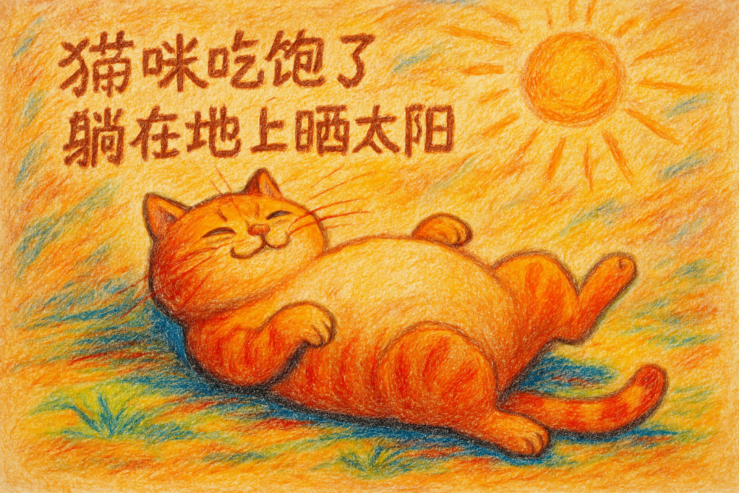
这个过程还挺有意思的,用AI来生成AI的提示词,人类负责提需求和标注。
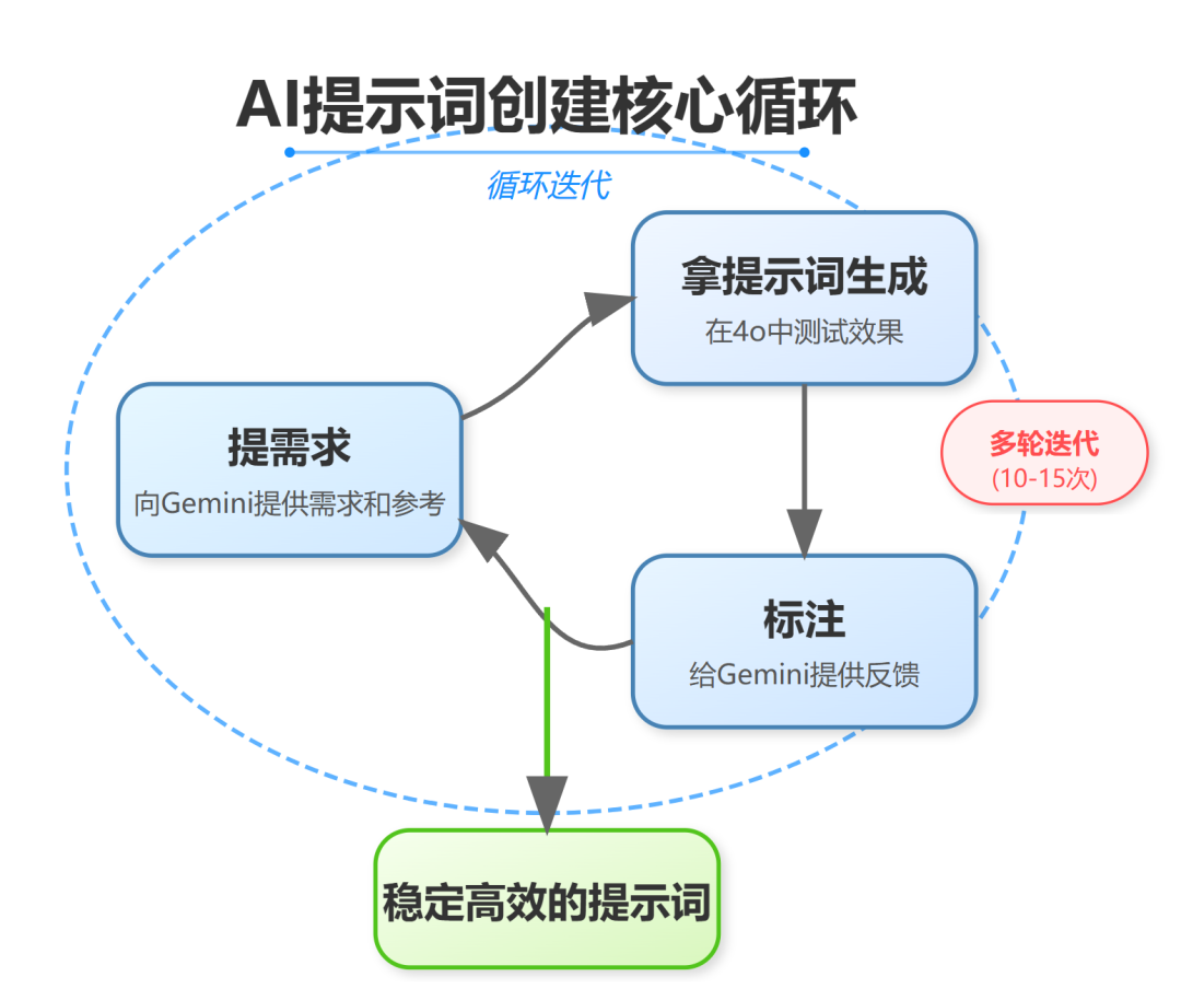
那让我们跟随一个AI漫画科普提示词来看一看如何用Gemini2.5来写提示词吧:
1.打开Gemini开发者模式,选择2.5版本:
https://aistudio.google.com/app/prompts/new_chat
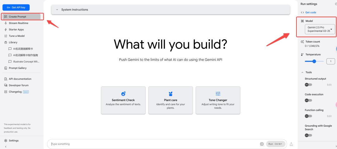
2.输入自己的需求,最好带上参考样例,这样可以让AI更加聚焦。
我这里用的是 @吴熳 老师做的英语卡片,看到了她的卡片,我感觉我可以搞点AI科普卡片出来。
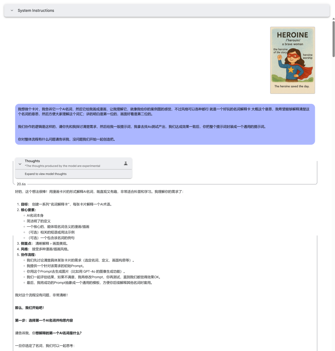
继续和AI沟通,告诉它我们到底要做一件什么样的事情。
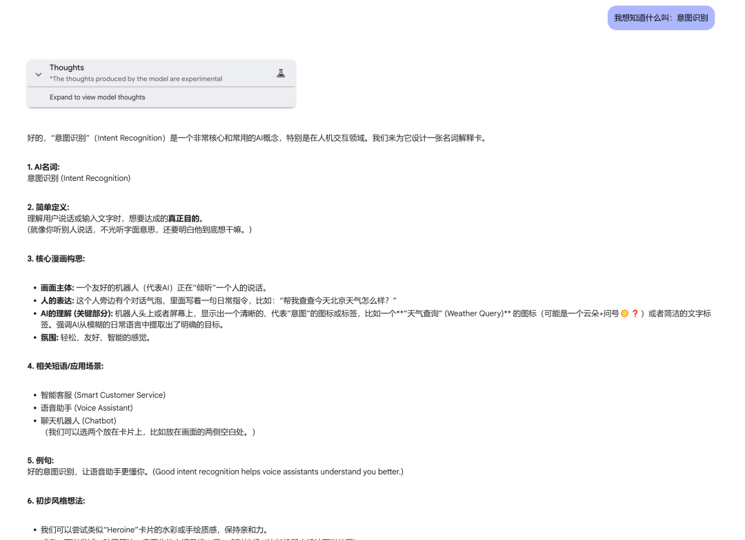
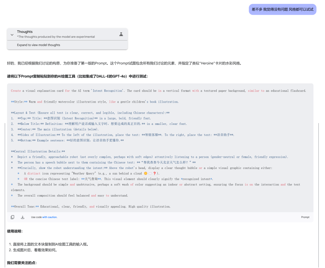
3.根据AI产出的第一版提示词,扔到4o里去测试,看看效果怎么样
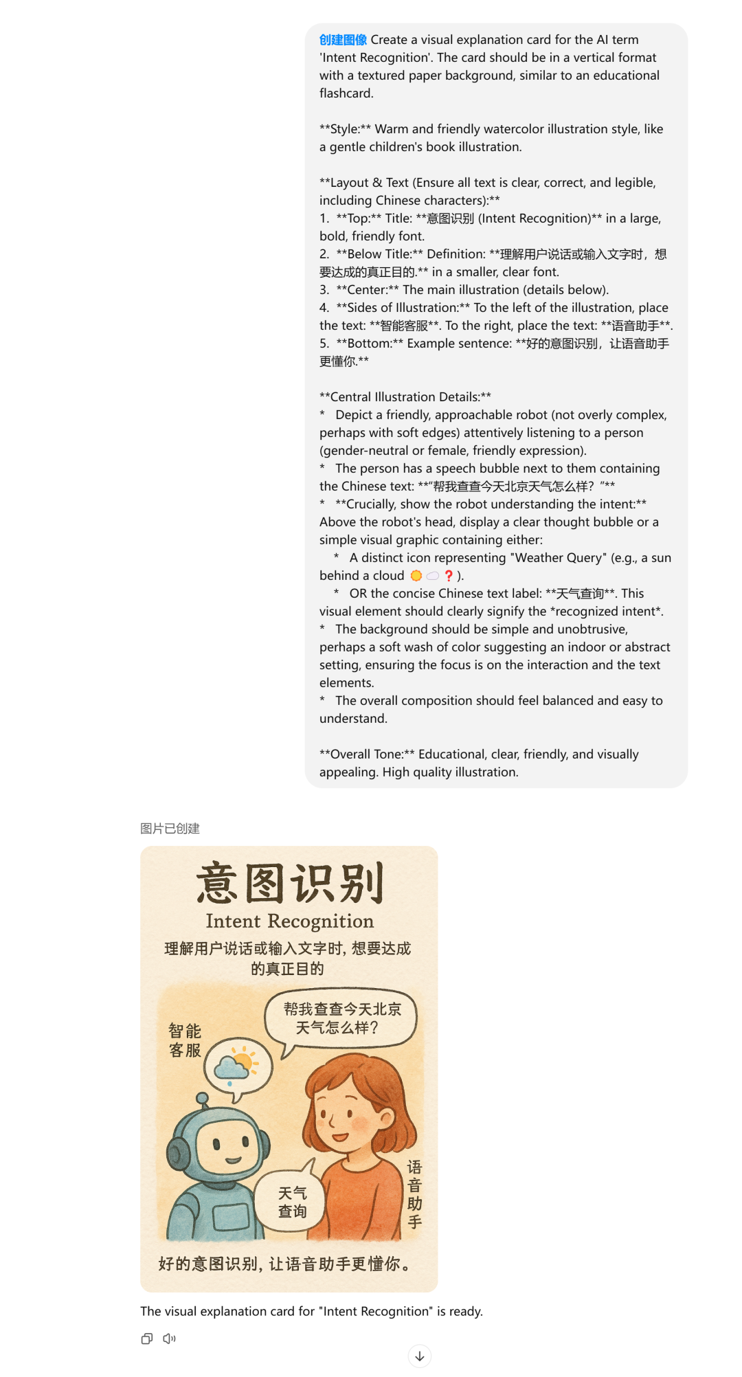
4.拿到4o的结果后,人要给到足够的建议,给Gemini 2.5进行标注,方便Gemini了解如何去优化提示词
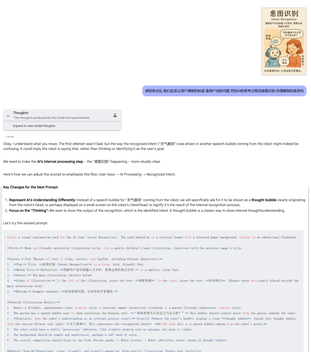
5.反复标注改提示词,直到生成一个满意的为止。
需求越复杂,标注次数越多,我的AI绘画卡标注了十几轮次的对话。
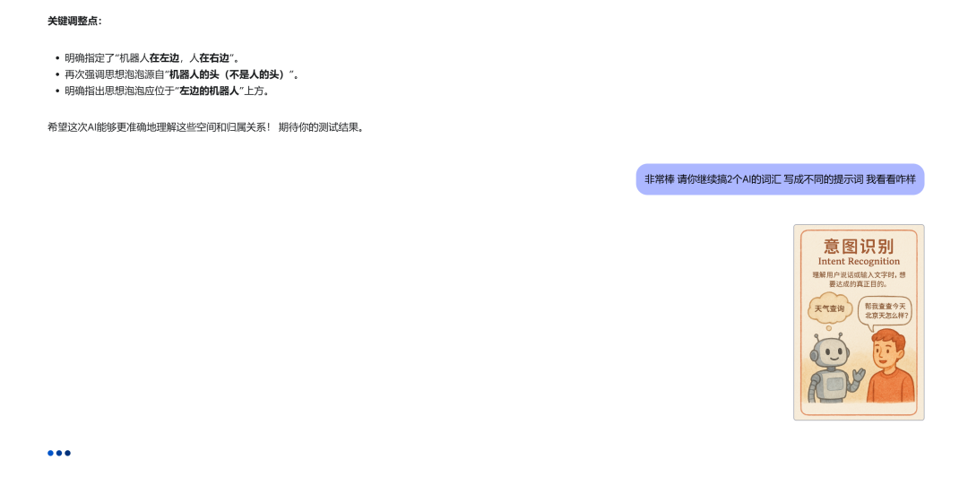
6.标注完了让AI继续产出多个其它内容的提示词,我们去测试效果怎么样,矫正提示词的稳定性。
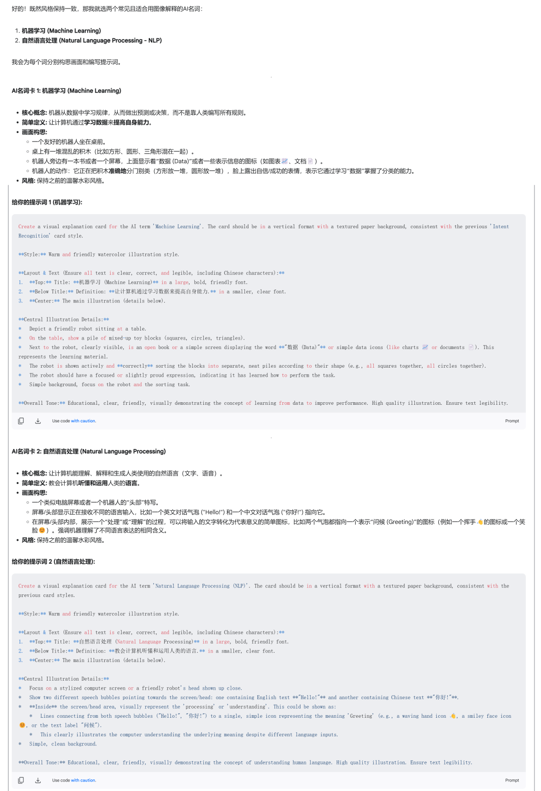
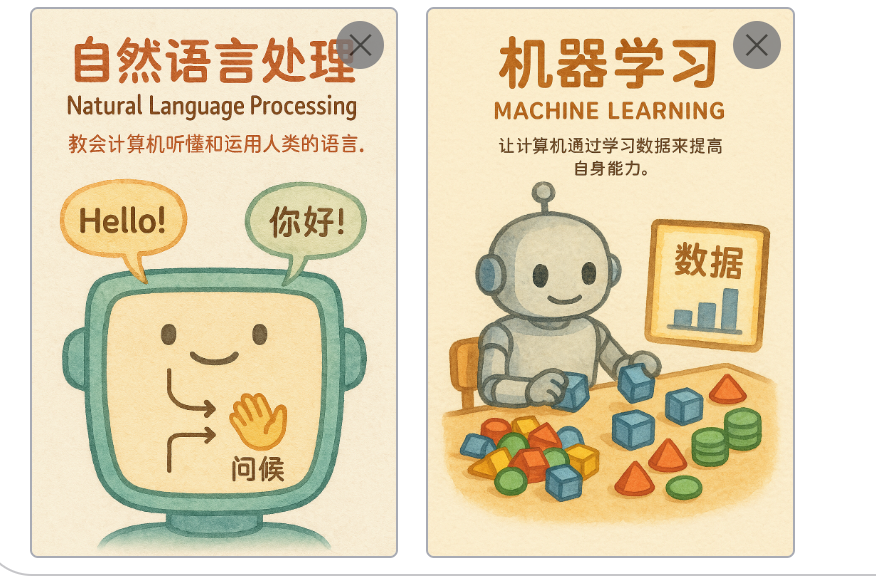
接下来可以选择继续让AI产出提示词,然后一个卡片一个卡片生成。
也可以再萃取一个通用提示词出来,萃取通用提示词我们需要告诉AI明确的需求和结构要求;如果有特定的结构比如我喜欢json,那我会给到参考json。
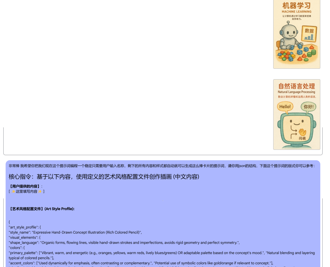
最后难道AI给你的json提示词,继续去4o做测试。
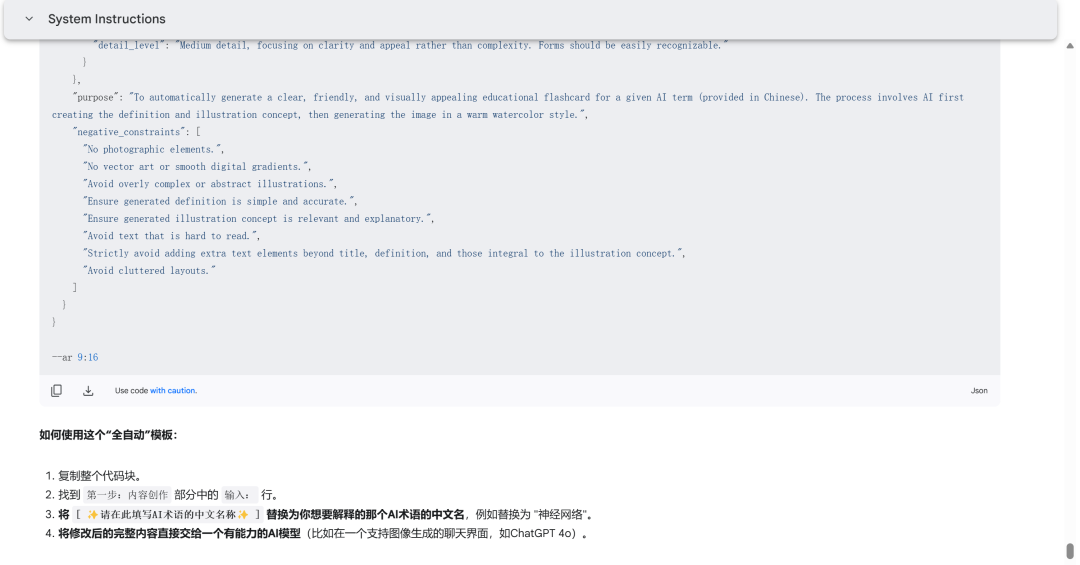
重复标注+测试流程若干次,得到一个稳定性高的提示词。
以下是一些使用Gemini 2.5的技巧:
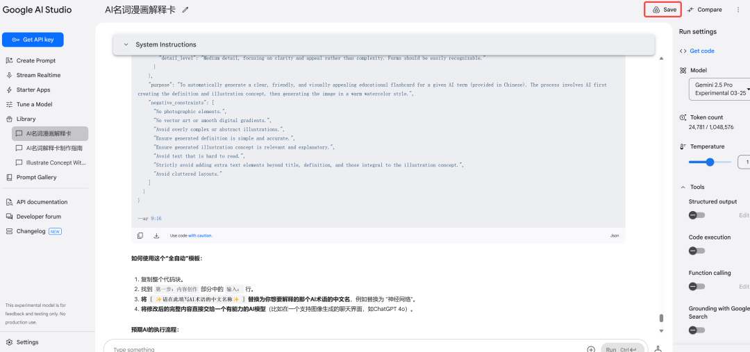
1.记得点save保存,要么刷新网页所有内容都没了。
Gemini的开发者模式是没有自动保存的,如果你跟AI唠嗑了半天没保存不小心关了网页,那么你只能从头开始了。
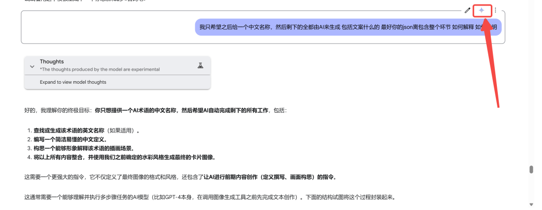
2.觉得Gemini本次回答的不好,可以点这个按钮,让它重新生成
最后是两个提示词,大家需要的自取,全部开源:
– AI彩绘提示词:
## 核心指令:基于以下内容,使用定义的艺术风格配置文件创作插画 (中文内容)
**【用户提供的内容】**:
[ ✨这里填写内容✨ ]
—
**【艺术风格配置文件】(Art Style Profile):**
{
“art_style_profile”: {“style_name”: “Expressive Hand-Drawn Concept Illustration (Rich Colored Pencil)”,
“visual_elements”: {
“shape_language”: “Organic forms, flowing lines, visible hand-drawn strokes and imperfections, avoids rigid geometry and perfect symmetry.”,
“colors”: {
“primary_palette”: [“Vibrant, warm, and energetic (e.g., oranges, yellows, warm reds, lively blues/greens) OR adaptable palette based on the concept’s mood.”, “Natural blending and layering typical of colored pencils.”],
“accent_colors”: [“Used dynamically for emphasis, often contrasting or complementary.”, “Potential use of symbolic colors like gold/orange if relevant to concept.”],
“shading”: “Achieved through layered colored pencil strokes (hatching, cross-hatching, scumbling). Visible stroke direction and texture are KEY. Avoids smooth digital gradients.”
},
“lighting”: {
“type”: “Atmospheric and expressive, enhances mood and form rather than strict realism.”,
“source_direction”: “Variable, dictated by compositional needs and desired mood.”,
“shadow_style”: “Textured shadows built up with pencil strokes, edges can be soft or defined based on stroke density, reflecting the medium.”
},
“materials”: {
“surface_texture”: “**MUST HAVE prominent paper or canvas texture visible throughout.** Pigment texture from colored pencils should be apparent.”,
“reflectivity”: “Very low, matte finish typical of physical media on paper.”
},
“composition”: {
“object_presentation”: “Dynamic, organic arrangement. Elements should feel interconnected, flowing, or actively interacting, centered around a core visual metaphor. **Strictly avoid grid-like or list-like layouts.** **Visual concept takes priority over displaying text.**”,
“perspective”: “Often employs flattened perspective or slight expressive distortion, avoids rigid vanishing points unless conceptually necessary.”,
“background”: “**Visually integrated and conceptually supportive.** Must feature visible hand-drawn texture and strokes. However, the specific execution (e.g., pattern, dominant colors, structure, density of strokes) should **vary significantly based on the user’s content theme and mood**, offering visual distinction between different illustrations. **Avoid repetitive default background treatments (like generic swirls for every image); let the background subtly enhance the specific subject and atmosphere.**”
},
“typography”: {
“font_style”: “**Highly legible Hand-drawn artistic Chinese characters (简体中文).** Clarity is paramount. Style should match the illustration’s energy but prioritize readability. Avoid overly complex or illegible styles.”,
“text_placement”: “**Include a short, descriptive phrase or tagline (perhaps 1-2 short lines, roughly 8-20 characters total, flexible) derived from the user’s content that captures the core purpose, benefit, or feeling.** This text should be clearly readable, artistically integrated as a significant visual element, adding descriptive value beyond just a title. It must enhance understanding without overwhelming the visuals. **Aim for meaningful description, not just keywords.**”,
“color”: “Harmonizes with the overall color palette, ensuring **strong contrast** for readability.”
},
“rendering_style”: {
“technique”: “**Simulated Rich Colored Pencil on Textured Paper.** Focus on capturing the tactile quality.”,
“detail_level”: “Medium to high detail in texture and stroke work, while forms remain expressive and potentially simplified. Focus on ‘soul’ over photorealism.”
}
},“purpose”: “To generate a conceptually driven, emotionally resonant illustration that leverages the unique aesthetic and tactile qualities of hand-drawn colored pencil art to interpret the user’s input, **communicating primarily through visuals, thoughtfully enhanced by a meaningful, descriptive, yet concise hand-drawn text phrase or tagline that is seamlessly integrated.**”,
“negative_constraints”: [
“No photographic elements.”,
“No smooth, vector-like gradients or fills.”,
“No perfectly straight lines or geometric precision (unless part of the concept).”,
“No standard computer fonts.”,
“No non-Chinese text.”,
“Avoid overly clean, sterile digital look.”,
“Avoid literal, uninspired interpretations of the input.”,
“**Avoid lengthy sentences, multiple paragraphs, or purely informational text blocks.**”,
“**Avoid text that is difficult to read due to style, size, or placement.**”,
“**Avoid layouts where text visually dominates the artwork.**”,
“**Avoid highly repetitive background patterns across different images unless conceptually justified.**”
]
}}
–ar 9:16
– AI科普卡提示词:
## 核心指令:为用户提供的AI术语中文名称,自动创作并生成一张解释卡片插画。
**第一步:内容创作(由AI完成)**
* **输入:** 用户仅提供AI术语的中文名称: **[ ✨强化学习✨ ]**
* **任务:**
1. **确定英文名称:** 查找或生成该术语对应的常用英文名称。
2. **撰写中文定义:** 创作一句简洁、清晰、易于理解的中文定义,解释该术语的核心含义。定义应适合科普性质的卡片。
3. **构思插画场景:**
* 思考如何用一个具体的、视觉化的场景或比喻来解释这个术语。
* 场景应易于理解,能直观传达术语的关键概念。
* 描述这个场景,包括必要的元素(人物、物品、动作、符号等)及其互动方式。**这个描述将作为下面图像生成的主要依据。**
**第二步:图像生成(基于第一步创作的内容,使用定义的艺术风格)**
* **使用以下【艺术风格配置文件】和第一步生成的内容(英文名、定义、插画场景描述)来创作最终的卡片图像。**
—
**【艺术风格配置文件】(Art Style Profile):**
{
“art_style_profile”: {“style_name”: “Warm FriendlyWatercolor Educational Card”,
“visual_elements”: {
“shape_language”: “Soft edges, friendly and approachable forms, simple and clear shapes suitable for easy understanding.”,
“colors”: {
“primary_palette”: [“Warm and inviting colors (e.g., soft oranges, yellows, gentle blues, light greens). Palette should feel cohesive and pleasant.”],
“accent_colors”: [“Used subtly for emphasis where needed, maintaining overall harmony.”],
“shading”: “Achieved through soft watercolor washes and layering. Avoid harsh lines or complex gradients. Texture should suggest watercolor on paper.”
},
“lighting”: {
“type”: “Simple, clear, and even lighting. Focus is on clarity, not dramatic effect.”,
“source_direction”: “Generally frontal or ambient.”,
“shadow_style”: “Soft, subtle shadows using watercolor washes.”
},
“materials”: {
“surface_texture”: “**MUST HAVE a visible, consistent textured paper background throughout the card.** Illustrations should have a gentle watercolor texture.”,
“reflectivity”: “Low, matte finish typical of watercolor on paper.”
},
“composition”: {
“object_presentation”: “**Central illustration clearly depicting the concept described in the AI-GENERATED ‘illustration_concept’ from Step 1.** Focus on the interaction or process being explained. Layout should be clean and uncluttered.”,
“perspective”: “Simple, often flattened 2D perspective for clarity.”,
“background”: “Subtle, unobtrusive background, often a light color wash or the textured paper itself, ensuring focus remains on the central illustration and text.”
},
“typography”: {
“font_style”: “**Legible, friendly font for all text (Chinese and English).** Simplicity and readability are paramount. Avoid overly decorative fonts.”,
“text_placement”: [
“**Top:** Large, bold title containing the AI Term (Chinese first, AI-GENERATED English name below or beside in parentheses).”,
“**Below Title:** Smaller font size for the AI-GENERATED definition.”,
“**NO other text elements** unless part of the AI-GENERATED illustration concept itself.”
],
“color”: “Dark, highly readable color (e.g., dark brown, black, or a dark tone harmonious with the palette) ensuring strong contrast against the background.”
},
“rendering_style”: {
“technique”: “**Simulated Warm Watercoloron Textured Paper.** Focus on a gentle, friendly, hand-drawn feel.”,
“detail_level”: “Medium detail, focusing on clarity and appeal rather than complexity. Forms should be easily recognizable.”
}
},“purpose”: “To automatically generate a clear, friendly, and visually appealing educational flashcard for a given AI term (provided in Chinese). The process involves AI first creating the definition and illustration concept, then generating the image in a warm watercolor style.”,
“negative_constraints”: [
“No photographic elements.”,
“No vector art or smooth digital gradients.”,
“Avoid overly complex or abstract illustrations.”,
“Ensure generated definition is simple and accurate.”,
“Ensure generated illustration concept is relevant and explanatory.”,
“Avoid text that is hard to read.”,
“Strictly avoid adding extra text elements beyond title, definition, and those integral to the illustration concept.”,
“Avoid cluttered layouts.”
]
}}
–ar 9:16
本文由人人都是产品经理作者【云舒】,微信公众号:【云舒的AI观察笔记】,原创/授权 发布于人人都是产品经理,未经许可,禁止转载。
题图来自Unsplash,基于 CC0 协议。
此内容由惯性聚合(RSS阅读器)自动聚合整理,仅供阅读参考。 原文来自 — 版权归原作者所有。