






前言
温馨提示:本日记本只提供魔改参考,并不做通用处理,很多源码修改都需要根据自己博客做小小微调
另外在修改源码时注意做好备份处理。本帖只提供思路与方法,如果哪里炸了,请检查语法与缩进等,猹概不负责啦!
继白嫖店长、冰老师、小康、小N等大佬的魔改之后,猹终于不满于白嫖,开始想动手实操,把自己的博客调教成想要的样子,也以此来使猹学前端有实操的机会。
当然在整个站点还没修改完之前,这些魔改内容只会在猹的魔改测试站出现。你可以在测试站点进行预览。(当然测试站点会有非常多的bug和还没调的设置和样式,这些也不需要和猹吐槽)在魔改完成之前主站也不会再做任何样式调整
注:这部分前言内容会在魔改日记本的每一篇都出现;另外这是一篇日记而非教程,文风可能不是那么友好(逃
小菜单的调整
缘由
其实小菜单的魔改要从上篇日记说起。双栏变单栏,就需要把侧边栏有用的部分提取出来。对于我而言,侧边栏最有用的莫过于作者卡片和文章页的目录,至于统计也算稍稍有用(数据咱还是偶尔要康康的嘛),这个可以丢页脚。
在上篇日记中,我已经实现了侧边菜单栏集成作者卡片。但是侧栏只有移动端具备,电脑端整一个侧边菜单栏显然不合适。那么小菜单就成了丢作者卡片的好去处。而目录丢小菜单也是再合适不过了,本来butterfly主题的移动端也是这么干的。现在就差怎么设计合适了。
我前前后后想过了好多个方案,有类似于两侧加雷姆角标的(来自火喵的建议,想试试的可以直接引入<script src="https://cdn1.tianli0.top/gh/fz6m/lamu-leimu-button@1.2/dist/lamu-leimu.min.js"></script> # 拉姆雷姆角标参考;还有类似书签一样的侧边菜单;最后写了现在这版
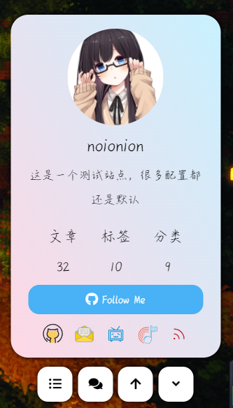
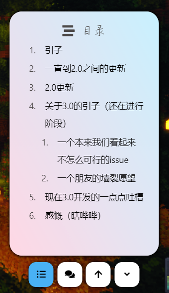
另外其实这篇魔改大部分是可以直接用的(只要你只限于我开的这些功能的话
基础面板布局和样式
本身卡片直接从侧边栏的源码直接扒就有,只有样式和JS函数算是对于我来讲真正麻烦的东西。毕竟是个前端大白菜,很多东西还是得一步一步来。
首先是html的原本代码。除开目录页,小功能菜单显然能在电脑端时有作者卡片、跳转最顶和展开关闭,而在文章页(这个判断hexo有内部函数可以实现)则必须有目录和评论跳转功能。最基本的几项功能就有了。因为展开和关闭写在一起再用js、css去完成动画的变化显然比分开写两个要难,所以不如写两个再去控制显隐吧。
把原先的[root]\themes\butterfly\layout\includes\rightside.pug备份,重写一份代码
    //- 作者UI卡片

      .is-center
        .avatar-img
          img(src=url_for(theme.avatar.img) onerror=`this.onerror=null;this.src='` + url_for(theme.error_img.flink) + `'` alt="avatar")
        .author-info__name= config.author
        .author-info__description!= theme.aside.card_author.description || config.description

      .site-data
        if site.posts.length
          .data-item.is-center
            .data-item-link
              a(href=url_for(config.archive_dir) + '/')
                .headline= _p('aside.articles')
                .length-num= site.posts.length

        if site.tags.length
          .data-item.is-center
            .data-item-link
              a(href=url_for(config.tag_dir) + '/' )
                .headline= _p('aside.tags')
                .length-num= site.tags.length

        if site.categories.length
          .data-item.is-center
            .data-item-link
              a(href=url_for(config.category_dir) + '/')
                .headline= _p('aside.categories')
                .length-num= site.categories.length

      //- begin follow_me按钮
      if theme.aside.card_author.button.enable
        a
          i(class=theme.aside.card_author.button.icon)
          span=theme.aside.card_author.button.text
      //- end

      //- begin 社交
      if(theme.social)
        .menu-info-social-icons.is-center
          !=fragment_cache('social', function(){return partial('includes/header/social')})
      //- end


      //- 繁简体切换
        button
          i.fas.fa-cog.fa-spin
      //- 目录
      if is_post()
        button
          i.fas.fa-list-ul
      //- 跳转评论
      if is_post()
        button
          i.fas.fa-comments
      //- 跳转最上
      button
        i.fas.fa-arrow-up
      //- 菜单展开/关闭
      button
        i.fas.fa-angle-up
      button
        i.fas.fa-angle-down
html的基本架构就有了
现在来考虑每一部分的css。这里就不唠嗑咋写的了,不断调试出真知喽(记得不忘黑夜模式)
rightside-menu
  position: absolute
  transform: translate(-13rem, -21rem)
  #rightside-avatar-card
    box-shadow: 0 0 5px #000
    background: linear-gradient(60deg, #ffd7e4 0%, #c8f1ff 100%)
    border-radius: 1rem
    padding: 0.5rem 1rem 0.5rem 1rem
    width: 12rem
    height: 19.6rem
    display: none

    font-family: 'aqqxs', sans-serif
    #rightside-avatar
      margin-top: 0.3rem

    .site-data
      margin-top: 0.5rem
      display: table
      padding: 0 0.5rem
      width: 100%
      table-layout: fixed
      .data-item
        display: table-cell

    .headline
      font-size: 0.875rem
      color: #000
    .length-num
      font-size: 0.8rem !important
      color: #000
    .author-info__name
      color: #000
    .author-info__description
      color: #000

    .author-info__name
      font-weight: 500
      font-size: 1.57em

    #card-info-btn
      display: block
      margin: 0.3rem 0 0 0
      background-color: var(--btn-bg)
      color: var(--btn-color)
      text-align: center
      line-height: 2.4
      overflow: hidden
      border-radius: 0.625rem

    .menu-info-social-icons
      margin: 0.5rem 0 0 0
      .social-icon
        display: inline
        padding: 0 0.3rem 0 0.3rem

  #rightside-menus
    padding: 0.5rem 1rem 0.5rem 1rem
    width: 12rem
    transform: translateY(19.6rem)
    #rightside-childmenu-contents
    #rightside-childmenu-comment
      visibility: hidden
    #rightside-childmenu-fold
      display: none

    button
      box-shadow: 0 0 5px #000
      height: 2rem
      width: 2rem
      border-radius: 0.6rem
      background: var(--card-bg)
      margin: 0 0.15rem 0 0.15rem

[data-theme="dark"]
  #rightside-menu
    #rightside-avatar-card
      box-shadow: 0 0 5px #fff
      background: linear-gradient(60deg, #2c0c16 0%, #043749 100%)
      .author-info__name
      .author-info__description
      .headline
      .length-num
        color: #fff
    #rightside-menus
      button
        box-shadow: 0 0 5px #fff
        background: #000
        .fas
          color: #fff
样子基本成行啦(正常而言的显隐状态也已经写进上面的代码里了)
目录布局和样式
按照这个布局,我们其实只需要在作者卡片相同位置上覆盖一层相同块大小的目录即可。这样空间也不会显得太挤。
所以再加入新的html和css来描述目录和样式(一般而言鼠标在停留于目录某一项时,此项重点突出会更好一点,所以给他加上了hover的样式。至于追踪页面定位目录调项,这咱还不会就没做)
if is_post()

    //- - let tocNumber = page.toc_number !== undefined ? page.toc_number : theme.toc.number

      .item-headline.is-center
        i.fas.fa-stream
        span= _p('aside.card_toc')

      if (page.encrypt == true)
        .toc-content.toc-div-class(style="display:none")!=toc(page.origin, {list_number: tocNumber})
      else
        .toc-content!=toc(page.content, {list_number: tocNumber})
#rightside-contents
  position: absolute
  transform: translate(-13rem, -21rem)
  display: none
  #card-toc
    box-shadow: 0 0 5px #000
    background: linear-gradient(60deg, #ffd7e4 0%, #c8f1ff 100%)
    border-radius: 1rem
    padding: 0.5rem 1rem 0.5rem 1rem
    width: 12rem
    height: 19.6rem
    .item-headline
      font-size: 1rem
      span
        margin-left: 0.5rem
        font-family: 'aqqxs', sans-serif
    span.toc-text
      color: #000
    .toc
      width: 105%
      overflow-y: scroll
      height: 16.3rem
      margin-top: -0.3rem
      margin-left: -0.7rem
      .toc-child
        margin-left: -1rem
      &::-webkit-scrollbar
        width: 0
    .toc-link
      display: block
      padding-left: .3rem
      border-left: 3px solid transparent
      color: var(--toc-link-color)
      transition: all 0.6s ease-in-out
      margin: 0.1rem 0 0.1rem 0.1rem
      &:hover
        background: var(--btn-bg)
        border-radius: 0.4rem
        box-shadow: 0 0 0.2rem #000
        margin: 0.3rem 0 0.3rem 0.1rem
        span.toc-text
          color: #fff

[data-theme="dark"]
  #rightside-contents
    #card-toc
      background: linear-gradient(60deg, #2c0c16 0%, #043749 100%)
      span.toc-text
        color: #fff
各个按钮的功能
这个对于我应该算是最难的吧,毕竟没学过js。所以就查了一下原先的js来进行仿写。(如果熟悉bf源码的会发现我有好多都是源码直接扣过来的)
这里涉及的函数应该有三项,小菜单的展开和关闭、目录的展开和关闭、还有跳转顶部。跳转顶部最好解决,可以直接抄源码。而其他块元素的显示隐藏一般有两种,一是写两套样式,然后用js给对应块套类(店长的方法,可惜我懒,咱不想写两套);另一种是直接对块进行显隐控制。
这里咱吃了大亏,因为display: none会使元素的体积被忽略,咱为了少写个校准便宜就直接用了visibility: visible/hidden。visibility的原理是让浏览器重写样式,比如令元素不可见,层次比较多的元素不会一次性消失,而是一个个消失(这就特别怪异)
最后还是写偏移了
document.addEventListener('DOMContentLoaded', function () {
  const rightSideFn = {
    showBtn: () => {
      if (window.innerWidth > 900) {
        document.getElementById('rightside-avatar-card').style.display = "inline-block"
        document.getElementById('rightside-menus').style.transform = "translateY(0)"
      }
      document.getElementById('rightside-childmenu-unfold').style.display = "none"
      document.getElementById('rightside-childmenu-fold').style.display = "inline-block"
      document.getElementById('rightside-childmenu-contents').style.visibility = "visible"
      document.getElementById('rightside-childmenu-comment').style.visibility = "visible"
    },

    hideBtn: () => {
      document.getElementById('rightside-avatar-card').style.display = "none"
      document.getElementById('rightside-childmenu-unfold').style.display = "inline-block"
      document.getElementById('rightside-childmenu-fold').style.display = "none"
      document.getElementById('rightside-menus').style.transform = "translateY(19.6rem)"
      document.getElementById('rightside-contents').style.display = "none"
      document.getElementById('rightside-childmenu-contents').style.background = "var(--card-bg)"
      document.getElementById('rightside-childmenu-contents').style.visibility = "hidden"
      document.getElementById('rightside-childmenu-comment').style.visibility = "hidden"
    },

    ShowOrHideContent: () =>{
      if (document.getElementById('rightside-contents').style.display == "inline-block") {
        document.getElementById('rightside-contents').style.display = "none"
        document.getElementById('rightside-childmenu-contents').style.background = "var(--card-bg)"
      }
      else {
        document.getElementById('rightside-contents').style.display = "inline-block"
        document.getElementById('rightside-childmenu-contents').style.background = "var(--btn-bg)"
      }
      event.stopPropagation()
    },

    scrollToTop: () => {
      btf.scrollToDest(0, 500)
    }
  }

  document.getElementById('rightside').addEventListener('click', function (e) {
    const $target = e.target.id || e.target.parentNode.id
    switch ($target) {
      case 'rightside-childmenu-go-up':
        rightSideFn.scrollToTop()
        break
      case 'rightside-childmenu-unfold':
        rightSideFn.showBtn()
        break
      case 'rightside-childmenu-fold':
        rightSideFn.hideBtn()
        break
      case 'rightside-childmenu-contents':
        rightSideFn.ShowOrHideContent()
        break
      default:
        break
    }
  })
细节修改
大体上面的已经可以做完了,但咱魔改自己的站点,那肯定是希望精益求精。电脑端时看不出啥问题了,就从移动端下手喽
手机看小菜单时总觉得不居中奇奇怪怪的;因为在手机时作者卡片是不需要显示了(侧边菜单栏有了),首页那个展开也展开不出啥来,不如干脆默认展开;最后是目录,移动端可能在展开目录想收起时是点目录外区域而非点目录按钮。
于是我针对移动端做了css和js的一点点修复
@media screen and (max-width: 900px)
  #rightside
    height: 2rem
    width: 12rem
    margin: auto
    left: 38px
    #rightside-menu
      transform: translate(0, -18rem)
      #rightside-childmenu-unfold
        display: none
      #rightside-childmenu-contents
      #rightside-childmenu-comment
        visibility: visible
      button
        height: 1.5rem
        width: 1.5rem
    #rightside-contents
      transform: translate(0, -18rem)
document.addEventListener("click", function(event){
  if (document.getElementById('rightside-contents').style.display == "inline-block" && window.innerWidth <= 900)
    rightSideFn.ShowOrHideContent()
})
document.getElementById('rightside').addEventListener("click", function(event){
  event = event || window.event
  event.stopPropagation()
})
复制提醒和F12禁用与提醒
这个是根据火喵酱的利用element显示Notification通知,复制提醒,禁用F12或右键菜单提醒来做的(我写的时候这个笨蛋火喵把cdn写错了,导致我以为hexo不能直接用这玩意)
引入vue组件(我很想把这个去掉的)和alement组件库/样式表
<!-- 引入VUE -->
<script src="https://cdn1.tianli0.top/npm/vue@2.6.14/dist/vue.min.js"></script>
<!-- 引入样式 -->
<script src="https://cdn1.tianli0.top/npm/element-ui@2.15.6/lib/index.js"></script>
<!-- 引入组件库 -->
<link rel="stylesheet" href="https://cdn1.tianli0.top/npm/element-ui@2.15.6/packages/theme-chalk/lib/index.css">
然后js引入
document.addEventListener("copy",function(e){
  new Vue({
    data:function(){
      this.$notify({
        title:"哎嘿!复制成功",
        message:"若要转载请务必保留原文链接!猹分你个瓜!",
        position: 'bottom-right',
        offset: 50,
        showClose: false,
        type:"success"
      });
      return{visible:false}
    }
  })
})


document.onkeydown = function () {
  if (window.event && window.event.keyCode == 123) {
    event.keyCode = 0;
    event.returnValue = false;
    new Vue({
      data:function(){
        this.$notify({
          title:"啊啊!你干嘛啊!",
          message:"怎么能随随便便想扒猹的底裤呢?坏!",
          position: 'bottom-right',
          offset: 50,
          showClose: false,
          type:"error"
        });
        return{visible:false}
      }
    })
    return false;
  }
};
即可享用(魔改测试站的控制台如果打开,会看到我的一段话哦(感觉貌似有点涩
完整的代码
这篇魔改的大部分都是可以直接拿去用的(小菜单阉割了好多功能所以要就自己加喽),所以就放完整的源码以供参考了
rightside.pug须替换源码
    //- 作者UI卡片

      .is-center
        .avatar-img
          img(src=url_for(theme.avatar.img) onerror=`this.onerror=null;this.src='` + url_for(theme.error_img.flink) + `'` alt="avatar")
        .author-info__name= config.author
        .author-info__description!= theme.aside.card_author.description || config.description

      .site-data
        if site.posts.length
          .data-item.is-center
            .data-item-link
              a(href=url_for(config.archive_dir) + '/')
                .headline= _p('aside.articles')
                .length-num= site.posts.length

        if site.tags.length
          .data-item.is-center
            .data-item-link
              a(href=url_for(config.tag_dir) + '/' )
                .headline= _p('aside.tags')
                .length-num= site.tags.length

        if site.categories.length
          .data-item.is-center
            .data-item-link
              a(href=url_for(config.category_dir) + '/')
                .headline= _p('aside.categories')
                .length-num= site.categories.length

      //- begin follow_me按钮
      if theme.aside.card_author.button.enable
        a
          i(class=theme.aside.card_author.button.icon)
          span=theme.aside.card_author.button.text
      //- end

      //- begin 社交
      if(theme.social)
        .menu-info-social-icons.is-center
          !=fragment_cache('social', function(){return partial('includes/header/social')})
      //- end


      //- 繁简体切换
        button
          i.fas.fa-cog.fa-spin
      //- 目录
      if is_post()
        button
          i.fas.fa-list-ul
      //- 跳转评论
      if is_post()
        button
          i.fas.fa-comments
      //- 跳转最上
      button
        i.fas.fa-arrow-up
      //- 菜单展开/关闭
      button
        i.fas.fa-angle-up
      button
        i.fas.fa-angle-down

  if is_post()

      //- - let tocNumber = page.toc_number !== undefined ? page.toc_number : theme.toc.number

        .item-headline.is-center
          i.fas.fa-stream
          span= _p('aside.card_toc')

        if (page.encrypt == true)
          .toc-content.toc-div-class(style="display:none")!=toc(page.origin, {list_number: tocNumber})
        else
          .toc-content!=toc(page.content, {list_number: tocNumber})
CSS(STYLUS)源码(自行引入)
#rightside-menu
  position: absolute
  transform: translate(-13rem, -21rem)
  #rightside-avatar-card
    box-shadow: 0 0 5px #000
    background: linear-gradient(60deg, #ffd7e4 0%, #c8f1ff 100%)
    border-radius: 1rem
    padding: 0.5rem 1rem 0.5rem 1rem
    width: 12rem
    height: 19.6rem
    display: none

    font-family: 'aqqxs', sans-serif
    #rightside-avatar
      margin-top: 0.3rem

    .site-data
      margin-top: 0.5rem
      display: table
      padding: 0 0.5rem
      width: 100%
      table-layout: fixed
      .data-item
        display: table-cell

    .headline
      font-size: 0.875rem
      color: #000
    .length-num
      font-size: 0.8rem !important
      color: #000
    .author-info__name
      color: #000
    .author-info__description
      color: #000

    .author-info__name
      font-weight: 500
      font-size: 1.57em

    #card-info-btn
      display: block
      margin: 0.3rem 0 0 0
      background-color: var(--btn-bg)
      color: var(--btn-color)
      text-align: center
      line-height: 2.4
      overflow: hidden
      border-radius: 0.625rem

    .menu-info-social-icons
      margin: 0.5rem 0 0 0
      .social-icon
        display: inline
        padding: 0 0.3rem 0 0.3rem

  #rightside-menus
    padding: 0.5rem 1rem 0.5rem 1rem
    width: 12rem
    transform: translateY(19.6rem)
    #rightside-childmenu-contents
    #rightside-childmenu-comment
      visibility: hidden
    #rightside-childmenu-fold
      display: none

    button
      box-shadow: 0 0 5px #000
      height: 2rem
      width: 2rem
      border-radius: 0.6rem
      background: var(--card-bg)
      margin: 0 0.15rem 0 0.15rem

#rightside-contents
  position: absolute
  transform: translate(-13rem, -21rem)
  display: none
  #card-toc
    box-shadow: 0 0 5px #000
    background: linear-gradient(60deg, #ffd7e4 0%, #c8f1ff 100%)
    border-radius: 1rem
    padding: 0.5rem 1rem 0.5rem 1rem
    width: 12rem
    height: 19.6rem
    .item-headline
      font-size: 1rem
      span
        margin-left: 0.5rem
        font-family: 'aqqxs', sans-serif
    span.toc-text
      color: #000
    .toc
      width: 105%
      overflow-y: scroll
      height: 16.3rem
      margin-top: -0.3rem
      margin-left: -0.7rem
      .toc-child
        margin-left: -1rem
      &::-webkit-scrollbar
        width: 0
    .toc-link
      display: block
      padding-left: .3rem
      border-left: 3px solid transparent
      color: var(--toc-link-color)
      transition: all 0.6s ease-in-out
      margin: 0.1rem 0 0.1rem 0.1rem
      &:hover
        background: var(--btn-bg)
        border-radius: 0.4rem
        box-shadow: 0 0 0.2rem #000
        margin: 0.3rem 0 0.3rem 0.1rem
        span.toc-text
          color: #fff

.el-notification
  box-shadow: 0 0 10px #000

[data-theme="dark"]
  #rightside-menu
    #rightside-avatar-card
      box-shadow: 0 0 5px #fff
      background: linear-gradient(60deg, #2c0c16 0%, #043749 100%)
      .author-info__name
      .author-info__description
      .headline
      .length-num
        color: #fff
    #rightside-menus
      button
        box-shadow: 0 0 5px #fff
        background: #000
        .fas
          color: #fff

  #rightside-contents
    #card-toc
      background: linear-gradient(60deg, #2c0c16 0%, #043749 100%)
      span.toc-text
        color: #fff

  .el-notification
    box-shadow: 0 0 10px #fff


@media screen and (max-width: 900px)
  #rightside
    height: 2rem
    width: 12rem
    margin: auto
    left: 38px
    #rightside-menu
      transform: translate(0, -18rem)
      #rightside-childmenu-unfold
        display: none
      #rightside-childmenu-contents
      #rightside-childmenu-comment
        visibility: visible
      button
        height: 1.5rem
        width: 1.5rem
    #rightside-contents
      transform: translate(0, -18rem)
JS源码(须与alement的cdn一起自行引入)
document.addEventListener('DOMContentLoaded', function () {
  const rightSideFn = {
    showBtn: () => {
      if (window.innerWidth > 900) {
        document.getElementById('rightside-avatar-card').style.display = "inline-block"
        document.getElementById('rightside-menus').style.transform = "translateY(0)"
      }
      document.getElementById('rightside-childmenu-unfold').style.display = "none"
      document.getElementById('rightside-childmenu-fold').style.display = "inline-block"
      document.getElementById('rightside-childmenu-contents').style.visibility = "visible"
      document.getElementById('rightside-childmenu-comment').style.visibility = "visible"
    },

    hideBtn: () => {
      document.getElementById('rightside-avatar-card').style.display = "none"
      document.getElementById('rightside-childmenu-unfold').style.display = "inline-block"
      document.getElementById('rightside-childmenu-fold').style.display = "none"
      document.getElementById('rightside-menus').style.transform = "translateY(19.6rem)"
      document.getElementById('rightside-contents').style.display = "none"
      document.getElementById('rightside-childmenu-contents').style.background = "var(--card-bg)"
      document.getElementById('rightside-childmenu-contents').style.visibility = "hidden"
      document.getElementById('rightside-childmenu-comment').style.visibility = "hidden"
    },

    ShowOrHideContent: () =>{
      if (document.getElementById('rightside-contents').style.display == "inline-block") {
        document.getElementById('rightside-contents').style.display = "none"
        document.getElementById('rightside-childmenu-contents').style.background = "var(--card-bg)"
      }
      else {
        document.getElementById('rightside-contents').style.display = "inline-block"
        document.getElementById('rightside-childmenu-contents').style.background = "var(--btn-bg)"
      }
      event.stopPropagation()
    },

    scrollToTop: () => {
      btf.scrollToDest(0, 500)
    }
  }

  document.getElementById('rightside').addEventListener('click', function (e) {
    const $target = e.target.id || e.target.parentNode.id
    switch ($target) {
      case 'rightside-childmenu-go-up':
        rightSideFn.scrollToTop()
        break
      case 'rightside-childmenu-unfold':
        rightSideFn.showBtn()
        break
      case 'rightside-childmenu-fold':
        rightSideFn.hideBtn()
        break
      case 'rightside-childmenu-contents':
        rightSideFn.ShowOrHideContent()
        break
      default:
        break
    }
  })


  document.addEventListener("click", function(event){
    if (document.getElementById('rightside-contents').style.display == "inline-block" && window.innerWidth <= 900)
      rightSideFn.ShowOrHideContent()
  })
  document.getElementById('rightside').addEventListener("click", function(event){
    event = event || window.event
    event.stopPropagation()
  })


  document.addEventListener("copy",function(e){
    new Vue({
      data:function(){
        this.$notify({
          title:"哎嘿!复制成功",
          message:"若要转载请务必保留原文链接!猹分你个瓜!",
          position: 'bottom-right',
          offset: 50,
          showClose: false,
          type:"success"
        });
        return{visible:false}
      }
    })
  })


  document.onkeydown = function () {
    if (window.event && window.event.keyCode == 123) {
      event.keyCode = 0;
      event.returnValue = false;
      new Vue({
        data:function(){
          this.$notify({
            title:"啊啊!你干嘛啊!",
            message:"怎么能随随便便想扒猹的底裤呢?坏!",
            position: 'bottom-right',
            offset: 50,
            showClose: false,
            type:"error"
          });
          return{visible:false}
        }
      })
      return false;
    }
  };
})