


为了更好的阅读体验,在阅读本文之前,你需要对 Compose 或者 Flutter (实在太像了) 有过基础的了解 Compose 虽然发布已经快一个月了。但是真正用到项目中的应该是少之又少了。靠着以前写 Flutter 积累的少许经验,最近决定试试水,在项目中使用,接下来大概率会更新一些在使用
Compose遇到的问题
日常开发中,类似下面这中搜索功能应该是很常见的需求了,接下来我们就来实现它 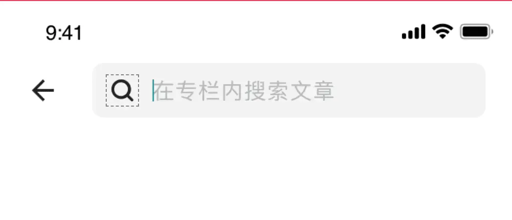
TextField 提供了很多的参数用法,我们先参照 Google 开发文档的基础用法尝试完成以下 UI 给的样式。 稍微了解的同学都知道这个实现起来很简单:row + icon + TextField 完事 还是贴一下简单的代码吧。主要看 TextField 部分
var text by remember { mutableStateOf("") }
    Row(
        Modifier
            .fillMaxWidth()
            .padding(end = 20.dp, start = 10.dp)
            .background(Color.White),
        verticalAlignment = Alignment.CenterVertically
    ) {
···· 省略 ····
        TextField(
            value = text,
            onValueChange = {
                text = it
                onValueChange.invoke(it)
            },
            singleLine = true,
            placeholder = { Text(value, fontSize = 16f.sp, color = colorResource(id = R.color.color_BFBFBF)) },
            leadingIcon = { BuildImageIcon(R.drawable.icon_search_black, 24.dp) },
            trailingIcon = {
                BuildImageIcon(R.drawable.icon_edit_clean, 24.dp) {
                    text = ""
                }
            },
            textStyle = TextStyle(color = colorResource(id = R.color.color_262626), fontSize = 16.sp),
            modifier = Modifier
                .fillMaxSize()
                .padding(start = 20.dp)
                .background(colorResource(id = R.color.colorF5F5F5))
                .defaultMinSize(minHeight = 40.dp),
            shape = RoundedCornerShape(8.dp),
               colors = TextFieldDefaults.textFieldColors(
                backgroundColor = colorResource(id = R.color.colorF5F5F5),
            ),
        )
    }
}
凭我多年的经验,我想已经可以开始划水了。🎉 然而。。。。、运行后却是这个样子~~~ 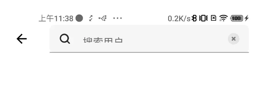
首先改最简单的下划线: 只需要修改 TextField 的 colors 就可以了:
colors = TextFieldDefaults.textFieldColors(
                backgroundColor = colorResource(id = R.color.colorF5F5F5),
            +   focusedIndicatorColor = Color.Transparent,
            +   unfocusedIndicatorColor = Color.Transparent
            ),
高度不对: 这个直接修改 Modifier 就好了。
Modifier.fillMaxSize().height(40.dp).padding(start = 20.dp),接下来是最关键的文字显示不全了:
TextField 内部边距TextField 试了很多属性,都不能直接取消 TextField 内置 padding 查看源代码可以发现。TextField 是基于 BasicTextField 的,在内部写了默认高度: 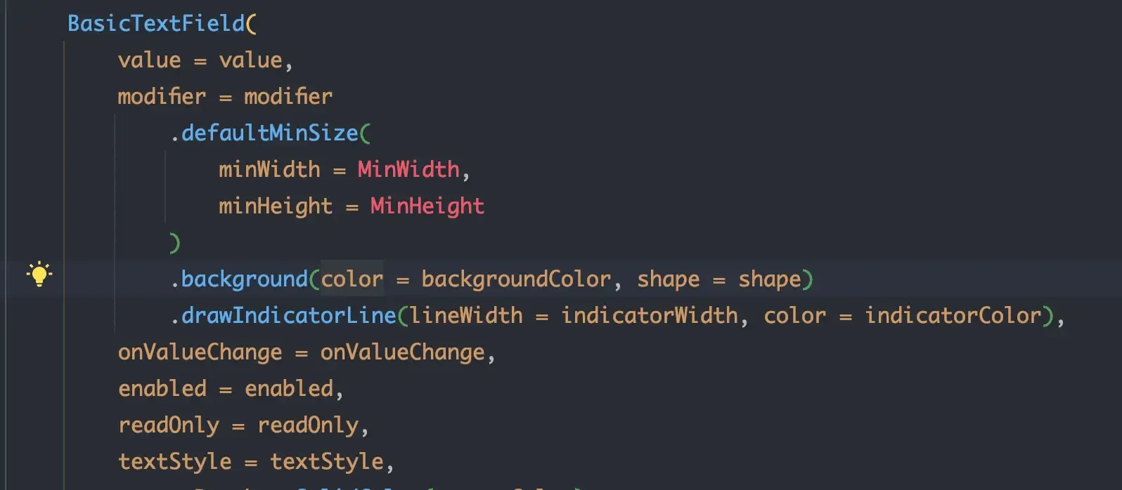 那么修改这个默认高度呢,尝试了一下,没有效果 ····· 很遗憾,试了很多办法,Google、stackoverflow 找了几个小时,没有办法。
 TextField 就只能这样,全文完!!!😪
BasicTextField 进行修改TextField 可以看到是在 androidx.compose.material 包下的一个类,可以看做是一个符合 Material Design 设置的输入框,想要让它完全符合国内的设计确实有点难。好在我们看到了 BasicTextField 这个类,我们可以直接使用 BasicTextField 来实现。
BasicTextField 的使用BasicTextField 用起来跟 TextField 区别不大:
BasicTextField没有提供 leading、trailing 属性,我们使用 Row + icon + BasicTextField + icon 来自己实现 贴一下代码:BuildImageIcon是自己封装的一个本地 drawable 的 Image 一定要记得给Row加上verticalAlignment而不是给textStyle加上。因为它只能控制文字在 horizontal 方向上的位置
var text by remember { mutableStateOf("") }
   Row(
            Modifier
                .fillMaxWidth()
                .background(
                    colorResource(id = R.color.colorF5F5F5),
                    shape = RoundedCornerShape(8.dp)
                )
                .height(40.dp)
                .padding(start = 10.dp),
            verticalAlignment = Alignment.CenterVertically,
        ) {
            BuildImageIcon(R.drawable.icon_search_black, 24.dp)
            BasicTextField(
                value = text,
                onValueChange = {
                    text = it
                    onValueChange.invoke(it)
                },
                singleLine = true,
                modifier = Modifier
                    .weight(1f)
                    .padding(start = 10.dp),
                textStyle = TextStyle(
                    color = colorResource(id = R.color.color_262626),
                    fontSize = 16.sp,
                ),
                keyboardActions = KeyboardActions(onSearch = {
                    onSearch?.invoke(text)
                }),
                keyboardOptions = KeyboardOptions(imeAction = ImeAction.Search)
            )
            BuildImageIcon(R.drawable.icon_edit_clean, 24.dp) {
                text = ""
            }
        }
运行后效果还是非常接近设计图的: 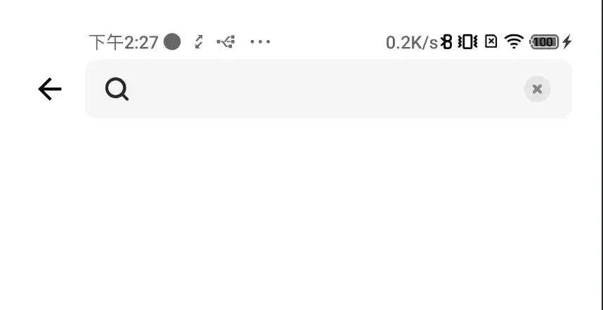 输入文字测试一下也没有问题:
 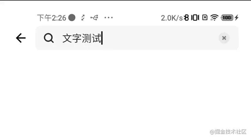 以为这就完了吗?不不,还有一个明显的问题,输入框没有 hint (或者说 placeholder )
BasicTextField 增加 placeholder这个问题还是很好解决的。稍微查看一下 BasicTextField 的源码,有一个 decorationBox 属性,在注释里写的很清楚:
Composable lambda that allows to add decorations around text field, suc as icon, placeholder, helper messages or similar, and automatically increase the hit target area of the text field. To allow you to control the placement of the inner text field relative to your decorations, the text field implementation will pass in a framework-controlled composable parameter “innerTextField” to the decorationBox lambda you provide. You must call innerTextField exactly once. 大致意思是说,通过它你可以在文本字段周围添加装饰物,如图标、占位符、帮助信息或类似的东西,并自动增大文本字段的目标区域 而且
TextField的这些功能也是通过这个实现的 这里直接贴一下 decorationBox 这块的代码:
decorationBox = { innerTextField ->
                    if (text.isEmpty()) {
                        Box(
                            modifier = Modifier
                                .padding(start = 5.dp)
                                .fillMaxSize(), contentAlignment = Alignment.CenterStart
                        ) {
                            Text(
                               "这里是占位部分", fontSize = 16f.sp,
                                modifier = Modifier
                                    .fillMaxWidth(),
                                style = TextStyle(
                                    color = colorResource(id = R.color.color_BFBFBF),
                                    fontSize = 16.sp,
                                ),
                            )
                        }
                    } else
                        innerTextField()
                },
说一下我的理解 innerTextField 这个就是当前 BasicTextField 自身的文字输入部分,我们先根据上面的 text 判断一下是否有输入的文字,如果没有就展示我们的占位 Text。 运行看看效果:
可以说是跟效果图几乎一样了,非常完美。 这次真的可以 说要收工了。😚 但是!!!!发现点击输入框后不显示光标。这个体验是真的不好。
如果有多个输入框的情况下,用户根本不知道点的是那个。 发现去掉了我们设置的 placeholder 后,再点击就正常了。但是 placeholder 去掉后就跟设计图不符了,肯定是不能去掉的。 这个问题真的困扰我很久。
BasicTextField 有 placeholder 的情况下还能显示光标这个问题我也没有找到好的办法,如果哪位大佬有办法希望能不吝赐教。 进过半天的思索无果后,最后只能使用终极办法: 用 Box 将两个控件放到一起 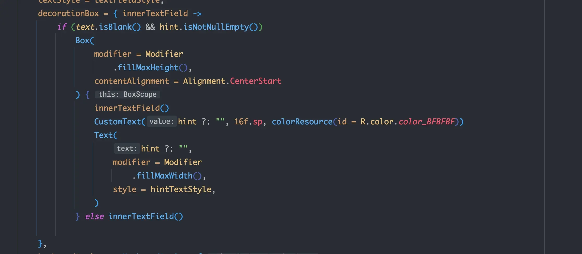 运行后的效果
 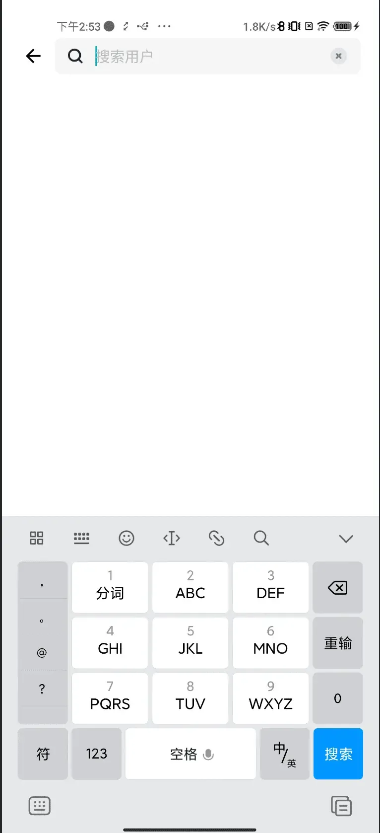 这样处理之后,确实是符合要求了,但是感觉写法上不是很优雅。希望评论区能有个更优雅的写法 最后,送上封装后的
 BasicTextField,更符合实际项目中使用:
@Composable
fun CustomTextField(
    modifier: Modifier = Modifier,
    hint: String? = null,
    showCleanIcon: Boolean = false,
    onTextChange: String.() -> Unit = {},
    leadingIcon: @Composable (() -> Unit)? = null,
    trailingIcon: @Composable (() -> Unit)? = null,
    keyboardOptions: KeyboardOptions = KeyboardOptions.Default,
    keyboardActions: String.() -> Unit = {},
    textFieldStyle: TextStyle = defaultTextStyle,
    hintTextStyle: TextStyle = defaultHintTextStyle,
    ) {
    var text by remember { mutableStateOf("") }
    Row(
        modifier,
        verticalAlignment = Alignment.CenterVertically,
    ) {
        leadingIcon?.invoke()
        BasicTextField(
            value = text,
            onValueChange = {
                text = it
                onTextChange.invoke(it)
            },
            cursorBrush = SolidColor(colorResource(id = R.color.color_currency)),
            singleLine = true,
            modifier = Modifier
                .weight(1f)
                .padding(start = 10.dp),
            textStyle = textFieldStyle,
            decorationBox = { innerTextField ->
                if (text.isBlank() && hint.isNotNullEmpty())
                    Box(
                        modifier = Modifier
                            .fillMaxHeight(),
                        contentAlignment = Alignment.CenterStart
                    ) {
                        innerTextField()
                        CustomText(hint ?: "", 16f.sp, colorResource(id = R.color.color_BFBFBF))
                        Text(
                            hint ?: "",
                            modifier = Modifier
                                .fillMaxWidth(),
                            style = hintTextStyle,
                        )
                    } else innerTextField()
            },
            keyboardActions = KeyboardActions {
                keyboardActions(text)
            },
            keyboardOptions = keyboardOptions
        )
        trailingIcon?.invoke()
        if (showCleanIcon)
            ImageIcon(R.drawable.icon_edit_clean, 24.dp) {
                text = ""
            }
    }
}
此内容由惯性聚合(RSS阅读器)自动聚合整理,仅供阅读参考。 原文来自 — 版权归原作者所有。