


Modern phones are not simple rectangles. They have rounded corners, camera cutouts, dynamic islands, and home indicators that double as gesture areas. Browsers know the dimensions of all of these and expose the parts that could obscure content as safe area insets.
The "safe area" is the portion of the screen that is guaranteed to be free from being obscured by system UI. The safe-area-inset is the measurement of how much space the system UI is taking up on each edge of the screen. By using these values in your CSS, you can make sure that important content and controls are not obscured by the system UI.
If you don't want your floating chat button to end up sitting behind the home indicator, where it's unreachable, you need to account for the safe area inset.
Environment variables for safe area insets
With the safe-area-inset environment variables, you can make your layout adapt to the current device's safe area and avoid those bugs. The env() function is how you read those values in CSS:
body {
  padding-top: env(safe-area-inset-top);
  padding-right: env(safe-area-inset-right);
  padding-bottom: env(safe-area-inset-bottom);
  padding-left: env(safe-area-inset-left);
}
Browser support
Safe-area-insets are baseline widely available, which means you can use them in production today and be confident that they will work for almost all your users on mobile devices.
Since it's baseline widely available, you don't really need to think about fallbacks but if you want to be extra safe, you can provide a fallback padding if the browser doesn't support env():
body {
  padding-top: 1rem; /* Fallback for browsers that don't support env() */
  padding-top: calc(env(safe-area-inset-top) + 1rem);
}
And for browsers that support env() but not safe-area-inset-* variables, you can provide a fallback value directly in the env() function. If safe-area-inset-top is not supported, it will fall back to 1rem:
body {
  padding-top: env(safe-area-inset-top, 1rem);
}
It's worth noting that this situation is purely theoretical, as all browsers that support env() also support safe-area-inset-* variables. That might not be the case with other environment variables, so it's good to know that this fallback mechanism exists.
Before we get into problem areas, let's get a general understanding of how these variables work and how you can use them to affect the layout.
In this demo, change each inset and watch how a realistic mobile UI that takes safe area insets into account shifts to remain usable:
Top inset (44px)
Right inset (0px)
Bottom inset (34px)
Left inset (0px)
OverlayShow safe inset areas
The specific px values here are not particular to any specific device, the point is to show how the device sets these variables and how your layout can respond to them as they change.
On real devices, you can think of these values as constants. They're provided by the browser and while they might change when switching from portrait to landscape or between OS updates that change the device UI as well as simply differ per device, they don't change dynamically as the user scrolls or interacts with the page. The browser provides them as a constant value that you can use to ensure your content is not obscured by the system UI.
Which web pages actually need this?
If you want your pages to look the best they can, all of them.
Browsers by default will prevent your site from being obscured by the notch or home indicator, so your content will be safe without any special handling. That does come with a downside, which is that the browser will give you a smaller viewport to reserve space:
You'll notice the edges here keep the site from being obscured, but they also don't look that great. Ideally we want the content to stretch edge-to-edge, but we want to make sure they're not obscured by system UI. To get that, you need to opt in to the full viewport and handle safe areas yourself.
To do so is a two-step process. First, you need to add viewport-fit=cover to your meta viewport tag:
<meta name="viewport" content="width=device-width, viewport-fit=cover" />This will make the browser stretch your page edge-to-edge:
As you can see, the content sits behind the dynamic island and home indicator. viewport-fit=cover tells the browser that you want to be responsible for making sure your content is not obscured by the system UI.
And now we can move those elements away from behind the system UI using env(safe-area-inset-*).
.content {
  padding-right: env(safe-area-inset-right);
  padding-left: env(safe-area-inset-left);
}
If you opt into the full viewport, here are the kinds of things you now have to think about to make sure your content is not obscured by the system UI:
- Fixed headers and navigation bars should have enough space above or below for the notch/dynamic island/camera punch hole or home indicator
- Floating chat or help buttons should remain inside the safe area
- Full-screen dialogs and drawers should take up the right height without being obscured by the home indicator
- Map or video controls near screen corners
Safe-area-inset doesn't provide margins
Safe-area-insets are defined to be exactly the space that the system UI is taking up. That means they don't provide any margin between the system UI's edge and your content.
If you set padding to just the safe-area-inset value, your content will sit right up against the edge of the safe area, which is right up against the system UI.
To add some breathing room, you can add your own padding on top of the safe area insets by combining things with calc(). This way you can ensure that your content is not only safe from being obscured but also has some space to breathe:
body {
  padding-top: calc(env(safe-area-inset-top) + 1rem);
  padding-right: calc(env(safe-area-inset-right) + 1rem);
  padding-bottom: calc(env(safe-area-inset-bottom) + 1rem);
  padding-left: calc(env(safe-area-inset-left) + 1rem);
}
Safe-area-inset only has non-zero values on mobile devices
env() is supported across browsers and platforms, but the safe-area-inset-* variables really only have non-zero values on mobile devices.
Desktop browsers always return 0 because there is no UI on top of pages in desktop browsers. It's only on mobile devices that these values are non-zero and that you have to account for them.
That's exactly why these bugs are so easy to miss. If you test in the Chrome responsive view, the safe area insets will still be 0 and you won't see any issues during development.
Testing on real devices is often delegated to the end of the project. By then, making layout changes to accommodate safe areas can be expensive, and the bugs can slip through to production. Even worse, they often only affect users on certain devices, so they can go unnoticed for a long time.
Polypane's device emulation supports safe area insets
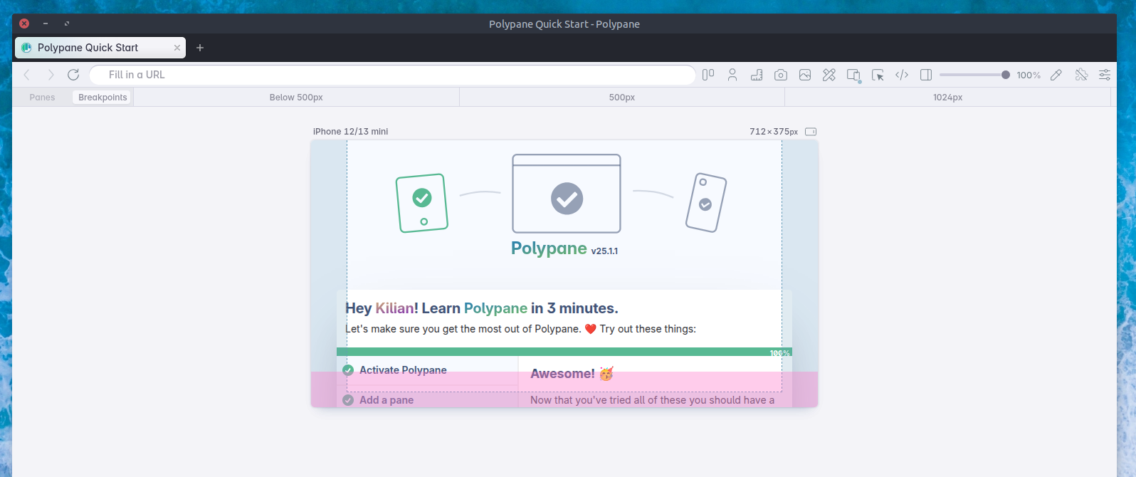
Polypane is the first and only desktop browser to emulate safe area insets. Every device in Polypane has correct safe area inset values for both portrait and landscape orientations.
Here's Polypane showing the safe area insets in blue, and the small viewport height difference in pink:
We're also the only desktop browser to emulate svh, but that's a topic for another article.
With Polypane's safe-area-inset overlay visualization, you can see exactly where the unsafe areas are on each device.
Solving a specific issue: Floating buttons
Let's look at a specific example of how to use safe-area-inset values to solve a common issue: floating buttons that end up behind the home indicator and become unreachable.
Bottom inset (34px)
Right inset (0px)
Button offset (10px)
OverlayShow safe inset areas
.chat-button {
  position: fixed;
  right: 10px;
  bottom: 10px;
}
Toggle the positioning between 'Fixed position' and 'Using env()' to switch between hard-coded offsets and offsets that use safe-area-inset-bottom and safe-area-inset-right.
safe-area-max-inset
Along with safe-area-inset-*, the specification also describes safe-area-max-inset-* variables. Those are not widely supported yet, but they are worth mentioning because they have slightly different behavior:
safe-area-inset-*gives you the current inset value right now. On scroll, the browser chrome can collapse, and the inset value can shrink all the way to0. Your element moves with that change.safe-area-max-inset-*gives you the maximum inset the browser can report for that edge. It stays stable even when the browser chrome collapses. Use it when you want a reserved zone that does not jump around.
Drag or scroll the phone to simulate the browser address bar appearing and disappearing.
The green button uses safe-area-inset-bottom and follows the current inset. The blue button uses safe-area-max-inset-bottom and stays put.
OverlayShow safe inset areas
When to use which really depends on your situation. For some UI components it makes sense to move with the live viewport state, like a floating chat button that should always be just above the home indicator.
For other things, like a persistent cookie banner or a full-screen dialog, it can be better to reserve a stable zone that doesn't shift when the browser chrome collapses so that users don't inadvertently tap the wrong button.
/* Moves with the live viewport state */
.floating-cta {
  bottom: calc(env(safe-area-inset-bottom) + 1rem);
}

/* Holds a stable reserved zone regardless of browser chrome */
.persistent-zone {
  bottom: calc(env(safe-area-max-inset-bottom) + 1rem);
}
Browser support for safe-area-max-inset-*
As of now, only Chromium implements safe-area-max-inset-* so there is no support in (mobile) Safari or Firefox. That means you can't depend on it yet and should provide a fallback stack for other browsers:
.bottom-spacer {
  padding-bottom: 1rem;
  padding-bottom: calc(env(safe-area-inset-bottom) + 1rem);
  padding-bottom: calc(env(safe-area-max-inset-bottom, env(safe-area-inset-bottom)) + 1rem);
}
Notice how we're using the env() fallback mechanism to fall back to safe-area-inset-bottom if safe-area-max-inset-bottom is not supported.
Testing safe areas in Polypane
As covered earlier, safe area bugs are easy to miss during development. Chrome's responsive view always reports inset values of 0, and real-device testing tends to get pushed to the end of the project, when fixing layout issues is expensive and bugs have already reached production.
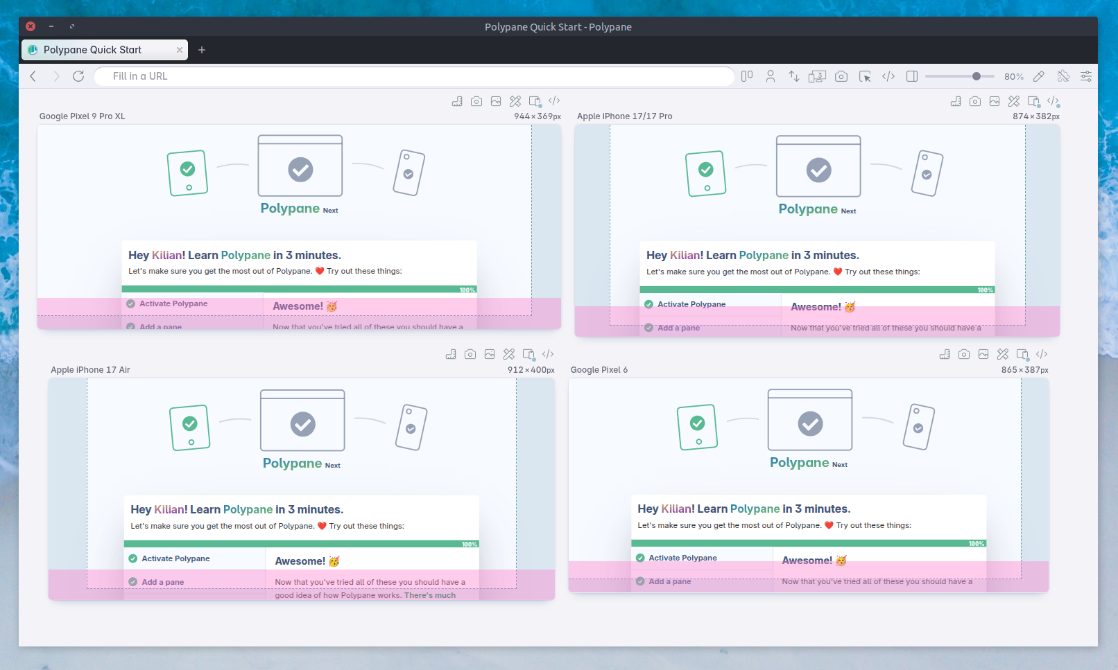
Polypane changes that. You can test safe area insets (and small viewport behavior) directly on your desktop, across multiple devices and orientations simultaneously, as part of your normal development workflow.
Catch real-device layout failures during development, not after shipping.
What to take away
Safe areas are not edge cases for unusual devices. They are the reality of modern mobile devices with camera punch holes, notches, dynamic islands, and home indicator bars. Your users are on those devices, and if you want to give them the best experience, you need to make sure your content is not obscured by the system UI.
Make sure your viewport is set to viewport-fit=cover so you get the full viewport and that you use env(safe-area-inset-*) so all your content is visible and accessible. That gives users the best experience.
Get started with testing safe areas in Polypane today, and catch real-device layout failures during development, not after shipping.