





最近发现 ★ wizard zines 中的这本 《Hell Yes! CSS!》 对于理解 CSS 的核心概念特别有用。结合 DeepSeek 的解释,对于理解 CSS 似乎非常有帮助,因此结合原文核心内容和 DeepSeek 的解释汇集为本文。
《Hell Yes! CSS!》是一本杂志,短短几十页将 CSS 的核心概念用n漫画的形式讲述清楚,是我在看 《Modern CSS with Tailwind Flexible Styling Without the Fuss - Second Edition (beta B3.0) (Noel Rappin)》这本书时推荐的。本文不会带有全部的原文内容,而只会有一些关键的页面,如需查看原文请自行寻找或购买。
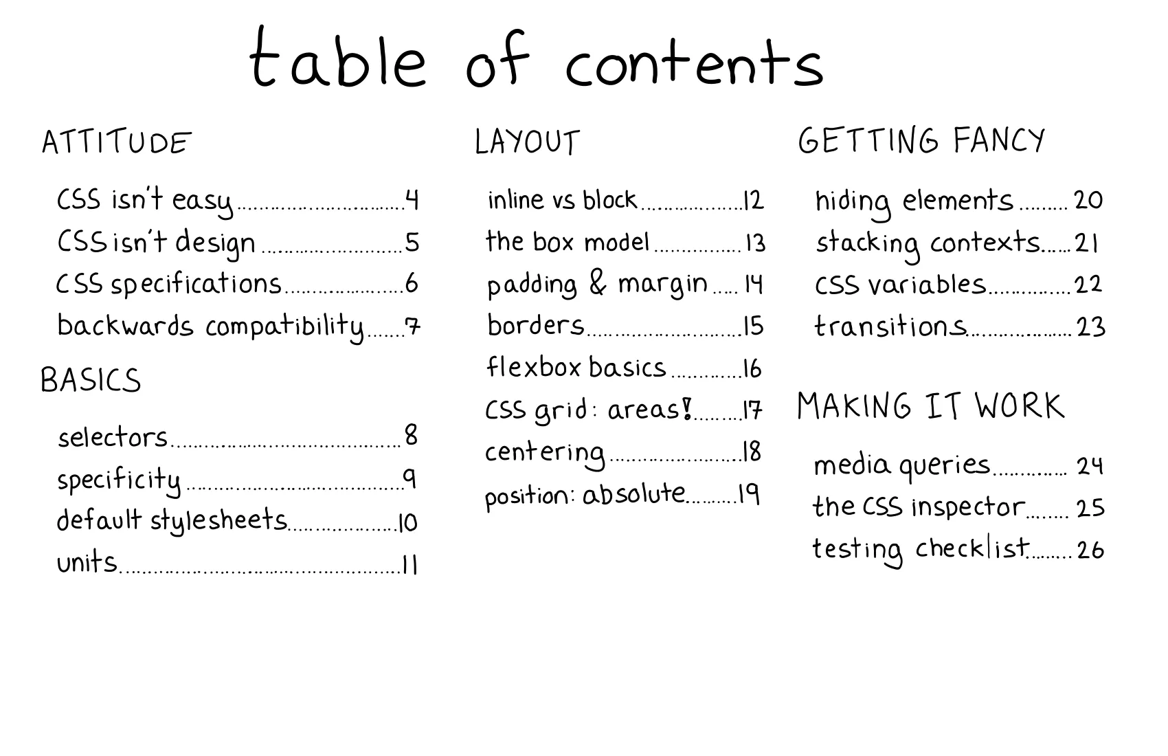
这是《Hell Yes CSS》小册子的目录部分,列出了书中涵盖的主要主题和章节。以下是对每个主题的简要解释:
display: none 或 visibility: hidden。这个目录涵盖了从基础到高级的 CSS 主题,适合不同水平的读者学习和参考。如果你对某个具体主题有疑问或需要更详细的解释,请告诉我!
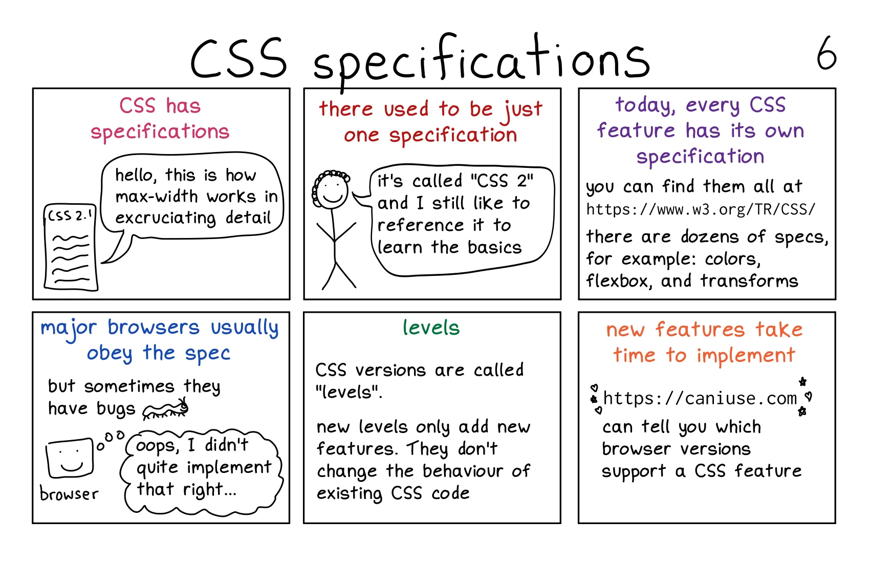
这段内容介绍了 CSS 规范(CSS specifications)的基本概念和相关信息。以下是对内容的详细解释:
CSS 规范的定义:
max-width、flexbox、transforms 等)都有其独立的规范文档。CSS 2:
现代 CSS 规范:
flexbox、grid、transforms 等都有各自的规范。浏览器对规范的实现:
CSS 版本(Levels):
新特性的实现:
这段内容强调了 CSS 规范的重要性,并解释了如何通过规范文档和工具(如 Can I use)来学习和使用 CSS。
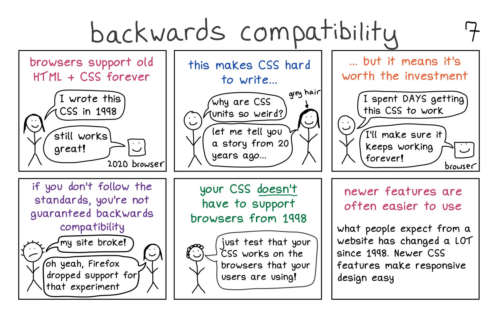
这段内容讨论了 CSS 的向后兼容性(backwards compatibility),并解释了它对开发者的影响。以下是对内容的详细解释:
定义:
优点:
挑战:
px、em、rem 等)可能看起来很奇怪或难以理解。这些单位的设计考虑了历史兼容性。标准和实验性特性:
不需要支持所有旧浏览器:
新特性的优势:
flexbox、grid、media queries)使得响应式设计(responsive design)变得更加简单。用户期望的变化:
CSS 单位:
px(像素):绝对单位。em:相对于父元素的字体大小。rem:相对于根元素(<html>)的字体大小。%:百分比单位,相对于父元素的尺寸。响应式设计(Responsive Design):
实验性特性:
-webkit-、-moz-),并且可能在未来被修改或移除。这段内容强调了 CSS 向后兼容性的重要性,同时也提醒开发者不必过度关注旧浏览器的支持。现代 CSS 特性更易于使用,并且能够更好地满足现代网页设计的需求。
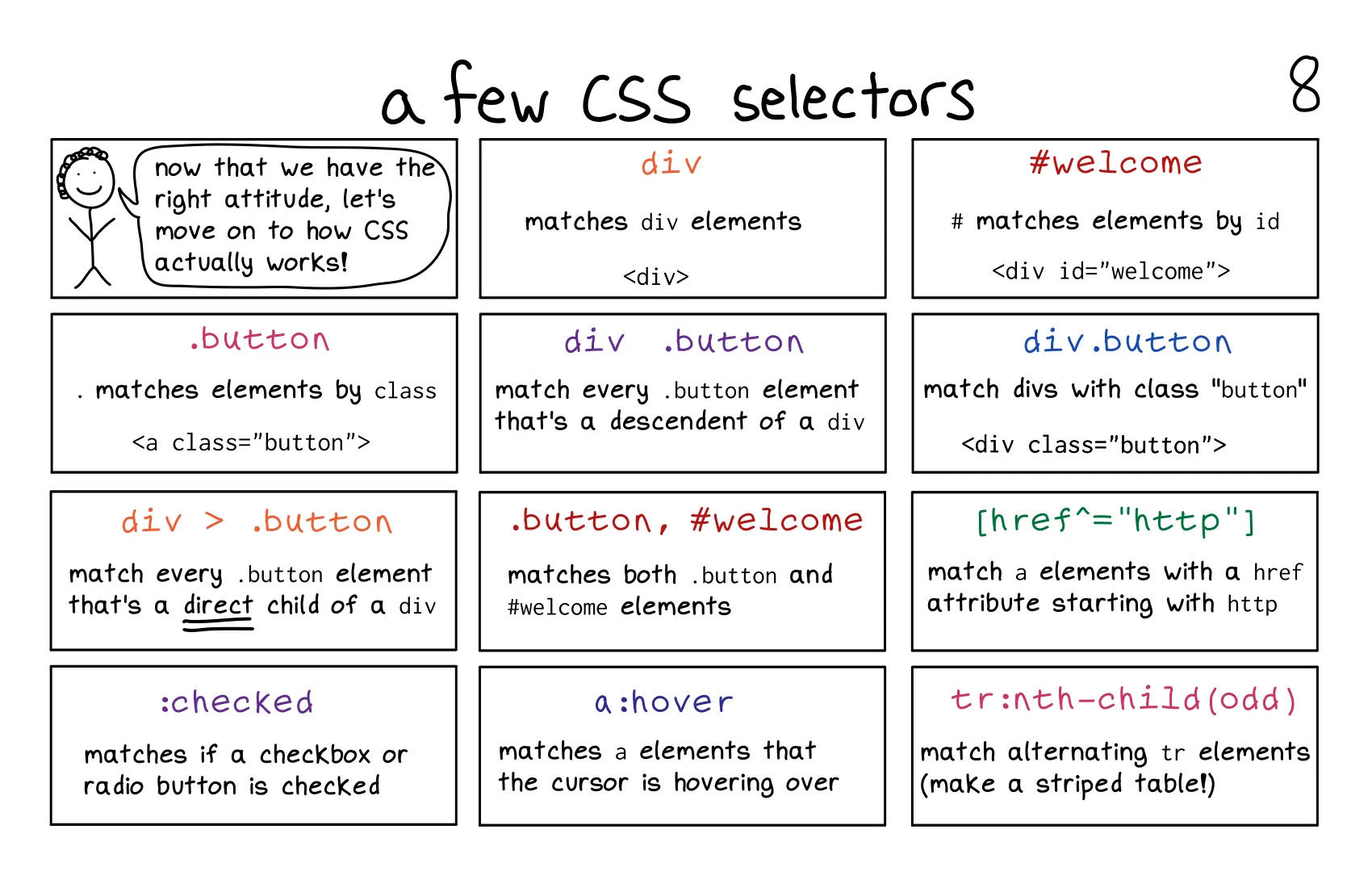
这段内容介绍了一些常见的 CSS 选择器(CSS Selectors),这些选择器用于选择 HTML 元素并应用样式。以下是对每个选择器的详细解释:
.buttonclass="button" 的元素。<a class="button">Click me</a>
div > .buttondiv 元素直接子元素的 .button 元素。<div>
<a class="button">Click me</a> <!-- 匹配 -->
<span>
<a class="button">Not matched</a> <!-- 不匹配 -->
</span>
</div>
:checked<input type="checkbox">)或单选按钮(<input type="radio">)。<input type="checkbox" id="agree">
<label for="agree">I agree</label>
:checked { background-color: yellow; }
div<div> 元素。div { border: 1px solid black; }
div .buttondiv 元素后代的 .button 元素(不一定是直接子元素)。<div>
<a class="button">Click me</a> <!-- 匹配 -->
<span>
<a class="button">Also matched</a> <!-- 匹配 -->
</span>
</div>
.button, #welcome.button 元素和 id="welcome" 的元素(逗号表示“或”)。<a class="button">Click me</a>
<div id="welcome">Welcome!</div>
.button, #welcome { color: blue; }
a:hover<a> 元素。<a href="#">Hover over me</a>
a:hover { color: green; }
#welcomeid="welcome" 的元素。<div id="welcome">Welcome!</div>
#welcome { font-size: 20px; }
div.buttonclass="button" 的 <div> 元素。<div class="button">Click me</div>
div.button { background-color: yellow; }
[href^="http"]href 属性值以 http 开头的 <a> 元素。<a href="http://example.com">External link</a>
<a href="/about">Internal link</a> <!-- 不匹配 -->
[href^="http"] { color: purple; }
tr:nth-child(odd)<tr> 元素)。<table>
<tr><td>Row 1</td></tr>
<tr><td>Row 2</td></tr>
<tr><td>Row 3</td></tr>
</table>
tr:nth-child(odd) { background-color: lightgray; }
这些选择器是 CSS 中非常常用的工具,能够帮助你精确地选择并样式化 HTML 元素。
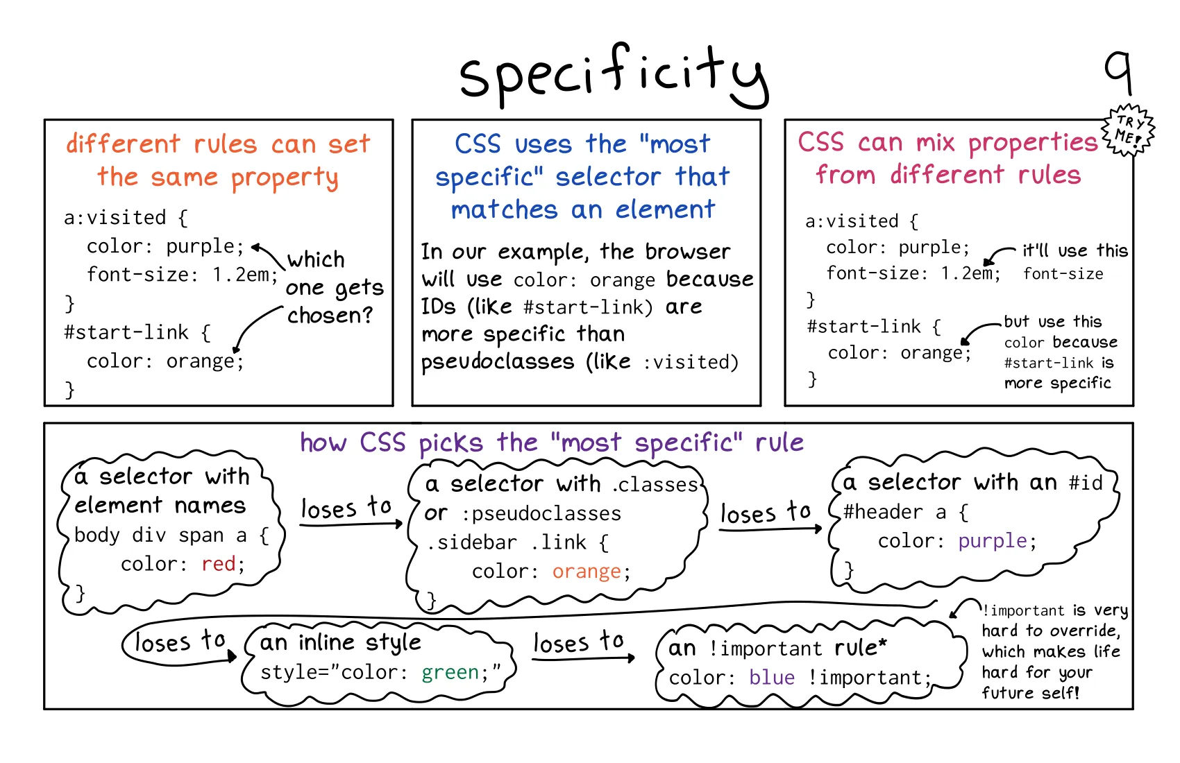
这段内容详细解释了 CSS 特异性(Specificity) 的概念,即当多个 CSS 规则应用于同一个元素时,浏览器如何决定使用哪个规则。以下是对内容的详细解释:
!important: 最高优先级,但应谨慎使用,因为它难以覆盖。style 属性。#start-link。.button 或 :hover。div 或 a。示例 1:
a:visited {
    color: purple;
    font-size: 1.2em;
}
#start-link {
    color: orange;
}
<a id="start-link" href="#"> 元素:color: orange 会被应用,因为 #start-link(ID 选择器)比 a:visited(伪类选择器)具有更高的特异性。font-size: 1.2em 仍然会从 a:visited 规则中应用,因为没有其他规则覆盖它。示例 2:
.sidebar .link {
    color: orange;
}
#header a {
    color: purple;
}
<div id="header"><a class="link"> 元素:color: purple 会被应用,因为 #header a(ID + 元素选择器)比 .sidebar .link(类 + 类选择器)具有更高的特异性。!important 的作用!important 是 CSS 中的一种强制优先级机制,它会覆盖其他所有规则。a {
color: blue !important;
}
#start-link {
color: orange;
}
#start-link 具有更高的特异性,color: blue 仍然会被应用,因为它使用了 !important。!important 会导致代码难以维护,应尽量避免。style 属性)的优先级高于外部或内部样式表中的规则。<a id="start-link" href="#" style="color: green;">Link</a>
#start-link { color: orange; },color: green 仍然会被应用,因为内联样式的优先级更高。!important > 内联样式 > ID 选择器 > 类/伪类选择器 > 元素选择器。!important,以保持代码的可维护性。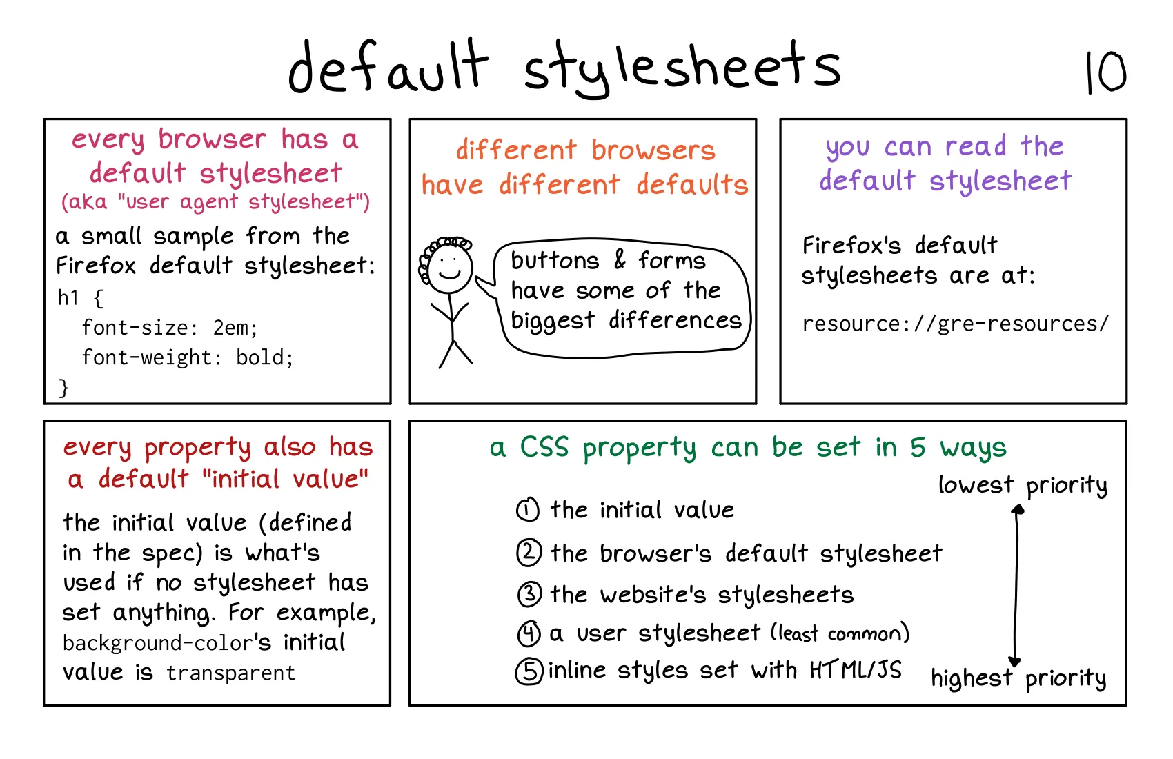
这段内容介绍了 默认样式表(Default Stylesheets) 和 CSS 属性的优先级。以下是对内容的详细解释:
h1 {
    font-size: 2em;
    font-weight: bold;
}
<h1> 元素的定义。<button>)和表单元素(如 <input>、<select>)的默认样式差异较大。resource://gre-resources/
background-color 的初始值是 transparent(透明)。font-size 的初始值通常是 medium。CSS 属性可以通过以下 5 种方式设置,优先级从低到高依次为:
初始值(Initial Value):
浏览器的默认样式表(User Agent Stylesheet):
网站的样式表(Author Stylesheet):
<style> 标签中的样式。用户样式表(User Stylesheet):
内联样式(Inline Styles):
style 属性设置的样式,优先级最高。<h1 style="color: red;">Hello World</h1>
<h1> 的文字颜色为红色,因为内联样式的优先级高于网站的样式表。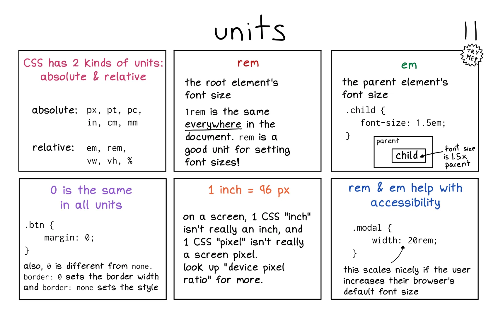
这段内容介绍了 CSS 单位(Units),包括绝对单位和相对单位,并解释了它们的用途和区别。以下是对内容的详细解释:
CSS 单位分为两类:
px(像素)pt(点,1pt = 1/72 英寸)pc(派卡,1pc = 12pt)in(英寸)cm(厘米)mm(毫米)font-size: 16px; 表示字体大小为 16 像素。em: 相对于父元素的字体大小。rem: 相对于根元素(<html>)的字体大小。vw: 相对于视口宽度的 1%。vh: 相对于视口高度的 1%。%: 相对于父元素的尺寸。rem 单位rem 是相对于根元素(<html>)的字体大小的单位。1rem 等于根元素的字体大小(通常为 16px,除非显式修改)。rem 是设置字体大小的好单位,因为它在整个文档中保持一致。html {
font-size: 16px;
}
.model {
width: 20rem; /* 20 * 16px = 320px */
}
em 单位em 是相对于父元素的字体大小的单位。16px,1.5em 就是 24px。em 的值会随着父元素的字体大小变化。.parent {
font-size: 16px;
}
.child {
font-size: 1.5em; /* 1.5 * 16px = 24px */
}
0 的特殊性0 在所有单位中相同:px、em、rem 还是其他单位,0 的值都是相同的。margin: 0; 表示外边距为 0。0 与 none 的区别:border: 0; 设置边框宽度为 0。border: none; 设置边框样式为无。1 inch = 96px:1 inch 并不等于实际的 1 英寸,1px 也不一定等于屏幕的物理像素。rem 和 em 的辅助功能rem 和 em 可以使页面更好地适应不同的用户设置。rem 和 em 的元素会自动缩放,提升可访问性。.model {
width: 20rem; /* 根据根元素字体大小动态调整 */
}
px、in)适合需要固定大小的场景。rem、em、%)适合需要灵活性和响应式设计的场景。rem 和 em 有助于提升页面的可访问性,特别是在用户调整字体大小时。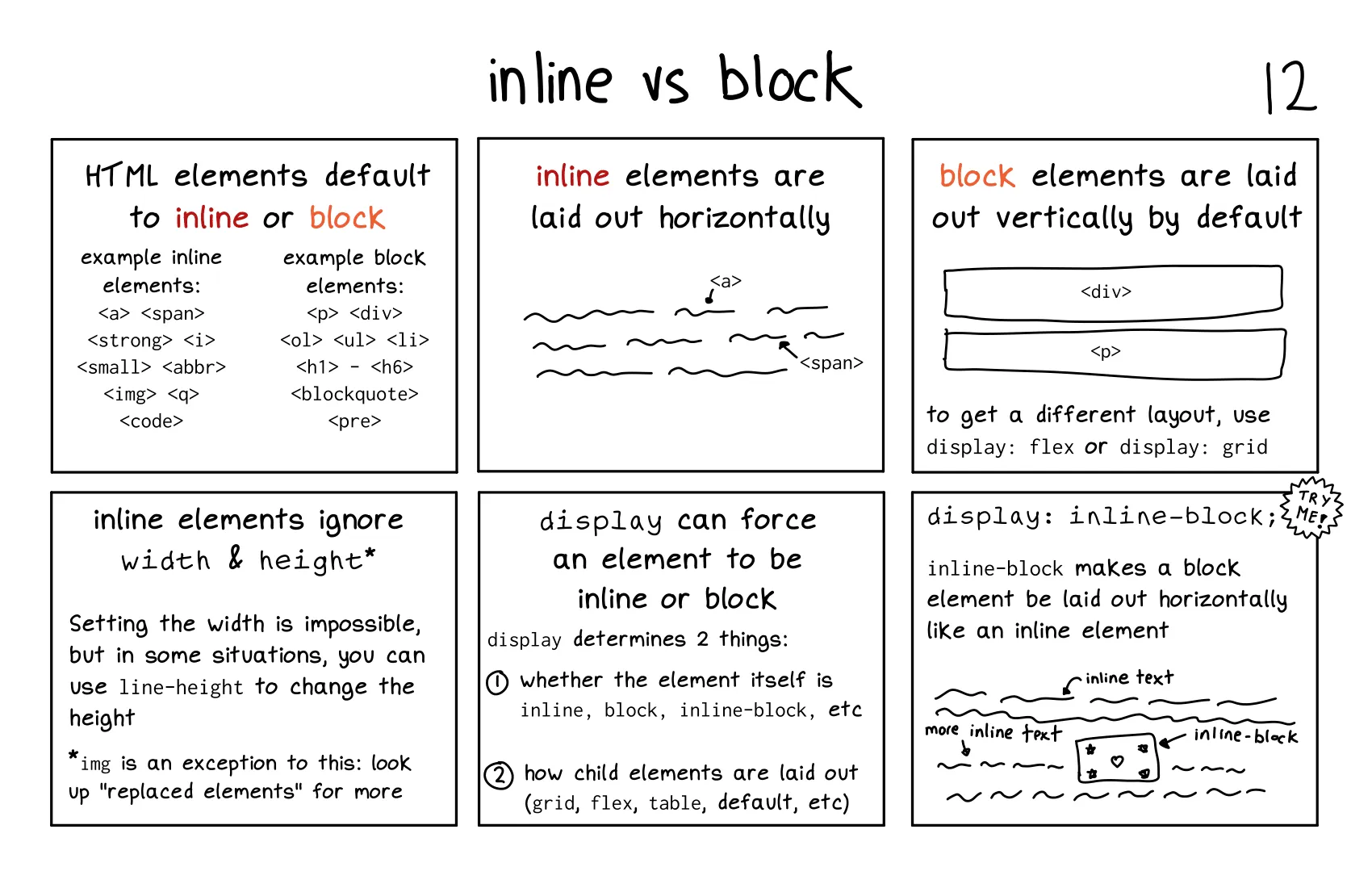
这段内容详细解释了 内联元素(Inline Elements) 和 块级元素(Block Elements) 的区别,以及如何使用 display 属性来控制元素的布局行为。以下是对内容的详细解释:
width 和 height 属性(除非使用 line-height 调整高度)。<a>、<span>、<strong>、<i>、<small>、<abbr>、<img>、<q>、<code> 等。<a href="#">Link</a>
<span>Text</span>
<img src="image.jpg" alt="Image">
width 和 height 属性。<p>、<div>、<ol>、<ul>、<li>、<h1> 到 <h6>、<blockquote>、<pre> 等。<div>Block 1</div>
<p>Block 2</p>
display 属性display 属性用于控制元素的布局行为,包括:flex、grid 等)。inline: 元素表现为内联元素。block: 元素表现为块级元素。inline-block: 元素表现为内联元素,但可以设置 width 和 height。flex: 元素表现为弹性盒子容器。grid: 元素表现为网格容器。inline-block 的特殊性inline-block 使块级元素像内联元素一样水平排列,同时保留块级元素的特性(如可以设置 width 和 height)。.box {
display: inline-block;
width: 100px;
height: 100px;
background-color: lightblue;
}
<div class="box">Box 1</div>
<div class="box">Box 2</div>
<img> 元素:<img> 是内联元素,但它是一个 替换元素(Replaced Element),可以设置 width 和 height。line-height:line-height 调整高度。display: flex 或 display: grid。.container {
display: flex;
justify-content: space-between;
}
<div class="container">
    <div>Item 1</div>
    <div>Item 2</div>
</div>
display 属性可以灵活控制元素的布局行为,如 inline-block、flex 或 grid。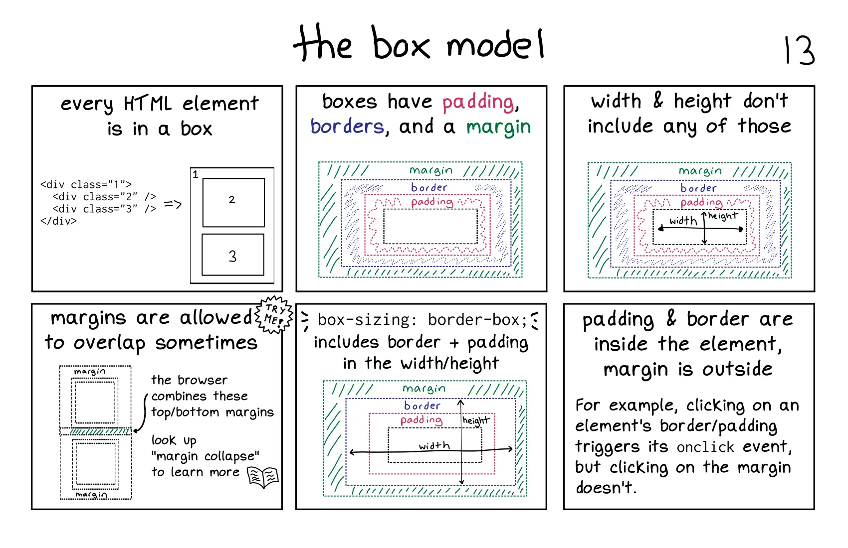
这段内容详细解释了 CSS 盒模型(Box Model),包括盒模型的组成部分及其行为。以下是对内容的详细解释:
width 和 height 属性定义。padding 属性设置。padding: 10px;。border 属性设置。border: 1px solid black;。margin 属性设置。margin: 20px;。width 和 height 的行为width 和 height 只定义内容区域的大小,不包括内边距、边框和外边距。.box {
width: 100px;
height: 100px;
padding: 10px;
border: 5px solid black;
margin: 20px;
}
width + padding + border + margin = 100px + 20px + 10px + 40px = 170px。box-sizing: border-boxwidth 和 height 定义为包括内容、内边距和边框的总大小。.box {
box-sizing: border-box;
width: 100px;
height: 100px;
padding: 10px;
border: 5px solid black;
}
width - padding - border = 100px - 20px - 10px = 70px。border-box 可以更直观地控制元素的总大小。.box1 {
margin-bottom: 20px;
}
.box2 {
margin-top: 30px;
}
box1 和 box2 之间的实际外边距为 30px(而不是 50px)。onclick 事件。onclick 事件。box-sizing: border-box 可以更直观地控制元素的总大小。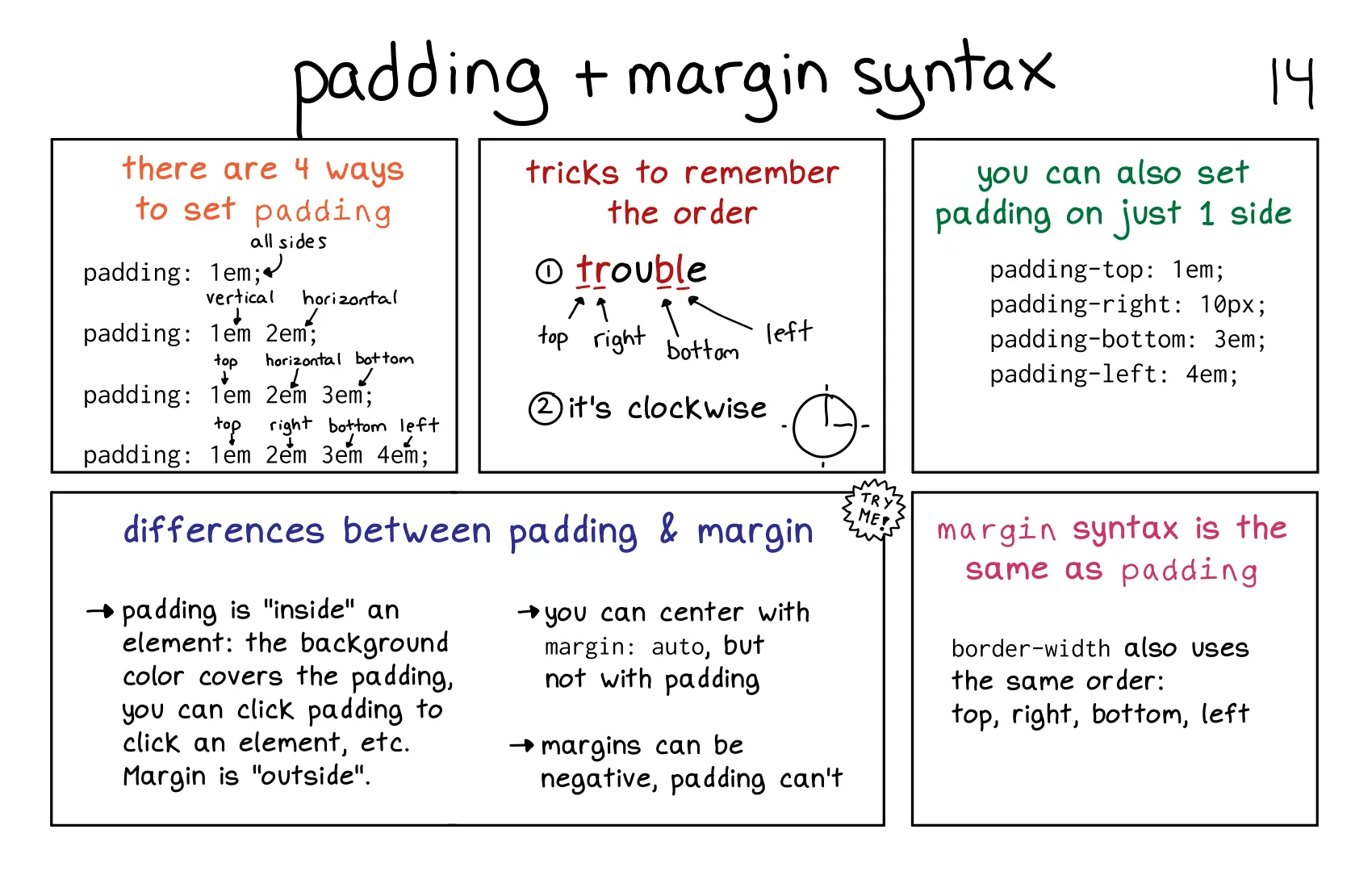 这段内容详细介绍了 内边距(Padding) 和 外边距(Margin) 的语法及其区别。以下是对内容的详细解释:
定义: 内边距是内容与边框之间的空间,可以使用 padding 属性设置。
四种设置方式:
1em。1em,左右内边距为 2em。1em,左右内边距为 2em,下内边距为 3em。padding: 1em 2em 3em 4em;
1em,右内边距为 2em,下内边距为 3em,左内边距为 4em。记忆技巧:
padding-top: 1em;
padding-right: 10px;
padding-bottom: 3em;
padding-left: 4em;
margin 属性设置。padding 相同:margin: 1em; /* 所有边相同 */
margin: 1em 2em; /* 垂直和水平 */
margin: 1em 2em 3em; /* 上、水平、下 */
margin: 1em 2em 3em 4em; /* 上、右、下、左 */
margin-top: 1em;
margin-right: 10px;
margin-bottom: 3em;
margin-left: 4em;
margin: auto; 实现水平居中,但 padding 不能用于居中。margin: -10px;),但内边距不能为负值。padding 和 margin 相同:border-width: 1em 2em 3em 4em; /* 上、右、下、左 */
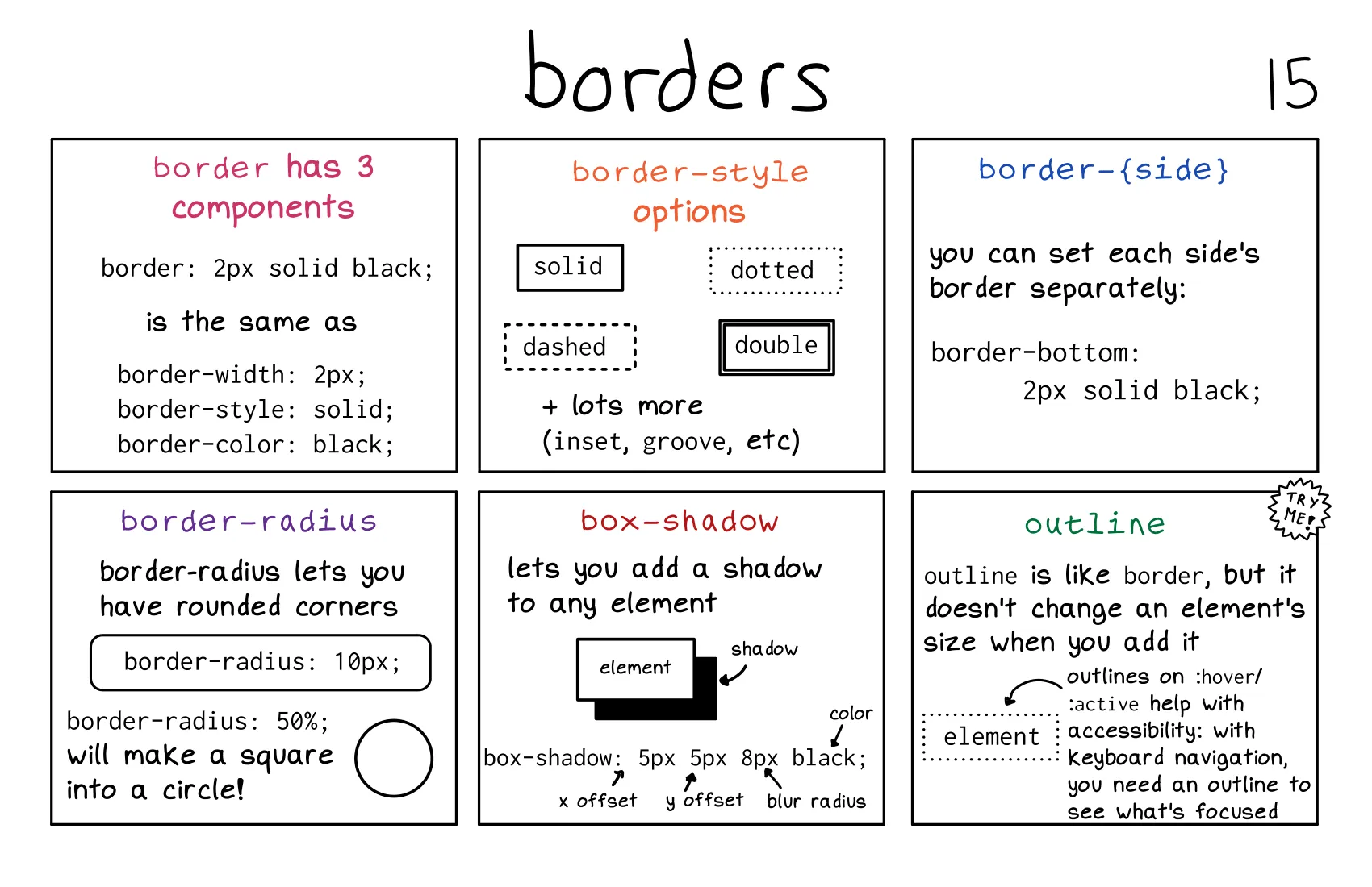
这段内容详细介绍了 边框(Border) 及其相关属性,包括边框样式、圆角、阴影和轮廓。以下是对内容的详细解释:
2px。solid(实线)。black(黑色)。border-width: 2px;
border-style: solid;
border-color: black;
solid: 实线。dotted: 点线。dashed: 虚线。double: 双线。inset(内嵌)、groove(凹槽)等。border-bottom: 2px solid black;
border-topborder-rightborder-leftborder-radius 用于设置元素的圆角。border-radius: 10px; /* 圆角半径为 10px */
border-radius: 50%; /* 将正方形变为圆形 */
px、em)。50% 时,正方形元素会变为圆形。box-shadow 用于为元素添加阴影。box-shadow: 5px 5px 8px black;
5px: 水平偏移(x 轴)。5px: 垂直偏移(y 轴)。8px: 模糊半径(blur radius)。black: 阴影颜色。box-shadow: 2px 2px 4px rgba(0, 0, 0, 0.5); /* 带透明度的阴影 */
outline 类似于边框,但它不会影响元素的尺寸。:hover 或 :focus 状态,提升可访问性。border-radius 实现,支持百分比和固定值。box-shadow 添加,可以设置偏移、模糊半径和颜色。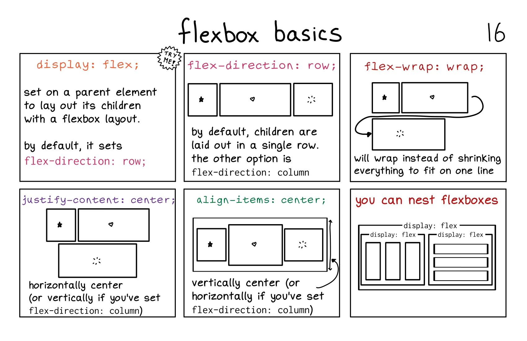
这段内容介绍了 Flexbox 的基础知识,包括如何使用 display: flex 创建弹性布局,以及常见的 Flexbox 属性。以下是对内容的详细解释:
display: flex;,其子元素会自动成为弹性项目(flex items)。flex-direction 属性flex-direction: row;(子元素水平排列)。row: 子元素从左到右排列。row-reverse: 子元素从右到左排列。column: 子元素从上到下排列。column-reverse: 子元素从下到上排列。.container {
display: flex;
flex-direction: row;
}
flex-wrap 属性flex-wrap: nowrap;(子元素不换行,可能会溢出容器)。wrap: 子元素在容器宽度不足时换行。wrap-reverse: 子元素换行,但顺序相反。.container {
display: flex;
flex-wrap: wrap;
}
justify-content 属性center: 子元素居中对齐。flex-start: 子元素向主轴起点对齐(默认值)。flex-end: 子元素向主轴终点对齐。space-between: 子元素均匀分布,首尾元素贴边。space-around: 子元素均匀分布,周围留有相等空间。.container {
display: flex;
justify-content: center;
}
align-items 属性center: 子元素居中对齐。flex-start: 子元素向交叉轴起点对齐。flex-end: 子元素向交叉轴终点对齐。stretch: 子元素拉伸以填满容器高度(默认值)。.container {
display: flex;
align-items: center;
}
<div class="container">
    <div class="item">Item 1</div>
    <div class="item">Item 2</div>
    <div class="nested-container">
        <div class="nested-item">Nested Item 1</div>
        <div class="nested-item">Nested Item 2</div>
    </div>
</div>
.container {
    display: flex;
}
.nested-container {
    display: flex;
}
flex-direction、flex-wrap、justify-content 和 align-items。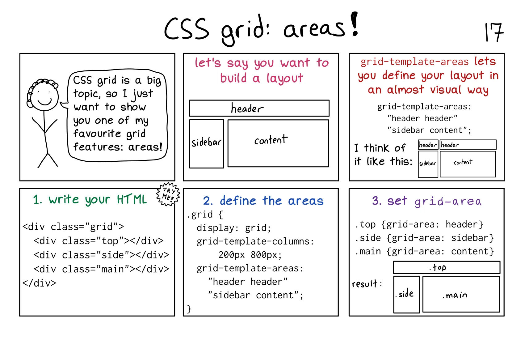
这段内容介绍了 CSS Grid 中的一个强大功能:网格区域(Grid Areas)。通过网格区域,你可以以直观的方式定义复杂的布局。以下是对内容的详细解释:
步骤 1: 编写 HTML 结构
<div class="grid">
    <div class="top">Header</div>
    <div class="side">Sidebar</div>
    <div class="main">Content</div>
</div>
步骤 2: 定义网格区域
.grid {
    display: grid;
    grid-template-columns: 200px 800px; /* 定义两列,宽度分别为 200px 和 800px */
    grid-template-areas:
        "header header"  /* 第一行:header 占据两列 */
        "sidebar content"; /* 第二行:sidebar 和 content 各占一列 */
}
grid-template-areas 通过直观的方式定义布局,类似于绘制布局图。步骤 3: 为每个元素分配网格区域
.top {
    grid-area: header; /* 将 .top 元素放置在 header 区域 */
}
.side {
    grid-area: sidebar; /* 将 .side 元素放置在 sidebar 区域 */
}
.main {
    grid-area: content; /* 将 .main 元素放置在 content 区域 */
}
---------------------
|       Header       |
---------------------
| Sidebar | Content  |
---------------------
header 区域占据整个第一行。sidebar 和 content 区域分别占据第二行的两列。grid-template-areas,你可以以近乎视觉化的方式定义布局,便于理解和维护。grid-template-areas 的值即可。grid-template-areas 和 grid-area,你可以直观地定义和分配布局区域。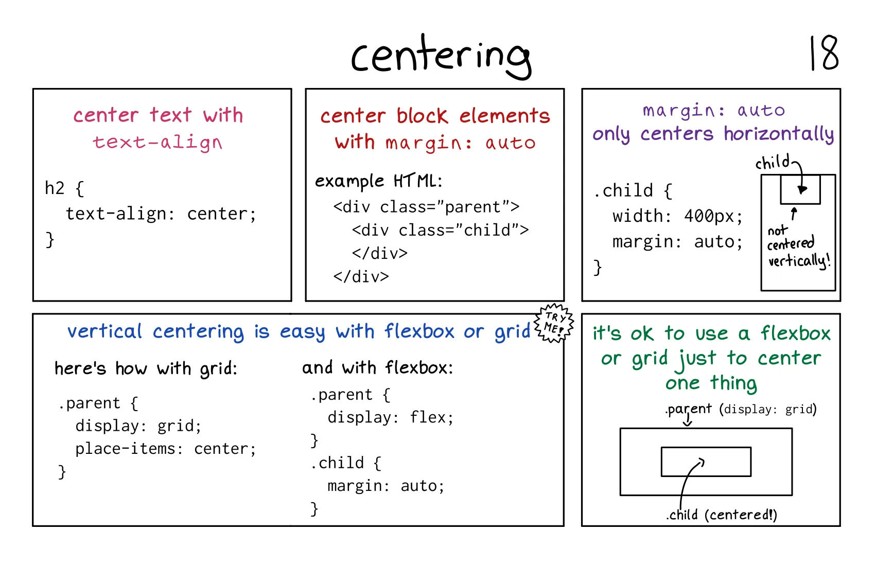
这段内容介绍了如何在 CSS 中实现 文本居中 和 块级元素居中,并提供了多种方法。以下是对内容的详细解释:
text-align 属性。h2 {
text-align: center;
}
margin: auto;。<div class="parent">
<div class="child"></div>
</div>
.child {
width: 400px;
margin: auto; /* 水平居中 */
}
margin: auto; 只能实现水平居中,不能实现垂直居中。方法 1: 使用 Grid 布局
.parent {
display: grid;
place-items: center; /* 水平和垂直居中 */
}
place-items: center; 是 justify-items 和 align-items 的简写,用于在 Grid 容器中居中子元素。方法 2: 使用 Flexbox 布局
.parent {
display: flex;
justify-content: center; /* 水平居中 */
align-items: center; /* 垂直居中 */
}
justify-content 控制主轴(水平方向)的对齐,align-items 控制交叉轴(垂直方向)的对齐。<div class="parent">
<div class="child">Centered!</div>
</div>
.parent {
display: flex; /* 或 display: grid; */
justify-content: center;
align-items: center;
}
text-align: center;。margin: auto;。place-items: center; 或 Flexbox 的 justify-content: center; align-items: center;。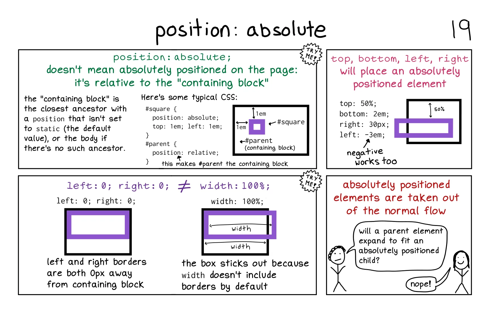
这段内容详细介绍了 position: absolute 的使用方法及其行为。以下是对内容的详细解释:
position: absolute 的基本概念position: absolute; 用于将元素从文档流中移除,并相对于其 包含块(containing block) 进行定位。position 不为 static 的祖先元素。如果没有这样的祖先元素,则包含块为 <body>。position: absolute 的使用<div id="parent">
<div id="square"></div>
</div>
#parent {
position: relative; /* 设置包含块 */
}
#square {
position: absolute;
top: 1em;
left: 1em;
}
#parent 设置了 position: relative;,因此 #square 会相对于 #parent 进行定位。#square 的左上角距离 #parent 的左上角分别为 1em。top、bottom、left、right 属性#square {
position: absolute;
top: 50%; /* 距离包含块顶部 50% */
bottom: 2em; /* 距离包含块底部 2em */
right: 30px; /* 距离包含块右侧 30px */
left: -3em; /* 距离包含块左侧 -3em */
}
left: -3em;)。left 和 right,元素的宽度会根据包含块的宽度自动调整。width 不包括边框和内边距。如果设置了 width: 100%;,元素可能会超出包含块的范围。box-sizing: border-box; 来使 width 包括边框和内边距。position 均为 static),绝对定位元素会相对于 <body> 进行定位。position: absolute 用于将元素从文档流中移除,并相对于包含块进行定位。position 不为 static 的祖先元素。top、bottom、left、right 可以精确控制绝对定位元素的位置。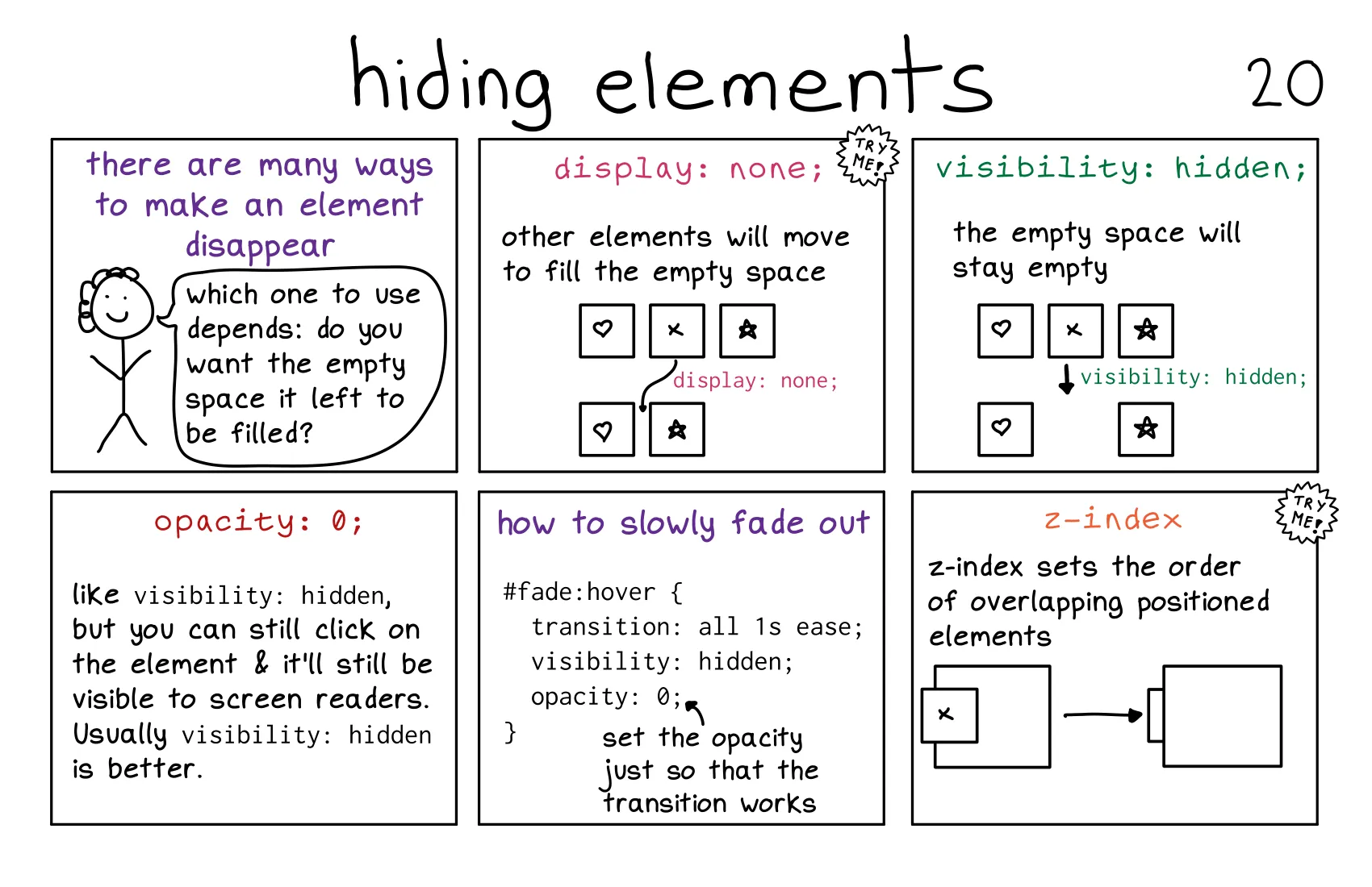
这段内容介绍了在 CSS 中隐藏元素的几种方法,并解释了它们的区别。以下是对内容的详细解释:
display: none;.hidden {
display: none;
}
visibility: hidden;.hidden {
visibility: hidden;
}
opacity: 0;transition 结合使用,实现淡出效果。.fade-out {
opacity: 0;
transition: opacity 1s ease;
}
.fade-out:hover {
opacity: 1;
}
z-indexposition 不为 static)有效。.overlay {
position: absolute;
z-index: -1; /* 将元素置于其他元素下方 */
}
display: none;:visibility: hidden;:opacity: 0;:display: none;: 完全隐藏元素,不占据空间。visibility: hidden;: 隐藏元素,但保留空间。opacity: 0;: 使元素透明,保留空间和交互性。z-index: 控制重叠元素的堆叠顺序。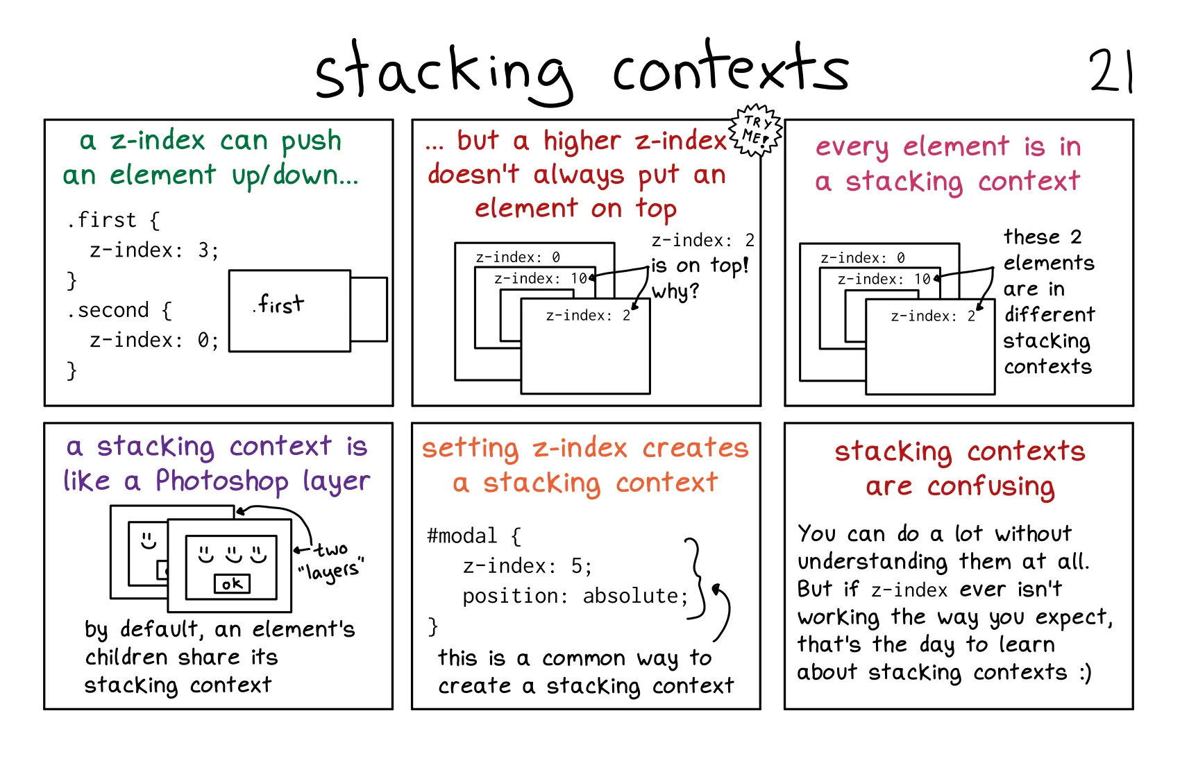
这段内容详细介绍了 堆叠上下文(Stacking Contexts) 的概念及其对 z-index 的影响。以下是对内容的详细解释:
z-index 决定。z-index 的作用z-index 用于控制元素在堆叠上下文中的层叠顺序。.first {
z-index: 3;
}
.second {
z-index: 0;
}
.first 元素会显示在 .second 元素的上方,因为它的 z-index 值更大。z-index 的限制z-index 值更大,它也可能不会显示在另一个元素的上方。z-index 只在同一个堆叠上下文中有效。.parent1 {
z-index: 0;
}
.parent2 {
z-index: 10;
}
.child {
z-index: 2;
}
.child 位于 parent1 的堆叠上下文中,而 parent2 位于另一个堆叠上下文中,parent2 的 z-index: 10 会使整个堆叠上下文位于 parent1 的上方,即使 .child 的 z-index 更大。position 为 absolute、relative、fixed 或 sticky,并且 z-index 不为 auto。opacity 小于 1。transform、filter、will-change 等属性。#modal {
z-index: 5;
position: absolute; /* 创建新的堆叠上下文 */
}
<div class="parent">
    <div class="child"></div>
</div>
.parent {
    z-index: 1;
    position: relative; /* 创建堆叠上下文 */
}
.child {
    z-index: 10;
}
.child 的 z-index 只在 .parent 的堆叠上下文中有效。z-index 只在同一个堆叠上下文中有效。position、opacity、transform 等属性可以创建新的堆叠上下文。z-index 没有按预期工作,可能是因为元素位于不同的堆叠上下文中。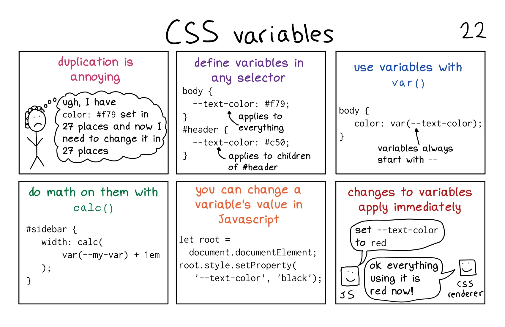
这段内容介绍了 CSS 变量(CSS Variables) 的基本用法,包括如何定义、使用和动态修改变量。以下是对内容的详细解释:
-- 前缀定义变量。body {
--text-color: #f79; /* 定义变量 --text-color */
}
#header {
--text-color: #c50; /* 在 #header 及其子元素中覆盖 --text-color */
}
var() 函数引用变量。body {
color: var(--text-color); /* 使用变量 --text-color */
}
-- 开头。calc() 函数对变量进行数学运算。#sidebar {
width: calc(var(--my-var) + 1em); /* 计算宽度 */
}
let root = document.documentElement;
root.style.setProperty('--text-color', 'black'); /* 将 --text-color 修改为黑色 */
-- 前缀定义,使用 var() 函数引用。calc() 对变量进行数学运算。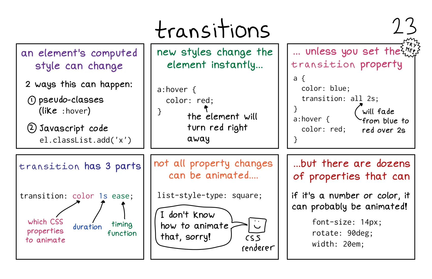
这段内容详细介绍了 CSS 过渡(Transitions) 的基本概念和使用方法。以下是对内容的详细解释:
:hover)或 JavaScript 代码触发。transition 属性定义过渡效果。a {
color: blue;
transition: all 2s; /* 所有属性变化在 2 秒内完成 */
}
a:hover {
color: red; /* 鼠标悬停时颜色变为红色 */
}
transition 属性 包含三个部分:color、width 等)。1s)。ease)。a {
transition: color 1s ease; /* 颜色变化在 1 秒内以 ease 速度曲线完成 */
}
font-sizerotatewidthlist-style-type)无法过渡。.box {
width: 100px;
transition: width 1s ease;
}
.box:hover {
width: 200px; /* 宽度从 100px 过渡到 200px */
}
transition 属性实现,用于在样式变化时创建平滑的动画效果。list-style-type)无法过渡。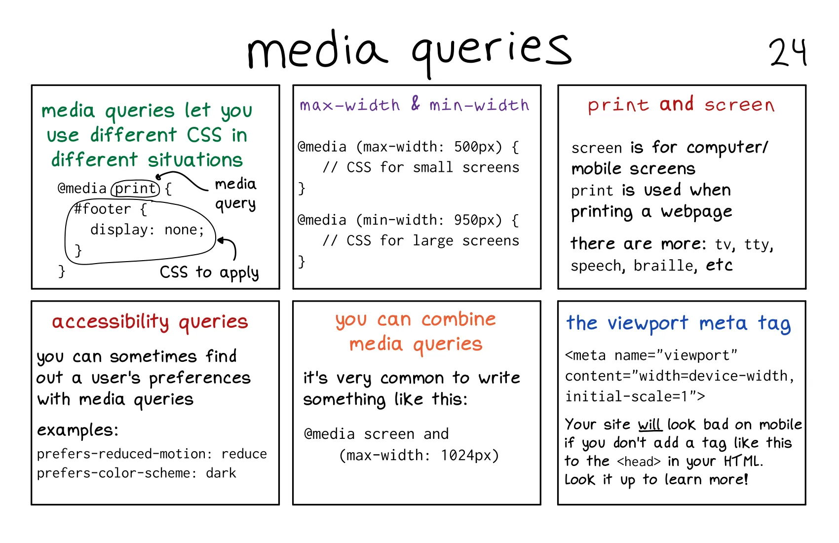
这段内容详细介绍了 媒体查询(Media Queries) 的基本概念和使用方法,以及如何通过媒体查询实现响应式设计。以下是对内容的详细解释:
@media 规则定义媒体查询。@media print {
#footer {
display: none; /* 打印时隐藏页脚 */
}
}
max-width: 应用于屏幕宽度小于或等于指定值的情况。@media (max-width: 500px) {
/* 小屏幕样式 */
}
min-width: 应用于屏幕宽度大于或等于指定值的情况。@media (min-width: 950px) {
/* 大屏幕样式 */
}
screen: 用于计算机和移动设备的屏幕。print: 用于打印网页时的样式。tv、tty、speech、braille 等。prefers-reduced-motion: 检测用户是否偏好减少动画。@media (prefers-reduced-motion: reduce) {
/* 减少动画的样式 */
}
prefers-color-scheme: 检测用户是否偏好深色模式。@media (prefers-color-scheme: dark) {
/* 深色模式样式 */
}
and 组合多个条件。@media screen and (max-width: 1024px) {
/* 屏幕宽度小于等于 1024px 时的样式 */
}
<meta name="viewport" content="width=device-width, initial-scale=1">
width=device-width: 使页面的宽度与设备的屏幕宽度一致。initial-scale=1: 设置页面的初始缩放比例为 1。viewport meta 标签可以确保网页在移动设备上正确显示。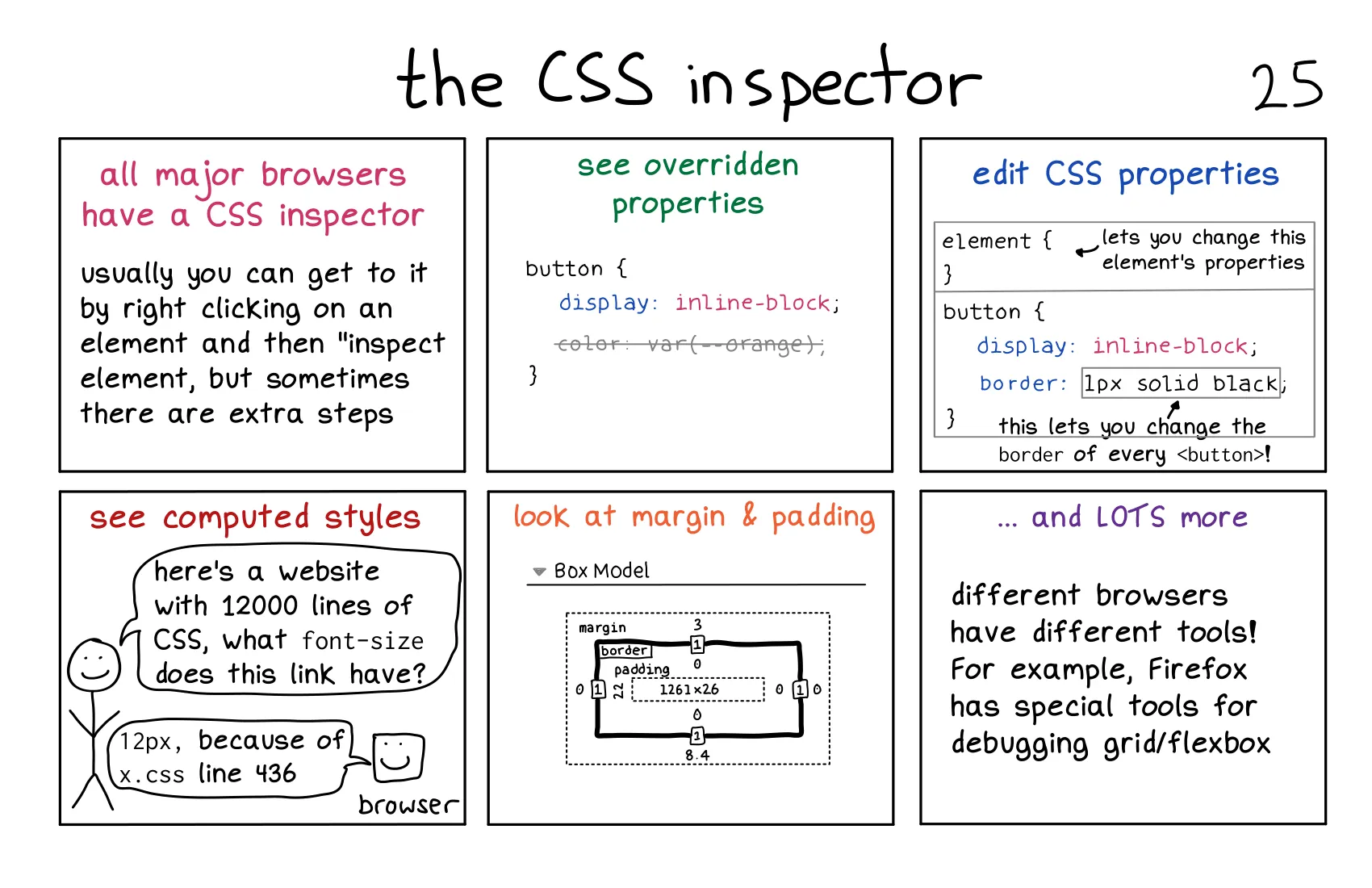
这段内容介绍了 CSS 检查器(CSS Inspector) 的功能及其在调试和开发中的重要性。以下是对内容的详细解释:
<button>Click me</button>
button {
    display: inline-block;
    color: var(--orange);
    border: 1px solid black;
}
color 或 border 属性,并立即看到按钮样式的变化。!important)。button {
color: red; /* 被覆盖 */
}
button.special {
color: blue; /* 实际应用的样式 */
}
color: red; 被 color: blue; 覆盖。font-size 最终计算为 12px,检查器会显示这一结果。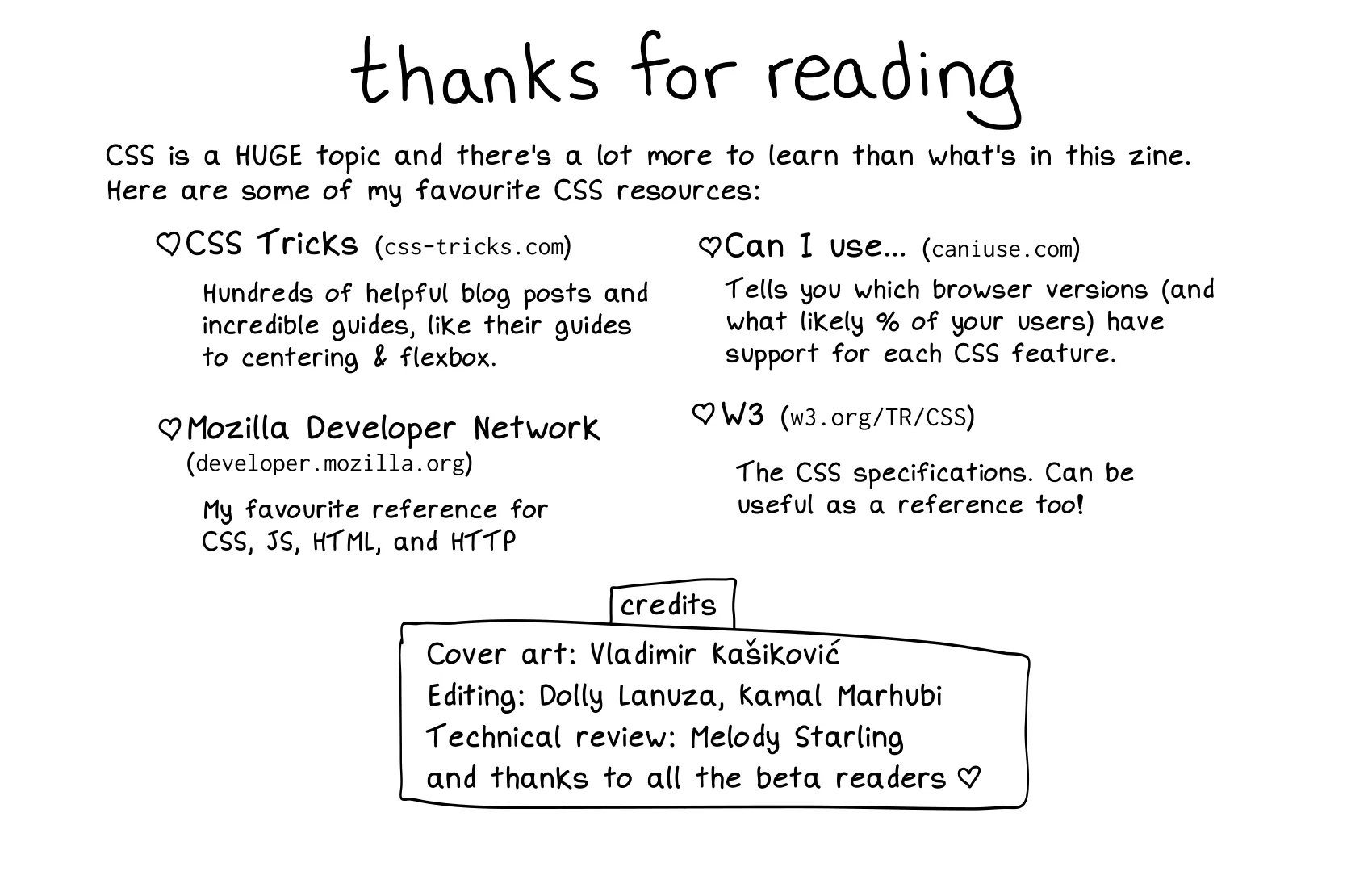
这段内容总结了 CSS 学习资源,并感谢了参与制作这本小册子的人员。以下是对内容的详细解释:
这本书内容涵盖了 CSS 基础知识、布局技巧、调试工具 和 学习资源,对于了解 CSS 核心知识很有用,部分内容不易理解的,结合 DeepSeek 的解释能够帮助快速理解。
此内容由惯性聚合(RSS阅读器)自动聚合整理,仅供阅读参考。 原文来自 — 版权归原作者所有。