


在典型的图形设计器中,有多种技术手段实现item之间的连接:
(1)在工具箱中,提供连接元素,用户可以将其先拖拽到Designer Canvas上,然后,通过连接点将源Item和目标Item连接起来。
(2)Item本身具备连接点,用户可以直接拖拽到其余Item上。
本文,采用第(2)种方式实现。
相信,大家已经知道:在设计器应用程序中,如何去连接Item,但是这里会介绍一些细节问题,以此来说明在连接过程中,各个活动所涉及到的相关类。
(1)如果将鼠标移动到designer item上时,将会在Item的四周出现类型为Connector的四个元素。其默认的布局定义在ConnectorDecoratorTemplate,它是DesignerItem 模板的一部分。当鼠标移动到其中一个Connector之上时,鼠标变为十字形。
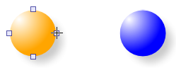
(2)如果点击鼠标左键并拖拽,connector将会生成一个类型为ConnectorAdorner的adorner,该adorner负责绘制源connector与当前鼠标位置之间的路径。在拖拽过程中,adorner同时针对DesignerCanvas进行hit-testing,以便确认鼠标是否处于目标Item的connector之上。
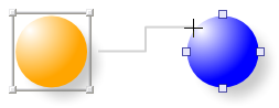
(3)如果在一个Connector元素上方释放鼠标,ConnectorAdorner将会创建一个Connection实例,并将其添加到designer canvas的子控件集合中。如果鼠标在其它地方释放,将不会创建Connection实例。
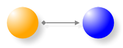
(4)正如DesignerItem一样,Connection也实现ISelectable接口。如果一个Connection实例被选中,将会在connection path的两端看到两个rectangles。他们属于类型为ConnectionAdorner的adorner,会在Connection被选中后,自动出现。
注意:ConnectorAdorner属于Connector,而ConnectionAdorner属于Connection。

(5)这两个rectangles代表Thumb控件,它们是ConnectionAdorner实例的一部分,该实例允许修改当前连接。

(6)例如,拖拽connection中目标Item端的thumb并释放,可以重新连接当前connection。
注意:ConnectorAdorner和ConnectionAdorner在功能上很相似,不同的是它们使用Adorner类的方式。

Connectors的默认布局是ConnectorDecoratorTemplate,它是DesignerItem模板的一部分。
 View Code
<ControlTemplate x:Key="ConnectorDecoratorTemplate" TargetType="{x:Type Control}">
<Grid Margin="-5">
<s:Connector Orientation="Left" VerticalAlignment="Center"
HorizontalAlignment="Left"/>
<s:Connector Orientation="Top" VerticalAlignment="Top"
HorizontalAlignment="Center"/>
<s:Connector Orientation="Right" VerticalAlignment="Center"
HorizontalAlignment="Right"/>
<s:Connector Orientation="Bottom" VerticalAlignment="Bottom"
HorizontalAlignment="Center"/>
</Grid>
</ControlTemplate>
Connector类拥有Position属性,该属性定义connector中心位置相对于designer canvas的相对位置。由于Connector类实现了INotifyPropertyChanged接口,因此它能通知客户端该属性值的变化。当Item改变位置或者改变自身尺寸时,自动触发connector的LayoutUpdated事件,作为WPF布局程序的一部分。当Position属性更新之后,会触发事件通知客户端。
View Code
public class Connector : Control, INotifyPropertyChanged
{
private Point position;
public Point Position
{
get { return position; }
set
{
if (position != value)
{
position = value;
OnPropertyChanged("Position");
}
}
}
public Connector()
{
// fired when layout changes
base.LayoutUpdated += new EventHandler(Connector_LayoutUpdated);
}
void Connector_LayoutUpdated(object sender, EventArgs e)
{
DesignerCanvas designer = GetDesignerCanvas(this);
if (designer != null)
{
//get center position of this Connector relative to the DesignerCanvas
this.Position = this.TransformToAncestor(designer).Transform
(new Point(this.Width / 2, this.Height / 2));
}
}
...
}
Connection拥有Source和Sink属性,其类型都是Connector。当source或sink connector被设置时,会立即注册事件Handler监听connector的PropertyChanged事件。
View Code
public class Connection : Control, ISelectable, INotifyPropertyChanged
{
private Connector source;
public Connector Source
{
get
{
return source;
}
set
{
if (source != value)
{
if (source != null)
{
source.PropertyChanged -=
new PropertyChangedEventHandler(OnConnectorPositionChanged);
source.Connections.Remove(this);
}
source = value;
if (source != null)
{
source.Connections.Add(this);
source.PropertyChanged +=
new PropertyChangedEventHandler(OnConnectorPositionChanged);
}
UpdatePathGeometry();
}
}
}
void OnConnectorPositionChanged(object sender, PropertyChangedEventArgs e)
{
if (e.PropertyName.Equals("Position"))
{
UpdatePathGeometry();
}
}
....
}
这段代码仅仅显示了source connector,但是sink connector也一样。事件handler最后会更新connection path。
定制Connector模板
View Code
<Path IsHitTestVisible="False"
Fill="Orange"
Stretch="Fill"
Data="M 0,10 5,0 10,10 Z">
<s:DesignerItem.DragThumbTemplate>
<ControlTemplate>
<Path Fill="Transparent" Stretch="Fill"
Data="M 0,10 5,0 10,10 Z"/>
</ControlTemplate>
</s:DesignerItem.DragThumbTemplate>
</Path>
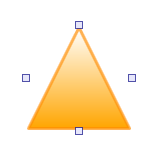
问题是仅仅在鼠标置于Item上方时,connectors才可见。如果尝试触及connector左右两边时会存在问题。但通过名为DesignerItem.ConnectorDecoratorTemplate 的附件属性可以解决该问题,它允许为connector decorator自定义模板。其用法为:
View Code
<Path IsHitTestVisible="False"
Fill="Orange"
Stretch="Fill"
Data="M 0,10 5,0 10,10 Z">
<!-- Custom DragThumb Template -->
<s:DesignerItem.DragThumbTemplate>
<ControlTemplate>
<Path Fill="Transparent" Stretch="Fill"
Data="M 0,10 5,0 10,10 Z"/>
</ControlTemplate>
<s:DesignerItem.DragThumbTemplate>
<!-- Custom ConnectorDecorator Template -->
<s:DesignerItem.ConnectorDecoratorTemplate>
<ControlTemplate>
<Grid Margin="0">
<s:Connector Orientation="Top" HorizontalAlignment="Center"
VerticalAlignment="Top" />
<s:Connector Orientation="Bottom" HorizontalAlignment="Center"
VerticalAlignment="Bottom" />
<UniformGrid Columns="2">
<s:Connector Grid.Column="0" Orientation="Left" />
<s:Connector Grid.Column="1" Orientation="Right"/>
</UniformGrid>
</Grid>
</ControlTemplate>
</s:DesignerItem.ConnectorDecoratorTemplate>
</Path>
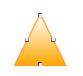
该解决方案提供了另外一种方法,但是需要较为巧妙的布局,通常是行不通的。为此,提供了RelativePositionPanel,允许相对于panel 的边缘来放置items。下面的例子是通过设置RelativePosition附加属性,在RelativePositionPanel上放置三个按钮。
View Code
<c:RelativePositionPanel>
<Button Content="TopLeft" c:RelativePositionPanel.RelativePosition="0,0"/>
<Button Content="Center" c:RelativePositionPanel.RelativePosition="0.5,0.5"/>
<Button Content="BottomRight" c:RelativePositionPanel.RelativePosition="1,1"/>
</ControlTemplate>
当安放Connnector位置时,该Panel离得非常近。
View Code
<Path IsHitTestVisible="False"
Fill="Orange"
Stretch="Fill"
Data="M 9,2 11,7 17,7 12,10 14,15 9,12 4,15 6,10 1,7 7,7 Z">
<!-- Custom DragThumb Template -->
<s:DesignerItem.DragThumbTemplate>
<ControlTemplate>
<Path Fill="Transparent" Stretch="Fill"
Data="M 9,2 11,7 17,7 12,10 14,15 9,12 4,15 6,10 1,7 7,7 Z"/>
</ControlTemplate>
</s:DesignerItem.DragThumbTemplate>
<!-- Custom ConnectorDecorator Template -->
<s:DesignerItem.ConnectorDecoratorTemplate>
<ControlTemplate>
<c:RelativePositionPanel Margin="-4">
<s:Connector Orientation="Top"
c:RelativePositionPanel.RelativePosition="0.5,0"/>
<s:Connector Orientation="Left"
c:RelativePositionPanel.RelativePosition="0,0.385"/>
<s:Connector Orientation="Right"
c:RelativePositionPanel.RelativePosition="1,0.385"/>
<s:Connector Orientation="Bottom"
c:RelativePositionPanel.RelativePosition="0.185,1"/>
<s:Connector Orientation="Bottom"
c:RelativePositionPanel.RelativePosition="0.815,1"/>
</c:RelativePositionPanel>
</ControlTemplate>
</s:DesignerItem.ConnectorDecoratorTemplate>
</Path>

此内容由惯性聚合(RSS阅读器)自动聚合整理,仅供阅读参考。 原文来自 — 版权归原作者所有。