









There is a golden rule in Machine Learning that states: the more data, the better. This rule is a double-edged sword. An indiscriminate addition of data might introduce noise, reduce model performance, and slow down its training process. In this case, more data can hurt model performance, so it’s essential to understand how to deal with it.
In Machine Learning, “dimensionality” refers to the number of features (i.e. input variables) in a dataset. These features (represented as columns in a tabular dataset) fed into a Machine Learning model are called predictors or “p”, and the samples (represented as rows) “n“. Most Machine Learning algorithms assume that there are many more samples than predictors. Still, sometimes the scenario is exactly the opposite, a situation referred to as “big-p, little-n” (“p” for predictors, and “n” for samples).
In industries like Life Sciences, data tends to behave exactly in this way. For example, by using high throughput screening technologies, you can measure thousands or millions of data points for a single sample (e.g., the entire genome, the amounts of metabolites, the composition of the microbiome). Why is this a problem? Because in high dimensions, the data assumptions needed for statistical testing are not met, and several problems arise:
This situation is referred to as “the Curse of Dimensionality”, which states that as data dimensionality increases, we can suffer from a significant impact on the implementation time of certain algorithms, make visualization extremely challenging, and make some Machine Learning models useless. A large number of dimensions in the feature space can mean that the volume of that space is very large, and in turn, the points that we have in that space often represent a small and non-representative sample.
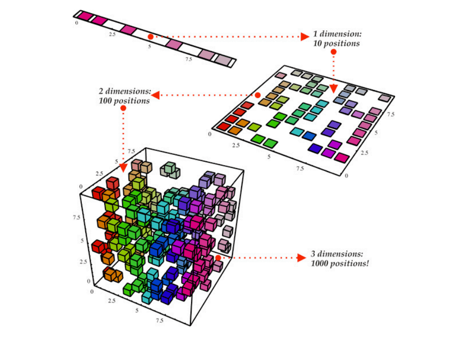
With one dimension (top left), there are only ten possible positions. Therefore ten datum are required to create a representative sample that ‘covers’ the problem space. With two dimensions, there are 10² = 100 possible positions; therefore 100 datum are required to create a representative sample that ‘covers’ the problem space. With three dimensions, there are now 10³ = 1000 possible positions; therefore 1000 datum are required to create a representative sample that ‘covers’ the problem space. This exponential growth in the required number of datum continues to grow exponentially indefinitely.
The good news is that we can reduce data dimensionality to overcome these problems. The concept behind dimensionality reduction is that high-dimensional data are dominated by a small number of simple variables. This way, we can find a subset of variables to represent the same level of information in the data or transform the variables into a new set of variables without losing much information.
When facing high-dimensional data, it is helpful to reduce dimensionality by projecting the data to a lower-dimensional subspace that captures the data’s “essence.” There are several different ways in which you can achieve this algorithmically: PCA, t-SNE and UMAP.
PCA is a linear dimensionality reduction algorithm that helps us extract a new set of variables from an existing high-dimensional dataset. The idea is to reduce the dimensionality of a dataset while retaining as much variance as possible.
PCA is also an unsupervised algorithm that creates linear combinations of the original features, called principal components. Principal components are learned in such a way that the first principal component explains maximum variance in the dataset, the second principal component tries to explain the remaining variance in the dataset while being uncorrelated to the first one, and so on.
Instead of simply choosing useful features and discarding others, PCA uses a linear combination of the existing features in the dataset and constructs new features that are an alternative representation of the original data.
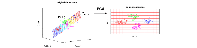
The three original variables (genes) are reduced to a lower number of two new variables termed principal components (PCs). Left: Using PCA, we can identify the two-dimensional plane that optimally describes the highest variance of the data. This two-dimensional subspace can then be rotated and presented as a two-dimensional component space (right).
This way, you might keep only as many principal components as needed to reach a cumulative explained variance of 85%. But why not keep all components? What happens is that each additional component expresses less variance and more noise, so representing the data with a smaller subset of principal components preserves the signal and discards the noise.
PCA increases interpretability while minimizing information loss. It can be used to find the most significant features in a dataset and allows data visualization in 2D and 3D. At the same time, PCA is most suitable when variables have a linear relationship among them (it won’t be able to capture more complex relationships) and is susceptible to significant outliers.
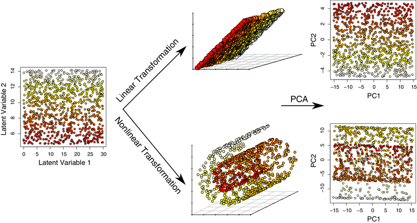
Example of dimensionality reduction of linear and nonlinear data by PCA. The same 2D points can be mapped onto a 3D space using a linear transformation (rotation) or a nonlinear transformation (spiral). When PCA is applied to the 3D datasets, the resulting 2D visualizations are strikingly different. For the linearly-transformed data, PCA is able to entirely recover the structure of the original data. However, for the nonlinear dataset, the limitation of PCA to rigid rotation of the axes causes the loss of salient information about the original data. For the linear case, PC1 and PC2 cumulatively account for 100% of the total variation, whereas they account for only 75% of the total variation in the nonlinear case.
You can find a tutorial on calculating PCA in this link and an example coded in Python here.
Created for high-dimensional visualization purposes, t-SNE is a non-linear dimensionality reduction algorithm. This algorithm tries to maximize the probability that similar points are positioned near each other in a low-dimensional map while preserving longer-distance relationships as a secondary priority. It attracts data points that are nearest neighbors to each other and simultaneously pushes all points away from each other.
Contrary to PCA, t-SNE it’s not a deterministic technique but a probabilistic one. The idea behind it is to minimize the divergence between two distributions: a distribution that measures pairwise similarities of the input objects, and a distribution that measures pairwise similarities of the corresponding low-dimensional points in the embedding. It looks to match both distributions to determine how to best represent the original dataset using fewer dimensions.
More specifically, t-SNE uses a normal distribution (in the higher dimension) and a t-Distribution (in the lower dimension) to reduce dimensionality. t-Distribution is a lot like a normal distribution, with the difference that it is not as tall as a normal distribution in the middle, but its tails are taller at the ends. The idea is to cluster data points in the lower dimension in a more sparse way to generate better visualizations.
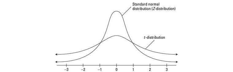
Why is t-Distribution used instead of normal distribution in lower dimensions? Because without it data clusters would clump up in the middle and will be harder to visualize.
There are several tuneable hyperparameters to optimize t-SNE, like:
Changing these hyperparameters can deeply affect the accuracy and quality of t-SNE results.
t-SNE can give us a fascinating projection of the latent space. In this example from the MNIST handwritten digits dataset, the 3D projection shows dense clusters where the same digits are close to one another.
t-SNE is an incredibly flexible algorithm that can find structure where others cannot. Unfortunately, it can be hard to interpret: after processing, the input features are no longer identifiable, and you cannot make any inference based only on the outputs.
While being stochastic, multiple executions with different initializations will yield different results, and whatsmore, both its computational and memory complexity are O(n2 ), which can make it quite heavy on system resources.
Find here an interactive explanation of t-SNE.
UMAP is another nonlinear dimension-reduction algorithm that overcomes some of the limitations of t-SNE. It works similarly to t-SNE in that it tries to find a low-dimensional representation that preserves relationships between neighbors in high-dimensional space, but with an increased speed and better preservation of the data’s global structure.
UMAP is a non-parametric algorithm that consists of two steps: (1) compute a fuzzy topological representation of a dataset, and (2) optimize the low dimensional representation to have as close a fuzzy topological representation as possible as measured by cross entropy.
Dimensionality reduction applied to the Fashion MNIST dataset. 28x28 images of clothing items in 10 categories are encoded as 784-dimensional vectors and then projected to 3 using UMAP and t-SNE.
There are two main hyperparameters in UMAP that are used to control the balance between local and global structure in the final projection:
Fine-tuning these hyperparameters can be challenging, and this is where UMAP’s speed is a big advantage: by running it multiple times with a variety of hyperparameter values, you can get a better sense of how the projection is affected.
Compared to t-SNE, UMAP presents several advantages since it:
You can find an interactive explanation of UMAP here and try different algorithms and datasets in the TensorBoard Embedding Projector.
There’s one thing we can be certain about in Machine Learning: the future will bring more data. Whatsmore, Machine Learning models will continue to evolve to highly complex architectures. In that scenario, dimensionality reduction algorithms can bring huge benefits like:
In turn, these benefits translate into better model performance, increased interpretability, and improved data scalability. But of course, dimensionality reduction comes with data loss. No dimensionality reduction technique is perfect : by definition, we’re distorting the data to fit it into lower dimensions. This is why it’s so critical to understand how these algorithms work and how they are used to effectively visualize and understand high-dimensional datasets.
此内容由惯性聚合(RSS阅读器)自动聚合整理,仅供阅读参考。 原文来自 — 版权归原作者所有。